SSC CGL Previous Year Questions: Data Interpretation - 7 - SSC CGL MCQ
18 Questions MCQ Test SSC CGL Mathematics Previous Year Paper (Topic-wise) - SSC CGL Previous Year Questions: Data Interpretation - 7
DIRECTIONS: The pie-chart given below shows the distribution of workforce by occupational category for country X in 1981 and 1995. Study the chart and answer the questions no. 15 to 19. (SSC Sub. Ins. 2012)

Q. The increase in the number of Clerical workers in the workforce of country X from 1981 to 1995 (in millions) is:

DIRECTIONS: The pie-chart given below shows the distribution of workforce by occupational category for country X in 1981 and 1995. Study the chart and answer the questions no. 15 to 19. (SSC Sub. Ins. 2012)

Q. The ratio of the number of workers in the Professional category in 1981 to the number of such workers in 1995 is

| 1 Crore+ students have signed up on EduRev. Have you? Download the App |
DIRECTIONS: The pie-chart given below shows the distribution of workforce by occupational category for country X in 1981 and 1995. Study the chart and answer the questions no. 15 to 19. (SSC Sub. Ins. 2012)
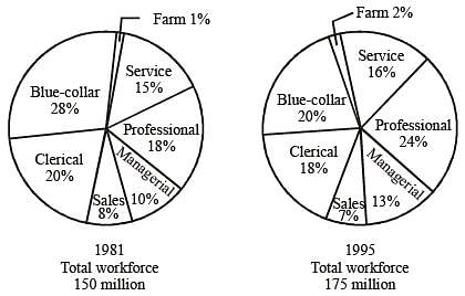
Q. In 1981, the number of categories which comprised of more than 25 million workers each, is

DIRECTIONS: The pie-chart given below shows the distribution of workforce by occupational category for country X in 1981 and 1995. Study the chart and answer the questions no. 15 to 19. (SSC Sub. Ins. 2012)

Q. In 1981, the number of Sevice workers in the workforce, in millions, was
DIRECTIONS: The following graph shows the production of cotton bales of 100 kg each in lakhs by different states A, B, C, D and E over the years. Study the graph and answer Question Nos. 11 to 14. (SSC CGL 2nd Sit.2011)

Q. The number of States for which the production of cotton in 2005–2006 is less than or equal to the preceding year is
DIRECTIONS: The following graph shows the production of cotton bales of 100 kg each in lakhs by different states A, B, C, D and E over the years. Study the graph and answer Question Nos. 11 to 14. (SSC CGL 2nd Sit.2011)

Q. How many kg of cotton was produced by State C durig the given period?
DIRECTIONS: The following graph shows the production of cotton bales of 100 kg each in lakhs by different states A, B, C, D and E over the years. Study the graph and answer Question Nos. 11 to 14. (SSC CGL 2nd Sit.2011)
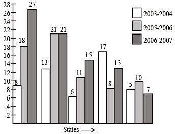
Q. In which State(s) is there a steady increase in the production of cotton during the given period?
DIRECTIONS: The following graph shows the production of cotton bales of 100 kg each in lakhs by different states A, B, C, D and E over the years. Study the graph and answer Question Nos. 11 to 14. (SSC CGL 2nd Sit.2011)

Q. The production of State C in 2003–2004 is how many times its production in 2006–2007?
DIRECTIONS: The following graph shows the demand and production of cotton by 5 companies A, B, C, D and E. Study the graph and answer questions. (SSC CGL 1st Sit.2011)
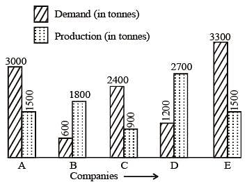
Q. The demand for company B is what percent of the demand for company C?
DIRECTIONS: The following graph shows the demand and production of cotton by 5 companies A, B, C, D and E. Study the graph and answer questions. (SSC CGL 1st Sit.2011)

Q. The production of company D is how many times that of the production of the company A?
DIRECTIONS: The following graph shows the demand and production of cotton by 5 companies A, B, C, D and E. Study the graph and answer questions. (SSC CGL 1st Sit.2011)

Q. What is the difference (in tonnes) between average demand and average production of the five companies taken together?
DIRECTIONS: The following graph shows the demand and production of cotton by 5 companies A, B, C, D and E. Study the graph and answer questions. (SSC CGL 1st Sit.2011)

Q. What is the ratio of companies having more demand than production to those having more production than demand?
DIRECTIONS: The pie chart, given here, shows the amount of money spent on various sports by a school administration in a particular year.
Observe the pie chart and answer the questions based on this graph. (SSC CGL 2nd Sit.2010)

Q. If the money spent on football is ₹ 9,000, then what was the total amount spent on all sports ?
DIRECTIONS: The pie chart, given here, shows the amount of money spent on various sports by a school administration in a particular year.
Observe the pie chart and answer the questions based on this graph. (SSC CGL 2nd Sit.2010)

Q. If the money spent on football was ₹9,000, what amount was spent on Cricket ?
DIRECTIONS: The pie chart, given here, shows the amount of money spent on various sports by a school administration in a particular year.
Observe the pie chart and answer the questions based on this graph. (SSC CGL 2nd Sit.2010)
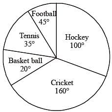
Q. If the money spent on football was ₹ 9,000 how much more money was spent on hockey than on football?
DIRECTIONS: The pie chart, given here, represents the number of valid votes obtained by four students who contested election for school leadership. The total number of valid votes polled was 720.
Observe the chart and answer the questions based on it. (SSC CGL 1st Sit. 2010)

Q. By how many votes did the winner defeat his nearest rival ?
DIRECTIONS: The pie chart, given here, represents the number of valid votes obtained by four students who contested election for school leadership. The total number of valid votes polled was 720.
Observe the chart and answer the questions based on it. (SSC CGL 1st Sit. 2010)

Q. Who was the winner....?
DIRECTIONS: The pie chart, given here, represents the number of valid votes obtained by four students who contested election for school leadership. The total number of valid votes polled was 720.
Observe the chart and answer the questions based on it. (SSC CGL 1st Sit. 2010)
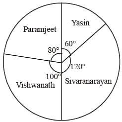
Q. What was the minimum number of votes obtained by any candidate?
|
21 docs|55 tests
|
|
21 docs|55 tests
|


