The horizontal bars in the above diagram represent 2020 aggregate sales (in ₹ million) of a company for the different subcategories of its products. The top four product subcategories (Bookcases, Chairs, Furnishings, Tables) belong to furniture product category; the bottom four product subcategories (Accessories, Copiers, Machines, Phones) belong to the technology product category while all other product subcategories belong to the office supply product category. For each of the product subcategories, there is a vertical line indicating the sales of the corresponding subcategory in 2019.
Question for CAT Previous Year Questions: Bar Graphs
Try yourself:The total sales (in ₹ million) in 2019 from products in office supplies category is closest to
Explanation
The total sales from products in the office supply category in 2019 is : Sum of sales of : Binders: 3.6 million Art : 0.4 million. Appliances: 1.9 million Envelops: 0.3 million Fasteners: 0.1 million Labels: 0.2 million Paper = 1.5 million. Storage: 4.3 million. Supplies: 1.1 million. The sum of sales of these products = 3.6+0.4+1.9+0.3+0.1+0.2+1.5+4.3+1.1 = 13.4 million. The closest among the option is 13.5 million.
View Solution
*Answer can only contain numeric values
Question for CAT Previous Year Questions: Bar Graphs
Try yourself:How many subcategories had sales of ₹ 4 million or more in 2019 and registered an increase in sales in excess of 25% in 2020?
Correct Answer : 1
Explanation
The number of subcategories had sales of ₹ 4 million or more in 2019 and registered an increase in sales in excess of 25% in 2020 : The subcategories with more than 4 million in sales in 2019 are : Chairs: 6.2 million in 2019 and 7 million in 2020. (For a 25 percent increase the sales must be at least 7.8 million and hence fails) Tables: 4.4 million in 2019 and 4.5 million in 2020. (For a 25 percent increase the sales must be at least 5.5 million and hence fails) Storage: 4.3 million sales in 2019 and 5.1 million in 2020. (For a 25 percent increase the sales must be at least 5.4 and hence fails) Phones: 5.75 million in 2019 and 7.5 million in 2020. (An increase of 30.5 percent) Hence only one subcategory satisfies the condition.
Check
View Solution
Question for CAT Previous Year Questions: Bar Graphs
Try yourself:The percentage increase in sales in Furniture category from 2019 to 2020 is closest to
Explanation
The percentage increase in sales in the furniture category from 2019 to 2020 are : Bookcases: 1.9 million in 2019 and 2.2 million in 2020. Chairs: 6.2 million in 2019 and 7 million in 2020. Furnishings: 2.05 million in 2019 and 2.1 million in 2020. Tables: 4.4 million in 2019 and 4.5 million in 2020. Hence the percentage increase is given by :
View Solution
Question for CAT Previous Year Questions: Bar Graphs
Try yourself:The improvement index for a category is the maximum percentage increase in sales from 2019 to 2020 among any of its subcategories. The correct order of categories in increasing order of this improvement index is
Explanation
The improvement index for a category is the maximum percentage increase in sales from 2019 to 2020 among any of its subcategories. Hence based on the information provided in the tabular data we need to look for the different subcategories where the rise in sales from 2019 to 2020 is higher. Based on the visual data : In the furniture category : Bookcases and Chairs have a relatively high percentage increase : Books cases: 1.9 million to 2.2 million (15.7 percent increase) Chairs: 6.2 million to 7 million (12.9 percent increase) In the office supply category : Binders and Appliances have a relatively high percentage increase : Binders: 3.6 million to 5.3 million (47 percent increase) Appliances: 1.9 million to 3.15 million (65.7 percent increase) In technology product category : Accessories: 3.1 to 4.4 million. (41.9 percent increase) Phones: 5.8 million to 7.7 million (32.7 percent increase) Hence among the categories : The highest increase among them is in the order : Furniture < Technology product < office supply.
View Solution
Passage - 2
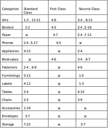
The different bars in the diagram above provide information about different orders in various categories (Art, Binders, ….) that were booked in the first two weeks of September of a store for one client. The colour and pattern of a bar denotes the ship mode (First Class / Second Class / Standard Class). The left end point of a bar indicates the booking day of the order, while the right end point indicates the dispatch day of the order. The difference between the dispatch day and the booking day (measured in terms of the number of days) is called the processing time of the order. For the same category, an order is considered for booking only after the previous order of the same category is dispatched. No two consecutive orders of the same category had identical ship mode during this period. For example, there were only two orders in the furnishing category during this period. The first one was shipped in the Second Class. It was booked on Sep 1 and dispatched on Sep 5. The second order was shipped in the Standard class. It was booked on Sep 5 (although the order might have been placed before that) and dispatched on Sep 12. So the processing times were 4 and 7 days respectively for these orders.
*Answer can only contain numeric values
Question for CAT Previous Year Questions: Bar Graphs
Try yourself:How many days between Sep 1 and Sep 14 (both inclusive) had no booking from this client considering all the above categories?
Correct Answer : 6
Explanation
Accumulating all the data : We get the following table : Note a-b : represents the duration where a is the day when order is booked and b is the day when it is dispatched . Now No booking days from the table are : September 8,9,10,11,12 and 14. So a total of 6 days .
Check
View Solution
Question for CAT Previous Year Questions: Bar Graphs
Try yourself:The sequence of categories -- Art, Binders, Paper and Phones -- in decreasing order of average processing time of their orders in this period is:
Explanation
Accumulating all the data : We get the following table :
Note a-b : represents the duration where a is the day when order is booked and b is the day when it is dispatched. Now taking average processing time per order for the above mentioned categories we get: So in decreasing order we get Phones , Art ,Binder , Paper.
View Solution
*Answer can only contain numeric values
Question for CAT Previous Year Questions: Bar Graphs
Try yourself:What was the average processing time of all orders in the categories which had only one type of ship mode?
Correct Answer : 11
Explanation
Accumulating all the data : We get the following table : Note a-b : represents the duration where a is the day when order is booked and b is the day when it is dispatched . Now Envelopes and Accessories has only 1 ship mode i.e Standard class . So therefore processing days for envelopes = 7-3 =4 and processing days for accessories = 19-1 =18 Therefore average
Check
View Solution
Question for CAT Previous Year Questions: Bar Graphs
Try yourself:Approximately what percentage of orders had a processing time of one day during the period Sep 1 to Sep 22 (both dates inclusive)?
Explanation
Accumulating all the data : We get the following table : Note a-b : represents the duration where a is the day when order is booked and b is the day when it is dispatched . Now from the table we observe that the total number of orders are 35 and 7 orders have a processing time of 1 unit The 7 orders are : Arts Standard class,Binders First class and standard class, Phones First class, Bookcases second class ( 2 orders) and Chairs standard class. So the percentage
View Solution
Passage - 3
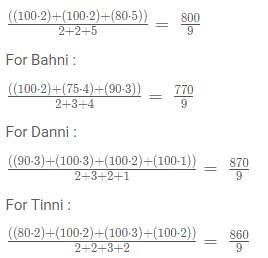
The figure above shows the schedule of four employees - Abani, Bahni, Danni, and Tinni - whom Dhoni supervised in 2020. Altogether there were five projects which started and concluded in 2020 in which they were involved. For each of these projects and for each employee, the starting day was at the beginning of a month and the concluding day was the end of a month, and these are indicated by the left and right end points of the corresponding horizontal bars. The number within each bar indicates the percentage of assigned work completed by the employee for that project, as assessed by Dhoni. For each employee, his/her total project-month (in 2020) is the sum of the number of months (s)he worked across the five projects, while his/her annual completion index is the weightage average of the completion percentage assigned from the different projects, with the weights being the corresponding number of months (s)he worked in these projects. For each project, the total employee-month is the sum of the number of months four employees worked in this project, while its completion index is the weightage average of the completion percentage assigned for the employees who worked in this project, with the weights being the corresponding number of months they worked in this project.
Question for CAT Previous Year Questions: Bar Graphs
Try yourself:The list of employees in decreasing order of annual completion index is:
Explanation
The annual completion index for different people is : The weightage average of the completion percentage assigned from the different projects, with the weights being the corresponding number of months (s)he worked in these projects. For Abani : The descending order for the four people is : Danni, Tinni, Abani, Bahni.
View Solution
Question for CAT Previous Year Questions: Bar Graphs
Try yourself:Which employees did not work in multiple projects for any of the months in 2020?
Explanation
Abani, Banni, and Danni did not work on multiple projects simultaneously in a month Tinni was the only person who worked on multiple projects which are project 4 and project 5 in the month of september.
View Solution
Question for CAT Previous Year Questions: Bar Graphs
Try yourself:Which of the following statements is/are true? I: The total project-month was the same for the four employees. II: The total employee-month was the same for the five projects.
Explanation
The total project month is the number of months Abani, Bahni, Danni, and Tinni individually worked for all the projects combined : Abani - 2+2+5 = 9 months Bahni - 2+4+3 = 9 months Danni - 3+3+2+1 = 9 months Tinni - 2+2+3+2 = 9 months. The total employee month for all the five projects is the sum of the total employee-month is the sum of the number of months four employees worked in this project. Project -1 = 2+2+2 = 6 months Project -2 = 3+2 = 5 months Project - 3 = 2+4+3 = 9 months. Project - 4 = 5+2+3 = 10 months. Project - 5 = 3+1+2 = 6 months. Only statement 1 is true.
View Solution
Question for CAT Previous Year Questions: Bar Graphs
Try yourself:The project duration, measured in terms of the number of months, is the time during which at least one employee worked in the project. Which of the following pairs of the projects had the same duration?
Explanation
Considering the information provided : For project 1 : 3 months. Project - 2: 3 months. Project - 3: 5 months. Project - 4: 5 months. Project - 5: 4 months. Among the given options option D is true which is project 3, project 4.
FAQs on CAT Previous Year Questions: Bar Graphs - Logical Reasoning (LR) and Data Interpretation (DI)
1. What is the CAT exam and how does it relate to bar graphs?
Ans. The CAT exam, short for Common Admission Test, is a computer-based test conducted in India for admission to various management programs. It is known for its high level of difficulty and is widely recognized by top business schools. Bar graphs are a common type of data representation used in the CAT exam, and questions related to bar graphs often appear in the Data Interpretation section of the exam.
2. How should I interpret a bar graph in the CAT exam?
Ans. When interpreting a bar graph in the CAT exam, you should carefully analyze the axes, labels, and bars. The height or length of each bar represents the quantity or value being measured. Pay attention to any additional information provided in the graph, such as legends or scales. It is crucial to understand the data presented in the bar graph accurately to answer questions related to it.
3. Are there any specific strategies to solve bar graph questions in the CAT exam?
Ans. Yes, there are several strategies that can be helpful in solving bar graph questions in the CAT exam. Firstly, carefully read the question and understand what information is required from the given bar graph. Pay attention to any units of measurement mentioned. Secondly, identify the key data points from the graph and organize them in a systematic manner. Thirdly, use estimation techniques to quickly eliminate incorrect answer choices. Lastly, practice solving a variety of bar graph questions to improve your speed and accuracy.
4. Can I expect multiple bar graphs in the CAT exam?
Ans. Yes, it is possible to encounter multiple bar graphs in the CAT exam. The exam aims to test your ability to interpret and analyze data from various sources, including multiple bar graphs. It is essential to be comfortable with reading and understanding multiple graphs simultaneously to perform well in the Data Interpretation section of the CAT exam.
5. Are there any recommended resources or practice materials to improve my bar graph interpretation skills for the CAT exam?
Ans. Yes, there are several resources available to improve your bar graph interpretation skills for the CAT exam. You can refer to CAT preparation books, online mock tests, and question banks that specifically focus on Data Interpretation. Additionally, you can solve previous year CAT question papers to understand the types of bar graph questions that have appeared in the exam in the past. Regular practice and familiarization with different types of bar graphs will help you build the necessary skills for the CAT exam.