SSC CGL Exam > SSC CGL Notes > SSC CGL Tier 2 - Study Material, Online Tests, Previous Year > Cartogram - Presentation of Data, Business Mathematics & Statistics
Cartogram - Presentation of Data, Business Mathematics & Statistics | SSC CGL Tier 2 - Study Material, Online Tests, Previous Year PDF Download

Graphing Statistics & Data
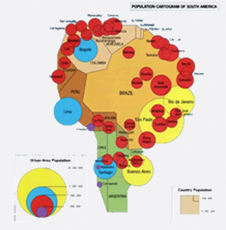
A cartogram or map chart is a map on which different symbols, signs, colours, diagrams, etc are superimposed. Geographically classified data can be presented by this method. It gives a very quick idea about the data in different geographical parts. Production of electricity statewise in a country, procurement of rise distric-wise in a state, munber of coal mines country wise etc can be presented by a cartogram.
Example
This map shows where the population clusters in South America are.
The document Cartogram - Presentation of Data, Business Mathematics & Statistics | SSC CGL Tier 2 - Study Material, Online Tests, Previous Year is a part of the SSC CGL Course SSC CGL Tier 2 - Study Material, Online Tests, Previous Year.
All you need of SSC CGL at this link: SSC CGL
|
1597 videos|1641 docs|920 tests
|
FAQs on Cartogram - Presentation of Data, Business Mathematics & Statistics - SSC CGL Tier 2 - Study Material, Online Tests, Previous Year
| 1. What is a cartogram? |  |
A cartogram is a visualization technique that presents statistical data using maps. It distorts the geographic boundaries of regions or countries to represent the variable being displayed, such as population or GDP. The size or shape of the regions on the map is proportional to the data being presented, allowing for a more intuitive understanding of the information.
| 2. How are cartograms useful in the presentation of data? | |
Cartograms are useful in the presentation of data as they provide a visually appealing way to represent complex information. By distorting the map's boundaries, cartograms can highlight variations in data across regions and make comparisons easier. They also allow for the identification of patterns, trends, and spatial relationships that may not be immediately apparent in traditional maps or numerical tables.
| 3. What are the advantages of using cartograms for data visualization? | |
There are several advantages of using cartograms for data visualization. Firstly, they provide a clear and concise representation of data, making it easier for viewers to interpret and understand the information being presented. Additionally, cartograms can effectively convey large amounts of data in a single image, saving space and reducing clutter. They also facilitate the identification of outliers and help in identifying regions where certain variables have higher or lower values.
| 4. Are there any limitations or challenges when using cartograms for data presentation? | |
Yes, there are some limitations and challenges when using cartograms for data presentation. One limitation is that the distortion of the map's boundaries can sometimes lead to misinterpretation or confusion, especially when viewers are not familiar with the original geographic shape of the regions. Another challenge is that creating accurate and aesthetically pleasing cartograms can be technically complex and time-consuming. Additionally, cartograms may not be suitable for presenting certain types of data, such as continuous variables or data that requires precise geographic references.
| 5. How can I create cartograms for my own data? | |
Creating cartograms for your own data requires specialized software or programming skills. There are various software tools available, such as Carto, QGIS, or ScapeToad, that allow you to generate cartograms from your data. These tools typically provide options for selecting the input data, choosing the variable to represent, and customizing the appearance of the cartogram. Alternatively, if you are familiar with programming languages like R or Python, you can use libraries and packages specifically designed for cartogram creation, such as `cartogram` in R or `cartopy` in Python.
About this Document

4.97/5
Rating

Sep 09, 2025
Last updated
Document Description: Cartogram - Presentation of Data, Business Mathematics & Statistics for SSC CGL 2025 is part of SSC CGL Tier 2 - Study Material, Online Tests, Previous Year preparation.
The notes and questions for Cartogram - Presentation of Data, Business Mathematics & Statistics have been prepared according to the SSC CGL exam syllabus. Information about Cartogram - Presentation of Data, Business Mathematics & Statistics covers topics
like and Cartogram - Presentation of Data, Business Mathematics & Statistics Example, for SSC CGL 2025 Exam. Find important definitions, questions, notes, meanings, examples, exercises and tests below for Cartogram - Presentation of Data, Business Mathematics & Statistics.
Introduction of Cartogram - Presentation of Data, Business Mathematics & Statistics in English is available as part of our SSC CGL Tier 2 - Study Material, Online Tests, Previous Year
for SSC CGL & Cartogram - Presentation of Data, Business Mathematics & Statistics in Hindi for SSC CGL Tier 2 - Study Material, Online Tests, Previous Year course.
Download more important topics related with notes, lectures and mock test series for SSC CGL
Exam by signing up for free. SSC CGL: Cartogram - Presentation of Data, Business Mathematics & Statistics | SSC CGL Tier 2 - Study Material, Online Tests, Previous Year
Description
Full syllabus notes, lecture & questions for Cartogram - Presentation of Data, Business Mathematics & Statistics | SSC CGL Tier 2 - Study Material, Online Tests, Previous Year - SSC CGL | Plus excerises question with solution to help you revise complete syllabus for SSC CGL Tier 2 - Study Material, Online Tests, Previous Year | Best notes, free PDF download
Information about Cartogram - Presentation of Data, Business Mathematics & Statistics
In this doc you can find the meaning of Cartogram - Presentation of Data, Business Mathematics & Statistics defined & explained in the simplest way possible. Besides explaining types of
Cartogram - Presentation of Data, Business Mathematics & Statistics theory, EduRev gives you an ample number of questions to practice Cartogram - Presentation of Data, Business Mathematics & Statistics tests, examples and also practice SSC CGL
tests

Related Searches
Online Tests
,mock tests for examination
,Free
,MCQs
,Extra Questions
,Business Mathematics & Statistics | SSC CGL Tier 2 - Study Material
,practice quizzes
,video lectures
,Summary
,Semester Notes
,ppt
,Viva Questions
,Online Tests
,Business Mathematics & Statistics | SSC CGL Tier 2 - Study Material
,Exam
,Cartogram - Presentation of Data
,Business Mathematics & Statistics | SSC CGL Tier 2 - Study Material
,Previous Year
,Objective type Questions
,Previous Year
,study material
,past year papers
,Previous Year
,Cartogram - Presentation of Data
,Important questions
,shortcuts and tricks
,Cartogram - Presentation of Data
,Sample Paper
,Previous Year Questions with Solutions
,Online Tests
;


Additional Information about Cartogram - Presentation of Data, Business Mathematics & Statistics for SSC CGL Preparation
Cartogram - Presentation of Data, Business Mathematics & Statistics Free PDF Download
The Cartogram - Presentation of Data, Business Mathematics & Statistics is an invaluable resource that delves deep into the core of the SSC CGL exam.
These study notes are curated by experts and cover all the essential topics and concepts, making your preparation more efficient and effective.
With the help of these notes, you can grasp complex subjects quickly, revise important points easily,
and reinforce your understanding of key concepts. The study notes are presented in a concise and easy-to-understand manner,
allowing you to optimize your learning process. Whether you're looking for best-recommended books, sample papers, study material,
or toppers' notes, this PDF has got you covered. Download the Cartogram - Presentation of Data, Business Mathematics & Statistics now and kickstart your journey towards success in the SSC CGL exam.
Importance of Cartogram - Presentation of Data, Business Mathematics & Statistics
The importance of Cartogram - Presentation of Data, Business Mathematics & Statistics cannot be overstated, especially for SSC CGL aspirants.
This document holds the key to success in the SSC CGL exam.
It offers a detailed understanding of the concept, providing invaluable insights into the topic.
By knowing the concepts well in advance, students can plan their preparation effectively.
Utilize this indispensable guide for a well-rounded preparation and achieve your desired results.
Cartogram - Presentation of Data, Business Mathematics & Statistics Notes
Cartogram - Presentation of Data, Business Mathematics & Statistics Notes offer in-depth insights into the specific topic to help you master it with ease.
This comprehensive document covers all aspects related to Cartogram - Presentation of Data, Business Mathematics & Statistics.
It includes detailed information about the exam syllabus, recommended books, and study materials for a well-rounded preparation.
Practice papers and question papers enable you to assess your progress effectively.
Additionally, the paper analysis provides valuable tips for tackling the exam strategically.
Access to Toppers' notes gives you an edge in understanding complex concepts.
Whether you're a beginner or aiming for advanced proficiency, Cartogram - Presentation of Data, Business Mathematics & Statistics Notes on EduRev are your ultimate resource for success.
Cartogram - Presentation of Data, Business Mathematics & Statistics SSC CGL Questions
The "Cartogram - Presentation of Data, Business Mathematics & Statistics SSC CGL Questions" guide is a valuable resource for all aspiring students preparing for the
SSC CGL exam. It focuses on providing a wide range of practice questions to help students gauge
their understanding of the exam topics. These questions cover the entire syllabus, ensuring comprehensive preparation.
The guide includes previous years' question papers for students to familiarize themselves with the exam's format and difficulty level.
Additionally, it offers subject-specific question banks, allowing students to focus on weak areas and improve their performance.
Study Cartogram - Presentation of Data, Business Mathematics & Statistics on the App
Students of SSC CGL can study Cartogram - Presentation of Data, Business Mathematics & Statistics alongwith tests & analysis from the EduRev app,
which will help them while preparing for their exam. Apart from the Cartogram - Presentation of Data, Business Mathematics & Statistics,
students can also utilize the EduRev App for other study materials such as previous year question papers, syllabus, important questions, etc.
The EduRev App will make your learning easier as you can access it from anywhere you want.
The content of Cartogram - Presentation of Data, Business Mathematics & Statistics is prepared as per the latest SSC CGL syllabus.
|
© EduRev
|
Education Revolution
|


|


Signup to see your scores
go up within 7 days!
Access 1000+ FREE Docs, Videos and Tests
Takes less than 10 seconds to signup