Bar Graph Chapter Notes | Mental Maths - Class 1 PDF Download
What is a Bar Graph?
Bar graphs, also referred to as bar charts, visually represent grouped data through vertical or horizontal rectangular bars. These bars have consistent widths, with one axis representing the variable quantity and the other axis indicating the measurement of the variable. The height or length of each bar corresponds to the value of the variable, facilitating comparison between different quantities. Bar charts are particularly useful for illustrating frequency distribution tables, simplifying data analysis and comprehension.

- The bar graph helps to compare the different sets of data among different groups easily.
- It shows the relationship using two axes, in which the categories are on one axis and the discrete values are on the other axis.
- The graph shows the major changes in data over time.
What Constitutes a Bar Graph?
Following are the many parts of a bar graph:
- Vertical axis
- Horizontal axis
- The bar graph’s title informs the reader of its purpose.
- The title of the horizontal axis indicates the information that is shown there.
- The title of the vertical axis indicates the data it is used to display.
- The categories on the particular axis indicate what each bar represents.
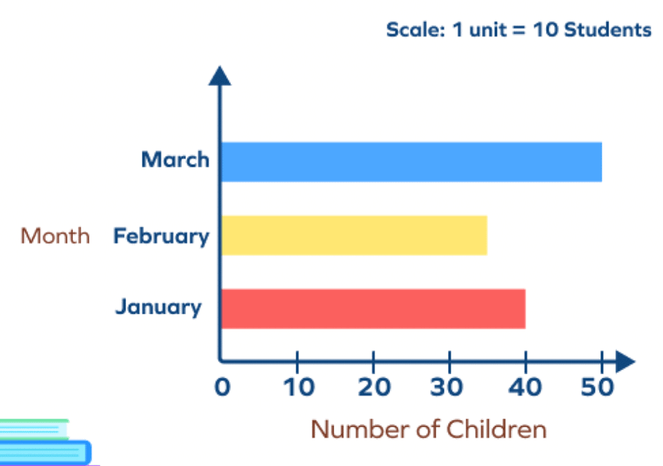
- The bar graph’s scale demonstrates how numbers are used in the data. It is a system of markings spaced at specific intervals that aid in object measurement. For instance, the scale of a graph may be stated as 1 unit = 10 fruits

Types of Bar Graphs
Bar graphs can be either up-and-down or side-to-side. The important part of a bar graph is how long or tall each bar is. If a bar is longer, it means the numbers are bigger.
In bar graphs, we usually see groups of categories or numbers. They have lines and rectangles. The rectangles show how often different things happen. Sometimes, they show the different things themselves. The lines help us know what each rectangle means. The number of lines on the side or bottom of a bar graph is called the scale.
The types of bar charts are as follows:
Vertical Bar Graphs
When the grouped data are represented vertically in a graph or chart with the help of bars, where the bars denote the measure of data, such graphs are called vertical bar graphs. The data is represented along the y-axis of the graph, and the height of the bars shows the values.
Horizontal Bar Graphs
When the grouped data are represented horizontally in a chart with the help of bars, then such graphs are called horizontal bar graphs, where the bars show the measure of data. The data is depicted here along the x-axis of the graph, and the length of the bars denote the values. Horizontal Bar Graph
Properties of Bar Graph
Some of the important properties of a bar graph are as follows:
- Every bar should share the same starting point.
- Each column in the graph needs to be the same width.
- The height of each bar must match its data value.
- The space between each bar should be consistent.
Applications of Bar Graphs
Bar graphs help us compare things in different groups or see how things change over time. But they work best when the changes are big.
Bar charts have lines and are made so all the information fits on the graph. When the order of the lines doesn't follow a pattern, the bars can be in any order. If the bars go from the biggest to the smallest number, they're called Pareto charts.
- In a restaurant, a bar graph can show which foods are popular. Each bar's height tells us how many orders were made for that food.
- In elections, bar graphs show how many people voted for each person. They also show how much money different parts spent. Bars are stacked to compare them easily.
Advantages and Disadvantages of Bar Chart
Advantages:
- Bar graphs make big data easy to understand with pictures.
- They show how often each group of data appears.
- Bar graphs help us see trends in data better than just looking at a table.
- They let us quickly see important numbers.
Disadvantages:
- Sometimes, bar graphs don't show all the details or reasons.
- People can change bar graphs to show false information.
How to Draw a Bar Graph?
Let's make a bar graph for different pets like cats, dogs, rabbits, and hamsters, and how many there are of each.
Step 1: Decide on the title, like "Pets at Home".
Step 2: Draw lines up and down and side to side.
Step 3: Put labels on the bottom line.
Step 4: Write "Cat", "Dog", "Rabbit", and "Hamster" on the bottom line.
Step 5: Label the side line with "Number of Pets".
Step 6: Pick how many pets each square means.
Step 7: Finally, draw bars for each type of pet with how many there are.

Double Bar Graphs
Introduction:
Double bar graphs are like superhero tools for comparing two things at once. Imagine you have marks from two tests for five students. A double bar graph helps us see, at a glance, which week the students did better.
 Key Points:
- Double bar graphs compare two quantities for the same observation.
- They are great for analyzing and comparing data effectively.
|
29 videos|64 docs|19 tests
|
FAQs on Bar Graph Chapter Notes - Mental Maths - Class 1
| 1. What is a bar graph? |  |
| 2. What constitutes a bar graph? |  |
| 3. What are the types of bar graphs? |  |
| 4. What are the properties of a bar graph? |  |
| 5. What are the advantages and disadvantages of a bar graph? |  |


