Year 11 Exam > Year 11 Notes > Geography for GCSE/IGCSE > Data Presentation
Data Presentation | Geography for GCSE/IGCSE - Year 11 PDF Download
Data presentation
- There are different types of data:
- Quantitative and qualitative
- Continuous and discrete
- There are many ways in which data can be presented:
- Graphs
- Annotated photographs
- Field sketches
- Maps
- Diagrams
- The types of data presentation used will depend on the data collected.
Graphical skills
Much of the data collected will be presented in the form of graphs of some form
- Each type of graph is suitable for particular data sets
- The graphs also may have advantages and disadvantages
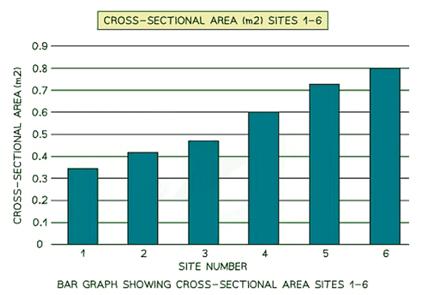
Bar Graphs
- Bar graphs are one of the simplest ways to represent discrete data. They are particularly useful for:
- Comparing different classes or groups of data.
- Showing changes over time.

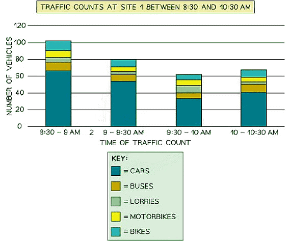
 Compound or divided bar chart
- Divided bar charts feature bars that are subdivided to represent data, with all bars totaling 100%.
- They are primarily used to compare numerical values across levels of a variable, such as over time.
Population pyramid
- Compound bar charts are a type of histogram that visualizes the age-sex distribution of a population.
- They can also be employed to illustrate the structural makeup of an area or country.
- Patterns within the data are easily identifiable with this type of chart.

Line Graphs
- Line graphs are useful for displaying continuous data over time or space.
- They have numerical and continuous axes.
- An example could be plotting temperature changes throughout the day.

- A river cross-section is a specific type of line graph as it doesn't represent continuous data, but the points can be connected to illustrate the shape of the river channel.
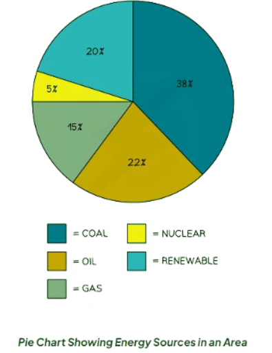
Pie Charts
- Pie charts are used to represent proportions, where the area of each segment corresponds to the proportion it represents.
- They can also be depicted as proportional circles.
- These charts can be integrated into maps to showcase variations at different locations.
- The total percentage of a pie chart must sum up to 100%.
- To calculate the degrees of each segment in a pie chart (totaling 360°), divide the percentage by 100 and then multiply by 360.
- Each segment in a pie chart should be distinctively colored.

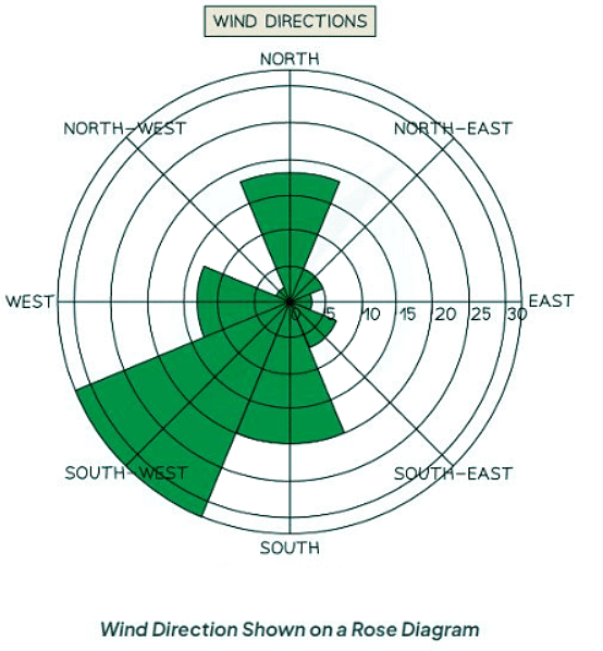
Rose diagram
- Utilize multidirectional axes for plotting data with bars.
- Compass points indicate the axis's direction.
- Applicable for displaying data like wind direction, noise levels, or light intensity.
Question for Data PresentationTry yourself: Which type of data presentation is most suitable for comparing different classes or groups of data?View Solution
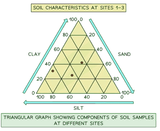
Triangular graph
- Features axes on three sides, each ranging from 0 to 100.
- Designed for representing data divisible into three parts, usually in percentages.
- Suitable for plotting information such as soil composition, employment distribution, etc.
- Review each side carefully to ensure correct interpretation of data directions.
Scatter graph
- Points in triangular graphs should not be connected. They are individual data points.
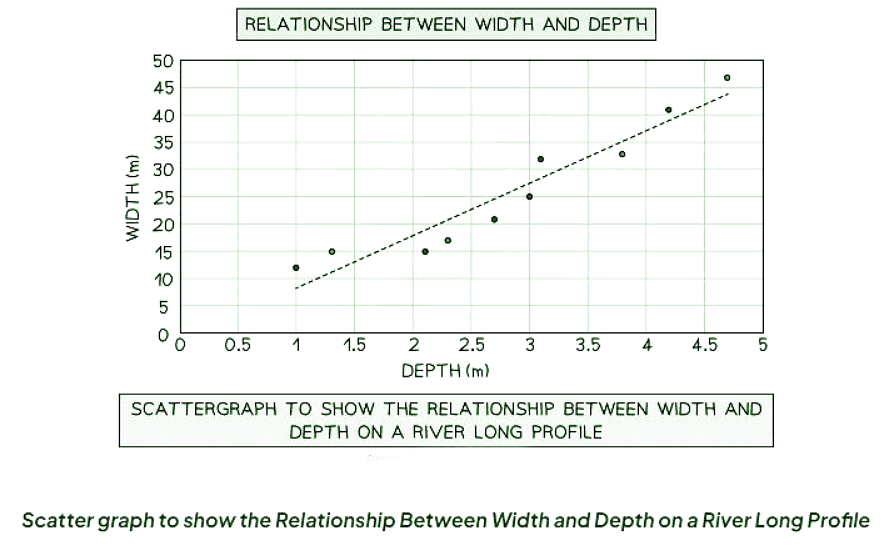
- The best fit line can be added to illustrate the relationships between the points.
- Triangular graphs are utilized to depict the relationship between two variables.
- In a river study, they are particularly useful for illustrating relationships between different river characteristics, such as the width and depth of the river channel.

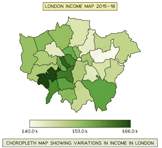
Choropleth Maps
- Choropleth maps use shading based on a predetermined key.
- Each shade represents a specific range of values.
- It's common to use various shades of a single color.
- These maps are ideal for displaying data like annual precipitation, population density, and income levels.

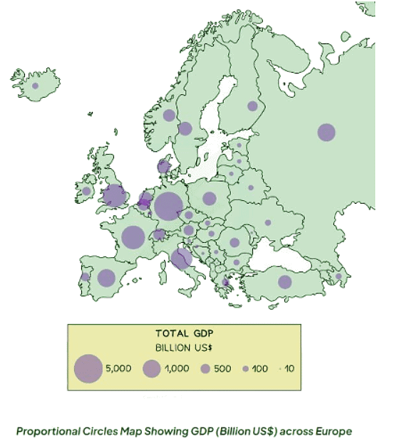
 Proportional symbols map
- Symbols on a map are depicted proportionally to the represented variable.
- Common symbols include circles, squares, or custom images.
- They can effectively showcase diverse data such as population distribution, wind farm locations, and traffic patterns.

Photographs
Photographs serve to depict various facets of sample sites, and they can be annotated as part of the fieldwork analysis.
Field sketches
- Each photograph should incorporate the location or site number, a title, and the compass direction.
- It should highlight key features present at the site.

Maps
- Maps play a crucial role in illustrating the position of features and sample sites during fieldwork investigations.
- They can also display pertinent features like amenities surrounding the sample sites.

Question for Data PresentationTry yourself: Which type of graph is suitable for displaying data on soil composition or employment distribution?View Solution
The document Data Presentation | Geography for GCSE/IGCSE - Year 11 is a part of the Year 11 Course Geography for GCSE/IGCSE.
All you need of Year 11 at this link: Year 11
|
57 videos|70 docs|80 tests
|
FAQs on Data Presentation - Geography for GCSE/IGCSE - Year 11
| 1. What are the key components of data presentation? |  |
Ans. The key components of data presentation include charts, graphs, tables, infographics, and dashboards that help visually represent and communicate information effectively.
| 2. How can data be presented effectively to make it easier to understand? |  |
Ans. Data can be presented effectively by choosing the right type of visualization, simplifying complex information, using color coding, providing clear labels and titles, and ensuring that the data is accurate and relevant to the audience.
| 3. What are some common mistakes to avoid when presenting data? |  |
Ans. Common mistakes to avoid when presenting data include using too many colors or effects, overcrowding the visuals with unnecessary information, not providing a clear narrative or context, and not considering the audience's knowledge level.
| 4. How can data presentation help in decision-making processes? |  |
Ans. Data presentation can help in decision-making processes by providing a clear overview of the information, highlighting key insights and trends, identifying patterns and correlations, and enabling stakeholders to make informed decisions based on the data.
| 5. What are some best practices for creating visually appealing data presentations? |  |
Ans. Some best practices for creating visually appealing data presentations include using consistent formatting and design elements, choosing a suitable color palette, incorporating white space for clarity, and focusing on simplicity and clarity in the visuals.
Related Searches


 Compound or divided bar chart

 Proportional symbols map


