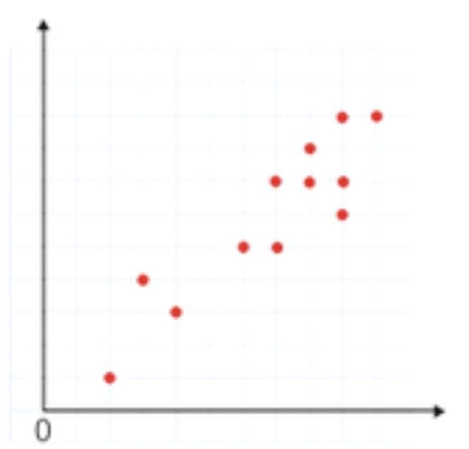
A strong positive correlation in a scatterplot shows that as one variable increases, the other also increases, with points closely clustered along an upward-sloping line.

|
A scatterplot is a type of data visualization that shows the relationship between two quantitative variables. Each point on the scatterplot represents an observation in the dataset, with the x-axis representing one variable and the y-axis representing the other. |
Card: 2 / 40 |
|
How can you determine if there is a correlation between two variables from a scatterplot? |
Card: 3 / 40 |
|
You can determine the correlation by observing the pattern of the points. If the points tend to rise together, there is a positive correlation. If one variable increases while the other decreases, there is a negative correlation. If the points are scattered without any clear pattern, there may be no correlation. |
Card: 4 / 40 |
|
A strong positive correlation in a scatterplot shows that as one variable increases, the other also increases, with points closely clustered along an upward-sloping line.
|
Card: 6 / 40 |
|
Given the scatterplot of height (in inches) vs. weight (in pounds), how would you describe a linear relationship? |
Card: 7 / 40 |
|
A linear relationship is shown when points follow a straight line, such as taller individuals usually weighing more, indicating a predictable link between height and weight.
|
Card: 8 / 40 |
|
Outliers can significantly affect the interpretation of a scatterplot by skewing the perceived relationship between the variables. They may indicate exceptions to the general trend or errors in data collection. It's important to analyze outliers to understand their impact on correlation and regression analysis. |
Card: 10 / 40 |
|
The line of best fit is a straight line that best represents the data on a scatterplot. It helps to predict values, understand trends, and illustrate the overall direction of the relationship between the two variables. |
Card: 12 / 40 |
|
The slope of the line of best fit indicates the rate of change between the two variables. A positive slope suggests that as one variable increases, the other does as well, while a negative slope indicates an inverse relationship. |
Card: 14 / 40 |
|
A scatterplot with no correlation shows widely scattered points with no pattern, indicating that one variable does not predict the other.
|
Card: 16 / 40 |
|
Pearson's correlation coefficient (r) is calculated as r = (nΣxy - ΣxΣy) / √[(nΣx² - (Σx)²)(nΣy² - (Σy)²)], where n is the number of pairs, Σxy is the sum of the product of paired scores, Σx and Σy are the sums of x scores and y scores respectively. |
Card: 18 / 40 |
|
If the correlation coefficient is 0.85, how would you describe the relationship between the variables? |
Card: 19 / 40 |
|
A correlation coefficient of 0.85 indicates a strong positive correlation between the two variables, suggesting that as one variable increases, the other tends to increase as well. |
Card: 20 / 40 |
 Unlock all Flashcards with EduRev Infinity Plan Starting from @ ₹99 only
|
|
A correlation coefficient of -1 implies a perfect negative correlation, meaning that as one variable increases, the other variable decreases in a perfectly linear manner. |
Card: 22 / 40 |
|
In a scatterplot, what does it indicate if the points are clustered tightly around a line? |
Card: 23 / 40 |
|
If the points are clustered tightly around a line, it indicates a strong correlation between the two variables, suggesting that one variable can reliably predict the other. |
Card: 24 / 40 |
|
The y-intercept is the value of y when x is 0. In the context of a scatterplot, it represents the starting point of the line of best fit and can provide insight into the relationship between the variables. |
Card: 26 / 40 |
|
Outliers in a scatterplot are points far from the overall pattern, appearing isolated and not fitting the main trend.
|
Card: 28 / 40 |
|
A residual is the difference between the observed value and the predicted value from the line of best fit. Analyzing residuals helps assess the accuracy of the model. |
Card: 30 / 40 |
|
While scatterplots can show correlation, they do not determine causation. Additional analysis, experiments, or evidence are required to establish a causal relationship between the variables. |
Card: 32 / 40 |
|
A curved pattern in a scatterplot indicates a non-linear relationship, where the rate of change varies at different levels of the variables.
|
Card: 34 / 40 |
|
Fill in the blank: In a scatterplot, a positive slope indicates that as variable x __________ variable y. |
Card: 35 / 40 |
|
The main limitation of scatterplots is that they can only show the relationship between two variables at a time. More complex relationships involving multiple variables cannot be effectively visualized with a scatterplot. |
Card: 38 / 40 |
|
If a scatterplot shows a cluster of points in the upper left and lower right quadrants, what type of correlation does it indicate? |
Card: 39 / 40 |
|
This pattern indicates a negative correlation, as points in the upper left suggest decreasing values while points in the lower right suggest increasing values. |
Card: 40 / 40 |
|
204 videos|126 docs|75 tests
|


|
Free Exam Preparation
at your Fingertips!
Access Free Study Material - Test Series, Structured Courses, Free Videos & Study Notes and Prepare for Your Exam With Ease

 Join the 10M+ students on EduRev
|

|


