Year 11 Exam > Year 11 Notes > Geography for GCSE/IGCSE > Graphs & Diagrams
Graphs & Diagrams | Geography for GCSE/IGCSE - Year 11 PDF Download

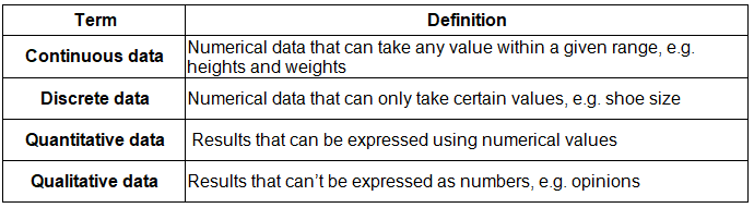
Key terminology
Line graph
- One of the simplest ways to display continuous data
- Both axes are numerical and continuous
- Used to show changes over time and space
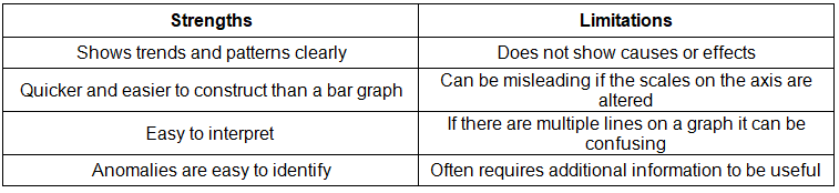
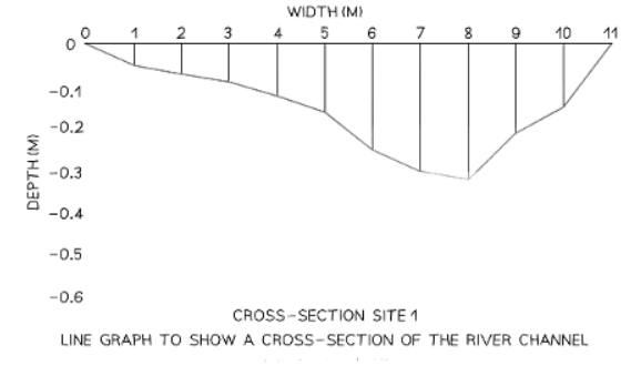
- A river cross-section is a specific type of line graph; although it does not represent continuous data, the points can be connected to illustrate the shape of the river channel
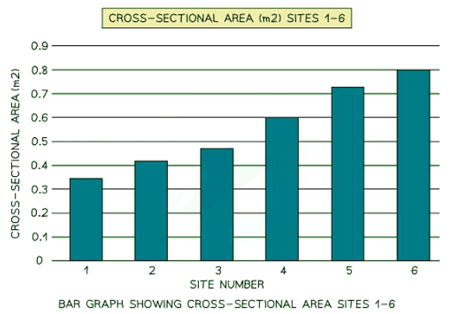
Bar chart
- A bar chart is the most basic method for presenting data
- Each bar has uniform width but varying lengths
- Bars are evenly spaced apart
- Suitable for discrete data
- Bar graphs are beneficial for comparing data sets and observing changes over time
Comparing Data
- Comparing classes or groups of data
- Changes over time
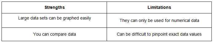
Histograms
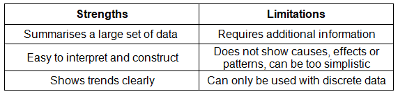
- Histograms show continuous data
- Always use a ruler to draw the bars
- All bars should be the same width
- The top of the bar should reach the number on the side of the graph that is being represented
- There should be no gaps, all bars should be touching
- Ensure all axes are labelled and that the graph has a title
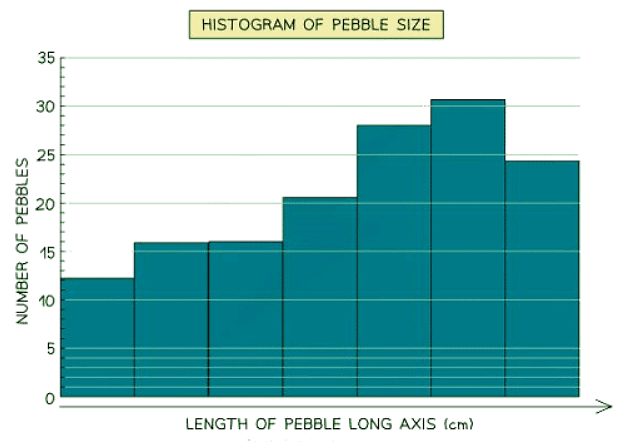
Compound or divided bar chart
- The bars in divided bar charts are subdivided to represent information, with all bars totaling 100%.
- These charts display a variety of categories.
- They are capable of showing percentages and frequencies effectively.

Histograms
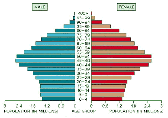
- A histogram is a graphical representation used to display the age-sex distribution of a population.
- It can be utilized to illustrate the structure of a specific area or country.
- Patterns within histograms are easily identifiable.

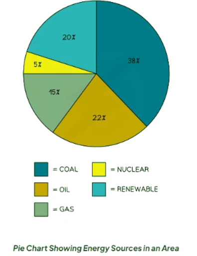
Pie Charts
- Pie charts are used to represent proportions, where the area of each segment corresponds to the proportion it represents.
- They can also be depicted as proportional circles.
- These charts can be integrated into maps to showcase variations at different locations.
- The total percentage of a pie chart must sum up to 100%.
- To calculate the degrees of each segment in a pie chart (totaling 360°), divide the percentage by 100 and then multiply by 360.
- Each segment in a pie chart should be distinctively colored.

Question for Graphs & DiagramsTry yourself: What type of graph is used to display changes over time and space?View Solution
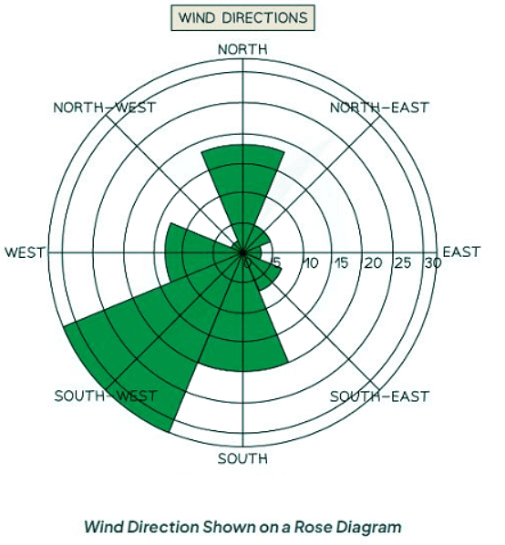
Rose diagram
- Utilize multidirectional axes for plotting data with bars.
- Compass points indicate the axis's direction.
- Applicable for displaying data like wind direction, noise levels, or light intensity.
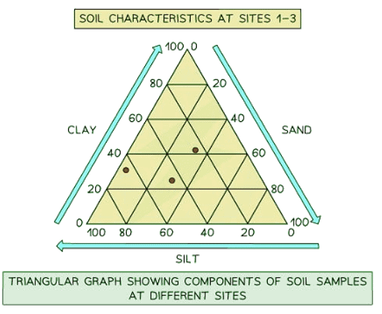
Triangular graph
- Features axes on three sides, each ranging from 0 to 100.
- Designed for representing data divisible into three parts, usually in percentages.
- Suitable for plotting information such as soil composition, employment distribution, etc.
- Review each side carefully to ensure correct interpretation of data directions.
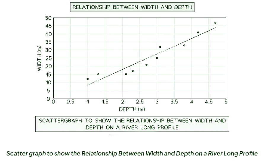
Scatter graph
- Points in triangular graphs should not be connected. They are individual data points.
- The best fit line can be added to illustrate the relationships between the points.
- Triangular graphs are utilized to depict the relationship between two variables.
- In a river study, they are particularly useful for illustrating relationships between different river characteristics, such as the width and depth of the river channel.

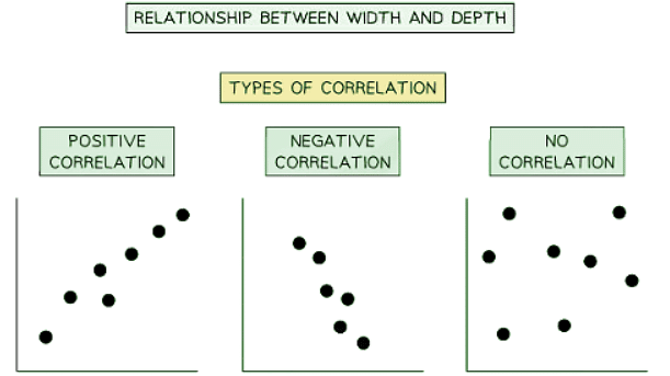
Types of correlation
Correlation helps us understand the relationship between different variables in data. There are three main types of correlation:
- Positive Correlation: When one variable increases, the other also increases. The line of best fit on a graph slopes from the bottom left to the top right.
- Negative Correlation: As one variable increases, the other decreases. The line of best fit on a graph slopes from the top left to the bottom right.
- No Correlation: When data points are scattered with no clear relationship between the variables.
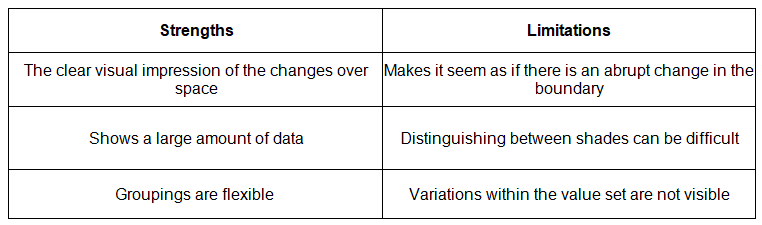
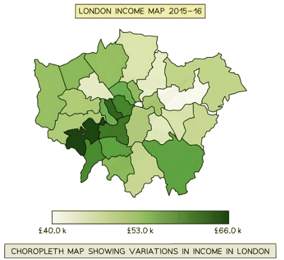
Choropleth Maps
- Choropleth maps use shading based on a predetermined key.
- Each shade represents a specific range of values.
- It's common to use various shades of a single color.
- These maps are ideal for displaying data like annual precipitation, population density, and income levels.
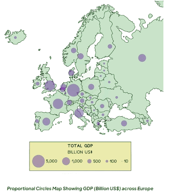
 Proportional symbols map
 Proportional symbols map
- Symbols on a map are depicted proportionally to the represented variable.
- Common symbols include circles, squares, or custom images.
- They can effectively showcase diverse data such as population distribution, wind farm locations, and traffic patterns.

Pictograms
- Proportional circles maps are a way of displaying data using symbols or diagrams drawn to scale.
- They are a useful way of representing data when accuracy is not critical and data is discrete.
- Years do not necessarily have to be continuous in these maps.
- Symbols in these maps do not need to be whole but can represent a proportion.
- A key is essential to indicate if the total number of objects or events that an image represents exceeds one.
How to read a pictogram
- Step 1: Carefully read the problem and identify the specific information requested from the pictograph.
- Step 2: Count the symbols corresponding to the desired information and report the count.
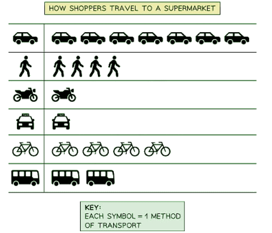
- In the illustration above, it is evident that out of 4 shoppers heading to the supermarket, only one opted for a taxi as their mode of transportation.
- The majority of shoppers, as depicted, chose to use a car for their journey to the supermarket.
Question for Graphs & DiagramsTry yourself: What type of graph is suitable for representing data divisible into three parts, usually in percentages?View Solution
The document Graphs & Diagrams | Geography for GCSE/IGCSE - Year 11 is a part of the Year 11 Course Geography for GCSE/IGCSE.
All you need of Year 11 at this link: Year 11
|
57 videos|70 docs|80 tests
|
FAQs on Graphs & Diagrams - Geography for GCSE/IGCSE - Year 11
| 1. How can divided bar charts be used to compare data in CIE IGCSE Geography? |  |
Ans. Divided bar charts can be used in CIE IGCSE Geography to compare data by visually representing different categories or subgroups within a larger data set. Each bar is divided into segments, allowing for easy comparison of the relative size or proportion of each category.
| 2. What is the significance of analyzing pie charts in CIE IGCSE Geography? | |
Ans. Analyzing pie charts in CIE IGCSE Geography is important as they provide a visual representation of data in the form of a circle divided into sectors. This allows for easy comparison of the proportions of different categories or components within a whole data set.
| 3. How are triangular graphs utilized in CIE IGCSE Geography? | |
Ans. Triangular graphs are used in CIE IGCSE Geography to represent data that involves three variables. The vertices of the triangle represent the three variables, and data points are plotted within the triangle to show the relationships between these variables.
| 4. In what scenarios would scatter graphs be beneficial for data analysis in CIE IGCSE Geography? | |
Ans. Scatter graphs are beneficial in CIE IGCSE Geography for analyzing the relationship between two continuous variables. They help to identify patterns, trends, and correlations between the variables, making them useful for drawing conclusions and making predictions based on the data.
| 5. How can correlation analysis be applied in CIE IGCSE Geography to interpret relationships between data sets? | |
Ans. Correlation analysis in CIE IGCSE Geography is used to determine the strength and direction of the relationship between two variables. It helps to identify if there is a positive, negative, or no correlation between the variables, providing valuable insights into how they interact with each other.
Related Exams
About this Document

Jan 05, 2025
Last updated
Document Description: Graphs & Diagrams for Year 11 2025 is part of Geography for GCSE/IGCSE preparation.
The notes and questions for Graphs & Diagrams have been prepared according to the Year 11 exam syllabus. Information about Graphs & Diagrams covers topics
like Pictograms and Graphs & Diagrams Example, for Year 11 2025 Exam. Find important definitions, questions, notes, meanings, examples, exercises and tests below for Graphs & Diagrams.
Introduction of Graphs & Diagrams in English is available as part of our Geography for GCSE/IGCSE
for Year 11 & Graphs & Diagrams in Hindi for Geography for GCSE/IGCSE course.
Download more important topics related with notes, lectures and mock test series for Year 11
Exam by signing up for free. Year 11: Graphs & Diagrams | Geography for GCSE/IGCSE - Year 11
Description
Full syllabus notes, lecture & questions for Graphs & Diagrams | Geography for GCSE/IGCSE - Year 11 - Year 11 | Plus excerises question with solution to help you revise complete syllabus for Geography for GCSE/IGCSE | Best notes, free PDF download
Information about Graphs & Diagrams
In this doc you can find the meaning of Graphs & Diagrams defined & explained in the simplest way possible. Besides explaining types of
Graphs & Diagrams theory, EduRev gives you an ample number of questions to practice Graphs & Diagrams tests, examples and also practice Year 11
tests
Related Searches
past year papers
,Extra Questions
,Graphs & Diagrams | Geography for GCSE/IGCSE - Year 11
,study material
,ppt
,Semester Notes
,video lectures
,Graphs & Diagrams | Geography for GCSE/IGCSE - Year 11
,Previous Year Questions with Solutions
,practice quizzes
,Graphs & Diagrams | Geography for GCSE/IGCSE - Year 11
,Viva Questions
,Sample Paper
,Objective type Questions
,MCQs
,Important questions
,Free
,Exam
,shortcuts and tricks
,Summary
,mock tests for examination
;


Additional Information about Graphs & Diagrams for Year 11 Preparation
Graphs & Diagrams Free PDF Download
The Graphs & Diagrams is an invaluable resource that delves deep into the core of the Year 11 exam.
These study notes are curated by experts and cover all the essential topics and concepts, making your preparation more efficient and effective.
With the help of these notes, you can grasp complex subjects quickly, revise important points easily,
and reinforce your understanding of key concepts. The study notes are presented in a concise and easy-to-understand manner,
allowing you to optimize your learning process. Whether you're looking for best-recommended books, sample papers, study material,
or toppers' notes, this PDF has got you covered. Download the Graphs & Diagrams now and kickstart your journey towards success in the Year 11 exam.
Importance of Graphs & Diagrams
The importance of Graphs & Diagrams cannot be overstated, especially for Year 11 aspirants.
This document holds the key to success in the Year 11 exam.
It offers a detailed understanding of the concept, providing invaluable insights into the topic.
By knowing the concepts well in advance, students can plan their preparation effectively.
Utilize this indispensable guide for a well-rounded preparation and achieve your desired results.
Graphs & Diagrams Notes
Graphs & Diagrams Notes offer in-depth insights into the specific topic to help you master it with ease.
This comprehensive document covers all aspects related to Graphs & Diagrams.
It includes detailed information about the exam syllabus, recommended books, and study materials for a well-rounded preparation.
Practice papers and question papers enable you to assess your progress effectively.
Additionally, the paper analysis provides valuable tips for tackling the exam strategically.
Access to Toppers' notes gives you an edge in understanding complex concepts.
Whether you're a beginner or aiming for advanced proficiency, Graphs & Diagrams Notes on EduRev are your ultimate resource for success.
Graphs & Diagrams Year 11 Questions
The "Graphs & Diagrams Year 11 Questions" guide is a valuable resource for all aspiring students preparing for the
Year 11 exam. It focuses on providing a wide range of practice questions to help students gauge
their understanding of the exam topics. These questions cover the entire syllabus, ensuring comprehensive preparation.
The guide includes previous years' question papers for students to familiarize themselves with the exam's format and difficulty level.
Additionally, it offers subject-specific question banks, allowing students to focus on weak areas and improve their performance.
Study Graphs & Diagrams on the App
Students of Year 11 can study Graphs & Diagrams alongwith tests & analysis from the EduRev app,
which will help them while preparing for their exam. Apart from the Graphs & Diagrams,
students can also utilize the EduRev App for other study materials such as previous year question papers, syllabus, important questions, etc.
The EduRev App will make your learning easier as you can access it from anywhere you want.
The content of Graphs & Diagrams is prepared as per the latest Year 11 syllabus.
|
© EduRev
|
Education Revolution
|


|


Signup to see your scores
go up within 7 days!
Access 1000+ FREE Docs, Videos and Tests
Takes less than 10 seconds to signup