Introduction to SAT Writing Charts & Graphs | Grammar for Digital SAT PDF Download
SAT Charts and Graphs questions are present on four sections of the exam:
- Evidence-Based Reading
- Writing & Language
- Math (No Calculator)
- Math (Calculator).
Although these types of questions are expected on the math sections, it may be surprising to see them on the verbal sections.
However, the SAT aims to evaluate students' abilities to analyze both quantitative and verbal information, often simultaneously. To achieve this goal, the Math sections feature a significant number of word problems, while figures are incorporated into Evidence-Based Reading and Writing & Language sections.
The development of this skill is crucial for students in college, irrespective of their chosen field of study. Initially, these questions may appear daunting to many students. Nonetheless, adopting this general approach for SAT Charts and Graphs questions can assist in earning additional points.
1. Taking Charts and Graphs Questions Out of Order
Charts and Graphs questions on the SAT can appear in any section, but test-takers do not necessarily have to answer them in sequence. Instead, they should prioritize the questions according to their personal level of difficulty. For instance, those who excel at math but find Evidence-Based Reading challenging may consider prioritizing charts and graphs questions on the verbal sections, especially those that do not require knowledge of the passage. Conversely, students who find data analysis daunting can save these questions for later.
2. Identifying the Task in Charts and Graphs Questions
Charts and Graphs questions may seem laborious. Therefore, students should always identify the task and underline or annotate the question to clarify the task further. It's also essential to pay attention to differences between answer choices to gain a better understanding of what needs to be found. Additionally, in the case of charts and graphs questions on Writing & Language or Evidence-Based Reading, students should determine if the graph alone can answer the question or if text research is necessary.
3. Paying Attention to Titles, Axes, and Labels
Although it may seem obvious, paying close attention to titles, axes, and labels is crucial while analyzing data for most charts and graphs questions. Students should prioritize the title of the graph (similar to its main idea), any designated x- and y-axes, keys, or other labels. Often, this type of primary analysis alone can help students eliminate answer choices.
4. Identifying Trends and Patterns
Before attempting to answer the associated question, it's essential to evaluate the patterns and trends of a general graphic. Students can annotate or mark the graph to help move through trap answer choices more efficiently.
SAT Charts and Graphs: Writing and Language
When taking the SAT Writing and Language section, students can anticipate encountering 1-2 passages with an accompanying informational chart or graph. These passages will contain an underlined statement, and students will be tasked with determining whether the statement is supported by the graph. The two types of graph-related questions that students should expect are detail-based and big-picture. For detail-based questions, students must answer specific queries about the graph, whereas big-picture questions require the identification of significant trends. Regardless of the type of question, students must remember that the answer is within the graph itself, and no outside information is necessary. Here are some strategies to minimize mistakes and maximize performance on these questions.
Reading the Graph
Before you jump to the answer choices, try to identify some key information upfront.
For example:
- What’s the general trend/shape of the graph?
- As one variable increases, does the other likewise increase? Decrease? Is it a bell curve?
- Are there any “outliers”? Any big spikes or jumps?
- Is there a key? What are the labels on the axes? What are the units?
- Most importantly, what is the title of the graph?
Identifying the title of a figure is essential in determining the scope of the chart. We cannot extrapolate information beyond the stated scope (i.e., the title!).
Let’s look at an example to clarify:

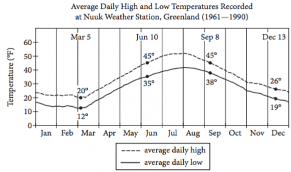
The chart's title indicates that it displays the recorded temperatures in Greenland from 1961-1990. As a result, any answer that we choose must pertain to that specific region and time period. It's not feasible to utilize this chart to predict present-day temperatures or to apply the bell-curve trend to temperatures throughout Europe.
This is a critical point to bear in mind since incorrect responses are often based on this idea. The incorrect answers will likely be too general or possibly too restricted.
Other common traps to look out for:
- Answers with extreme language (words like every, all, must, never, etc.)
- Choices that might be true, but aren’t explicitly supported by the graph
- Information that is supported by the graph, but doesn’t answer the question
Unfamiliar Graphics
As previously stated, the charts and graphs on the Writing and Language section of the SAT are simple and don't require any external information. However, to make things more challenging, the College Board may sometimes include infographics that deviate from the usual bar graph format.

The graphics on the Writing and Language section of the SAT can come in different formats, making them difficult to study for. However, there's no need to panic. You can trust your ability to read labels and titles accurately and apply the same strategies you used elsewhere.
For instance, a question with an unfamiliar graph may seem intimidating, but you can approach it logically. In the given example, the circles in the graph are nested within each other. This nesting indicates that Professional Networks is the broadest category of Professional Development, followed by Coaching and Consultation and then Foundation and Skill-Building Workshops. This conclusion is supported by answer choice C.
SAT Charts and Graphs: Evidence-Based Reading
Similar to the Writing and Language section, a few of the five passages on the Evidence-Reading section also feature graphs or charts. Fortunately, the same approaches can be used, and the graphics in the Reading section are often simpler. In fact, most of the graphic questions on this section can be answered solely by analyzing the graphic, without referring to the accompanying text. Even when a question appears to relate to both the text and the graphic, only comprehension of the graph is necessary to arrive at the correct answer. Here's an instance:

This question type is frequently encountered on the SAT. Upon seeing a reference to the passage, many test-takers may panic and scramble to scan the text for relevant information. However, in these types of questions, all of the statements are backed up by the passage. Your sole responsibility is to identify which statement is additionally supported by the graphic.
As in the Writing and Language section, prepare for such questions by asking yourself the following questions beforehand:
- What’s the general trend/shape of the graph?
- As one variable increases, does the other likewise increase? Decrease? Is it a bell curve?
- Are there any “outliers”? Any big spikes or jumps?
- Is there a key? What are the labels on the axes? What are the units?
- What’s the title of the graph?
- Are there multiple lines? Where do they meet? Are there any points where values don’t change?
Common Errors
In the Reading section, incorrect answer choices may exhibit the same errors as those in the Writing and Language section. Keep an eye out for answers that are too general or too specific and are not reasonable based on the graph's specific study. Also, watch for responses that are outside the scope of the question, contain extreme language such as "every," "all," "must," and "never," or are potentially true but not explicitly supported by the graph. Furthermore, beware of answers that correctly interpret the graph's data but do not address the question. Finally, answers that do not precisely match the graph's units should be avoided.
SAT Charts & Graphs: Math
- The SAT Math sections feature the most graphs and charts on the test, but fortunately, these questions are typically straightforward and don't require extensive calculation. Students can expect to encounter scatterplots, bar graphs, histograms, Cartesian graphs, line graphs, and simple tables.
- The same strategies for reading and analyzing graphs from the Verbal sections apply to the Math sections. It's crucial to identify the units on the axes, take note of the graph's title, determine the general trend and shape, identify any outliers or clusters, recognize the slope if the graph contains a linear equation, and clearly understand what the question is asking.
- It's important to note that graphs and charts are more prevalent in the Data Analysis & Problem Solving questions in the Calculator Section (Section 4) of the SAT Math sections.
Scatterplots
The scatterplot is an important chart type that appears frequently on the SAT Math section and is particularly useful for predicting values based on limited data. Each point on the graph represents a real data point, and a line of best fit is drawn through those points to represent the trend of those values. It's important to note that the further a point is from the line of best fit, the more likely it is to be an outlier. Additionally, the line of best fit can be extended to predict future values, and the slope represents the predicted increase or decrease in y for each x, while the y-intercept is the value of y when the x-value is 0. Although we can make estimates based on the line of best fit, we cannot determine definitive values from it.
Let’s look at an example of a question involving a scatterplot:

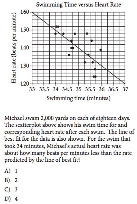
The given chart displays heart rate data recorded at specific swim times, with each point representing a recorded heart rate value and the line of best fit indicating the predicted heart rate for the set of times.
The task at hand is to calculate the difference between the predicted heart rate and the actual heart rate at the 34-minute mark.
Upon observing the graph, we can see that Michael's actual recorded heart rate was 148 BPM at the 34-minute mark, while the line of best fit predicts a heart rate of 150 BPM. Therefore, the difference between the two values is 2, which corresponds to answer choice B.
|
42 videos|49 docs|89 tests
|

|
Explore Courses for SAT exam
|

|


