Introdution to Line Charts and Solved Examples | Data Interpretation for UGC NET PDF Download
What is a line graph?
A line graph is defined as a graphical representation of information that does not change over a course of time. In a line graph, multiple points are connected to each other and depict a trend in the change of the variable. These also show us the changes expressed by the values over a given course of time.
The main objective of a line graph is to show a certain value change over a course of given time. They can also be used in mathematical functions to calculate changes in the values of a given function over a period of time.
Line graphs are helpful in finance as a result of them being extremely effective at making visual representations of trends over time. For this reason, they are usually accustomed to depicting how stocks perform over a selected amount of time.
How to create a line graph?
- Several steps need to be addressed to create a line graph. These are:
- Identifying the variables.
- Determining the scale of the graph; Subtracting the minimum data value from the maximum data value for each variable.
- Determining the scale of the graph; Calculating the numerical value that has to be assigned to each unit to fit the range of the data.
- Adding labels to all the axes in the graph.
- Finding the coordinates for the data points and plot them on the graph.
- Drawing the graph by joining the data points with straight lines.
How to construct a line graph?
Two types of axes make up a line graph, namely the x-axis and the y-axis. They represent two different types of data that intersect at various points on the graph and have the same origin point (0,0). In these axes, the x-axis represents the data type that is not dependent on the two data types, and the y-axis represents the data type that is dependent on the former mentioned axis data type.
For each line graph, the data points should be marked about their axes, with increasing divisions on their respective axes. For example, while measuring the temperature of a place on a daily basis for a period of a week, the x-axis represents the day of measure in the span of the week, and the y-axis represents the temperature for that particular day.
When a line graph is used to represent the changes in temperature over the course of the week, the data point primarily represents the highest recorded temperature of that day.
If we assume that a day recorded a temperature of 20 degrees at the start of the day and ends at around 18 degrees at the end of the day, while peaking at 32 degrees during the afternoon, the day’s temperature is taken as 32 degrees.
These data points are linked together so that; if the temperature per day keeps increasing over time, the graph will be on an upward slope towards the right. Invertedly, if the day’s temperature keeps decreasing over a period of a few days, the line represents a downward slope towards the right.
There are three types of line graphs, and creating them differs slightly from each other. A simple line graph is created by plotting the points on a coordinate plane in joining the points to a single line. On the other hand, a multiple line graph has two lines or more depending on the number of variables depicted by the graph.
The points of one particular variable are plotted and joined by a single line. The points of another variable are slotted and joined by a single line, and the process is repeated to form a multiple line graph. A multi-line graph is drawn for a compound line graph, and then the different types of areas are shaded.
Conclusion
A line graph joins data points that represent the change in the value of a variable with respect to the change in an independent variable. A line graph is drawn on a coordinate plane that can be described using the x and y axes. Linear graphs and line charts are other synonyms of the line graph. The x-axis in the graph is referred to as the independent axis, and the y-axis in the graph is referred to as the dependent axis.
Three different types of line graphs can be drawn depending on the usage of the graph. A simple line graph is drawn by connecting the points with a single line, whereas a multiple line graph and a compound line graph consist of more than one variable, and hence multiple lines are drawn to obtain the graphs.
Solved Example
Q1: Directions: The following line graph shows the number of cars and bikes purchased by the five different companies A, B, C, D and E.
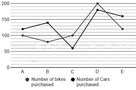
If the number of bikes purchased by company E is 40 more than company F and the number of cars purchased by company F is 40 more than company E. Find the ratio between the number of bikes purchased in company E and F to the number of cars purchased to the company E and F.
(a) 5: 7
(b) 5: 9
(c) 3: 5
(d) 4: 3
(e) 3: 8
Ans: (b)
Number of bikes purchased by company E = 120
Number of bikes purchased by company F = (120 - 40) = 80
Number of cars purchased by the company E = 160
Number of cars purchased by company F = (160 + 40) = 200
Required ratio = (120 + 80): (160 + 200) = 200: 360 = 5: 9
Q2: Directions: The following line graph shows the number of cars and bikes purchased by the five different companies A, B, C, D and E.

If the number of bikes purchased by the company D is increased by x% and the average number of bikes and cars purchased by the company D is 210. Find the value of x.
(a) 30%
(b) 15%
(c) 25%
(d) 20%
(e) 35%
Ans: (d)
Initial number of bikes and cars purchased in the company D = (200 + 180) = 380
After increasing x% in bike purchase number of bikes and cars purchased in company D = (210 × 2) = 420
Number of bikes purchase increased = 40
To find the value of x
(240 - 200)/200 × 100 = 40/200 × 100 = 20%
Q3: Directions: The following line graph shows the number of cars and bikes purchased by the five different companies A, B, C, D and E.

If 20% , 30% of the bikes purchased by the companies A and B respectively are yamaha bikes and 25% and 20% of the cars purchased from the companies A and B are Tata. Find the number of Tata cars and yamaha bikes purchased from company A and B.
(a) 116
(b) 118
(c) 102
(d) 122
(e) 126
Ans: (c)
Number of yamaha bikes purchased by company A = 100 × 20/100 = 20
Number of yamaha bikes purchased by company B = 80 × (30/100) = 24
Number of Tata cars purchased by company A = 120 × (25/100) = 30
Number of Tata cars purchased by company B = 140 × (20/100) = 28
Required total = (20 + 24 + 30 + 28) = 102
Q4: The line chart given below shows the profit percentage of a company on 5 different products P1, P2, P3, P4 and P5.
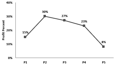 The expenditure of product P5 is Rs. 46000. What is the revenue of product P5?
(a) Rs. 52780
(b) Rs. 49680
(c) Rs. 47360
(d) Rs. 4600
Ans: (b)
Given:
From the chart
Profit percentage in P5 = 8%
Expenditure = Rs. 46000
Formula Used:
Profit percentage = [(Revenue – Expenditure)/Expenditure] × 100
Calculation:
Profit percentage = [(Revenue – Expenditure)/Expenditure] × 100
⇒ 8 = [(Revenue – 46000)/46000] × 100
⇒ Revenue – 46000 = 8 × 460
⇒ Revenue = 3680 + 46000
⇒ Revenue = 49680
Q5: The line chart given below shows the profit percentage of a company on 5 different products P1, P2, P3, P4 and P5.
 The revenue of product P3 is Rs. 38100. What is expenditure of product P3?
(a) Rs. 30000
(b) Rs. 32000
(c) Rs. 35000
(d) Rs. 29000
Ans: (a)
Given:
The revenue of product P3 is Rs. 38100.
Formula used:
Profit% = (revenue – expenditure)/expenditure × 100
Calculation:
The revenue of product P3 is 38100,
Let expenditure be Rs. y.
⇒ Profit% = (revenue – expenditure)/expenditure × 100
⇒ 27 = (38100 – y)/y × 100
⇒ 27y = 3810000 – 100y
⇒ 127y = 3810000
⇒ y = 30000
∴ Expenditure of product P3 is Rs. 30000
|
18 videos|18 docs|18 tests
|

|
Explore Courses for UGC NET exam
|

|


