CAT Exam > CAT Notes > Additional Study Material for CAT > Exercise 14.1 NCERT Solutions - Statistics
NCERT Solutions for Class 9 Maths Chapter 14 - Exercise 14.1 Statistics
Q.1. Give five examples of data that you can collect from your day-to-day life.
Sol.
Five examples from day-to-day life:
- Number of students in our class.
- Number of fans in our school.
- Electricity bills of our house for last two years.
- Election results obtained from television or newspapers.
- Literacy rate figures obtained from Educational Survey
Q.2. Classify the data in Q.1 above as primary or secondary data.
Sol.
Primary data: when the information was collected by the investigator herself or himself with a definite objective in her or his mind, the data obtained is called primary data.
Primary data; (i), (ii) and (iii)
Secondary data; when the information was gathered from a source which already had the information stored, the data obtained is called secondary data
Secondary data; (iv) and (v)
Presentation of Data
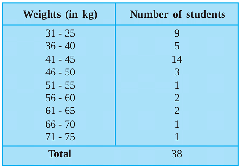
- Every group into which the raw data is condensed is called a class-interval.

- In each of these classes, the least number is called the lower-class limit and the greatest number is called the upper-class limit.
- The difference between the upper limit and the lower limit of a class is called its class size.
- The difference between the maximum value and the minimum value of the observation is called the range.
- The class-mark of a class =

The document NCERT Solutions for Class 9 Maths Chapter 14 - Exercise 14.1 Statistics is a part of the CAT Course Additional Study Material for CAT.
All you need of CAT at this link: CAT
|
5 videos|378 docs|164 tests
|
FAQs on NCERT Solutions for Class 9 Maths Chapter 14 - Exercise 14.1 Statistics
| 1. What is data presentation? |  |
Ans. Data presentation refers to the process of organizing and displaying data in a meaningful and understandable format, such as charts, graphs, or tables. It helps in summarizing and communicating the information contained in the data effectively.
| 2. What are the different methods of data presentation? |  |
Ans. There are several methods of data presentation, including:
- Tables: Data can be organized in rows and columns to provide a systematic representation.
- Graphs: Graphs such as bar graphs, line graphs, and pie charts are commonly used to visually represent data.
- Diagrams: Diagrams like Venn diagrams and flowcharts can be used to show relationships or processes.
- Maps: Maps can be used to represent geographical data.
- Infographics: Infographics combine text, images, and visuals to present data in a visually appealing manner.
| 3. How can data presentation help in understanding statistics? |  |
Ans. Data presentation plays a crucial role in understanding statistics as it helps in simplifying complex information and patterns. By presenting data in a visual format, it becomes easier to identify trends, patterns, and relationships within the data. This can aid in making informed decisions and drawing accurate conclusions based on the statistical information.
| 4. What are the key factors to consider while choosing a data presentation method? |  |
Ans. When selecting a data presentation method, it is important to consider the following factors:
- Nature of the data: The type and characteristics of the data will influence the choice of presentation method. For example, categorical data may be best represented using a bar graph, while continuous data may be better suited for a line graph.
- Purpose of presentation: The intended purpose of the presentation, such as comparing values, showing trends, or highlighting proportions, should be taken into account.
- Audience: The level of understanding and familiarity of the audience with different presentation methods should be considered to ensure effective communication of the information.
- Accessibility: The chosen presentation method should be easily accessible and understandable for the intended audience.
| 5. How can data presentation help in decision-making? |  |
Ans. Data presentation aids in decision-making by providing a clear and concise representation of information. It allows decision-makers to visually analyze and interpret data, identify patterns, and make comparisons. This helps in understanding the current situation, predicting future trends, and evaluating the effectiveness of different options. Effective data presentation can lead to more informed and data-driven decision-making processes.

|
Explore Courses for CAT exam
|

|
Signup for Free!
Signup to see your scores go up within 7 days! Learn & Practice with 1000+ FREE Notes, Videos & Tests.
Related Searches


