Practice Questions for Writing Task 1 | Writing for Academic IELTS PDF Download
Bar Chart Practice Questions
Q.1. The bar chart below shows the hours per week that teenagers spend doing certain activities in Chester from 2002 to 2007.

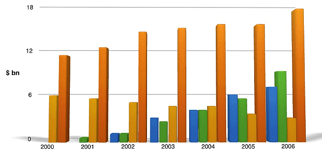
Q. 2. The chart below shows the global sales of different kinds of digital games from 2000 to 2006.

Line Graph Practice Questions
Q.1. The graph below shows the population figures for different type of turtles in India from 1980 to 2012.

Q. 2. The graph below shows the amount of goods transported in the UK from 1974 to 2002.

Q. 3. The line graph below shows the consumption of 4 kinds of meat in a European country from 1979 to 2004.

Table Practice Questions
Q. 1. The table below shows the proportion of income spent on 4 common items in the UK in 1998.
The proportion of income adults and children spent on 4 common items in the UK in 1998

Q. 2. The table below gives information about the underground railway systems in 6 countries.

Q. 3. The table below shows consumer spending on different items in 5 countries in 2002.

Q.4. The table below gives information about the employment sectors in which people from 3 age groups worked.
Pie Chart Practice Questions
Q. 1. The pie charts below show the average household expenditures in a county in 1950 and 2010.
Q.2. The charts below show the percentage of students joining North West University.

Q.3. The charts below give information about the electricity generation in two countries in 2009.

Diagram Practice Question
Q.1. The diagram below shows how coal is used to generate electricity.

Multiple Charts Practice Question
Q. 1. Bar Chart & Two Pie Charts
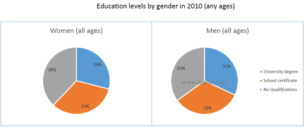
The charts below give information about levels of education in Glasgow, a city in Scotland, in 2010.


Q.2. Table & 3 Pie Charts
The pie charts and table give information about the total value and sources of fish imported to the US between 1988 Sources of fish imported to the US

|
33 videos|200 docs|17 tests
|
FAQs on Practice Questions for Writing Task 1 - Writing for Academic IELTS
| 1. What is the IELTS Writing Task 1? |  |
| 2. How is the IELTS Writing Task 1 scored? |  |
| 3. What kind of visuals can I expect in the IELTS Writing Task 1? |  |
| 4. How can I improve my writing skills for the IELTS Writing Task 1? |  |
| 5. How can I manage my time effectively in the IELTS Writing Task 1? |  |

|
Explore Courses for IELTS exam
|

|


