Table Chart based Questions | General Aptitude for GATE - Mechanical Engineering PDF Download
Table Chart is the simplest form of presenting the data and most widely used in Data Interpretation section of various competitive exams.
- The boxes of the table consist of different types of information like facts and figures, etc.
- Generally, the first row and column of the table denote the titles. Unlike other DI questions such as Pie Charts or Bar Graphs, it is more difficult and time-consuming to interpret data in tabular form.

Let's have a look at some solved questions based on Table Chart:
Q1. The following table gives the percentage distribution of the population of five states, P, Q, R, S, and T, on the basis of the poverty line and also on the basis of sex.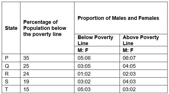
(i) If the male population above the poverty line for State R is 1.9 million, then the total population of State R is?
(a) 4.5 million
(b) 4.85 million
(c) 5.35 million
(d) 6.25 million
Ans: (d) 6.25 million
Solution: Let the total population of State R be x million.
Then, the population of State R above the poverty line:
And so, the male population of State R above the poverty line:
But, It is given that the male population of State R above poverty line = 1.9 million
∴ The total population of State R = 6.25 million
(ii) What will be the number of females above the poverty line in State S if it is known that the population of State S is 7 million?
(a) 3 million
(b) 2.43 million
(c) 1.33 million
(d) 5.7 million
Ans: (b) 2.43 million
Solution: Total population of State S = 7 million.
∴ Population above poverty line = {100 - 19}% of 71 million = 81% of 7 million = 5.67 million.
And so, the number of females above the poverty line in State S:
Q2. Study the following table and answer the questions based on it.
(i) Total expenditure on all these items in 1998 was approximately what percent of the total expenditure in 2002?
(a) 62%
(b) 66%
(c) 69%
(d) 71%
Ans: (c) 69%
Solution: 

(ii) The ratio between the total expenditure on Taxes for all the years and the total expenditure on Fuel and Transport for all the years respectively is approximate?
(a) 4:7
(b) 10:13
(c) 15:18
(d) 5:8
Ans: (b) 10:13
Solution: 
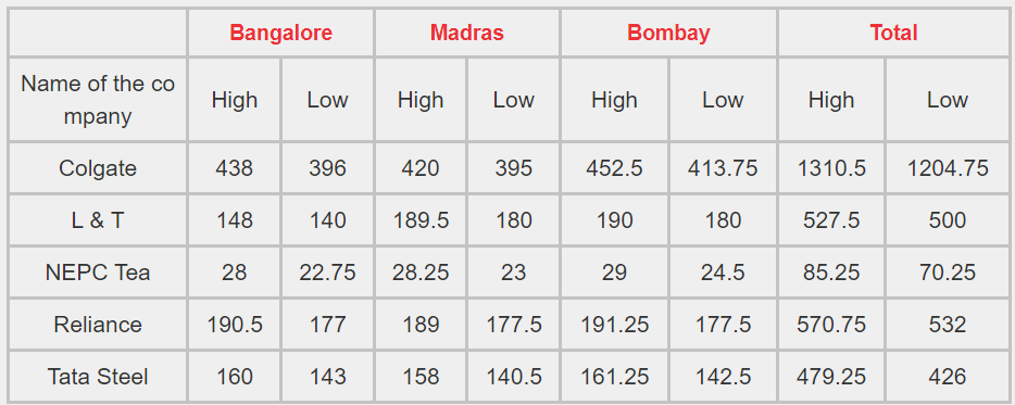
Q3. Read the table given below and answer the questions accordingly.
Shares traded on Bangalore, Madras, Bombay Stock Exchanges (in Rupees)
(i) The average of the high rates of share in all the three Stock Exchanges for NEPC Tea is
(a) Rs.28.422.
(b) Rs.27.423.
(c) Rs.29.14.
(d) Rs.28.93
Ans: (a) Rs.28.422.
Solution: The last column is the total of all three stock exchanges (high rates and low rates, resp.) for every company. So, the average for NEPC high rates = 85.25/3= Rs. 28.42. Hence, the answer is 1st option.
(ii) For Reliance, the low rate of share is less than the average of the low rates of shares of the same company, in the Stock Exchange at
(a) Madras
(b) Bombay
(c) Bangalore
(d) None of these
Ans: (c) Bangalore
Solution: Average of low rates of shares of Reliance = (177.5+177.5+177)/3> 177, which is the low rate of share of Reliance at Bangalore stock exchange. So, the correct option is 3.
(iii) For Tata Steel, the ratio of the high rate of share to the low rate is maximum in the Stock Exchange at
(a) Bangalore
(b) Madras
(c) Bombay
(d) None of these
Ans: (c) Bombay
Solution: At Bangalore Stock Exchange, ratio of high rate to low rate = (160/143) = 1.11;
At Madras Stock Exchange, ratio of high rate to low rate = (158/140.5) = 1.12;
At Bombay Stock Exchange, ratio of high rate to low rate = (161.25/142.5) = 1.13.
As the maximum ratio is in Bombay, it will be the answer. Hence, the answer option is 3.
(iv) The low rate of share in L & T at Madras Stock Exchange bears a ratio, to the total low rate of share of the same company, of
(a) 8/19
(b) 9/20
(c) 11/25
(d) 9/25
Ans: (d) 9/25
Solution: Low rate of share of L & T at Madras Stock Exchange = Rs. 180.
Total of low rate of share of L & T in all three Stock Exchanges = Rs. 500.
Ratio of (i)/(ii)= 180/500 = 9/25. Hence, the answer is 4th option.
Q4. The following table shows the number of new employees added to different categories of employees in a company and also the number of employees from these categories who left the company every year since the foundation of the Company in 1995.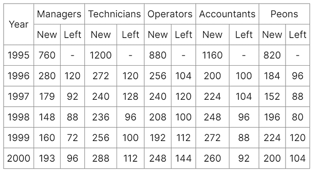
(i) What is the difference between the total number of Technicians added to the Company and the total number of Accountants added to the Company during the years 1996 to 2000?
(a) 128
(b) 112
(c) 96
(d) 88
Ans: (d) 88
Solution: Required difference = (272 + 240 + 236 + 256 + 288) - (200 + 224 + 248 + 272 + 260) = 88.
(ii) What was the total number of Peons working in the Company in the year 1999?
(a) 1312
(b) 1192
(c) 1088
(d) 968
Ans: (b) 1192
Solution: Total number of Peons working in the Company in 1999
= (820 + 184 + 152 + 196 + 224) - (96 + 88 + 80 + 120)
= 1192.
(iii) What is the pooled average of the total number of employees of all categories in the year 1997?
(a) 1325
(b) 1195
(c) 1265
(d) 1235
Ans: (b) 1195
Solution: Total number of employees of various categories working in the Company in 1997 are: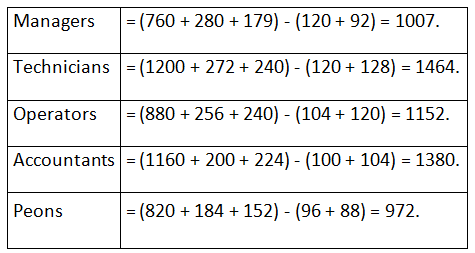
∴ Therefore Pooled average of all the five categories of employees working in the Company in 1997
= 1/5 x (1007 + 1464 + 1152 + 1380 + 972)
= 1/5 x (5975)
= 1195.
|
193 videos|169 docs|152 tests
|
FAQs on Table Chart based Questions - General Aptitude for GATE - Mechanical Engineering
| 1. How can a table chart help in organizing data effectively? |  |
| 2. What are the common types of table charts used in data analysis? |  |
| 3. How do you create a table chart in Excel or Google Sheets? |  |
| 4. What are some best practices for designing a table chart for a report or presentation? |  |
| 5. How can a table chart be used to identify trends or patterns in data analysis? |  |


