Types of Graphs | Science for ACT PDF Download
let’s check out the different types of graphs
1. Scatter Plot
Scatter plots depict plotted points on a graph to illustrate the correlation between two sets of data. To exemplify, let's consider the following passage, which is derived from the same context as the previous example:
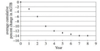
In this particular instance, each data point on the scatter plot represents the measurement of the average cumulative percent change in AGTB for a specific year. Let's practice by attempting the following question: What was the average cumulative percent change in AGTB during Year 2?
To find the answer, we locate Year 2 on the x-axis of the scatter plot. We then trace a vertical line from that point to the corresponding data point on the scatter plot. Next, we refer to the y-axis to determine the value for the average cumulative percent change in AGTB, which in this case is 6%.
Scatter plots can become slightly more challenging when they present questions about unmarked points. Such questions assess your ability to interpolate and extrapolate data.
2. Interpolations
While the term may initially appear daunting, interpolation refers to the process of calculating values between known data points, which are already provided in the visual representation. Let's examine the following ACT Science question as an illustration:
Example:
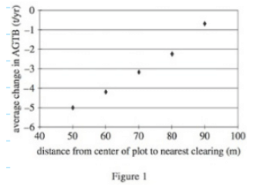
Q. Based on the findings of Study 1, if the distance from the center of a 100 m x 100 m plot is 75 m from the nearest clearing, the estimated average change in the AGTB (Annual Groundwater Table Balance) at the plot over a span of 17 years would be closest to which of the following options?
A. - 1.1 t/yr
B. - 2.6 t/yr
C. + 1.1 t/yr
D. + 2.6 t/yr
Correct Answer is Option B
By connecting the data points on the scatter plot with a line, we can estimate the value at 75 m from the plot's center to the nearest clearing. Referring to my diagram below:
[Diagram indicating the estimated point at 75 m]
Using this approach, we can approximate the average change in AGTB to be around -2.8. The closest option to this value is answer B, -2.6 t/yr, making it the correct answer.
It is important to note that you don't need to possess exceptional drawing skills for this process. Simply mark the relevant points on the given graph and employ the process of elimination.
However, it's worth mentioning that this method becomes slightly more challenging when dealing with extrapolations, where we calculate data beyond the provided bounds.
3. Extrapolations
In order to show how extrapolation works, we are going to work through an ACT Science practice question:
Example:
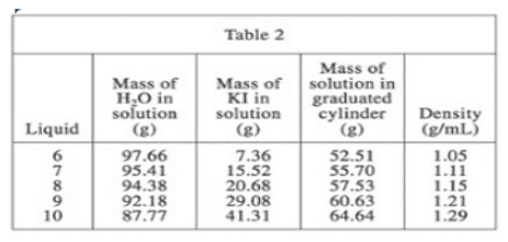
Q. Suppose that in Experiment 2, a sixth KI/H20 solution was measured, and the mass of the solution in the graduated cylinder was 67.54 g. The density of this solution would likely be closest to which of the following options?
A. 1.25 g/ml
B. 1.30 g/ml
C. 1.35 g/ml
D. 1.40 g/ml
Correct Answer is Option C
We need to determine the density value that corresponds to 67.54 g of solution in the graduated cylinder based on the provided table. By examining the relationship between 60.63 g of solution and 64.64 g of solution, we observe a mass difference of +4.01 g and a density difference of +0.08 g/ml.Since 67.54 g of solution (as mentioned in the question) exceeds the highest value of 64.64 g (associated with Liquid 10) in the table, we calculate the precise mass difference between the two: 67.54 - 64.64 = 2.9 g.
Comparing this mass difference of 2.9 g to the 4.01 g difference between the last entry and the second-to-last entry, we note that the change in density will be slightly smaller. Consequently, the density change should be approximately +0.06 g/ml. Adding this value to the last density entry in the table (1.29 g/ml), we obtain 1.29 + 0.06 = 1.35 g/ml. Thus, the answer is C. Even if there is a slight deviation, the answer would still be correct.
4. Ranking Lists
On occasion, the ACT may prompt you to organize data in ascending or descending order according to specific criteria such as height or mass
Example:
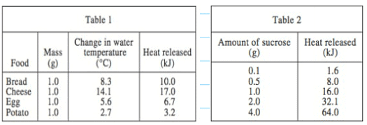
Q. According to Tables 1 and 2, as the mass of successive sucrose samples increased, the change in the water temperature produced when the sample was burned would most likely:
A. Increase only
B. Decrease only
C. Increase, then decrease
D. Decrease, then increase
Correct Answer is Option A
By examining Table 1, we can determine the order of increasing mass for the sucrose samples: potato, egg, bread, cheese. This information allows us to eliminate answer choices B and C since they incorrectly rank cheese before the other three samples.
To decide between options A and D, we need to refer to Table 2. It is essential to note the mention of heat released per gram in this table. While the entire table analyzes heat released by glucose, the amount of grams varies.
According to Table 2, 1 gram of sucrose releases 16 kJ of heat. We must locate where this value of 16 kJ fits within the rankings of heat released. Referring back to Table 1, the final rankings should be potato, egg, bread, sucrose, cheese. Hence, the correct answer is A, as the heat released increases with the increasing mass of the sucrose samples.
5. Line Graphs
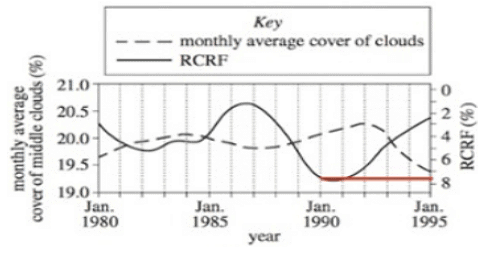
Line graphs can be challenging to interpret in the science section. The difficulty arises from the fact that they represent an infinite number of data points, requiring precision in identifying specific points of interest. Additionally, line graphs are frequently utilized to present two distinct sets of data, with each set displayed on either the left or right side of the graph. Take a look at the provided example graph:
Example:
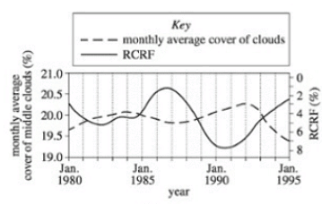
Q. Answer the example question “What is the RCRF in January 1990?”,
To determine the RCRF (Relative Cooling Rate Factor) in January 1990, follow these steps:
Identify the correct line on the graph. In this case, the solid line corresponds to RCRF, as indicated by the key.
(i) Match the solid line to the measurement scale on either the right or left side of the graph. In this example, the right side represents RCRF in percentage.
(ii) To locate the RCRF value for January 1990, it may be helpful to draw a straight line that intersects with the solid line at that specific point. Refer to the diagram below:
(iii) Determine the point of intersection between the solid line and the January 1990 mark. Based on the diagram, the approximate RCRF value is around 7-7.5%.
(iv) Therefore, the answer to the question "What is the RCRF in January 1990?" is approximately 7-7.5%.
7. Tricky Graphs
Let’s check out a graph that is not what it seems:
Example:
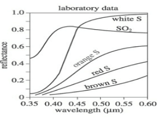
Q. Which of the following colors exhibited the highest light absorption across all wavelengths?
A. White S
B. Orange S
C. Red S
D. Brown S
Correct Answer is Option D
Let's analyze the provided graph. The graph displays five different lines, each representing a distinct color of light along with Sulfur Oxide (which is irrelevant for this question and can be disregarded). The graph depicts the reflectance at various wavelengths.
To determine which color absorbs the most light, we need to consider that absorbance is the opposite of reflectance. Reflectance is what the graph illustrates. Although it may seem tempting to choose White S as it appears to have the highest reflectance across all wavelengths among the given options, we must remember that absorbance and reflectance are inversely related.
Upon examining the graph and considering all wavelengths, we observe that Brown S exhibits the lowest reflectance. Since reflectance and absorption are inversely proportional, we can conclude that Brown S absorbs the most light. Therefore, the correct answer is D.
Interpreting Trends
When it comes to interpreting trend questions, it might sometimes feel like attempting to predict the future through a crystal ball. However, fear not, as you don't need any psychic abilities to tackle these questions.
Let me start this section by emphasizing that you don't have to memorize an endless number of potential trends to excel. In fact, having a clear understanding of the terms "increasing" and "decreasing" should enable you to answer nearly all the questions related to data trends on the ACT. Nonetheless, it's beneficial to be familiar with a few common trends that you're likely to come across.
Direct Correlations
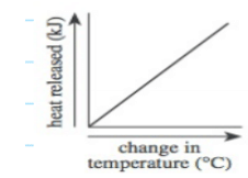
- Although direct relationships may not always be represented by a straight line, it can be beneficial to envision them as lines with a positive slope. When one variable increases, the other also increases, and when one decreases, the other follows suit. Here is an example graph illustrating a Direct correlation:

Inverse Correlation
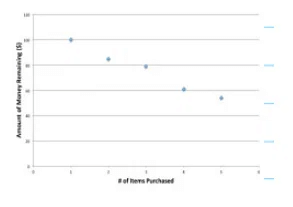
- In an inverse correlation, as one variable increases, the other decreases. A simple example is shopping, where as you buy more items, your available money decreases. The following graph demonstrates this inverse relationship:

Exponential Curve
- Exponential trends occur when one variable experiences an increasing rate of growth. Visually, the value of the variable initially increases gradually and then accelerates, leading to faster and faster growth. On a graph, this appears as an upward-curving shape resembling a "J," while in a table, you observe larger and larger increases in one variable for the same increment in the other variable. Exponential trends can also be negative, although they are less common. In a negative exponential graph, one variable initially decreases slowly but then declines more rapidly over time. Exponential trends are frequently observed in population or bacterial growth, which often exhibit explosive increases after an initial slow phase.
Logistic Curve
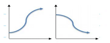
- Data exhibiting logistic (or "S-curve") trends initially display slow growth, followed by a steeper incline, and eventually plateau. These trends commonly occur in populations with limited resources, where exponential growth is possible initially but reaches a saturation point as resources become scarce.

No Trend
- It is important to remember that sometimes data in a figure or table may not exhibit any discernible trend. This is a common occurrence in real scientific studies as well. If you do not observe a trend between two variables, there is no need to panic. Instead, look for options that indicate "no trend" or "none of the above."
|
486 videos|517 docs|337 tests
|

|
Explore Courses for ACT exam
|

|
