Ex-23.2 (Part - 1), Graphical Representation Of Statistical Data, Class 9, Math RD Sharma Solutions | RD Sharma Solutions for Class 9 Mathematics PDF Download
Q1: Explain the reading and interpretation of bar graphs.
Ans: A bar graph is a diagram consisting of a sequence of vertical or horizontal bars or rectangles, each of which represents an equal interval of the values of a variable, and has the height proportional to the quantities of the phenomenon under consideration in that interval. A bar graph may also be used to illustrate discrete data, in which case each bar represents a distinct circumstance.
While drawing a bar graph, we keep in mind that:
1. The width of the bars should be uniform throughout.
2. The gap between any two bars should be uniform throughout.
3. Bars may be either horizontal or vertical.
Each bar must be of the same width and the gap between them must be uniform. Make sure that the width of the bars and the gap between them should not be necessarily same.
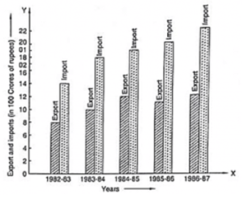
Q2: Read the following bar graph and answer the following questions:
(i)What information is given by the bar graph?
{ii) In which year the export is minimum?
(iii)In which year the import is maximum?
(iv) In which year the difference of the values of export and import is maximum ?
Ans:
(1) The bar graph represents the import and export (in 100 Crores of rupees) from 1982-83 to 1986-87.
(2) The export is minimum in the year 1982-83 at the height of the bar corresponding to export is minimum in the year 1982-83.
(3) The import is maximum in the year 1986-87 as the height of the bar corresponding to import is maximum in the year 1986-87.
(4) The bars of export and import are side by side. Clearly, it is seen from the bar graph that the difference between the values of export and import is maximum in the year 1986-87.
It is seen from the bar graph that the height of the 3s bar from the left is least, which is corresponding to DCE. Hence, the requirement is least in DCE.
Q3: The following bar graph shows the results of an annual examination in a secondary school. Read the bar graph (Fig. 23.28) and choose the correct alternative in each of the following:
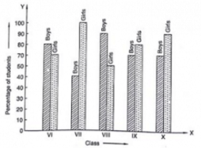
(i)The pair of classes in which the results of boys and girls are inversely proportional are:
(a) VI, VIII (b) VI, IX (c) VII, IX (d) VIII, X
(ii) The class having the lowest failure rate of girls is:
(a) VI (b) X (c) IX (d) VIII
(iii) The class having the lowest pass rate of students is:
(a) VI (b) VII (c) VIII (d) IX
Ans :
(1) The pair of classes in which the results of boys and girls are inversely proportional are VI and IX.
(2) The lowest failure rate of girls is same to the highest pass rate. Hence, the class having the lowest failure rate of girls is VII (the height of the bar corresponding to girls for this class is maximum).
(3) The sum of the heights of the bars for boys and girls in class VII is minimum, which is 95 + 40 = 135. Hence, the class having the lowest pass rate is VII. Hence, the correct choice is (b).
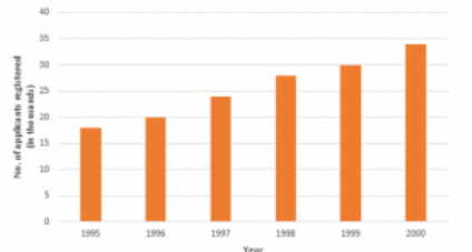
Q4: The following data gives the number (in thousands) of applicants registered with an Employment Exchange during 1995-2000:
| Year | 1995 | 1996 | 1997 | 1998 | 1999 | 2000 |
| Number of applicants registered(in thousands) | 18 | 20 | 24 | 28 | 30 | 34 |
Construct a bar graph to represent the above data.
Ans: To represent the given data by a vertical bar graph, we first draw horizontal and vertical axes. Let us consider that the horizontal and vertical axes represent the years and the number of applicants registered in thousands respectively. We have to draw 6 bars of different lengths given in the table. At first we mark 6 points in the horizontal axis at equal distances and erect rectangles of the same width at these points. The heights of the rectangles are proportional to the number of applicants registered.
The vertical bar graph of the given data is following:
Q5: The production of saleable steel in some of the steel plants of our country during 1999 is given below:
| Plant | Bhilai | Durgapur | Rourkela | Bokaro |
| Production(in thousands | 160 | 80 | 200 | 150 |
Construct a bar graph to represent the above data on a graph paper by using the scale 1 big divisions = 20 thousand tonnes.
Ans: To represent the given data by a vertical bar graph, we first draw horizontal and vertical axes. Let us consider that the horizontal and vertical axes represent the plants and the production in thousand tonnes respectively. We have to draw 4 bars of different lengths given in the table.
The scale 1 big divisions must be 20 thousand tonnes. So, fast find the heights of the bars corresponding to different plants. After that, we follow the well known procedure.
The heights of the different bars are:
- The height of the bar corresponding to Bhilai 160/20 = 8 big division.
- The height of the bar corresponding to Durgapur is 80/20 = 4 big divisions.
- The height of the bar corresponding to Rourkela =10 big divisions.
- The height of the bar corresponding to Bokaro is = 7.5 big divisions.
At first we mark 4 points in the horizontal axis at equal distances and erect rectangles of the same width at these points. The heights of the rectangles are proportional to the productions. The vertical bar graph of the given data is following:
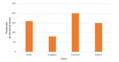
Note that one big division in the vertical axis is equivalent to 20 thousand tonnes
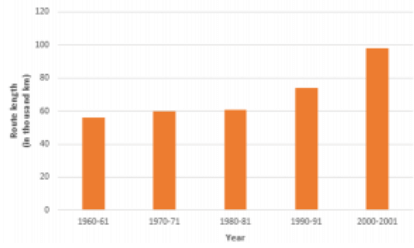
Q6: The following table gives the route length (in thousand kilometres) of the Indian Railways in some of the years:
| Year | 1960-61 | 1970-71 | 1980-81 | 1990-91 | 2000-2001 |
| Route length(in thousand km) | 56 | 60 | 61 | 74 | 98 |
Represent the above data with the help of a bar graph.
Ans: To represent the given data by a vertical bar graph, we first draw horizontal and vertical axes. Let us consider that the horizontal and vertical axes represent the years and the route lengths in thousand km respectively. We have to draw 5 bars of different lengths given in the table.
At first we mark 5 points in the horizontal axis at equal distances and erect rectangles of the same width at these points. The heights of the rectangles are proportional to the route lengths.
The vertical bar graph of the given data is following:
Q7: The following data gives the amount of loans (in crores of rupees) disbursed by a bank during some years:
| Year | 1992 | 1993 | 1994 | 1995 | 1996 |
| Loan(in corers of rupees) | 28 | 33 | 55 | 55 | 80 |
(i) Represent the above data with the help of a bar graph.
(ii) With the help of the bar graph, indicate the year in which amount of loan is not increased over that of the preceding year.
Ans: To represent the given data by a vertical bar graph, we first draw horizontal and vertical axes. Let us consider that the horizontal and vertical axes represent the years and the amount of loan in Crores of rupees respectively. We have to draw 5 bars of different lengths given in the table. At first, we mark 5 points in the horizontal axis at equal distances and erect rectangles of the same width at these points. The heights of the rectangles are proportional to the amount of loan disbursed by the bank.
(1) The vertical bar graph of the given data is following:
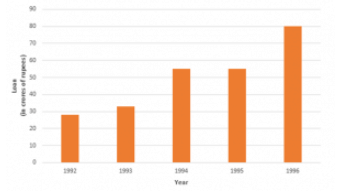
(2) It is seen from the bar graph that the heights of the bars in the years 1994 and 1995 are same. Hence, the amount of loan is not increased in the year 1995 over the preceding year 1994.
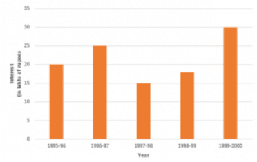
Q8: The following table shows the interest paid by a company (in lakhs):
| Year | 1995-96 | 1996-97 | 1997-98 | 1998-99 | 1999-2000 |
| Interest(in lakhs of rupees) | 20 | 25 | 15 | 18 | 30 |
Draw the bar graph to represent the above information.
Ans: To represent the given data by a vertical bar graph, we first draw horizontal and vertical axes.
Let us consider that the horizontal and vertical axes represent the years and the interests in lakhs of rupees respectively. We have to draw 5 bars of different lengths given in the table. At first, we mark 5 points in the horizontal axis at equal distances and erect rectangles of the same width at these points. The heights of the rectangles are proportional to the interests paid by the company.
The vertical bar graph of the given data is following:
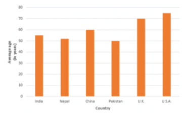
Q9: The following data shows the average age of men in various countries in a certain year.
| Country | India | Nepal | China | Pakistan | U.K | U.S.A |
| Average age(in years) | 55 | 52 | 60 | 50 | 70 | 75 |
Represent the above information by a bar graph.
Ans: To represent the given data by a vertical bar graph, we first draw horizontal and vertical axes.
Let us consider that the horizontal and vertical axes represent the countries and the average age of men’s respectively. We have to draw 6 bars of different lengths given in the table. At first, we mark 6 points in the horizontal axis at equal distances and erect rectangles of the same width at these points. The heights of the rectangles are proportional to the average age of men’s in different countries.
The vertical bar graph of the given data is following:
FAQs on Ex-23.2 (Part - 1), Graphical Representation Of Statistical Data, Class 9, Math RD Sharma Solutions - RD Sharma Solutions for Class 9 Mathematics
| 1. What is the importance of graphical representation of statistical data? |  |
| 2. What are the different types of graphs that can be used to represent statistical data? |  |
| 3. How can we interpret a bar graph? |  |
| 4. What information can be obtained from a line graph? |  |
| 5. How can we analyze a pie chart effectively? |  |


