NCERT Solutions: Introduction to Graphs

Exercise 13.1
Q1: The following graph shows the temperature of a patient in a hospital, recorded every hour.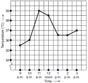
(a) What was the patient's temperature at 1 p.m.?
(b) When was the patient's temperature 38.5° C?
(c) The patient's temperature was the same two times during the period given. What were these two times?
(d) What was the temperature at 1.30 p.m.? How did you arrive at your answer?
(e) During which periods did the patients' temperature showed an upward trend?
Solution:
(i) The patient's temperature at 1 p.m. was 36.5°.
(ii) The patient's temperature 38.5° C was at 12 noon.
(iii) The patient's temperature was same at 1 p.m. and 2 p.m.
(iv) The patient's temperature at 1:30 p.m. was 36.5° C [because the temperature of the patient was constant (i.e. 36.5° C) from 1 p.m. to 2 p.m.].
(v) The temperature of patient showed an upward trend during 9 a.m to 10 a.m. to 11 a.m. and 2 p.m. to 3 p.m.
Q2: The following line graph shows the yearly sales figures for a manufacturing company.
(a) What were the sales in (i) 2002 and (ii) 2006?
(b) What were the sales in (i) 2003 and (ii) 2005?
(c) Compute the difference between the sales in 2002 and 2006.
(d) In which year was there the greatest difference between the sales as compared to its previous year?
Solution:
(a) (i) Company's sale in 2002 was Rs 4 crores.
(ii) Company's sale in 2006 was Rs 8 crores.
(b) (i) Company's sale in 2003 was Rs 7 crores.
(ii) Company's sale in 2005 was Rs 10 crores.
(c) Difference between the sales in 2002 and 2006 = [Rs 8 crores] - [Rs 4 crores] = Rs 4 crores
(d) The greatest difference between the sales of two consecutive years 2004 and 2005.
Q3: For an experiment in Botany, two different plants, plant A and B were grown under similar laboratory conditions. Their height were measured at the end of each week for 3 weeks. The results are shown by the following graph.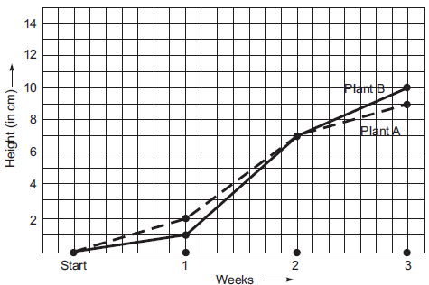
(a) How high was plant A after (i) 2 weeks and (ii) 3 weeks?
(b) How high was plant B after (i) 2 weeks and (ii) 3 weeks?
(c) How much did plant A grow during the 3rd week?
(d) How much did plant B grow from the end of the 2nd week to the end of the 3rd week?
(e) During which week did plant A grow most?
(f) During which week did plant B grow least?
(g) Were the two plants of the same height during any week shown here? Specify.
Solution:
(a) (i) After 2 weeks:
The plant A was 7 cm high.
(ii) After 3 weeks:
The plant A was 9 cm high.
(b) (i) After 2 weeks:
The plant B was 7 cm high.
(ii) After 3 weeks:
The plant B was 10 cm high.
(c) During the 3rd week, the plant grew (9 cm - 7 cm), i.e. 2 cm.
(d) The plant B grew 10 cm - 7 cm = 3 cm from the end of 2nd week to the end of the 3rd week.
(e) The growth of the plant A:
During the 1st week = 1 cm - 0 cm = 1 cm
During the 2nd week = 7 cm - 1 cm = 6 cm
During the 3rd week = 9 cm - 7 cm = 2 cm
Thus, during the 2nd week, the plant A grew the most.
(f) The growth of the plant B during:
the 1st week = 1 cm - 0 cm = 1 cm
the 2nd week = 7 cm - 1 cm = 6 cm
the 3rd week = 10 cm - 7 cm = 3 cm
Thus, the plant-B grew the least in the first week.
(g) Both the plants have shown almost the same height at the end of the 2nd week.
Q4: The following graph shows the temperature forecast and the actual temperature for each day of a week.
(a) On which days was the forecast temperature the same as the actual temperature?
(b) What was the maximum forecast temperature during the week?
(c) What was the minimum actual temperature during the week?
(d) On which day did the actual temperature differ the most from the forecast temperature?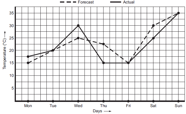
Solution:
(a) The forecast temperature was the same as the actual temperature on Tuesday, Friday and Sunday.
(b) The maximum forecast temperature during the week was 35° C.
(c) The maximum actual temperature during the week was 15° C.
(d) Difference between the actual temperature and the forecast temperature on
Monday = 17.5°C - 15° C = 2.5° C
Tuesday = 20.5° C - 20° C = 0.5° C
Wednesday = 30.0° C - 25° C = 5° C
Thursday = 22.5°C - 15° C = 7.5° C
Friday = 15° C - 15° C = 0° C
Saturday = 30°C - 25° C = 5° C
Sunday = 35° C - 35° C = 0° C
Thus, the maximum difference was on Thrusday.
Q5: Use the tables below to draw linear graphs.
(a) The number of days a hill side city received snow in different years.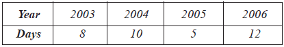
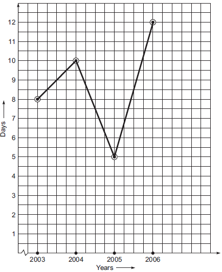
(b) Population (in thousands) of men and women in a village in different years.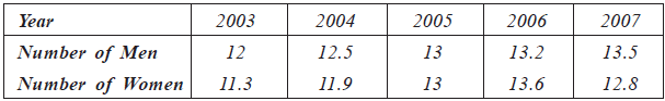
Solution:
(a) Linear graph to show, snow fall in different years
(b) Linear graph showing population of men and women in a village in different years:
Q6: A courier-person cycles from a town to a neighbouring suburban area to deliver a parcel to a merchant. His distance from the town at different times is shown by the following graph.
(a) What is the scale taken for the time axis?
(b) How much time did the person take for the travel?
(c) How far is the place of the merchant from the town?
(d) Did the person stop on his way? Explain.
(e) During which period did he ride fastest?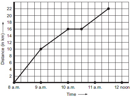
Solution:
(a) The time is taken along the x-axis. The scale along x-axis is 4 units = 1 hour
(b) Total travell time = 8 a.m. to 11:30 a.m.
(c) Distance of the merchant from the town = 22 km
(d) Yes, the stopage time = 10:00 a.m. to 10.30 a.m.
(e) His fast ride is between 8:00 a.m. and 9:00 a.m.

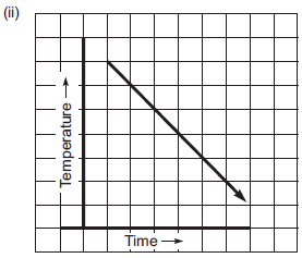
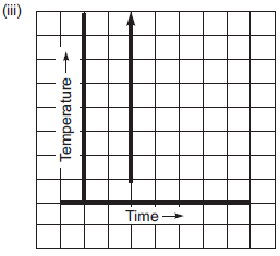
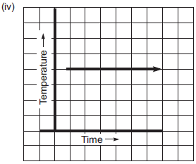
Q7: Can there be a time-temperature graph as follows? Justify your answer.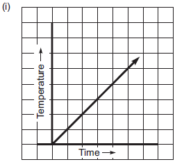
Solution:(i) It is showing the increase in temperature.
(ii) It is showing the decrease in temperature.
(iii) The graph figure (iii) is not possible since temperature is increasing very rapidly which is not possible.
(iv) It is showing constant temperature.
Exercise 13.2
Q1: Draw the graphs for the following tables of values, with suitable scales on the axes.
(a) Cost of apples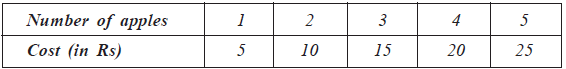
(b) Distance travelled by a car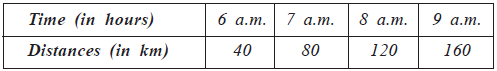
(i) How much distance did the car cover during the period 7.30 a.m. to 8 a.m.?
(ii) What was the time when the car had covered a distance of 100 km since it's start?
(c) Interest on deposits for a year.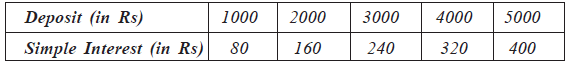
(i) Does the graph pass through the origin?
(ii) Use the graph to find the interest on Rs 2500 for a year.
(iii) To get an interest of Rs 280 per year, how much money should be deposited?
Solution:
(a) I. Draw x-axis and y-axis mutually perpendicular to each other.
II. Take a suitable scale.
III. Take the number of apples along the x-axis and mark the cost (in Rs) along the y-axis.
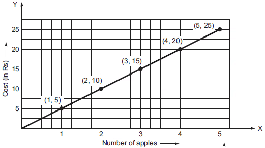
IV. Plot the points (1, 5), (2, 10), (3, 15), (4, 20) and (5, 25)
V. Joint the points.
We obtain the graph a straight line.
(b) I. Draw the axis.
II. Choose suitable scale along x-axis and along y-axis.
III. Mark time (in hours) along x-axis and distance (in km) along y-axis
IV. Plot the points (6, 40) (7, 80), (8, 120) and (9, 160).
V. By joining the points we get the required graph.(i) In the graph, draw a perpendicular at the point indicating 7:30 a.m. on the x-axis such that it meets the graph at A. From A draw a line parallel to x-axis to meet y-axis at 100 km.∴ Distance travelled between 7:30 a.m. and 8:00 a.m.
= 120 km - 100 km
= 20 km
(ii) 7:30 a.m.
(c) I. Draw axes.
II. Take appropriate scale on x-axis and y-axis.
III. Mark the deposits along the x-axis.
IV. Mark the interest along the y-axis.
V. Plot the point (1000, 80) (2000, 160), (3000, 240), (4000, 320) and (5000, 400).
VI. Join the points and get the graph. Now from the graph, we have:(i) Yes, it passes through the origin(ii) From the graph, the interest on Rs 2500 is Rs 200.
(iii) From the graph an interest of Rs 280 can be got by depositing Rs 3500.
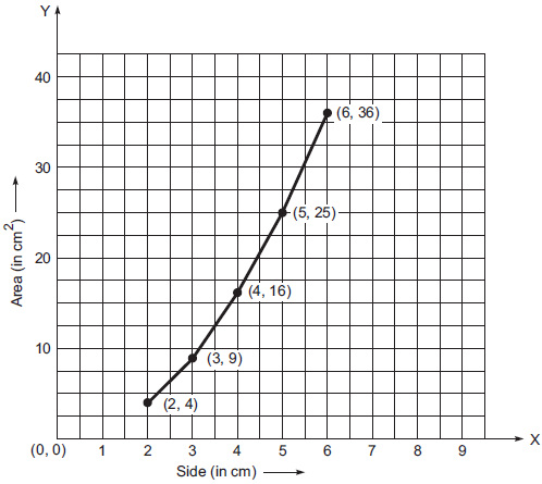
Q2: Draw a graph for the following.
(i) 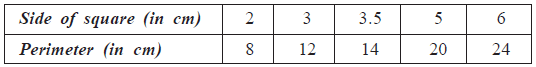
Is it a linear graph?
(ii) 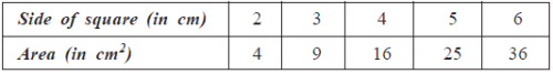
Is it a linear graph?
Solution: (i) Taking the side of the square along the x-axis and the perimeter along the y-axis and plotting the points (2, 8), (3, 12), (3.5, 14), (5, 20) and (6, 24), we get the required graph as a straight line.
∴ This graph is a linear graph.
(ii) Taking the side of the square along the x-axis and area (in cm2) along the y-axis, we can draw the required graph by plotting the points (2, 4), (3, 9), (4, 16), (5, 25) and
(6, 36) as shown in the following figure.
∵ The graph in not a straight line.
∴ It is not a linear graph.
FAQs on NCERT Solutions: Introduction to Graphs
| 1. What are the different types of graphs and when do you use each one in Class 8 maths? |  |
| 2. How do you read coordinates on a graph and why is the order important? | |
| 3. What's the difference between dependent and independent variables on a graph? | |
| 4. Why do some graphs show straight lines and others show curves, and what does each tell you? | |
| 5. What are the steps to plot points accurately on a coordinate plane for CBSE Class 8? | |