NCERT Solutions: Statistics (Exercise 12.1)

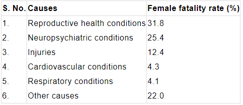
Q1. A survey conducted by an organisation for the cause of illness and death among the women between the ages 15-44 (in years) worldwide, found the following figures (in %):
(i) Represent the information given above graphically.
(ii) Which condition is the major cause of women's ill health and death worldwide?
(iii) Try to find out, with the help of your teacher, any two factors which play a major role in the cause in (ii) above being the major cause.
Ans: (i) The given data can be represented using a bar graph by depicting causes on the x-axis and family fatality rate on the y-axis, and selecting an acceptable scale (1 unit = 5% for the y-axis).
(ii) Reproductive health issues are the primary cause of women's illness and mortality worldwide, affecting 31.8% of women.
(iii) Two factors responsible for the cause in (ii) are:
- Lack of proper care and understanding - for example, inadequate antenatal and postnatal care, and lack of awareness about pregnancy-related risks.
- Lack of medical facilities - including poor access to trained health personnel and emergency obstetric services in many areas.
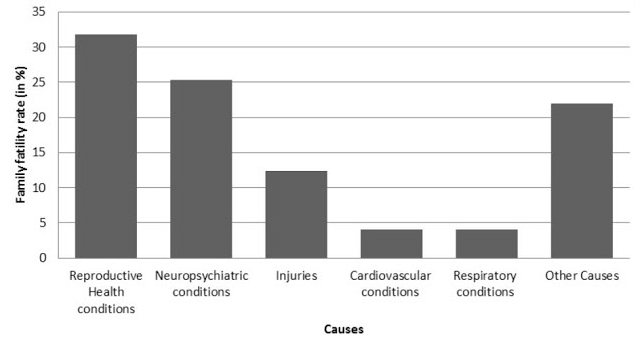
Q2. The following data on the number of girls (to the nearest ten) per thousand boys in different sections of Indian society is given below.
(i) Represent the above information by a bar graph.
(ii) In the classroom, discuss what conclusions can be arrived at from the graph.
Ans: (i) The graph of the information presented above may be built by choosing an appropriate scale (1 unit = 10 girls for the y-axis) and representing each section (variable) on the x-axis and the number of girls per thousand boys on the y-axis.
(ii) Conclusions that can be drawn from the graph:
- The Scheduled Tribes (ST) category shows the highest number of girls per thousand boys (970), while urban areas show the lowest (910).
- Rural areas have more girls per thousand boys than urban areas, suggesting a relative difference in sex ratio between rural and urban settings.
- Backward and SC/ST districts show higher numbers of girls per thousand boys compared to their non-backward and non-SC/ST counterparts.
- These differences point to regional and social variations in the sex ratio that may be influenced by demographic, social and economic factors.
Q3. Given below are the seats won by different political parties in the polling outcome of a state assembly elections:
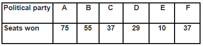
(i) Draw a bar graph to represent the polling results.
(ii) Which political party won the maximum number of seats?
Ans:
(i) The bar graph representing the polling results is given below:
- X-axis: Parties A-F
- Y-axis: 1 unit = 10 seats
(ii) From the bar graph, it is clear that Party A won the maximum number of seats. This is seen from the tallest bar corresponding to Party A, which shows the highest seat count among all parties.
Q4. The length of 40 leaves of a plant are measured correct to one millimetre, and the obtained data is represented in the following table:
(i) Draw a histogram to represent the given data. [Hint: First make the class intervals continuous]
(ii) Is there any other suitable graphical representation for the same data?
(iii) Is it correct to conclude that the maximum number of leaves are 153 mm long? Why?
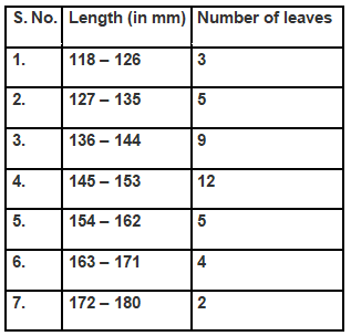
Ans: (i) The data provided in the question is represented in discontinuous class intervals. To convert it into continuous class intervals, we adjust the class limits by subtracting 0.5 from each lower limit and adding 0.5 to each upper limit so that there are no gaps between classes. After this adjustment, choose an appropriate scale, draw contiguous rectangles whose bases are the continuous class-intervals and whose heights are the corresponding frequencies to obtain the histogram.
- X-axis: 1 unit = 9 mm
- Y-axis: 1 unit = 1 leaf
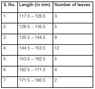
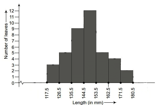
(ii) Yes. The same grouped data can also be represented by a frequency polygon, which is obtained by plotting class mid-points on the x-axis against frequencies on the y-axis and joining the points with straight lines.
(iii) No. We cannot conclude that the maximum number of leaves are exactly 153 mm long. The tallest class actually covers a range of values, and after making intervals continuous the class containing 153 mm spans a range (for example, 144.5 mm to 153.5 mm). The value 153 mm is one possible measurement within that class, but the data show only that most leaves lie in that interval, not at the single value 153 mm.
Q5. The following table gives the life times of 400 neon lamps:
(i) Represent the given information with the help of a histogram.
(ii) How many lamps have a life time of more than 700 hours?
Ans:
(i) To draw the histogram, take the life-time intervals on the x-axis with equal widths and the frequencies on the y-axis. For each interval draw a rectangle whose height equals the frequency of lamps in that interval. Label axes and give a title to the graph for clarity.
- X-axis: 100 hours per division
- Y-axis: 10 lamps per division
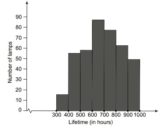
(ii) To find the number of neon lamps with a life time exceeding 700 hours, add the frequencies of the class-intervals that lie above 700 hours. That is, 74 + 62 + 48 = 184 lamps have a lifetime of more than 700 hours.
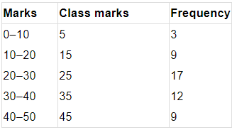
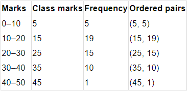
Q6. The following table gives the distribution of students of two sections according to the marks obtained by them:
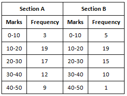
Represent the marks of the students of both sections on the same graph by two frequency polygons. From the two polygons compare the performance of the two sections.
Ans:
The class-marks = (lower limit + upper limit)/2
For section A:
For section B:
How to construct and compare:
- Compute the class mid-points (class marks) for each class in both sections.
- Plot the class marks on the x-axis and the corresponding frequencies on the y-axis for each section.
- Join the plotted points of each section with straight lines to form two frequency polygons, using different styles or colours to distinguish them.
- X-axis: Class marks (5, 15, 25, 35, 45)
- Y-axis: 1 unit = 2 students
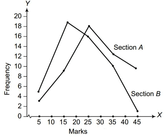
From the resulting graph, it is evident that students of Section A generally scored higher frequencies at larger marks compared to Section B, so Section A performed better overall.
Q7. The runs scored by two teams A and B on the first 60 balls in a cricket match are given below:
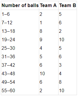
Represent the data of both teams on the same graph by frequency polygons.
Note: The given class intervals are not continuous. Therefore, we first modify the distribution to be continuous.
Ans: The data provided in the question is presented in discontinuous class intervals. To create continuous class intervals, adjust each lower limit by subtracting 0.5 and each upper limit by adding 0.5 so there are no gaps between consecutive classes. Using the adjusted intervals, compute class mid-points and plot frequencies against these mid-points for both teams. Join the points for each team with straight lines to obtain two frequency polygons on the same graph.
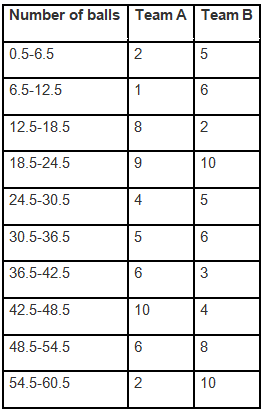
The runs scored by both teams are then represented on the graph below using frequency polygons.
- X-axis: Class marks (6, 12, 18, ... 60)
- Y-axis: 1 unit = 1 run
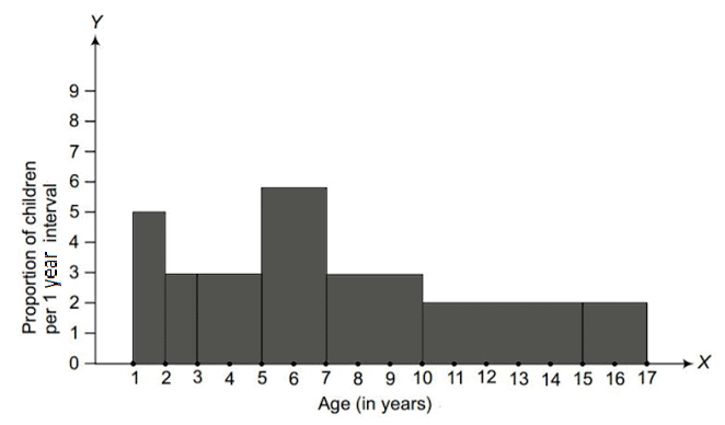
Q8. A random survey of the number of children of various age groups playing in a park was found as follows:
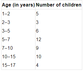
Draw a histogram to represent the above data.
Ans: The widths of the class intervals in the given data vary. In such cases the height of each rectangle in the histogram must represent the frequency density (frequency per unit class-width), so that the area of each rectangle is proportional to the actual frequency. Procedure:
- Compute frequency density = frequency ÷ class width for each age group.
- Plot ages on the x-axis using the given class intervals and plot frequency density on the y-axis.
- Draw rectangles over each class interval with heights equal to the computed densities.
This ensures the area of each rectangle correctly represents the number of children in that age group.
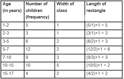
Let the x-axis = the age of children
y-axis = proportion of children per 1-year interval
Q9. 100 surnames were randomly picked up from a local telephone directory and a frequency distribution of the number of letters in the English alphabet in the surnames was found as follows:
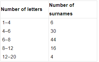
(i) Draw a histogram to depict the given information.
(ii) Write the class interval in which the maximum number of surnames lie.
Ans:
(i) The width of the class intervals in the provided data varies. For such unequal class widths, calculate the frequency density for each class (frequency ÷ class width) so that the area of each rectangle represents the actual frequency. Then draw the histogram with class intervals on the x-axis and frequency density on the y-axis.
- Scale on Y-axis = 1 division = 5 units
- Scale on X-axis = 1 division = 1 letter
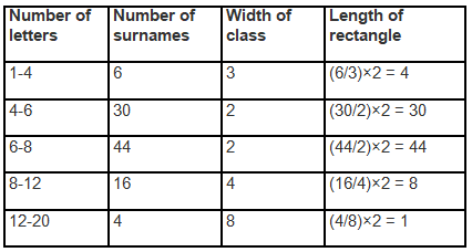
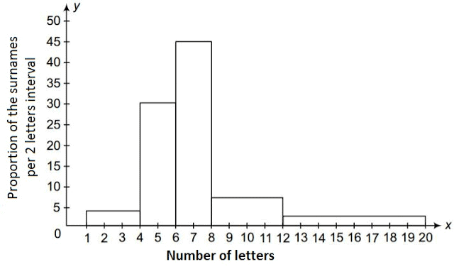
(ii) The class interval 6-8 contains the highest number of surnames, as shown by the largest area (or tallest bar when densities are comparable) in the histogram.
MEASURES OF CENTRAL TENDENCY
- We can make out some important features of the given data by considering only certain representatives.
- These representatives are called the measures of central tendency or averages. There are three main averages: Mean, Median and Mode.
Mean
- The mean (or average) of a number of observations is the sum of the values of all the observations divided by the total number of observations.
- It is denoted by the symbol x, and we read it as x-bar.
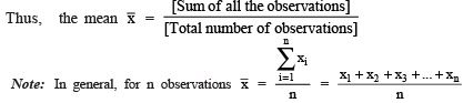
Here ∑ is a Greek symbol called sigma.
The summation is read as the sum of x as i varies from 1 to n.
Mode
- The mode is the value of the observation which occurs most frequently, i.e., an observation with the maximum frequency is called the mode of the data.
- Note: In a given dataset, the value around which there is the greatest concentration is called the mode of the data.
Median
- After arranging the given data in an ascending or a descending order of magnitude, the value of the middle-most observation is called the median of the data.
- Note: For 'n' observations (taken in order),
(i) if n is odd, the median = value of observation.
(ii) if n is even, the median = mean of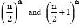 observations.
FAQs on NCERT Solutions: Statistics (Exercise 12.1)
| 1. How do I find the mean of a dataset in statistics Class 9? |  |
| 2. What's the difference between median and mode in statistics problems? | |
| 3. Why do we need to organize data using frequency distribution tables? | |
| 4. How do I calculate the mean from a frequency distribution table for my statistics homework? | |
| 5. What are the main steps for solving statistics questions in Exercise 12.1 correctly? | |


