NCERT Solutions - Presentation of Data

Q1: Bar diagram is a
(i) one-dimensional diagram
(ii) two-dimensional diagram
(iii) diagram with no dimension
(iv) none of the above
Ans: (i)
Explanation: A bar diagram is a one-dimensional diagram because each bar represents the magnitude of a single variable along one axis while the other axis is used for measurement. Bars are drawn as separate rectangles perpendicular to the base line; their heights (or lengths) indicate the values being compared. Bar diagrams are used for discrete or categorical data and make visual comparison between categories easy.
Q2: Data represented through a histogram can help in finding graphically the
(i) mean
(ii) mode
(iii) median
(iv) all the above
Ans: (ii)
Explanation: A histogram helps to locate the modal class graphically because the tallest rectangle (bar) corresponds to the class with the highest frequency. The modal value can be estimated more precisely by joining the top corners of the modal class rectangle to the top corners of the adjacent class rectangles and finding the intersection point of these diagonal lines. That intersection gives an improved graphical estimate of the mode.
Q3: Ogives can be helpful in locating graphically the
(i) mode
(ii) mean
(iii) median
(iv) none of the above
Ans: (iii)
Explanation: Ogives are cumulative frequency curves. The median can be found graphically as the x-axis value at which the 'less than' ogive and the 'more than' ogive intersect. This intersection point corresponds to the value that divides the distribution into two equal halves, which is the median.
Q4: Data represented through arithmetic line graph help in understanding
(i) long-term trend
(ii) cyclicity in data
(iii) seasonality in data
(iv) all the above
Ans: (iv)
Explanation: An arithmetic line graph (time-series graph) plots values against time and therefore reveals temporal patterns. It helps identify the long-term trend, recurring cyclical movements and short-term seasonal fluctuations in the data. Different components become visible when the series is viewed over an appropriate time span.
Q5: Width of bars in a bar diagram need not be equal (True/False).
Ans: False
Explanation: In a bar diagram all bars should have equal width and equal spacing between them. Equal widths ensure that comparisons are based only on the height (or length) of bars, not on area, which keeps the visual comparison correct and unambiguous.
Q6: Width of rectangles in a histogram should essentially be equal (True/False).
Ans: False
Explanation: In a histogram the width of each rectangle corresponds to the width of its class interval. If class intervals are equal, the rectangles have equal width. If class intervals are unequal, rectangle widths vary accordingly. Thus, widths need not always be equal - they must reflect the class sizes.
Q7: Histogram can only be formed with continuous classification of data (True/False).
Ans: True
Explanation: Histograms are used for continuous data presented as a frequency distribution over class intervals. Discrete data cannot be directly shown as a histogram unless converted into an appropriate continuous (exclusive) series. For discrete series, bar diagrams are used instead.
Q8: Histogram and column diagram are the same method of presentation of data (True/False).
Ans: False
Explanation: Histograms and column (bar) diagrams differ. A histogram is used for continuous data and its rectangles are drawn adjacent to each other (no gaps), with widths representing class intervals. A column or bar diagram is used for discrete or categorical data; bars are separated by gaps and have equal width. Thus their appearance and usage are different.
Q9: Mode of a frequency distribution can be known graphically with the help of histogram (True/False).
Ans: True
Explanation: The modal class is identified as the class with the highest rectangle in a histogram. A refined graphical estimate of the mode can be obtained by drawing diagonals from the top corners of the modal rectangle to the tops of adjacent rectangles and finding the intersection point of these diagonals. The corresponding x-value gives the modal value.
Q10: Median of a frequency distribution cannot be known from the ogives (True/False).
Ans: False
Explanation: Ogives are cumulative frequency curves and are well suited to locate the median graphically. The median is the x-value at which the 'less than' and 'more than' ogives intersect. This provides a clear graphical method to estimate the median for grouped data.
Q11: What kinds of diagrams are more effective in representing the following?
(i) Monthly rainfall in a year
(ii) Composition of the population of Delhi by religion
(iii) Components of cost in a factory
Ans: (i) The monthly rainfall for a year is best represented by a bar diagram because it allows easy month-by-month comparison; the heights of the bars show which months have higher or lower rainfall.
(ii) The composition of Delhi's population by religion can be shown using a simple bar diagram to compare counts across religions. A pie chart may also be used when the objective is to show each religion's share of the whole population.
(iii) Different components of cost in a factory are most effectively shown by a pie chart because the whole circle represents the total cost and each sector indicates the proportionate share of a component, making relative contributions easy to visualise.
Q12: Suppose you want to emphasise the increase in the share of urban non-workers and lower level of urbanisation in India as shown in Example 4.2. How would you do it in the tabular form?
Ans: Share of Rural and Urban Non-workers in India
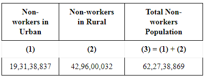
From the table it is clear that although the absolute number of rural non-workers is larger than that of urban non-workers, the relative shares show a lower proportion for urban non-workers. This difference in shares highlights the lower level of urbanisation. A concise table with columns for year, total population, rural non-workers (number and share) and urban non-workers (number and share) will make this comparison and the trend in urbanisation immediately clear.
Q13: How does the procedure of drawing a histogram differ when class intervals are unequal in comparison to equal class intervals in a frequency table?
Ans: When class intervals are equal, every rectangle in the histogram has the same width and heights represent frequencies directly. When class intervals are unequal, rectangle widths must reflect the actual class widths and frequencies must be adjusted before plotting so that area, not height, represents frequency. The usual procedure is to compute an adjustment factor for each class (related to its width) and then obtain the adjusted frequency by dividing the original frequency by this factor.

The histogram is then drawn with rectangles whose widths equal the class widths and heights proportional to the adjusted frequencies, so that the area of each rectangle correctly represents the class frequency.
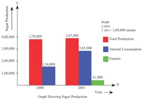
Q14: The Indian Sugar Mills Association reported that, 'Sugar production during the first fortnight of December 2001 was about 3,87,000 tonnes, as against 3,78,000 tonnes during the same fortnight last year (2000). The off-take of sugar from factories during the first fortnight of December 2001 was 2,83,000 tonnes for internal consumption and 41,000 tonnes for exports as against 1,54,000 tonnes for internal consumption and nil for exports during the same fortnight last season.'
(i) Present the data in tabular form.
(ii) Suppose you were to present these data in diagrammatic form which
of the diagrams would you use and why?
(iii) Present these data diagrammatically.
Ans:

(iii)
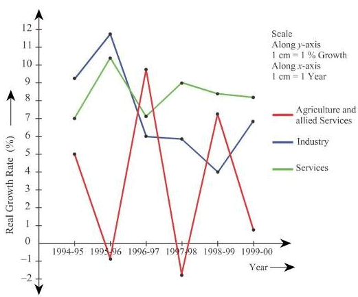
Q15: The following table shows the estimated sectoral real growth rates (percentage change over the previous year) in GDP at factor cost.
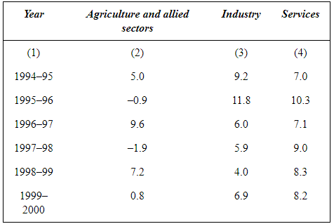
Represent the data as multiple time series graphs.
Ans:
FAQs on NCERT Solutions - Presentation of Data
| 1. What is the importance of data presentation? |  |
| 2. What are the different methods of data presentation? | |
| 3. How can data presentation help in data analysis? | |
| 4. What are the factors to consider while choosing a data presentation method? | |
| 5. How can data presentation enhance data storytelling? | |