Line Graph Examples with Questions

Data interpretation Line Graphs
What is a Line Graph?
A modified version of Bar Graph representation is said to be a Line Graph. On connecting the upper points of two adjacent Bars of a Bar Graph we get a line and on further repeating this procedure with other Bars we get a Line Graph representation.
Solving a Line Graph question
Problems based on line graphs appear frequently in competitive exams having data interpretation as a component. Given below is a popular type of question asked from line graphs:
DIRECTIONS: Study the following graph carefully and answer the questions given below.
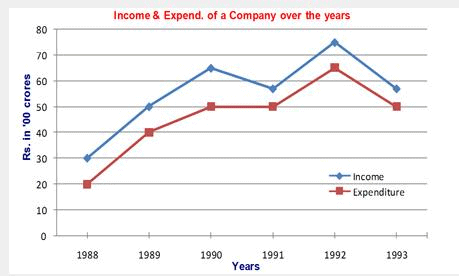
Example 1: In which of the following years was the percentage increase in income over the previous year the maximum?
1. 1989
2. 1990
3. 1991
4. 1992
Solution:
Ans: Option 1
Sol: Percentage increase = 100 × (Increase)/(Previous year income).
1989: Increase = 50 - 30 = 20 → % increase = 100 × 20/30 = 66.67%
1990: Increase = 65 - 50 = 15 → % increase = 100 × 15/50 = 30%
1991: Income falls from 65 to 55, so this is a decrease and cannot be the required year.
1992: Increase = 75 - 55 = 20 → % increase = 100 × 20/55 = 36.36%
All figures are in Rs '00 cr. Therefore the largest percentage increase occurs in 1989 (66.67%). Hence Option 1.
Alternatively,
For maximum percentage change, the increase (numerator) should be large while the previous-year income (denominator) should be small. For 1989 the increase is large and the previous-year income is the smallest among the candidate years, so 1989 gives the highest percentage increase. Thus calculating every percentage in full is not necessary in such comparisons. Hence, answer is 1st option.
Example 2: What was the average income of the company over the years (approximately)?
1. 4500 cr
2. 500 cr
3. 5500 cr
4. 550 cr
Solution:
Ans: Option 3
Sol: Average (in Rs '00 cr) = (30 + 50 + 65 + 55 + 75 + 55)/6 = 330/6 = 55 (Rs '00 cr).
Converted to crores: 55 × 100 = Rs 5500 cr. Hence Option 3.
Example 3: What is the ratio of income to expenditure in the year 1990?
1. 1.2
2. 1.3
3. 1.1
4. 1.4
Solution:
Ans: Option 2
Sol: Income in 1990 = 65 (Rs '00 cr) = Rs 6500 cr.
Expenditure in 1990 = 50 (Rs '00 cr) = Rs 5000 cr.
Ratio = 6500/5000 = 1.3. Hence Option 2.
Example 4: The total expenditure in 1988 and 1989 together was equal to the income in which of the following years?
1. 1900
2. 1991
3. 1993
4. None of these
Solution:
Ans: Option 4
Sol: The total expenditure in 1988 and 1989 together is given as Rs. 6000 cr.
Compare this with incomes of the years: 1988 = Rs 3000 cr, 1989 = Rs 5000 cr, 1990 = Rs 6500 cr, 1991 = Rs 5500 cr, 1992 = Rs 7500 cr, 1993 = Rs 5500 cr.
None of these incomes equals Rs 6000 cr. Therefore, the correct answer is Option 4.
FAQs on Line Graph Examples with Questions
| 1. What is a line graph? |  |
| 2. How do you interpret a line graph? | |
| 3. What are the advantages of using a line graph? | |
| 4. How can I create a line graph in Excel? | |
| 5. What are some common mistakes to avoid when creating line graphs? | |