IELTS Exam  >  IELTS Notes  >  Writing for Academic IELTS  >  Phrases and Collocations for Describing Tables, Graphs and Charts

Phrases and Collocations for Describing Tables, Graphs and Charts | Writing for Academic IELTS PDF Download

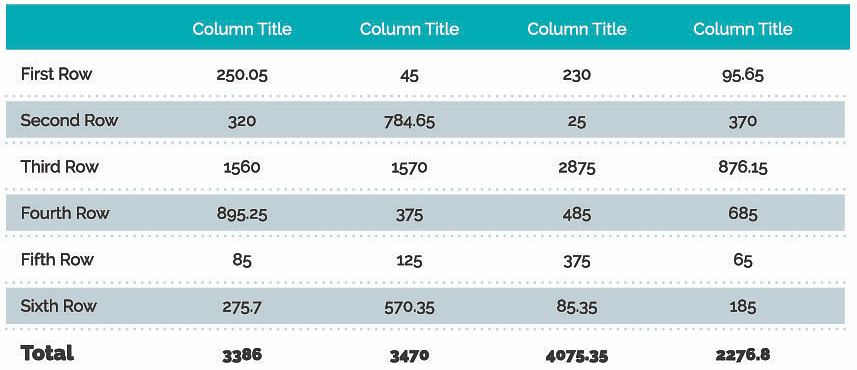
Table

Phrases and Collocations for Describing Tables, Graphs and Charts | Writing for Academic IELTSBar Chart

Phrases and Collocations for Describing Tables, Graphs and Charts | Writing for Academic IELTS

Pie Chart

 Phrases and Collocations for Describing Tables, Graphs and Charts | Writing for Academic IELTS

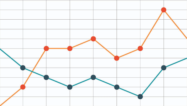
Line Graph

Phrases and Collocations for Describing Tables, Graphs and Charts | Writing for Academic IELTS

The main differences and similarities among tables, graphs and charts. While tables present information about different categories mainly in columns and rows, bar charts present the information in two axes: the values are given along one axis and each bar represents what is being measured along the other axis. It is often possible to turn tables into charts, but sometimes the categories are too different to do this. A pie chart is another way of presenting information, but here each segment is a percentage of a whole. Together they represent 100%. Last but not least, line graphs show how data change over time.

When approaching the Academic version of Writing Task 1, it’s important that you introduce the visual data by using one of the following phrases or collocations:

  • According to the table/ graph/chart…
  • The table/graph/chart shows…
  • The table/graph/chart illustrates…
  • Looking at the table/chart/graph, it can be seen that…
  • The table/graph/chart provides information about…

After introducing the visual data, you will be expected to describe the main trends presented in the table, graph and/or chart. Below are different phrases and collocations that you can use to describe a variety of trends:

Phrases and Collocations for Describing Tables, Graphs and Charts | Writing for Academic IELTS

  • a significant increase 
  • a considerable growth 
  • to increase dramatically 
  • to rise sharply 
  • to show an upward trend 

Phrases and Collocations for Describing Tables, Graphs and Charts | Writing for Academic IELTS

  • a sharp fall 
  • a significant drop 
  • to decline sharply 
  • to show a downward trend 
  • to hit the lowest point

Phrases and Collocations for Describing Tables, Graphs and Charts | Writing for Academic IELTS

  • to reach a peak/high 
  • at its peak 
  • all-time peak 
  • to rise towards its peak 
  • past its peak 

Phrases and Collocations for Describing Tables, Graphs and Charts | Writing for Academic IELTS

  • a considerable variation
  • a slight fluctuation
  • to vary considerably
  • to show some fluctuation

Phrases and Collocations for Describing Tables, Graphs and Charts | Writing for Academic IELTS

  • a period of stability
  • to remain stable
  • to remain constant

Phrases and Collocations for Describing Tables, Graphs and Charts | Writing for Academic IELTS

  • to reach a plateau
  • to level off
  • to flatten out

Some collocations and phrases used more specifically to talk about percentages and values being compared with each other, both of which are common features of tables and charts:

Phrases and Collocations for Describing Tables, Graphs and Charts | Writing for Academic IELTS

The document Phrases and Collocations for Describing Tables, Graphs and Charts | Writing for Academic IELTS is a part of the IELTS Course Writing for Academic IELTS.
All you need of IELTS at this link: IELTS
33 videos|200 docs|17 tests

Top Courses for IELTS

FAQs on Phrases and Collocations for Describing Tables, Graphs and Charts - Writing for Academic IELTS

1. What are some common phrases used to describe tables, graphs, and charts in IELTS?
Ans. Some common phrases used to describe tables, graphs, and charts in IELTS include: - The table/graph/chart illustrates/shows/presents/provides data/information about... - It can be observed from the table/graph/chart that... - The data in the table/graph/chart reveals/demonstrates/highlights... - There is a clear correlation/relationship between... - The table/graph/chart displays a comparison/contrast between...
2. How can I effectively describe the data in a table or chart for IELTS?
Ans. To effectively describe the data in a table or chart for IELTS, it is important to: - Start with an introduction stating what the table/graph/chart represents. - Identify the key trends, patterns, or significant points in the data. - Use appropriate vocabulary to describe the data accurately and precisely. - Make comparisons, contrasts, or connections between different elements in the data. - Provide specific details and figures from the table/graph/chart to support your description.
3. What are some collocations commonly used in IELTS when describing tables, graphs, and charts?
Ans. Some collocations commonly used in IELTS when describing tables, graphs, and charts are: - A sharp/increasing/decreasing/gradual/steep rise/fall - A significant/marked/slight/minor change - A peak/plateau/trend/progression - A fluctuation/variation/pattern/tendency - A correlation/relationship/association/connection - A comparison/contrast between
4. How can I effectively organize my description of a table or chart in IELTS?
Ans. To effectively organize your description of a table or chart in IELTS, you can follow these steps: - Begin with an introduction that provides an overview of the table/graph/chart. - Describe the main features or trends in the data, focusing on the most significant points. - Use paragraphs or bullet points to separate different aspects or categories in the data. - Provide supporting details and specific figures from the table/graph/chart to support your description. - Conclude by summarizing the main findings or implications of the data.
5. What are some useful language functions or phrases to use when describing tables, graphs, and charts?
Ans. Some useful language functions or phrases to use when describing tables, graphs, and charts include: - Comparing and contrasting: "In comparison to...", "On the other hand...", "Similarly..." - Highlighting trends: "There is a clear upward/downward trend in...", "Over the period shown, there was a significant increase/decrease in..." - Describing proportions: "Approximately...", "A significant majority/minority of...", "A relatively small/large percentage of..." - Speculating or making predictions: "It is likely that...", "Based on the data, we can infer that...", "It is possible that..." - Summarizing or concluding: "To summarize...", "In conclusion...", "Overall, it can be said that..."
33 videos|200 docs|17 tests
Download as PDF
Explore Courses for IELTS exam

Top Courses for IELTS

Signup for Free!
Signup to see your scores go up within 7 days! Learn & Practice with 1000+ FREE Notes, Videos & Tests.
10M+ students study on EduRev
Related Searches

practice quizzes

,

Phrases and Collocations for Describing Tables

,

video lectures

,

ppt

,

Previous Year Questions with Solutions

,

Phrases and Collocations for Describing Tables

,

shortcuts and tricks

,

Graphs and Charts | Writing for Academic IELTS

,

Semester Notes

,

Exam

,

Graphs and Charts | Writing for Academic IELTS

,

MCQs

,

Phrases and Collocations for Describing Tables

,

Sample Paper

,

Summary

,

Viva Questions

,

Free

,

Graphs and Charts | Writing for Academic IELTS

,

study material

,

pdf

,

past year papers

,

mock tests for examination

,

Extra Questions

,

Objective type Questions

,

Important questions

;