Multiple Variables | The Complete SAT Course - Class 10 PDF Download
The graphs we've looked at so far have contained only one variable - that is, they have only charted the rise and/ or fall of a single factor. Unfortunately, many of the graphs you are asked to work with on the SAT will contain more than one variable. When this is the case, you should always start by noting the key difference between the lines (or sectors, in the case of a bar graph or pie chart).
The biggest difference (or similarity) between the lines is the point of the graph.
Here are some questions to consider:
- Do the lines move in a similar way, or do they move in different ways? (e.g., do both lines rise or fall, or does one line rise while the other falls?)
- Is one line consistently high and the other consistently low?
- Do both lines ever pass through the same point?
- If there is a large increase/decrease, does it occur in the same place for both lines, or does it occur in different places?
I cannot stress how important this step is. While it may seem as if these questions are asking you to process an enormous amount of information, the reality is that only a small portion of what you see will actually be relevant.
Furthermore, the questions will almost invariably target the most significant differences between the lines or sectors. If you've already established those differences upfront, you're already most of the way to the answer.
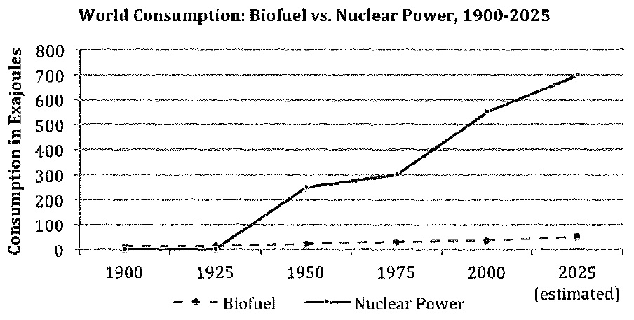
Let's consider this somewhat altered version of a graph we examined a little while ago:
When we Look at the graph, the difference between the two energy sources is striking: biofuel use rose slightly and gradually throughout the twentieth century and will continue its slow, steady increase in the twenty-first century. In contrast, nuclear power use rose sharply and significantly beginning in the mid-twentieth century and will continue to increase substantially in the twenty-first century.
Our "main point" could therefore be something like "NP way up, BF up slowly" (nuclear power use is going way up, while biofuel use is rising slowly).
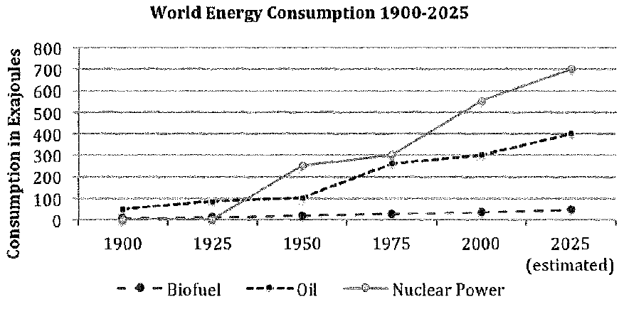
We could even be asked to deal with three variables:
Here, the main thing to notice is that biofuel use rose slightly and slowly; nuclear power use rose significantly and quickly; and oil use was somewhere in the middle.
Now let's look at a few more graph-only questions. The most straightforward of these will simply ask you to identify the answer best supported by the graph. Often, you will be able to answer these questions just by keeping the big picture in mind.
Let's consider the second version of line graph on the previous page, the one with the three variables. (Note that on the SAT, the actual questions frequently appear on different pages from the graphs themselves, so you must be comfortable flipping back and forth.)
Remember the big picture: nuclear energy - high; oil - medium; biofuel - low. In addition, the lines for oil and nuclear power are about equal at 1975.
Q. Which choice is supported by data in the graph?
(a) The amount of oil and the amount of nuclear power used in 1950 were roughly the same.
(b) By 2025, more energy will be obtained from nuclear energy than from oil or biofuel.
(c) The use of biofuels is predicted to decline between 2000 and 2025.
(d) Oil use rose at a dramatically higher rate than did biofuel use between 1975 and 2000.
We could work through these answers one by one (and in fact we're going to do so in a moment), but first let's consider the shortcut. Tire overall point of the graph is that nuclear energy has been way outstripping biofuel and oil for more than a century and will continue to do so in the immediate future.
Which answer comes closest to saying that? B). It simply states what the graph shows most obviously - by 2025, nuclear energy will be far ahead.
|
405 videos|217 docs|164 tests
|


