Practice Questions: Line Graphs

Directions for Questions (1-6):
The graph given below shows the quantity of milk and food grains consumed annually along with female and male population (in millions). Use the data to answer the questions that follow.
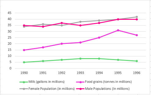
Q1: In which year was the difference between the percentage increase in the production of food grains and milk maximum?
(a) 1993
(b) 1994
(c) 1995
(d) 1996
Ans: (c)
Explanation: The difference between the two percentage changes will be largest when one of them is near its maximum positive change while the other is at a low or negative change. From the data, the percentage increase in food-grain production peaks in 1995, while milk shows a negative change in 1995. Because food grains are at their highest positive increase and milk is falling, the gap between their percentage changes is greatest in 1995. Hence (c) is correct.
Q2: When was the per capita production of milk least?
(a) 1990
(b) 1992
(c) 1994
(d) 1996
Ans: (a)
Explanation: The population is increasing steadily, but the milk produced decreased significantly in 1996.
Hence, the only two years we need to check for the least per capita milk production are the first year (1990) and 1996.
Milk produced in 1990 is 5 million gallons.
Total population in 1990 is 34+35 = 69 million.
Hence, per capita production of milk in 1990 is 0.072 gallon per person.
Milk produced in 1996 is 6 million gallons.
Total population in 1996 is 40+42 = 82 million.
Hence, per capita production of milk in 1996 is 0.073 gallon per person.
Hence, the year with the least per capita production of milk is 1990.
Q3: Referring to the previous question, in which year was the per capita consumption of this nutrient highest?
(a) 1993
(b) 1994
(c) 1995
(d) 1996
Ans: (c)
Explanation: The nutrient contribution per unit is given in the ratio 3:2 for milk:foodgrains. Total nutrient available in a year depends on quantities of milk and foodgrains consumed and these per-unit contributions. The year 1995 shows a large spike in food-grain consumption while milk stays roughly similar; this increases total nutrient availability most in 1995. Using the provided figures (as in the original worked step): total nutrient in 1995 = 30 × 80 + 7 × 120 = 3,240 million grams (as computed from the given unit figures). Therefore per-capita nutrient consumption is highest in 1995. Hence (c) is correct.
Q4: If milk contains 320 calories and foodgrains contain 160 calories, in which year was the per capita consumption of calories highest?
(a) 1993
(b) 1994
(c) 1995
(d) 1996
Ans: (c)
Explanation: Per-capita calorie intake depends on total calories from milk and foodgrains divided by total population. Milk supplies 320 calories per unit and foodgrains 160 calories per unit. The data show a clear spike in food-grain consumption in 1995 while milk remains relatively steady. That spike in the larger quantity of foodgrains raises the total calorie availability most in 1995, so per-capita calories are highest in 1995. Hence (c) is correct.
Q5: When was the per capita production of foodgrains most?
(a) 1992
(b) 1993
(c) 1994
(d) 1995
Ans: (d)
Explanation: Per-capita production = total foodgrain production ÷ total population. Total population changes little over the period, so the year with the largest total foodgrain production will also have the largest per-capita production. The total foodgrain production is highest in 1995, therefore per-capita production is highest in 1995. Hence (d) is correct.
Q6: If one gallon of milk contains 120 g of a particular nutrient, and one tonne of foodgrains contains 80 g of the same nutrient, in which year was the availability of this nutrient maximum?
(a) 1993
(b) 1994
(c) 1995
(d) 1996
Ans: (c)
Explanation: Compute total nutrient availability = (milk units × 120 g) + (foodgrain units × 80 g). The largest combined production occurs in 1994 and 1995, so check both:
Availability in 1994 = (120 × 8) + (25 × 80) = 960 + 2,000 = 2,960 (g in million-units as per the data units).
Availability in 1995 = (6 × 120) + (31 × 80) = 720 + 2,480 = 3,200 (same unit basis).
Since 3,200 > 2,960, availability is maximum in 1995. Hence (c) is correct.
Direction for Questions (7-10):
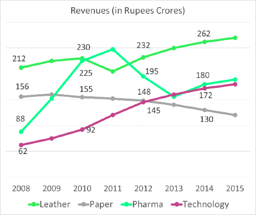
Q7: In the year 2013, what was the share of revenues of the division Pharma?
(a) 27%
(b) 35%
(c) 19%
(d) 22%
Ans: (d)
Explanation: To find the share for 2013, compute each division's 2013 revenue by applying the 2013 growth rates to the actual 2012 revenues, then divide Pharma's 2013 revenue by the total 2013 revenue and convert to a percentage. Using the given 2012 numbers and 2013 growth rates (as shown in the provided image/table), Pharma's share works out to 22%. Therefore (d) is correct.
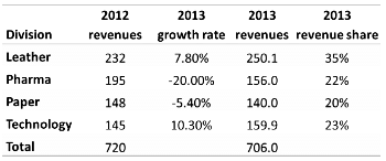
Share of Pharma is 22%.
The question is "In the year 2013, what was the share of revenues of the division Pharma?"
Hence, the answer is "22%".
Choice D is the correct answer.
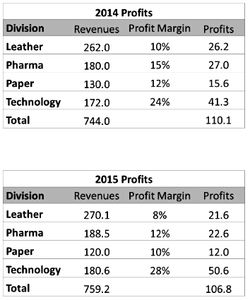
Q8: The profit margins by division in the years 2014 and 2015 are given in the table below. Find the yoy percentage growth in profits in 2015.
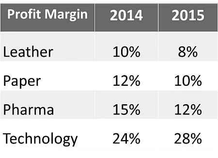
(a) -3%
(b) -6%
(c) 2.4%
(d) 0%
Ans: (a)
Explanation: First compute total profit in each year by summing profits across divisions (using the profit margins and revenues given). From the provided figures, total profit in 2014 = Rs. 110.1 Crores and in 2015 = Rs. 106.8 Crores.
Year-on-year percentage growth = (106.8 - 110.1) ÷ 110.1 ≈ -3.0%.
Thus profits declined by approximately 3% in 2015. Hence (a) is correct.
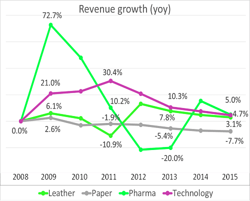
Q9: Which year saw the highest percentage growth in revenues overall?
Ans: 2009
Explanation: Completing the revenue grid year by year and computing overall revenues shows that 2009 has the largest year-on-year increase. This results from very strong positive growth across divisions in 2009 (notably Pharma and Technology), so the combined overall growth rate is highest in 2009. Scanning the growth-rate graph also confirms 2009 as the peak year for overall revenue growth.
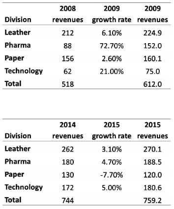 With this, we can complete the overall grid. The overall grid should make the last question also simpler.
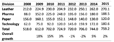 The maximum year on year growth rate was seen in 2009.
We could have obtained this by scanning at the growth rate graph as well. The Pharma number is off the charts and all 4 growth rates are positive. The 21% growth rate in Technology is also pretty high. So, here was an easy question that we have gone about in a roundabout fashion.
The question is "Which year saw the highest percentage growth in revenues overall?"
Hence, the answer is "2009".
2009 is the correct answer.
Q10: What was the total revenues in 2011?
(a) Rs. 640 Crores
(b) Rs. 725 Crores
(c) Rs. 760 Crores
(d) Rs. 680 Crores
Ans: (b)
Explanation: Use the known 2010 revenues by division and apply the 2011 growth rates for each division to obtain 2011 revenues by division. Sum those division revenues to get total revenue for 2011. Carrying out these calculations with the provided division data yields total 2011 revenues = Rs. 725 Crores. Hence option (b) is correct.
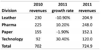
2011 revenues were Rs. 725 Crores.
The question is "What was the total revenues in 2011?"
Hence, the answer is "Rs. 725 Crores".
Choice B is the correct answer.
FAQs on Practice Questions: Line Graphs
| 1. What is a line graph? |  |
| 2. How do you interpret data from a line graph? | |
| 3. What are the advantages of using line graphs? | |
| 4. What types of data are best suited for line graphs? | |
| 5. Can line graphs be used to compare multiple data sets? | |