Tips and Tricks: Line Charts | Quantitative Aptitude for SSC CGL PDF Download
Definition
A line chart is a graphical representation employed to illustrate connected data points through straight lines. It is typically employed for portraying continuously changing data over a specific duration, like time, to exhibit trends, variations, or patterns. Constructing a line chart requires a grasp of its fundamental principles and the essential equations for plotting the data.
Tips and Tricks for line chart
- Slope (m) of the Line: The slope of the line connecting two data points (x1, y1) and (x2, y2) can be calculated using the following formula:
m = (y2 -y1 / (x2 – x1).
This formula represents the rate of change between the two data points and indicates whether the data is increasing or decreasing. - Equation of a Straight Line: The equation of a straight line in the slope-intercept form is commonly used to represent a line on a line chart:
y = m(x) + b- y is the dependent variable (vertical position).
- x is the independent variable (horizontal position).
- m is the slope of the line.
- b is the y-intercept, representing the value of y when x is zero.
This equation can be used to calculate the y-values for any given x-values along the line.
- Interpolation: In line charts, interpolation is frequently utilized to estimate y-values for x-values that lie between two given data points. This interpolation is commonly performed in a linear fashion, assuming a consistent rate of change between the provided data points.
- Plotting Data Points: To generate a line chart, you place the data points on the graph, assigning x-values to the x-axis and corresponding y-values to the y-axis. Subsequently, connect these points using straight line segments.
- Labeling and Scaling: Properly label the x-axis and y-axis with appropriate titles and units. Ensure that the scale of the axes is chosen to clearly represent the data and trends.
Important points for Tips and Tricks of line chart
- Carefully read and follow the instructions when reviewing the questions.
- Analyze the data presented in the Line Graph attentively.
- Grasp the application of converting percentages to fractions.
- Minimize unnecessary calculations and refrain from making assumptions beyond the provided data.
- For extensive addition, subtraction, multiplication, and division, develop an efficient method to reach the answers quickly.
- Establish a solid understanding of Data Interpretation (DI), as DI questions often rely on concepts related to Averages, Percentage, and Ratio and Proportion.
Examples

Example 1: In which of the following years was the investment minimum for company B?
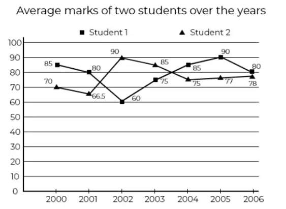
In which of the year the total marks is minimum for Student 2
(a) 2004
(b) 2005
(c) 2003
(d) 2002
Ans: (a)
Since the number of subjects are the same, the total marks would be minimum in the year whose average marks is the lowest.
Example 2: What would be the ratio of Student 1’s total average marks of the first and the last year to Student 2’s difference of marks in the first and last year.
(a) 9 : 10
(b) 165 : 8
(c) 8 : 165
(d) 1
Ans: (b)
Student 1’s total marks in 1st and last year = 85 + 80 = 165
Student 2’s difference in marks in 2st and last year = 78 – 70 = 8
Ratio = 165 : 8
Example 3: In which of the following years is the total marks maximum?
(a) 2006
(b) 2001
(c) 2003
(d) 2000
Ans: (d)
Since the number of subjects are the same, the total marks would be higher in the year whose average marks is the highest.
Example 4: What is the ratio of the average marks of Student 1 over the years to that of Student 2?
(a) 79.2 : 773
(b) 792 : 773
(c) 79 : 77
(d) None of these
Ans: (b)
Average marks of student 1 = (85 + 80 + 60 + 75 + 85 + 90 + 80)/7 = 79.2
Average marks of student 2 = (70 + 66.5 + 90 + 85 + 75+ 77 + 78)/7 = 77.3
Ratio = 79.2 : 77.3
Example 5: What percent is student 1’s average marks to that of student 2’s average marks in the 4th year
(a) 88.2
(b) 85.6
(c) 90
(d) 87.6
Ans: (a)
In 2003, Student 1 = 75
Student 2 = 85
Required % = 75/85 * 100 = 88.2
|
314 videos|170 docs|185 tests
|
FAQs on Tips and Tricks: Line Charts - Quantitative Aptitude for SSC CGL
| 1. What is a line chart? |  |
| 2. How do I create a line chart? |  |
| 3. What are the benefits of using a line chart? |  |
| 4. How can I enhance the readability of my line chart? |  |
| 5. Can I use a line chart for non-time-based data? |  |
|
314 videos|170 docs|185 tests
|

|
Explore Courses for SSC CGL exam
|

|


