Solved Examples: Line Charts | Quantitative Aptitude for SSC CGL PDF Download
Definition
A line chart, also known as a line graph, is a type of visual representation that displays data or statistical information through a series of distinct data points identified as 'markers.' These markers are linked by straight lines.
What is a Line Chart?
A line chart is a data visualization tool employed to represent data points continuously over an interval or time frame, usually on a two-dimensional Cartesian plane. Line charts excel at illustrating trends and patterns in data over time, finding applications in diverse fields like finance, economics, science, and engineering.
Application of Data Interpretation
There are numerous applications where Data Interpretation is employed to discern diverse information.
Four Types of Data Interpretation:
- Line Chart: A graphical representation illustrating continuously changing information over time.
- Pie Chart: Displays data proportionally through the length or central angle of each sector or slice.
- Bar Chart: Represents data with horizontal or vertical bars, where the length of each bar corresponds to the quantity it signifies.
- Radar Chart: A graphical approach for presenting multivariate data on a two-dimensional chart, showcasing three or more quantitative variables emanating from a common point.
Below is an example image to understand about Pie Chart
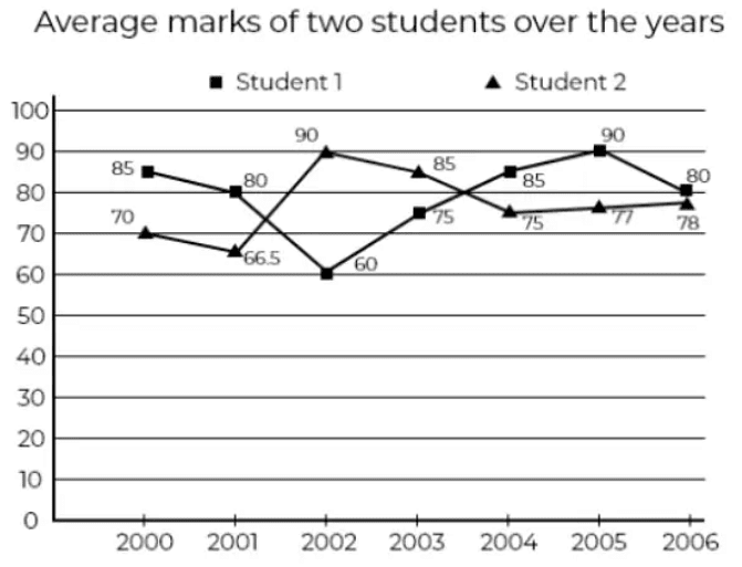
The below data shows: Average marks of the Graph of two students from the year 2001 to 2006.
Note: It displays quantitative values for a specific period of time. It included two axis: X and Y, displaying horizontally and vertically and usually denoted as (x, y).
Solved Examples
Example 1: The below line graph provides the percentage of the students who qualified an examination out of the total number of candidates who appeared for the examination over a period of seven years from 1994 to 2000. Study the graph carefully and answer the questions accordingly. If the total students appeared in 1992 and 1993 were 42000, then find the total number of candidates qualified in these two years.
(a) 19000
(b) 21000
(c) 32154
(d) Data Inadequate
Ans: (d)
The total students qualified in 1992 and 1993 cannot be concluded till we don’t know that how many students appeared in any one of the year or the percentage of qualified candidate together in 1992 and 1993.
Therefore, the data provided is inadequate.
Example 2: The below line graph provides the percentage of the students who qualified an examination out of the total number of candidates who appeared for the examination over a period of seven years from 1994 to 2000. Study the graph carefully and answer the questions accordingly. If the total students qualified in 1989 was 5600, then find out how many students applied for the exam in 1989?(a) 15020
(b) 16000
(c) 17100
(d) Data Inadequate
Ans: (b)
Let us assume the number of candidate applied for the exam in 1989 as x
Given, the number of students qualified = 5600
35% of x = 5600
Therefore, students applied in 1989 = 16000.
Example 3: The below line graph provides the percentage of the students who qualified an examination out of the total number of candidates who appeared for the examination over a period of seven years from 1994 to 2000. Study the graph carefully and answer the questions accordingly. In which year the difference between the numbers of students qualified was maximum?
(a) 1992-1993
(b) 1994-1995
(c) 1989-1990
(d) 1991-1992
Ans: (a)
The difference between 1989 -1990 = 60 – 35 = 25
1990-1991 = 70 – 60 = 10
1991-1992 = 70 – 60 = 10
1992-1993 = 90 – 60 = 30
1993-1994 = 90 – 90 = 0
1994 – 1995 = 90 – 70 = 20
Therefore, the maximum difference was form 1992-1993
Example 4: The line chart below shows the number of smartphones manufactured by company P and Q from the year 2005 to 2009. Study the graph carefully and answer the questions accordingly. The making of smartphones by Company Q in 2008 was about what percent in comparison to the making of smartphones by Company P?
(a) 152%
(b) 155%
(c) 153%
(d) 161%
Ans: (c)
In 2008 the smartphones produced by company P = 88000
In 2008 the smartphones produced by company Q = 135000
Example 5: The line chart below shows the number of smartphones manufactured by company P and Q from the year 2005 to 2009. Study the graph carefully and answer the questions accordingly. Find the approximate average number of smartphones produced by company P?(a) 105900
(b) 127000
(c) 106989
(d) 100000
Ans: (b)
Average number of smartphones produced by company P
Example 6: The line chart below shows the number of smartphones manufactured by company P and Q from the year 2005 to 2009. Study the graph carefully and answer the questions accordingly. Find the difference of between the smartphones produced by two Companies from 2005 to 2009.
(a) 32000
(b) 34000
(c) 31500
(d) 39500
Ans: (a)
Given, the production of smartphones by company P from 2005 to 2009 was: 121000 + 101000 + 145000 + 88000 + 180000 = 635000
The production of smartphones by company Q from 2005 to 2009 was: 141000 + 120000 + 102000 + 135000 + 169000 = 667000
Therefore, the difference = 667000 – 635000 = 32000
Example 7: The line chart below shows the number of smartphones manufactured by company P and Q from the year 2005 to 2009. Study the graph carefully and answer the questions accordingly. Identify the difference between the smartphones produced by Company Q in 2008 and 2009?(a) 31000
(b) 32500
(c) 34000
(d) 36500
Ans: (c)
In 2008 company Q manufactured 13500 smartphones
In 2009 company Q manufactured 16900 smartphones
Therefore, the difference = 169000 – 135000 = 34000 smartphones.
Example 8: The line graph below shows the export of three different companies from the year 2001 to 2007. Study the graph carefully and answer the questions accordingly. Find the difference between 2003 and 2006’s average export of the three Companies.(a) 9/2
(b) 8/3
(c) 10/3
(d) 11/2
Ans: (c)
Average export of company A, B, and C is 2003 = 
Average export of company A, B, and C is 2006 

Example 9: The line graph below shows the export of three different companies from the year 2001 to 2007. Study the graph carefully and answer the questions accordingly. Among the following years given below in which year the difference between the export from company A and company B was the minimum?(a) 2003
(b) 2005
(c) 2006
(d) 2007
Ans: (d)
In 2001: 40 – 20 = 20
In 2002: 80 – 50 = 30
In 2003: 130 – 30 = 100
In 2004: 80 – 60 = 20
In 2005: 110 – 40 = 70
In 2006: 70 – 40 = 30
In 2007: 130 – 110 = 20
On the basis of the option, the difference between the exports was minimum in 2007.
Example 10: The line graph below shows the export of three different companies from the year 2001 to 2007. Study the graph carefully and answer the questions accordingly. Among the following pairs of years find out which year the total exports of all the three companies was equal?(a) 2005 and 2006
(b) 2006 and 2007
(c) 2001 and 2002
(d) 2004 and 2007
Ans: (a)
In 2001 = 20 + 40 + 70 = 130
In 2002 = 50 + 30 + 80 = 160
In 2003 = 30 + 130 + 50 = 210
In 2004 = 60 + 80 + 50 = 190
In 2005 = 110 + 40 + 70 = 220
In 2006 = 40 + 70 + 110 = 220
In 2007 = 130 + 110 + 150 = 390
Therefore, in the years 2005 and 2006 the export from all the three companies was same.
|
314 videos|170 docs|185 tests
|
FAQs on Solved Examples: Line Charts - Quantitative Aptitude for SSC CGL
| 1. What is a line chart? |  |
| 2. How is a line chart different from other types of charts? |  |
| 3. How can I interpret a line chart? |  |
| 4. What are some common uses of line charts? |  |
| 5. How can I create a line chart in Excel? |  |
|
314 videos|170 docs|185 tests
|

|
Explore Courses for SSC CGL exam
|

|


