Tips and Tricks: Radar Charts | Quantitative Aptitude for SSC CGL PDF Download
Definition
Radar charts, also referred to as spider charts, polar charts, web charts, or star plots, serve as a visual tool for representing multivariate data. This graphical approach displays three or more quantitative variables on a two-dimensional chart, with each variable assigned an axis originating from a common point. The axes are positioned radially around a central point, evenly spaced to visually represent the different variables.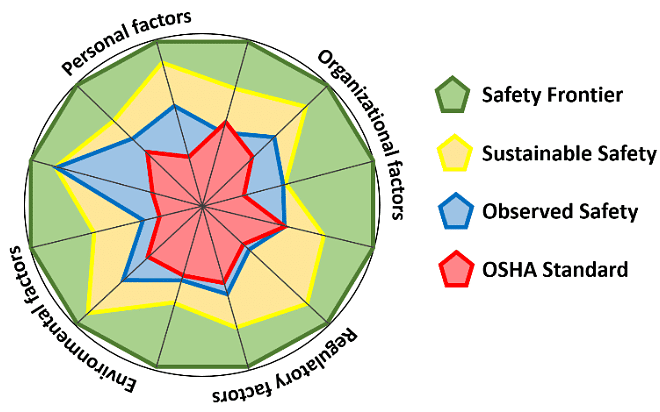
Tips, Tricks and Shortcuts to solve Radar Chart
- Avoid including more than 15 variables in a single chart to prevent overcrowding and maintain clarity in the diagram.
- Ensure that all axes are evenly distributed around the central point unless specified otherwise.
- When creating a comparative chart, opt for simplicity rather than complexity to enhance comprehension.
- Establish a common and practical scale for measuring all variables in the chart.
- Utilize distinct color codes to differentiate entities that share the same scale within the chart.
Important Notes on Rader Chart
- In Radar chart, every value is represented with respect to a central point.
- All the changes in the values are expressed in the form of distance from the central point.
- Radar chart is not used for identifying the accuracy in data, but rather generalized relationships between data.
Elements of Radar Chart
- Central Point: The central point serves as the hub of the radar chart, from which axes extend for various subjects.
- Axes: Axes emanate from the central point and provide a framework for representing different subjects in the radar chart.
- Values: Each axis on the radar chart displays values, distinguished by different colors.
- Grids: A web-like structure forms when values for a specific case are interconnected across all axes, aiding in the visualization and representation of information.
Important points for Radar Charts
- Axes: In a radar chart, there are radiating axes or spokes extending outward from a central point, with each axis corresponding to a distinct variable or category. The number of axes is determined by the quantity of variables under comparison. For instance, if there are five attributes being compared, there will be five evenly spaced axes around the central point.
- Data Points: Data points are plotted along each axis, showcasing the values of variables for a specific data point. These points are connected by lines, forming a closed shape resembling a polygon or web. The resulting shape visually represents how the data point performs across various variables.
- Data Interpretation: Radar charts offer a visual method for evaluating the comparison of a data point's values across different variables. This visual representation allows users to swiftly discern strengths and weaknesses in the performance or attributes of the entities being scrutinized. The enclosed area formed by connecting the data points can also be utilized for comparisons, with a larger area typically indicating superior overall performance.
Examples
Example 1: The given Radar chart shows the sale of mobile phones and tabs of a company from 2011-2016(in thousand).
Assumption: Total sale of mobile phones and tabs are given in terms of thousand.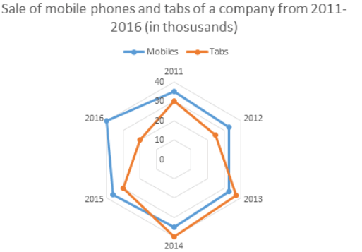
What is the proportion of total number of tabs sold to the total number of mobile phones sold in all the years?
(a) 45 : 118
(b) 108 : 166
(c) 91 : 106
(d) 60 : 159
Ans: (c)
Total number of tabs sold from 2011 to 2016 = 30 + 25 + 37 + 40 + 30 + 20 = 182
Total number of mobile phones sold from 2011 to 2016 = 35 + 33 + 33 + 35 + 36 + 40 = 212
Therefore, ratio = 182/212 = 91 : 106
Example 2: The given Radar chart shows the sale of mobile phones and tabs of a company from 2011-2016(in thousand).
Assumption: Total sale of mobile phones and tabs are given in terms of thousand.
In which year there was maximum percentage upsurge in the sales for tabs?
(a) 2013
(b) 2014
(c) 2015
(d) 2016
Ans: (a)
For tabs the sale in 2011 was 30 and in 2012 was 25. Therefore, the sale decreased. In 2012 was 25 and 2013 was also 37. Therefore, there was increase by 12 thousand. Percent increase = 12/25 * 100 = 14%. In 2013 was 37 and 2014 was 40. Therefore, there was an increase by 3 thousand. Percent increase = 3/37 * 100 = 8.10%. In 2014 was 40 and 2015 was 30. So, the sale decreased. In 2015 was 30 and 2016 was 20. Therefore, the sale decreased.
Thus, highest increase in the sale was in year 2013.
Example 3: The given Radar chart shows the Number of students(in thousand) in college A and B from year 2002 – 2007.
Assumption: Total number of students in each college is given in terms of thousand.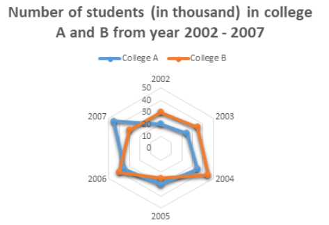
Which year has the highest number of difference between the number of students in college A and college B?
(a) 2002
(b) 2004
(c) 2006
(d) 2007
Ans: (d)
In 2002 the difference was: 30 – 20 = 10
In 2003: 35 – 25 = 10
In 2004: 45 – 35 = 10
In 2005: 30 – 25 = 5
In 2006: 40 – 35 = 5
In 2007: 45 – 30 = 15
Therefore, the difference was highest in the year 2007.
Example 4: The given Radar chart shows the Number of students(in thousand) in college A and B from year 2002 – 2007.
Assumption: Total number of students in each college is given in terms of thousand. Find the sum of the students in college A in 2002 and college B in 2006?
(a) 25000
(b) 50000
(c) 60000
(d) 63000
Ans: (c)
Students in college A in 2002 = 20000
Students in college B in 2006 = 40000
Therefore, sum = 20000 + 40000 = 60000 students.
Example 5: The given Radar chart shows the Number of students(in thousand) in college A and B from year 2002 – 2007.
Assumption: Total number of students in each college is given in terms of thousand.
Find the percent increase in college A’s students in the year 2006 as compared to the previous year.
(a) 16.66%
(b) 17%
(c) 21%
(d) 25%
Ans: (a)
In the year 2005, the students in college A were: 30
In the year 2006, the students in college A were: 35
Therefore increase = 35 – 30 = 5
Thus, percent increase = 5/30 * 100 = 16.66%
|
342 videos|310 docs|185 tests
|
FAQs on Tips and Tricks: Radar Charts - Quantitative Aptitude for SSC CGL
| 1. What is a radar chart? |  |
| 2. How can radar charts be used to solve problems? |  |
| 3. What are some tips for effectively using radar charts? |  |
| 4. Are there any shortcuts or tricks to create radar charts quickly? |  |
| 5. Can radar charts be used for any type of data analysis? |  |


