Year 4 Exam > Year 4 Notes > Mathematics > Introducing line graphs
Introducing line graphs

Line Graphs
- Line graphs visually represent data trends over time.
- They are useful for showing how one variable changes in relation to another.
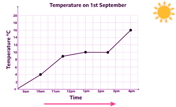
Horizontal Axis
- Definition: The horizontal axis, located at the bottom, progresses from left to right.
- Example: In the provided graph, the horizontal axis is labeled as "Time," indicating that time increases as we move along the line.
- Illustration: An arrow on the graph signifies the time's progression along the horizontal axis.
Vertical Axis
- Information Provided: The vertical axis indicates the temperature in degrees Celsius.
- Starting Point: It commences at 0°C.
- Increment: The scale progresses in increments of 2°C (e.g., 2, 4, 6...).
- Clarification: Although the labels increase by 2s, temperatures like 7°C or 9°C can still be measured on the graph, even if not explicitly labeled.
Examples
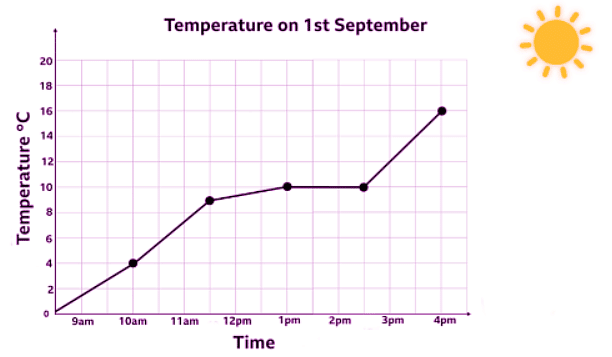
Example 1: Take a look at the graph again.
When was it 10°C?
Sol:
It was 10°C at 1pm.
Did you notice another time of the day when the temperature was 10°C?
Keep travelling across the line once you've reached 1pm and you will see that it was also 10°C at 2.30pm.
This means there are two times when the temperature was 10°C.
Example 2: When was the temperature 16°C?
This time we know the temperature but not the time.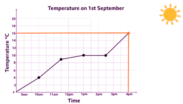
- First we slide up the vertical axis to 16°C and travel across to meet the line.
- Then we travel straight down to reach the horizontal axis which reads 4pm.
It was 16°C at 4pm.
The document Introducing line graphs is a part of the Year 4 Course Year 4 Mathematics.
All you need of Year 4 at this link: Year 4
FAQs on Introducing line graphs
| 1. What is a line graph? |  |
Ans. A line graph is a type of chart used to display data points over a continuous interval or time period. It is composed of a series of data points connected by straight line segments.
| 2. How are line graphs useful in data representation? | |
Ans. Line graphs are useful for showing trends and changes over time. They can help visualize patterns, comparisons, and relationships between different data points.
| 3. What are the key components of a line graph? | |
Ans. The key components of a line graph include the x-axis (horizontal axis), y-axis (vertical axis), data points, and lines connecting the data points.
| 4. How do you interpret a line graph? | |
Ans. To interpret a line graph, look at the trend of the line (whether it is increasing, decreasing, or staying constant), the steepness of the line (indicating the rate of change), and any significant fluctuations or patterns.
| 5. How can line graphs be used in educational settings? | |
Ans. In educational settings, line graphs can be used to analyze student performance over time, track progress, compare data from different sources, and illustrate concepts in subjects such as math, science, and social studies.
About this Document

4.88/5 Rating

Apr 20, 2026 Last updated
Related Exams
Document Description: Introducing line graphs for Year 4 2026 is part of Year 4 Mathematics preparation. The notes and questions for Introducing line graphs have been prepared according to the Year 4 exam syllabus. Information about Introducing line graphs covers topics like and Introducing line graphs Example, for Year 4 2026 Exam. Find important definitions, questions, notes, meanings, examples, exercises and tests below for Introducing line graphs.
Introduction of Introducing line graphs in English is available as part of our Year 4 Mathematics for Year 4 & Introducing line graphs in Hindi for Year 4 Mathematics course. Download more important topics related with notes, lectures and mock test series for Year 4 Exam by signing up for free. Year 4: Introducing line graphs
Description
Introducing line graphs of Year 4 Mathematics covers all the important topics, helping you prepare for the Year 4 exam on EduRev. Start for free!
Information about Introducing line graphs
In this doc you can find the meaning of Introducing line graphs defined & explained in the simplest way possible. Besides explaining types of Introducing line graphs theory, EduRev gives you an ample number of questions to practice Introducing line graphs tests, examples and also practice Year 4 tests


Related Searches
past year papers, Introducing line graphs, study material, Exam, Important questions, mock tests for examination, Summary, practice quizzes, MCQs, shortcuts and tricks, Objective type Questions, video lectures, Semester Notes, Previous Year Questions with Solutions, ppt, Viva Questions, pdf , Sample Paper, Extra Questions, Free, Introducing line graphs, Introducing line graphs;