Worksheet Solutions: Data Handling and Presentation - 1

Multiple Choice Questions (MCQs)
Q1: Why do we collect data?
(a) For fun only
(b) To record facts and numbers
(c) Cooking
(d) None of the above
Ans: (b) To record facts and numbers
Q2: Which of these shows information using pictures?
(a) Pictograph
(b) List
(c) Paragraph
(d) All of the above
Ans: (a) Pictograph
Q3: What does a bar graph represent?
(a) Numbers and values
(b) Stories
(c) Long answers
(d) None of the above
Ans: (a) Numerical values
Q4: In a pictograph, each picture can represent:
(a) One item only
(b) Multiple items
(c) Only data points
(d) None of the above
Ans: (b) Multiple items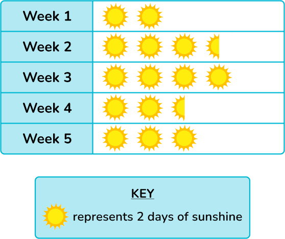
Q5: Why are infographics used?
(a) To make people confused
(b) To show information in an easy and interesting way
(c) To give very long explanations
(d) None of the above
Ans: (b) To show information in an easy and interesting way
Fill in the Blanks
Q1: Navya collected data on her classmates' favorite fruits. She found that 8 students liked apples, 12 liked bananas, and 5 liked oranges. The total number of students she surveyed is _______.
Ans: 25
Solution: The total number is found by adding the number of students who liked each fruit: 8 + 12 + 5 = 25.
Q2: A pictograph uses 1 symbol to represent 5 students. If 4 symbols are used to show the number of students who like chocolate, then _______ students like chocolate.
Ans: 20
Solution: Multiply the number of symbols (4) by the number each symbol represents (5): 4 × 5 = 20.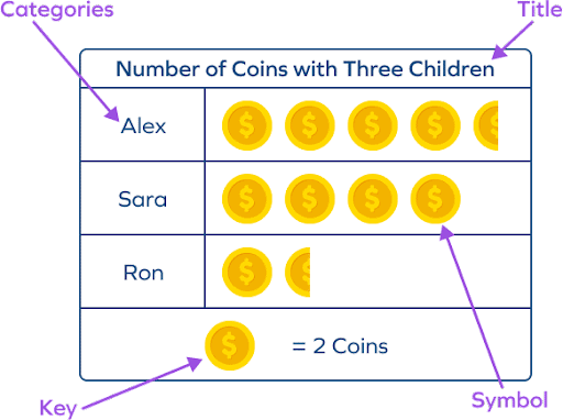
Q3: In a bar graph, the bar representing the number of students absent in Class 5 is twice the height of the bar for Class 3. If Class 3 had 4 students absent, then Class 5 had _______ students absent.
Ans: 8
Solution: Since the bar for Class 5 is twice as high, multiply the number of absent students in Class 3 by 2: 4 × 2 = 8.
Q4: If each tally mark represents 1 vote and 15 tally marks are recorded for a favorite game survey, then the total number of votes is _______.
Ans: 15
Solution: Each tally mark equals one vote, so the total number of votes equals the number of tally marks.
Q5: The number of symbols in a pictograph must be multiplied by _______ to find the total if each symbol represents more than one unit.
Ans: the scale
Solution: Multiply the number of symbols by the scale to find the total number of units represented.
True or False
Q1: A bar graph can only have vertical bars.
Ans: False
Solution: Bar graphs can have either vertical or horizontal bars, depending on what is being represented.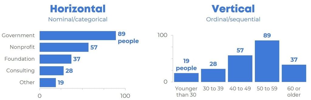
Q2: In a pictograph, one symbol can represent multiple units.
Ans: True
Solution: A scale in a pictograph allows one symbol to represent multiple units, making it easier to manage larger data.
Q3: The height of a bar in a bar graph does not need to correspond to the frequency it represents.
Ans: False
Solution: The height of a bar in a bar graph must correspond to the frequency to accurately represent the data.
Q4: A pictograph is useful for representing large amounts of data.
Ans: False
Solution: While pictographs are visually appealing, they are not always practical for representing large datasets.
Q5: The scale in a pictograph does not need to be mentioned.
Ans: False
Solution: The scale must be mentioned in a pictograph to clearly show what each symbol represents.
Solve the following
Q1: Study the following tally marks frequency table and answer the questions given below: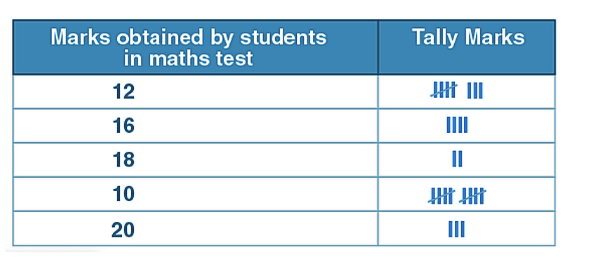
(i) How many students score 10 marks?
(ii) How many students scored above 10?
(iii) How many total students appeared on the test?
Solution:
(i) Number of students scored 10 marks = 10
(ii) Number of students scored above 10 marks = 17
(iii) Total number of students who appeared for the test = 27
Q2: Following are the scores of students of class 3 in a maths test:
12, 12, 14, 15, 16, 18, 13, 15, 16, 17, 18, 13, 16, 20, 20, 19, 17, 15, 12, 15, 16, 17, 18, 18, 19, 20, 16. 19.
Make a tally marks table.
Solution: 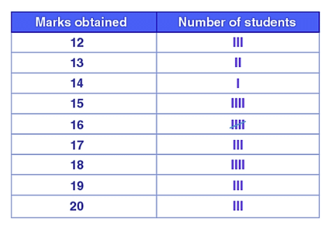
Q3: Tim recorded the number of donuts sold over five days.
Read the chart and answer the questions.
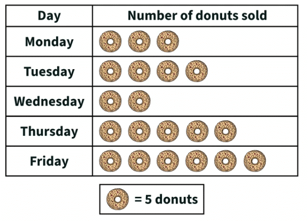
- How many donuts did he sell on Thursday?
- Which day did he sell the least donuts?
- Which day did he sell the most donuts?
- Which day did he sell 20 donuts?
Solution:
- Donuts sold on Thursday = 5 x 5 = 25 donuts
- least donuts were sold on Wednesday
- most donuts were sold on Friday
- Tuesday
FAQs on Worksheet Solutions: Data Handling and Presentation - 1
| 1. How do I organize raw data into a frequency table for Class 6 CBSE? |  |
| 2. What's the difference between a bar graph and a pictograph when presenting data? | |
| 3. Why do we need to represent data in different ways instead of just using tables? | |
| 4. How do I read and interpret information from a pie chart or circle graph correctly? | |
| 5. What common mistakes do students make when creating bar graphs and how do I avoid them? | |