CBSE Class 5  >  Class 5 Notes  >  Mathematics  >  Important Formulas: Data Through Pictures

Important Formulas: Data Through Pictures

Introduction

  • Data handling = collecting, organizing, and showing information.

  • We use tables, pictographs, and bar graphs to make data clear.

  • Graphs help us:

    • Compare data visually

    • Spot patterns quickly

    • Understand real-life situations (time use, food wastage, vehicles, etc.)

Collecting Data

  • Collecting data = gathering information about people, things, or activities.Collecting Data

  • Example: asking friends "How many hours do you watch TV?"

  • Data is recorded in a table with rows and columns for easy reading.

Reading and Understanding Tables

  • A table organizes numbers neatly.

  • Rows and columns show different details.

  • We can count, add, or compare quickly.
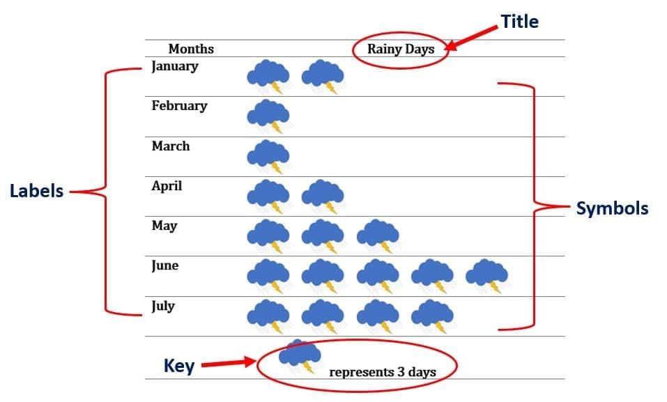
Pictographs

  • Definition: Showing data using pictures or symbols.

  • Each picture = some number of items.

  • Example: 1 book picture = 5 books.

Key Parts of a Pictograph

  • Title: tells the topic.

  • Labels: what is being counted.

  • Symbols/Pictures: the icons used.

  • Scale: value of each picture.

  • Key: small note explaining the scale.Key Parts of a Pictograph

Scales

  • Small data → scale 1 picture = 1 item.

  • Large data → scale 1 picture = 5, 10, or 20 items.

  • Choosing the right scale makes graphs neat.

Why Pictographs Are Useful

  • Easy to understand.

  • Quick to compare groups.

  • Fun and interesting.

  • Used in real life to share info clearly.
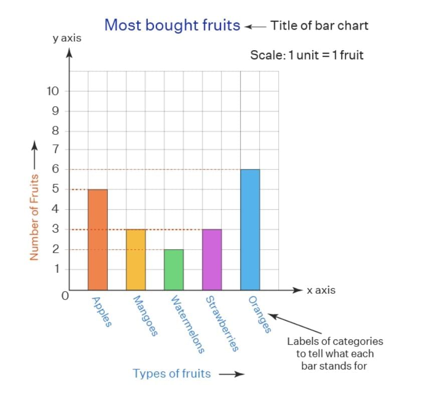
Bar Graphs

  • Definition: Graph using bars (rectangles) to show numbers.

  • Bar height/length = value.

  • Taller bar = bigger number.

Features of a Bar Graph

  • Title: topic of the graph.

  • Bars: rectangles for values.

  • Labels: X-axis (categories), Y-axis (numbers).

  • Scale: shows value of each step.

  • Equal spacing/width of bars.
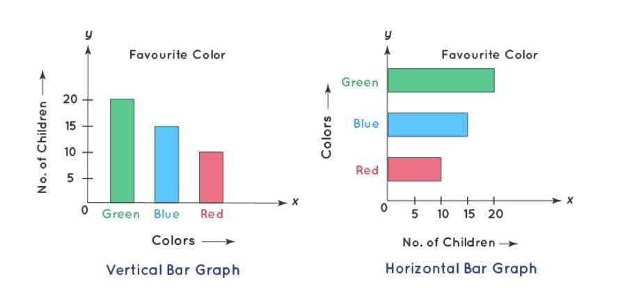
Features of a Bar Graph

Types

  • Vertical Bar Graph - bars go up (most common).

  • Horizontal Bar Graph - bars go sideways.Types

Why Useful?

  • Easy comparison.

  • Shows highest/lowest quickly.

  • Shows patterns (increase/decrease).

Pictograph vs Bar Graph

  • Pictograph: fun, pictures, less exact.

  • Bar Graph: neat, bars, exact numbers.Pictograph vs Bar Graph

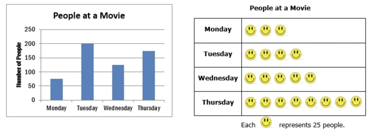
  • Both are useful depending on situation.

Conclusion

  • Data can be shown in tables, pictographs, or bar graphs.

  • Pictographs → simple, visual, quick comparison.

  • Bar graphs → exact, neat, easy to compare values.

  • Scales make graphs clearer.

  • Graphs help us solve real-life problems (time, traffic, wastage).

The document Important Formulas: Data Through Pictures is a part of the Class 5 Course Mathematics for Class 5.
All you need of Class 5 at this link: Class 5

FAQs on Important Formulas: Data Through Pictures

1. What is the importance of collecting data in studies and research?
Ans. Collecting data is crucial as it provides the foundation for analysis and decision-making. It allows researchers to identify patterns, test hypotheses, and draw conclusions. Accurate data collection ensures that the findings are reliable and can be used to support or refute theories.
2. How can I effectively read and understand tables in data representation?
Ans. To effectively read and understand tables, start by identifying the rows and columns, which represent different categories and data points. Look for headings that clarify what each row and column signifies. Pay attention to units of measurement and any footnotes that may provide additional context. Analyzing the data systematically will help reveal trends and comparisons.
3. What are the key differences between pictographs and bar graphs?
Ans. Pictographs use images or symbols to represent data, making them visually engaging and easy to understand, especially for younger audiences. Each image usually represents a specific quantity. Bar graphs, on the other hand, use rectangular bars to show the value of different categories, making it easier to compare quantities directly. Bar graphs often allow for more precise representation of data.
4. Why is it important to compare pictographs and bar graphs when presenting data?
Ans. Comparing pictographs and bar graphs is important because each method has its strengths. Pictographs can simplify data visualization for younger audiences, while bar graphs provide clarity and precision. Understanding both allows for selecting the most effective method to communicate specific types of data, ensuring that the audience grasps the information being presented.
5. What are some common mistakes to avoid when creating visual data representations?
Ans. Common mistakes to avoid include using inconsistent scales, which can misrepresent data, and overcrowding the visual with too much information, making it difficult to read. Additionally, failing to label axes or provide a clear legend can confuse the audience. It’s also important to choose the right type of graph that aligns with the data being represented to enhance understanding.
Explore Courses for Class 5 exam
Get EduRev Notes directly in your Google search
Related Searches
past year papers, MCQs, Previous Year Questions with Solutions, Free, Summary, mock tests for examination, Important Formulas: Data Through Pictures, Viva Questions, pdf , Exam, Important Formulas: Data Through Pictures, Extra Questions, Important Formulas: Data Through Pictures, shortcuts and tricks, practice quizzes, study material, Sample Paper, Important questions, Semester Notes, ppt, video lectures, Objective type Questions;