Tables: Introduction & Solved Examples

What is a Table?
A Table is a set of data arranged in rows and columns and is one of the most common ways of putting information across to people.
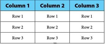
A Table consists of several boxes with information inside.
- The first row and the first column are generally used to denote the titles.
- While any type of data can be presented in table form, that too in a very accurate manner, interpreting the data in table form is more difficult and time-consuming than the other modes, all of which are basically pictorial or graphical in presentation.
- Tables give values that are organized but not represented visually.
- You may graph the data from the table to compare and see trends. You may create a table from a graph to make calculations easier.
Tips on Solving Table Chart Problems
- Read the data very carefully- The smallest detail may change the question's meaning completely. Similarly, the instructions must be understood carefully to prevent wasting time in calculating data that is not required, and also to find out exactly what the answer is that is sought.
- Understand the data- Before jumping to answer the questions, understand the data properly. The questions are designed to be deceptive, and a proper understanding of the requirements is a must. If the data provided is of the combined variety or if there is more than one data table/chart/graph, try to understand the relation between the given tables.
Example: One table may talk about absolute sales figures, while the other table may talk of sales as a percentage of production. Hence, any question on excess production or Goods in stock will require data from both tables. - Be very careful of the units used: In the tables and the units in which the answers (options) are provided. A mistake in the units may yield an entirely different answer. Also, be careful of whether the answer is required in decimal or percentage. Such errors are common and easily avoidable.

Let's look at some Examples
Example 1: Questions 1-4 are based on the table below, which is a record of the performance of a baseball team for the first seven weeks of the season.
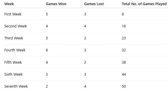 Q.1.1: How many games did the team win during the first seven weeks?
(A) 2
(B) 21
(C) 29
(D) 50
(E) 58
Answer: C
Solution: To find the total number of games won, add the number of games won for all the weeks.
5 + 4 + 5 + 6 + 4 + 3 + 2 = 29
The correct answer is choice (C).
Q.1.2: What percent of the games did the team win?
(A) 21%
(B) 29%
(C) 42%
(D) 58%
(E) 72%
Answer: D
Solution:
Across all seven weeks the team played 50 games (sum of totals) and won 29 of them.
To find the win percentage:
Win percentage =Win percentage =
= 58%
Q.1.3: Which week was the worst for the team?
(A) Second week
(B) Fourth week
(C) Fifth week
(D) Sixth week
(E) Seventh week
Answer: E
Solution:
Let's look at each week's winning ratio in words:
In the first week, the team won 5 out of 8 games (about 62.5%).
In the second week, 4 of 16 games (25%).
In the third week, 5 of 23 games (about 21.7%).
In the fourth week, 6 of 32 games (about 18.8%).
In the fifth week, 4 of 38 games (about 10.5%).
In the sixth week, 3 of 44 games (about 6.8%).
In the seventh week, 2 of 50 games (4%).
Since 4% is the lowest win rate, the seventh week was the worst for the team.
Answer: (E) Seventh week
Q.1.4: Which week was the best week for the team?
(A) first week
(B) third week
(C) fourth week
(D) fifth week
(E) sixth week
Answer: B
Solution:
Compare the numbers in the win-loss columns. Since there is more than 1 week with more wins than losses, you need to do a quick calculation.
Method 1
Compare the values of the ratio wins/losses. The greatest value will be the best week.
53 ≈ 1.67
52 = 2.5
63 = 2
42 = 2
The value for the third week is 2.5.
The correct answer is choice (B).
Method 2
Find the percentage of games won using the number of wins and the number of games each week.
58 = 62.5%
57 ≈ 70%
69 ≈ 67%
46 ≈ 67%
The team won 70% of its games in the third week.
The correct answer is choice (B).
Example 2: Here is an example consisting of tabular data:
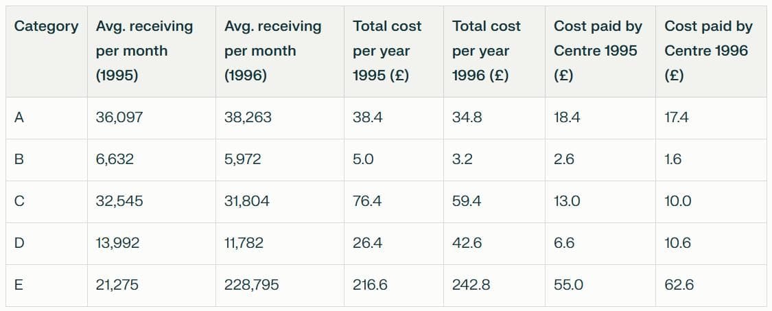
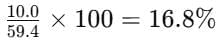
Q. 2.1 The category receiving the least percentage help from the centre (in the entire data) is:
(A) Category B in 1995
(B) Category C in 1996
(C) Category B in 1996
(D) Category D in 1995
Answer: B
Solution:(A) Category B in 1995 =
(Even without calculation, you can eliminate this choice.)
(B) Category C in 1996 =
(C) Category B in 1996 =(Even without calculation, you can eliminate this choice.)
(D) Category D in 1995 =Conclusion: From this, we arrive at the answer (B) since this is the least percentage.
Percentage = (10.0 / 59.4) × 100 ≈ 16.8%
This 16.8% is the lowest among the options listed.
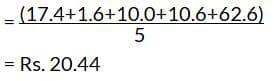
Q. 2.2 The difference between the average costs paid by the Centre during 1995 and 1996 is:
(A) £6,600
(B) £132
(C) £1,320
(D) £13.2
Answer: C
Solution:
Sum for 1995: 18.4 + 2.6 + 13.0 + 6.6 + 55.0 = 95.6Average for 1995
= £19.12
Sum for 1996: 17.4 + 1.6 + 10.0 + 10.6 + 62.6 = 102.2
Average for 1996
Difference: £20.44 - £19.12 = £1.32 → expressed in pounds as £1.32,
which corresponds to £1,320 when the unit is interpreted as "per 1,000" in the answer choices.
Q. 2.3 The monthly cost to the city receiving E category assistance in 1996 is most nearly:
(A) £1.8 less than in 1995
(B) £2.1 more than in 1995
(C) £2.1 less than in 1995
(D) £1.8 more than in 1995
Answer: B
Solution:
Here, straight calculation is only needed. We need to look at the total assistance figures.
In 1995: 216.612 = £18.05
In 1996: 242.812= £20.23Difference: £20.23 - £18.05 ≈ £2.18 ≈ £2.1 (nearest option)
Q. 2.4 Monthly costs to the city of category D during 1995 and 1996 bear a ratio (most nearly):
(A) 2 : 3
(B) 5 : 3
(C) 3 : 2
(D) 3 : 5
Answer: D
Solution:
From the table: 1995 = £26.4, 1996 = £42.6
Ratio: 26.4 : 42.6
Divide both terms by 8.8 ≈ (26.4 / 8.8) : (42.6 / 8.8) ≈ 3 : 4.84 ≈ 3 : 5 (nearest option)
Example 3: Directions: Study the table carefully to answer the following questions.
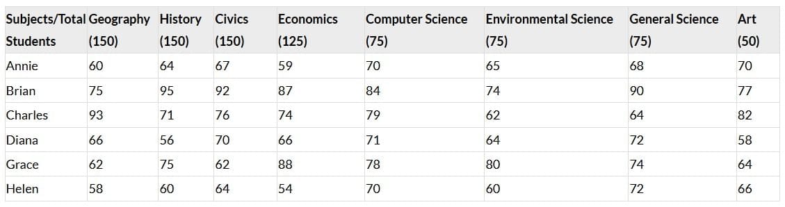
Q. 3.1: How many marks did Helen get in all subjects together?
(A) 505
(B) 496
(C) 525
(D) 601
(E) None of these
Answer: C
Solution:
Required Number :
= 87 + 90 + 96 + 67.5 + 52.5 + 45 + 54 + 33 = 525

Q. 3.2: What are the average marks obtained by all students together in Computer Science?
(A) 75.33
(B) 56.5
(C) 64.25
(D) 48.88
(E) None of these
Answer: B
Solution:
Total marks in Computer Science = (70 + 84 + 79 + 71 + 78 + 70) = 452
Average marks =
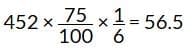
Q. 3.3: How many students have scored the highest marks in more than one subject?
(A) Three
(B) Two
(C) One
(D) None
(E) None of these
Answer: A
Solution:
Brian, Charles, and Grace scored the highest in more than one subject.
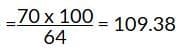
Q. 3.4: Marks obtained by Annie in Art is what percent of marks obtained by Grace in the same subject? (Rounded to two decimal places)
(A) 91.43
(B) 94.29
(C) 103.13
(D) 109.38
(E) None of these
Answer: (D)
Solution:Required Percentage:
Q. 3.5: Who has scored the highest marks in all the subjects together?
(A) Charles
(B) Helen
(C) Diana
(D) Grace
(E) None of those
Answer: E
Solution:
Total marks:
Annie = 90 + 96 + 100.5 + 73.75 + 52.5 + 48.75 + 51 + 35 = 547.5
Brian = 112.5 + 142.5 + 138 + 108.75 + 63 + 55.5 + 67.5 + 38.5 = 726.25
Charles = 139.5 + 106.5 + 114 + 92.5 + 59.25 + 46.5 + 48 + 41 = 647.25
Diana = 99 + 84 + 105 + 82.5 + 53.25 + 48 + 54 + 29 = 554.75
Grace = 93 + 112.5 + 93 + 110 + 58.5 + 60 + 55.5 + 32 = 614.5
Helen = 87 + 90 + 96 + 67.5 + 52.5 + 45 + 54 + 33 = 525
Example 4: Directions: Answer the questions based on the information given below.
The given table shows the data regarding the number of air conditioners and air coolers sold by a shop in 5 different months and also percentage of those installed.

If total number of air conditioners installed in all the months together is 1540 units, then find out the number of air coolers installed in the month of June.
(A) 120
(B) 170
(C) 140
(D) 210
(E) 150
Answer: E
Solution:
In March, Number of air conditioners installed = 2x × 0.8 = 1.6x
Number of air coolers installed = (3x + 90) × 13 = x + 30
Similarly, we can find out the number of air conditioners and air coolers installed in the given 5 months.
Total number of air conditioners installed in all the months together
= (1.6x) + (2x + 400) + (x + 300) + 2x + (0.9x + 90)
= 7.5x + 790
According to the question,
7.5x + 790 = 1540
Or, 7.5x = 750
Or, x = 100
Number of air coolers installed in the month of June = 1.5 x 100 = 150
Hence, option E.

Example 5: Directions: Answer the questions based on the information given below.
The given table shows the data regarding the number of air conditioners and air coolers sold by a shop in 5 different months and also percentage of those installed
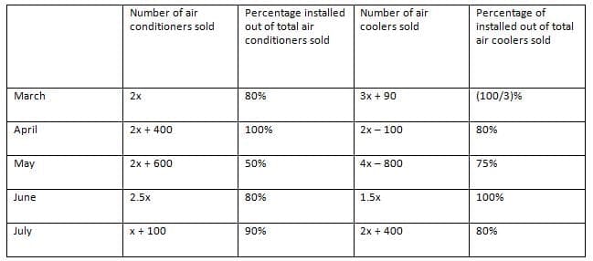
Find the difference between number of air conditioners installed in April and June together and the number of air coolers installed in March and May together.
(A)Can't be determined
(B) 970
(C) 870
(D) 210
(E) 530
Answer: B
Solution:
In March, Number of air conditioners installed = 2x × 0.8 = 1.6x
Number of air coolers installed = (3x + 90) × 13 = x + 30
Similarly, we can find out the number of air conditioners and air coolers installed in the given 5 months.
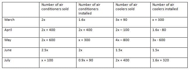
Number of air conditioners installed in April and June together = (2x + 400) + 2x = 4x + 400
Number of air coolers installed in March and May together = (x + 30) + (3x - 600) = 4x - 570
Required difference = (4x + 400) - (4x - 570) = 970
Hence, option B.
FAQs on Tables: Introduction & Solved Examples
| 1. What is a table in the context of data representation? |  |
| 2. How can I effectively interpret data from a table chart? | |
| 3. What are some common types of tables used in exams like UCAT? | |
| 4. What tips can help in solving table chart problems in exams? | |
| 5. How do tables differ from other data presentation formats like graphs or charts? | |