Careers in UI/UX Design


Design Fundamentals
Design is everywhere around us-from the websites we browse to the chairs we sit on, from the books we read to the apps on our phones. But what makes something well-designed? Why do some things feel intuitive and pleasant to use while others frustrate us? This document will introduce you to the fundamental principles and elements that form the foundation of all good design.
Whether you're designing a poster, a website, a product, or a space, understanding these fundamentals will help you create work that not only looks good but also communicates effectively and serves its intended purpose.
What Is Design?
Design is the intentional process of creating something that solves a problem or fulfills a need. It's not just about making things look pretty-though aesthetics can be important. Design is about function, communication, and experience.
Think of a door handle. A well-designed handle tells you immediately how to use it. If it's a flat plate, you push. If it's a curved handle, you pull. This is design communicating function through form. When design fails, we get "push" and "pull" signs on doors-a patch for poor design.
Good design is often invisible. When something works perfectly, we don't notice the design-we just use it. Bad design, on the other hand, makes us pause, confused or frustrated.
The Purpose of Design
Every design serves at least one purpose:
- Communication: Conveying a message, idea, or information clearly
- Functionality: Enabling someone to complete a task or action
- Aesthetics: Creating visual appeal or emotional response
- Experience: Shaping how someone interacts with and feels about something
Most successful designs balance all four purposes, though the emphasis varies depending on context. A fire alarm prioritizes function and communication over aesthetics. An art museum poster might emphasize aesthetics while still communicating event details.
Elements of Design
The elements of design are the basic building blocks-the raw ingredients you work with when creating anything visual. Just as a chef works with ingredients like salt, flour, and butter, designers work with line, shape, color, texture, space, form, and typography.
Line
A line is a mark connecting two points. It's the most basic element of design, yet incredibly powerful. Lines can:
- Define shapes and edges
- Create patterns and textures
- Direct the viewer's eye through a composition
- Convey emotion and energy
Different types of lines communicate different feelings:
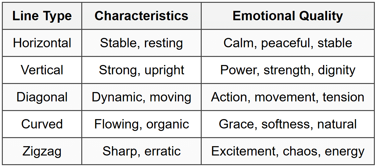
Lines also have weight (thin or thick) and quality (solid, dashed, rough, smooth), each adding different character to a design.
Shape
A shape is a defined area, typically enclosed by a line or distinguished by color or texture. Shapes are two-dimensional-they have width and height but no depth.
Shapes fall into three categories:
- Geometric shapes: Precise, mathematical forms like circles, squares, triangles, and rectangles. These feel structured, orderly, and intentional.
- Organic shapes: Irregular, natural forms like leaves, clouds, or puddles. These feel spontaneous, relaxed, and natural.
- Abstract shapes: Simplified or stylized versions of recognizable objects. Icons and logos often use abstract shapes.
Shapes carry symbolic meaning across cultures. Circles suggest unity, completeness, and infinity. Squares feel stable and trustworthy. Triangles point and direct attention, suggesting movement or hierarchy.
Form
Form is the three-dimensional version of shape. Forms have width, height, and depth. In two-dimensional design (like posters or websites), we create the illusion of form using techniques like shading, perspective, and overlapping.
Understanding form is crucial when designing:
- Product packaging
- Architecture and interior spaces
- Sculpture and 3D objects
- User interface elements that appear three-dimensional
Space
Space refers to the area around, between, and within design elements. There are two types:
- Positive space: The space occupied by the main subjects or elements
- Negative space (or white space): The empty space around and between elements
Negative space is not wasted space-it's an active design element. Think of it as the pauses in music or the silence in conversation. It gives elements room to breathe, helps create focus, and can even form hidden images (like the arrow in the FedEx logo).
Common mistakes beginners make:
- Filling every inch of space, creating cluttered designs
- Not leaving enough margin or padding
- Ignoring how negative space shapes positive space
Color
Color is perhaps the most emotionally powerful design element. It attracts attention, conveys mood, communicates meaning, and creates harmony or contrast.
Understanding Color Properties
Every color has three properties:
- Hue: The color itself (red, blue, yellow, etc.)
- Value: How light or dark the color is
- Saturation: How intense or muted the color is (also called chroma)
A bright red has high saturation. A dusty rose has low saturation. Navy blue has low value (dark), while sky blue has high value (light).
Color Temperature
Colors are classified as warm or cool:
- Warm colors: Reds, oranges, yellows-energetic, exciting, advancing (seem to come forward)
- Cool colors: Blues, greens, purples-calming, receding (seem to move back)
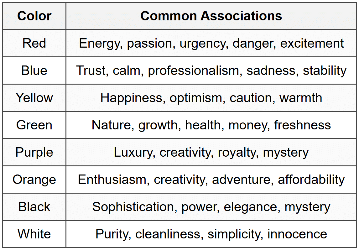
Color Psychology
Different colors evoke different emotions and associations, though these can vary by culture:
Texture
Texture refers to the surface quality of an object-how it feels or appears it would feel. In physical design, texture is literal (rough wood, smooth glass). In visual design, texture is implied through visual patterns and techniques.
Texture adds:
- Visual interest and depth
- Tactile quality (even if just visual)
- Contrast and variety
- Realism or stylistic character
A website might use subtle grain or noise to add warmth. A poster might incorporate rough, hand-drawn elements for an organic feel. Even a glossy, smooth finish is a texture choice.
Typography
Typography is the art and technique of arranging type. Since most design involves text, typography is crucial. Fonts and how you use them communicate just as much as the words themselves.
Type Classifications
- Serif: Fonts with small decorative strokes (serifs) at letter endings. Traditional, trustworthy, formal. Examples: Times New Roman, Garamond.
- Sans-serif: Fonts without serifs. Modern, clean, straightforward. Examples: Helvetica, Arial, Futura.
- Script: Fonts that mimic handwriting or calligraphy. Elegant, personal, decorative. Use sparingly.
- Display: Decorative fonts designed for headlines, not body text. Distinctive, expressive, attention-grabbing.
- Monospace: Fixed-width fonts where each character occupies the same space. Technical, precise. Used for code.
Typography Terminology
- Typeface: The design of the letters (Helvetica, Times New Roman)
- Font: A specific style and size of a typeface (Helvetica Bold 12pt)
- Kerning: Space between individual letter pairs
- Tracking: Overall space between all letters in text
- Leading: Vertical space between lines of text (line height)
- Hierarchy: Visual distinction between levels of text importance
Principles of Design
While elements are the ingredients, principles are the recipes-the guidelines for combining elements effectively. These principles help create cohesive, functional, and aesthetically pleasing designs.
Balance
Balance is the distribution of visual weight in a composition. A balanced design feels stable and comfortable, while an unbalanced one feels unsettling (which can be intentional for effect).
Types of Balance
Symmetrical balance: Elements are mirrored equally on both sides of a central axis. This creates formal, stable, traditional designs. Think of a centered wedding invitation or a classical building facade.
Asymmetrical balance: Different elements balance each other through careful positioning, size, and visual weight. A large element on one side might balance several smaller elements on the other. This creates dynamic, modern, interesting compositions.
Radial balance: Elements radiate from a central point, like spokes on a wheel or petals on a flower. This draws strong focus to the center.
Visual weight depends on several factors:
- Size: Larger elements have more weight
- Color: Darker and brighter colors have more weight
- Position: Elements at edges carry more weight
- Texture: Complex textures carry more weight than simple ones
- Isolation: An element surrounded by space gains weight
Contrast
Contrast is the difference between elements. It creates visual interest, establishes hierarchy, and draws attention to important elements. Without contrast, everything blends together into visual mush.
You can create contrast through:
- Size: Large headline vs. small body text
- Color: Dark vs. light, or complementary colors
- Shape: Geometric vs. organic
- Texture: Smooth vs. rough
- Position: Isolated element vs. grouped elements
- Type: Bold vs. light, serif vs. sans-serif
Key rule: Contrast should be strong. Subtle differences often look like mistakes. Make differences obvious and intentional.
Emphasis
Emphasis (or dominance) is about creating a focal point-the element that draws attention first and dominates the composition. This guides the viewer's eye and communicates what's most important.
Create emphasis through:
- Contrast (the emphasized element stands out)
- Placement (center or strategic position)
- Size (making it significantly larger)
- Isolation (surrounding with negative space)
- Direction (lines or shapes pointing to it)
A design without emphasis feels flat and confusing-the viewer doesn't know where to look. Too many emphasized elements creates chaos as everything competes for attention.
Proportion and Scale
Proportion is the relative size relationship between elements. Scale is the size of elements compared to what we expect or compared to the whole.
Good proportion creates harmony and hierarchy. An oversized headline is proportionally larger than body text, signaling importance. Consistent proportions throughout a design create unity.
Playing with scale can create drama and interest. An unexpectedly huge image or tiny text challenges expectations and grabs attention. However, scale manipulation must serve a purpose-otherwise it just confuses.
The Golden Ratio
The golden ratio (approximately 1:1.618) appears frequently in nature and has been used in design and architecture for centuries. It's believed to create aesthetically pleasing proportions, though this is somewhat debated.
More practically useful: divide spaces into thirds rather than halves, or use proportions like 2:3 or 3:5. These create more interesting, dynamic layouts than equal divisions.
Repetition and Rhythm
Repetition is using the same element multiple times throughout a design. This creates unity, consistency, and brand identity. Think of a website where all buttons look the same, or a magazine where headlines always use the same font.
Repetition builds:
- Visual consistency
- Recognition and familiarity
- Organization and structure
- Professional appearance
Rhythm is pattern created through repetition. Just as musical rhythm involves repeated beats with variation, visual rhythm involves repeated elements with variation in spacing, size, or color.
Types of rhythm:
- Regular rhythm: Even spacing and repetition (like a checkerboard)
- Flowing rhythm: Bends and curves create organic movement (like waves)
- Progressive rhythm: Elements gradually change (growing larger, changing color)
Pattern
Pattern is the repetition of elements in a predictable manner. Patterns can be simple (stripes, polka dots) or complex (intricate wallpaper designs).
Patterns serve multiple purposes:
- Add visual interest to backgrounds
- Create texture
- Unify a design
- Establish style and mood
Patterns work best when subtle and not overwhelming. They should enhance, not compete with, the main content.
Unity and Harmony
Unity means all parts of a design work together and feel like they belong together. Harmony is the pleasing arrangement of parts-nothing feels out of place or jarring.
Achieve unity through:
- Consistent color palette (usually 2-4 main colors)
- Limited type families (usually 2-3 fonts maximum)
- Repetition of shapes and elements
- Consistent spacing and alignment
- Coherent visual style
Think of unity as family resemblance-different elements should clearly belong to the same design family.
Variety
Variety provides visual interest through differences and changes. While unity creates harmony, variety prevents boredom. Good design balances unity with variety-enough consistency to feel cohesive, enough variation to stay interesting.
Add variety through:
- Different sizes
- Contrasting colors within your palette
- Mix of images and text
- Various textures
- Different element types (lists, paragraphs, quotes, images)
Movement
Movement is the path the viewer's eye follows through a composition. Strategic placement of elements creates visual flow, guiding viewers through information in a logical order.
Create movement through:
- Lines and shapes that direct the eye
- Repeated elements that create a path
- Contrast that draws attention
- Implied motion (diagonal lines, curved paths)
- Traditional reading patterns (left to right, top to bottom in Western cultures)
Good movement design considers the natural eye path. People typically scan in an F-pattern (web content) or Z-pattern (posters and ads).
Alignment
Alignment is positioning elements relative to each other and to the edges of the design. Proper alignment creates organization, connection, and visual cohesion.
Types of alignment:
- Edge alignment: Elements line up along their edges (left, right, top, bottom)
- Center alignment: Elements align on their center axis
- Visual alignment: Adjusting position based on optical appearance rather than mathematical center
Beginner tip: Nothing should be placed arbitrarily. Every element should align with something else in your design.
Proximity
Proximity is the principle that related items should be grouped together. When elements are close to each other, viewers perceive them as related. When separated, they seem unrelated.
Proximity helps:
- Organize information
- Reduce clutter
- Show relationships
- Create clear visual hierarchy
A common mistake is spacing everything evenly. Instead, group related elements close together and use more space between different groups.
Composition and Layout
Composition is how you arrange all elements within your design space. Good composition uses the principles we've discussed to create effective, appealing designs.
The Grid System
A grid is an invisible structure of horizontal and vertical lines that guides element placement. Grids provide consistency, alignment, and organization-especially important in multi-page documents or complex designs.
Types of grids:
- Manuscript grid: Single column, like a book page. Simple and traditional.
- Column grid: Multiple vertical columns (2, 3, 4, or more). Flexible for varying content types.
- Modular grid: Columns and rows create modules. Great for complex layouts like newspapers.
- Hierarchical grid: Custom arrangement based on content needs rather than regular columns.
Grids don't restrict creativity-they provide structure that makes creative freedom more effective. You can always break the grid intentionally for emphasis.
Visual Hierarchy
Visual hierarchy organizes content by importance, guiding viewers through information in the intended order. It answers the question: "What should viewers look at first, second, third?"
Create hierarchy through:
- Size: Larger = more important
- Position: Top and center gain priority
- Color: Bright colors draw attention
- Contrast: High contrast elements stand out
- Typography: Bold or larger text signals importance
Effective hierarchy lets viewers quickly scan and understand content. Poor hierarchy forces viewers to work hard figuring out what's important.
White Space
We mentioned negative space earlier. White space (which isn't always white) deserves special attention in layout. It's the unmarked space-margins, padding, gaps between elements.
White space:
- Improves readability
- Creates focus and emphasis
- Conveys elegance and sophistication
- Reduces cognitive load
- Organizes content into digestible chunks
Many beginners fear empty space, cramming too much into designs. Professional designers embrace white space strategically. More space doesn't mean less content-it means better organized, more effective content.
Visual Flow
Visual flow is the movement of the viewer's eye through your composition. In Western cultures, natural reading patterns include:
- Z-pattern: Eye moves horizontally across top, diagonally down, then horizontally across bottom. Common in simple layouts like ads or banners.
- F-pattern: Eye moves horizontally across top, then vertically down the left side with shorter horizontal movements. Common in text-heavy content like websites.
- Gutenberg diagram: Divides space into four quadrants-primary optical area (top-left), strong fallow area (top-right), weak fallow area (bottom-left), terminal area (bottom-right).
Understanding these patterns helps you place important elements where viewers naturally look.
Design Thinking and Process
Design isn't just about making things look good-it's a problem-solving process. Design thinking is a user-centered approach to solving problems creatively and practically.
The Design Process
While different designers follow different processes, most include these stages:
- Research and Discovery: Understand the problem, audience, context, and goals. What needs to be communicated? Who is the audience? What are their needs?
- Define: Clearly articulate the design problem and objectives. What defines success?
- Ideate: Generate multiple possible solutions through sketching, brainstorming, and exploration. Don't settle on the first idea.
- Prototype: Create rough versions to test ideas quickly. These can be sketches, wireframes, or mockups.
- Test and Refine: Get feedback, identify what works and what doesn't, and iterate.
- Execute: Create the final, polished design.
This process isn't always linear. You might cycle back to earlier stages as you learn more or encounter problems.
Understanding Your Audience
Effective design requires understanding who you're designing for. Consider:
- Demographics (age, location, education, income)
- Technical proficiency (are they tech-savvy or beginners?)
- Context (where and how will they interact with your design?)
- Goals and motivations (what do they want to accomplish?)
- Pain points and frustrations (what problems do they face?)
Designing for yourself versus designing for others requires different approaches. Personal preference takes a backseat to user needs.
Constraints and Limitations
Every project has constraints-budget, time, technology, materials, brand guidelines, accessibility requirements. Rather than obstacles, view constraints as creative parameters that focus your decisions.
Common constraints:
- Limited color palette
- Specific dimensions or formats
- Accessibility requirements (color contrast, font sizes)
- Brand guidelines
- Technical limitations (file size, print methods, screen capabilities)
- Budget restrictions
Working within constraints often produces more creative, focused solutions than unlimited freedom.
Color Theory for Designers
Color deserves deeper exploration beyond the basics. Understanding color theory helps you create effective color schemes and use color strategically.
The Color Wheel
The color wheel organizes colors in a circle showing relationships between primary, secondary, and tertiary colors:
- Primary colors: Red, yellow, blue-cannot be created by mixing other colors
- Secondary colors: Orange (red + yellow), green (yellow + blue), purple (blue + red)
- Tertiary colors: Mix of primary and adjacent secondary (red-orange, yellow-green, etc.)
Color Harmony
Color harmonies are combinations that work well together based on their positions on the color wheel:
- Complementary: Colors opposite on the wheel (red/green, blue/orange). High contrast, vibrant, energetic.
- Analogous: Colors next to each other (blue, blue-green, green). Harmonious, serene, cohesive.
- Triadic: Three colors evenly spaced (red, yellow, blue). Vibrant, balanced, bold.
- Split-complementary: One color plus two colors adjacent to its complement. Contrast without tension.
- Tetradic: Four colors in two complementary pairs. Rich but challenging to balance.
- Monochromatic: Variations of one hue (different values and saturations). Cohesive, sophisticated, elegant.
Creating a Color Palette
For most projects, limit yourself to 3-5 colors:
- Dominant color: 60% of the design-usually neutral or subtle
- Secondary color: 30% of the design-supports the dominant color
- Accent color: 10% of the design-bright, contrasting, draws attention
This 60-30-10 rule creates balanced, professional color schemes.
Color in Context
Colors behave differently depending on what surrounds them. A gray square appears darker against white than against black. A color appears more vibrant against its complement.
Consider color context when designing:
- Test colors in their actual environment
- Ensure sufficient contrast for readability
- Remember that colors look different on screen versus print
- Account for color blindness (avoid red-green combinations for critical information)
Typography in Practice
Typography can make or break a design. Good typography enhances readability and reinforces your message. Bad typography frustrates readers and undermines credibility.
Choosing Fonts
When selecting fonts, consider:
- Readability: Can people easily read it?
- Appropriateness: Does it match the tone and context?
- Versatility: Does it work at different sizes and weights?
- Distinctiveness: Is it interesting without being distracting?
General guidelines:
- Serif fonts for traditional, formal, or print contexts
- Sans-serif fonts for modern, clean, or digital contexts
- Script and display fonts sparingly, for headlines only
- Avoid overused fonts like Comic Sans or Papyrus unless ironically appropriate
Font Pairing
Using multiple fonts creates hierarchy and interest. Good pairings balance contrast with harmony.
Effective pairing strategies:
- Pair serif with sans-serif for classic contrast
- Use different weights of the same typeface family
- Combine geometric with organic or traditional with modern
- Ensure fonts have similar x-heights for visual harmony
Avoid pairing fonts that are too similar-this looks like a mistake rather than intentional contrast.
Text Hierarchy
Create clear hierarchy through:
- Size: Headlines largest, subheads medium, body text smaller
- Weight: Bold for emphasis, regular for body, light for secondary info
- Color: High contrast for important text, lower for less important
- Position: Top and left typically seen first in Western layouts
Establish consistent hierarchy rules and follow them throughout your design.
Readability Best Practices
- Line length: 45-75 characters per line for comfortable reading
- Line height: 1.4-1.6 times the font size for body text
- Font size: Minimum 16px for web body text, 10-12pt for print
- Contrast: High contrast between text and background (avoid light gray on white)
- Alignment: Left-aligned for body text in Western languages (easiest to read)
- Letter spacing: Slight increase for headlines, minimal for body text
- All caps: Use sparingly-harder to read in long passages
Design for Different Media
Design principles apply across media, but each medium has specific considerations.
Print Design
Designing for print involves physical materials-paper, ink, binding.
Key considerations:
- Color mode: Use CMYK (cyan, magenta, yellow, black) for print, not RGB
- Resolution: Minimum 300 DPI (dots per inch) for quality print
- Bleed: Extend background elements 0.125 inches beyond trim edge
- Paper stock: Different papers affect color appearance and feel
- Ink limitations: Solid black requires multiple inks (rich black) for depth
- Fold and trim: Account for how materials will be physically handled
Digital Design
Screen-based design includes websites, apps, and digital interfaces.
Key considerations:
- Color mode: Use RGB (red, green, blue) for screens
- Resolution: 72 PPI standard, but consider high-DPI screens
- Responsive design: Adapt to different screen sizes and orientations
- Interactive elements: Buttons, links, and forms must be clearly usable
- Load time: Optimize file sizes for fast loading
- Accessibility: Follow WCAG guidelines for inclusive design
- Animation: Motion can enhance but also distract or slow performance
User Interface (UI) Design
UI design focuses on how people interact with digital products.
Core principles:
- Clarity: Make functions and options obvious
- Consistency: Similar elements behave similarly
- Feedback: Show results of user actions immediately
- Efficiency: Minimize steps to complete tasks
- Forgiveness: Allow undo, provide confirmation for destructive actions
- Discoverability: Make features easy to find without instruction
Practical Applications
Let's see how these principles work in specific design contexts.
Designing a Poster
A poster must grab attention and communicate quickly from a distance.
Focus on:
- Strong focal point (large image or headline)
- Clear hierarchy (title, key info, details in that order)
- High contrast for visibility
- Minimal text (people won't read paragraphs)
- Bold colors and shapes
- White space to prevent clutter
Designing a Logo
A logo is a visual identity-it must be distinctive, memorable, and scalable.
Effective logos are:
- Simple: Easy to recognize and remember
- Relevant: Appropriate for the brand and industry
- Timeless: Not overly trendy (should last years)
- Versatile: Works in color, black and white, large and tiny
- Distinctive: Stands out from competitors
Designing a Website
Websites balance aesthetics with functionality and usability.
Priorities:
- Clear navigation that's always accessible
- Responsive design for all devices
- Fast load times
- Readable text (proper size, contrast, line length)
- Clear calls-to-action
- Consistent layout across pages
- Accessible to all users
Designing Infographics
Infographics visualize data and information to make complex content digestible.
Effective infographics:
- Have a clear narrative or flow
- Use visuals that enhance understanding, not just decorate
- Maintain consistent visual style
- Balance data accuracy with visual appeal
- Guide the viewer through information logically
- Use color and size to show relationships and importance
Common Design Mistakes
Learning what to avoid is as important as learning what to do.
Too Much Going On
Beginners often add too many fonts, colors, effects, and elements. More isn't better-it's cluttered. Limit your palette, stick to 2-3 fonts, and embrace white space.
Poor Contrast
Low contrast between text and background makes reading difficult. Light gray text on white backgrounds might look sophisticated but frustrates readers. Ensure sufficient contrast, especially for important information.
Ignoring Alignment
Random placement makes designs feel amateur. Everything should align with something. Use grids and guides to maintain consistent alignment.
Inconsistent Spacing
Uneven margins, padding, and gaps look sloppy. Define spacing rules (like 16px, 32px, 64px) and use them consistently.
Overusing Effects
Drop shadows, gradients, bevels, and glows should enhance, not dominate. When every element has effects, nothing stands out. Use effects sparingly and purposefully.
Wrong Font Choices
Decorative fonts for body text kill readability. Script fonts in all caps are illegible. Save fancy fonts for headlines and use readable fonts for content.
Ignoring Hierarchy
When everything is the same size and weight, nothing stands out. Create clear levels of importance through size, weight, and contrast.
Forgetting the Audience
Designing for yourself rather than users leads to confusion. Always consider who will use your design and in what context.
Developing Your Design Eye
Design skills improve through practice and observation. Here's how to develop your visual literacy:
Study Great Design
Analyze designs you admire. Ask yourself:
- What makes this effective?
- How did they create hierarchy?
- What colors, fonts, and spacing did they use?
- How does it guide my eye?
- What emotions does it evoke?
Practice Regularly
Design something daily, even if just for practice. Copy designs you admire to understand how they work. Then create original variations.
Seek Feedback
Show your work to others and ask specific questions: Is the hierarchy clear? Is anything confusing? What catches your eye first? Listen without defending your choices.
Learn the Rules, Then Break Them
Master fundamentals first. Once you understand why rules exist, you can break them intentionally for effect. But random rule-breaking just creates chaos.
Stay Curious
Design is everywhere. Notice typography on signs, layouts in magazines, color schemes in apps. Understanding why designs work or fail sharpens your skills.
Conclusion
Design fundamentals-elements, principles, color, typography, composition-form the foundation for all visual communication. Whether you're creating a poster, website, logo, or app, these concepts guide your decisions and help you create work that's both beautiful and functional.
Remember that design is purposeful. Every choice should serve the content and audience. Good design often goes unnoticed because it works so seamlessly. Bad design frustrates and confuses.
As you practice, you'll internalize these principles until they become second nature. You'll start seeing design decisions everywhere and understanding why certain approaches work while others fail. Most importantly, you'll develop your own design voice while maintaining the solid foundation these fundamentals provide.
Design is a learnable skill, not just innate talent. With practice, observation, and application of these fundamentals, you can create designs that communicate clearly, engage viewers, and serve their intended purpose beautifully.


