Product Design Workflow


Product Design Workflow
Welcome to this comprehensive guide on Product Design Workflow! If you're starting your journey in web and UI design, understanding the product design workflow is like learning the recipe before cooking a meal. You wouldn't just throw ingredients together randomly and hope for the best, right? Similarly, designing a successful digital product requires following a structured process that ensures you create something people actually want to use.
Think of product design workflow as a roadmap that guides you from a simple idea to a fully-realized, user-friendly product. Whether you're designing a website, a mobile app, or any digital interface, this workflow helps you make informed decisions, avoid costly mistakes, and create experiences that truly resonate with your users.
What is Product Design?
Before we dive into the workflow, let's establish what product design actually means in the context of digital products. Product design is the process of creating digital products that solve real problems for real people. It's not just about making something that looks pretty-it's about crafting an experience that is useful, usable, and delightful.
Imagine you're designing a food delivery app. Product design isn't just choosing colors and fonts. It's understanding:
- Why people order food online (convenience, variety, speed)
- What frustrates them about existing apps (confusing navigation, slow checkout)
- How they use their phones (one-handed, on the go, with distractions)
- What would make them choose your app over competitors
Product design sits at the intersection of business goals, user needs, and technical feasibility. A great product designer balances all three. You might have a brilliant design idea, but if it takes two years to build or if no one actually needs it, it won't succeed.
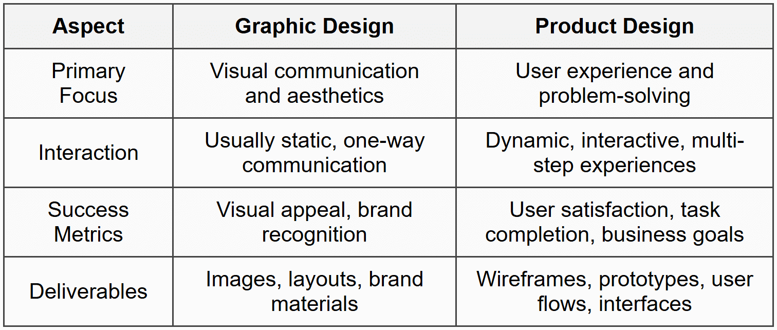
Product Design vs. Graphic Design
Many beginners confuse product design with graphic design, so let's clarify the difference. Graphic design focuses primarily on visual communication-creating logos, posters, brochures, and other static visual content. Product design, on the other hand, deals with interactive experiences that users navigate through to accomplish goals.
The Complete Product Design Workflow
Now that we understand what product design is, let's explore the workflow-the step-by-step process that professional designers follow. While different teams may have variations, the core workflow generally follows these stages:
- Discovery and Research
- Define the Problem
- Ideation and Exploration
- Design and Prototype
- Testing and Validation
- Implementation and Handoff
- Launch and Iteration
Think of this workflow as a journey, not a strict checklist. You'll often loop back to earlier stages as you learn new things. Let's explore each stage in detail.
Stage 1: Discovery and Research
Every great product starts with understanding. Before you sketch a single screen or choose a color, you need to deeply understand the landscape you're entering. The discovery phase is where you gather intelligence about your users, the market, and the problem space.
Understanding Your Users
The most critical question in product design is: "Who are we designing for?" The answer is never "everyone." Even products that seem universal, like Google Search, are designed with specific user behaviors and needs in mind.
User research helps you understand:
- Who your users are (demographics, behaviors, attitudes)
- What they're trying to accomplish (goals and motivations)
- What challenges they face (pain points and frustrations)
- How they currently solve their problems (existing solutions and workarounds)
Common Research Methods
User Interviews: One-on-one conversations with potential or existing users. Imagine you're designing a recipe app. You might sit down with home cooks and ask them to walk you through their process of finding and following recipes. You're not asking "Would you use this feature?"-you're observing their actual behavior and listening to their genuine frustrations.
Example Interview Question: "Tell me about the last time you tried to cook something new. How did you find the recipe? What was challenging about following it?"
Surveys: Questionnaires that gather quantitative and qualitative data from a larger group. While interviews give you depth, surveys give you breadth. You might learn that 73% of your potential users cook on their phones while in the kitchen, which would heavily influence your design decisions.
Competitive Analysis: Studying what already exists in the market. What are other recipe apps doing well? Where do they fall short? This isn't about copying-it's about understanding the landscape and finding opportunities for differentiation.
Analytics Review: If you're improving an existing product, analytics tell you how people actually use it, not how you think they use it. You might discover that a feature you thought was crucial is barely used, while users spend most of their time in an area you undervalued.
Creating User Personas
After gathering research, designers often create user personas-fictional characters that represent different user types. A persona isn't just a demographic profile; it's a rich, detailed description of a person's goals, behaviors, and context.
Sample Persona:
Name: Sarah, the Busy Professional
Age: 32
Occupation: Marketing Manager
Context: Works 50+ hours per week, wants to eat healthy but has limited time
Goals: Quick, healthy meals that don't require exotic ingredients
Frustrations: Recipe sites have too many ads, unclear instructions, no way to adjust serving sizes easily
Tech Comfort: High-uses phone for everything, including while cooking
Personas keep the team focused on real user needs throughout the design process. When debating a design decision, you can ask: "Would this help Sarah accomplish her goal?"
Stage 2: Define the Problem
With research in hand, it's time to crystallize exactly what problem you're solving. This stage is about moving from a broad understanding to a specific, focused problem statement.
Crafting a Problem Statement
A good problem statement is clear, focused, and user-centered. It follows this general format:
[User type] needs a way to [user need] because [insight from research].
For our recipe app example:
Busy professionals need a way to quickly find and follow simple, healthy recipes while cooking because current recipe websites are cluttered with ads and irrelevant content that interrupts their cooking flow.
Notice what this problem statement does:
- It specifies the user (busy professionals, not everyone)
- It identifies the core need (quick, simple recipe-following)
- It explains why existing solutions fall short (clutter and interruptions)
- It doesn't jump to solutions (it doesn't say "build an app with X feature")
Defining Success Metrics
How will you know if your design is successful? Before you start designing, establish success metrics-measurable indicators that your product is working.
For a recipe app, success metrics might include:
- Task completion rate: Can users successfully find and complete a recipe?
- Time to complete: How quickly can users accomplish their goals?
- User satisfaction: Do users report positive experiences?
- Retention rate: Do users come back and use the app repeatedly?
- Business metrics: Subscriptions, revenue, or whatever makes the business sustainable
These metrics will guide your design decisions and help you evaluate your work objectively rather than relying solely on personal preference.
Stage 3: Ideation and Exploration
Now comes the creative part-generating ideas for how to solve the problem. Ideation is about quantity before quality. The goal is to explore many possible solutions before committing to one direction.
Brainstorming Techniques
Sketching: Quick, rough drawings on paper or a whiteboard. These aren't meant to be pretty-they're thinking tools. You might sketch 20 different ways to layout a recipe view in 30 minutes. At this stage, you're exploring possibilities, not creating finished designs.
The beauty of sketching is that it's low-commitment. If an idea doesn't work, you haven't invested much time. You can try wild, unconventional approaches without worrying about wasted effort.
Mind Mapping: A visual technique for exploring relationships between ideas. You might start with "Recipe App" in the center and branch out into features, user needs, technical considerations, and more. Mind mapping helps you see the big picture and discover unexpected connections.
Design Studio: A collaborative brainstorming session where team members sketch ideas individually, then share and discuss them. Even if you're a solo designer, you can involve stakeholders or potential users in these sessions. Fresh perspectives often lead to breakthrough ideas.
Creating User Flows
A user flow is a diagram that shows the path a user takes to complete a task. It maps out every step from entry point to goal completion, including decision points and alternative paths.
For example, a user flow for "Making a Recipe" might look like:
Open app → Browse/Search recipes → Select recipe → View ingredients → Start cooking mode → Follow step-by-step instructions → Mark recipe as completed → Rate recipe
User flows help you identify:
- How many steps are required (can you reduce them?)
- Where users might get confused or stuck
- What screens and interactions you need to design
- Alternative paths users might take
Information Architecture
Information architecture (IA) is the structure and organization of your content. Think of it as the skeleton of your product. Before designing individual screens, you need to decide how everything fits together.
For a recipe app, you might organize content like this:
- Home
- Featured recipes
- Quick picks for you
- Categories
- Search/Browse
- Search by ingredient
- Search by cuisine
- Filter by dietary restrictions
- Recipe Details
- Photo and description
- Ingredients list
- Instructions
- Reviews and ratings
- My Recipes
- Saved recipes
- Cooking history
- Shopping list
- Profile/Settings
- Dietary preferences
- Account settings
Good information architecture makes content easy to find and understand. Poor IA leads to confused, frustrated users who can't accomplish their goals.
Stage 4: Design and Prototype
With a solid foundation of research, problem definition, and exploration, you're ready to create actual designs. This stage moves from abstract ideas to concrete, visual interfaces.
Wireframing
Wireframes are low-fidelity representations of your design-essentially blueprints that show layout and structure without visual design details. They're typically grayscale and use simple shapes to represent content.
Why start with wireframes instead of jumping straight to high-fidelity designs?
- Focus on structure: Without colors and images to distract, you and stakeholders can focus on whether the layout and functionality make sense
- Iterate quickly: It's much faster to move boxes around than to redesign polished interfaces
- Reduce attachment: People get attached to pretty designs and resist changes, even when changes would improve the product
- Clarify requirements: Wireframes help everyone understand exactly what's being built before significant resources are invested
A wireframe for a recipe details screen might show:
- A large rectangle at the top (recipe photo placeholder)
- Text lines for recipe name and description
- A box for ingredients list
- Numbered boxes for cooking steps
- Buttons for actions (save, share, start cooking)
At this stage, you're answering questions like: "Does the layout prioritize the most important information?" and "Can users easily understand what they can do on this screen?"
Visual Design
Once the structure is solid, you add visual design-colors, typography, images, icons, and all the aesthetic elements that give your product personality and polish.
Visual design isn't just decoration. It serves critical functions:
- Visual hierarchy: Using size, color, and contrast to guide users' attention to the most important elements
- Brand identity: Creating a consistent look and feel that makes your product recognizable
- Emotional connection: Colors, images, and style evoke feelings that influence how users perceive your product
- Usability: Good visual design makes interfaces easier to scan, understand, and use
Key Visual Design Principles
Consistency: Use the same styles for similar elements throughout your product. If primary buttons are blue and rounded, don't suddenly make one green and square. Consistency reduces cognitive load-users don't have to relearn your interface on every screen.
Contrast: Important elements should stand out from their surroundings. If everything is equally prominent, nothing is prominent. Use contrast in color, size, and spacing to create clear focal points.
Alignment: Elements should have clear visual relationships. Random placement creates chaos and confusion. Use grids and alignment to create order and flow.
Whitespace: Empty space isn't wasted space-it gives designs room to breathe and helps users focus. Cramming too much into a screen overwhelms users and makes everything harder to process.
Design Systems and Components
Professional product design uses design systems-collections of reusable components and standards that ensure consistency and speed up the design process.
Instead of designing each button from scratch every time you need one, you create a button component once with all its variations (primary, secondary, disabled, etc.) and reuse it throughout your product. This approach:
- Ensures visual consistency
- Speeds up design and development
- Makes updates easier (change the component once, and it updates everywhere)
- Improves quality through iteration and refinement
Common components in a design system include:
- Buttons (various types and states)
- Form inputs (text fields, dropdowns, checkboxes)
- Navigation elements (menus, tabs, breadcrumbs)
- Cards and containers
- Typography styles
- Color palettes
- Icons
- Spacing and layout grids
Prototyping
A prototype is an interactive simulation of your product. Unlike static design files, prototypes let you click through screens, test interactions, and experience the product as users would.
Prototypes can range from low-fidelity (clickable wireframes) to high-fidelity (polished designs with realistic interactions and animations). The fidelity you choose depends on what you're trying to learn or communicate.
Low-fidelity prototypes are great for:
- Testing basic flows and navigation early
- Getting quick feedback without investing in polish
- Exploring multiple options rapidly
High-fidelity prototypes are better for:
- Testing specific interactions and animations
- Getting realistic user feedback
- Demonstrating the product to stakeholders
- Providing detailed specifications to developers
Modern design tools make prototyping easy. You can link screens together, define interactions (tap, swipe, hover), add transitions, and even incorporate simple logic (show different screens based on user actions).
Stage 5: Testing and Validation
You've created a beautiful design-but does it actually work for users? The only way to know is to test it with real people. Usability testing reveals issues you'd never catch on your own because you're too close to the design.
Usability Testing Basics
In a usability test, you watch real users try to complete tasks with your prototype while thinking aloud. You're not testing the users-you're testing your design.
A typical usability test includes:
- Brief introduction: Explain the purpose without revealing too much about what you're testing
- Task scenarios: Give users realistic goals to accomplish (e.g., "Find a quick dinner recipe that takes under 30 minutes")
- Observation: Watch silently as users work through tasks, taking notes on where they struggle, what confuses them, and what works well
- Think-aloud protocol: Ask users to verbalize their thoughts as they work ("I'm looking for a search feature... I expected it to be at the top...")
- Follow-up questions: After tasks, ask about their experience, expectations, and suggestions
What to Look For
During testing, pay attention to:
- Task completion: Can users accomplish their goals? If not, where do they get stuck?
- Error patterns: Do multiple users make the same mistakes? That's a design problem, not a user problem
- Confusion points: Where do users pause, express uncertainty, or look for something that isn't there?
- Unexpected behavior: How do users approach tasks differently than you anticipated?
- Efficiency: Are there unnecessary steps or friction points that slow users down?
- Satisfaction: Do users express frustration, delight, or indifference?
Interpreting Results and Iterating
After testing, you'll identify issues to address. Not every issue has equal importance. Prioritize based on:
- Severity: Does it prevent task completion (critical) or just cause minor annoyance?
- Frequency: Do most users encounter it, or is it rare?
- Impact: Does it affect core functionality or peripheral features?
Then iterate-make changes to address the issues and test again. Product design is inherently iterative. Your first design is never perfect, and that's expected. Each testing round refines your understanding and improves your design.
Other Validation Methods
A/B Testing: Once your product is live, you can test variations by showing different versions to different users and measuring which performs better. For example, test two different homepage layouts to see which leads to more recipe views.
Analytics Analysis: Quantitative data reveals how users behave in aggregate. Are users dropping off at a particular step? Where do they spend their time? What features are most popular?
Feedback Channels: Reviews, support tickets, and feedback forms provide ongoing insights into user satisfaction and problems.
Stage 6: Implementation and Handoff
Your design is tested and refined-now it needs to be built. The handoff process is how you communicate your design to the developers who will implement it.
Design Specifications
Developers need detailed information to build your design accurately. Design specifications (specs) include:
- Measurements: Sizes, spacing, and positioning of elements
- Colors: Exact color codes (hex, RGB) for every element
- Typography: Font families, sizes, weights, line heights
- Interactions: How elements behave when clicked, hovered, or in different states
- Responsive behavior: How layouts adapt to different screen sizes
- Assets: All images, icons, and graphics developers need
Modern design tools can generate many of these specs automatically, showing developers exactly what they need to know.
Collaboration with Developers
Great product design requires close collaboration between designers and developers. Here's how to make that collaboration effective:
Involve developers early: Don't wait until handoff to talk to developers. Involve them during ideation and design to understand technical constraints and opportunities. They might know about capabilities you weren't aware of, or they might flag approaches that would be extremely difficult to build.
Be available during implementation: Questions will arise during development. Being responsive helps developers stay productive and ensures the final product matches your vision.
Understand trade-offs: Sometimes the ideal design isn't feasible within time or technical constraints. Be willing to collaborate on solutions that balance design quality with practical realities.
Review during development: Don't wait until development is complete to see the implementation. Regular check-ins let you catch issues early when they're easier to fix.
Design QA
Once features are implemented, conduct design quality assurance (QA)-review the built product to ensure it matches your designs and functions correctly.
Check for:
- Visual accuracy (colors, spacing, typography)
- Interaction behavior (animations, transitions, states)
- Responsive behavior across devices
- Edge cases (error states, loading states, empty states)
- Accessibility (keyboard navigation, screen reader compatibility)
Document any discrepancies and work with developers to address them before launch.
Stage 7: Launch and Iteration
Your product is built and ready to launch-but the design process doesn't end here. Launch is the beginning of a new phase: learning from real users at scale and continuously improving.
Monitoring and Measurement
Remember those success metrics you defined early on? Now you measure them. How is your product performing against your goals?
- Are users completing core tasks successfully?
- How long does it take them?
- What's the retention rate?
- How do users rate their experience?
- Are business goals being met?
Both quantitative data (analytics, metrics) and qualitative feedback (reviews, support tickets) provide insights into what's working and what needs improvement.
Continuous Improvement
Product design is never truly "done." User needs evolve, technology changes, competitors innovate, and you discover new opportunities. The best products improve continuously based on real-world usage and feedback.
This might mean:
- Refining existing features based on usage patterns
- Fixing usability issues that become apparent at scale
- Adding new capabilities to serve user needs better
- Removing features that aren't providing value
- Optimizing for performance and efficiency
The workflow comes full circle. Insights from launch inform new research, which leads to new problem definitions, which spark new ideation, and so on. Product design is a cycle of learning and improvement.
Key Principles That Guide the Workflow
Throughout all stages of the product design workflow, certain principles keep you on track:
User-Centered Design
Users are at the center of every decision. This sounds obvious, but it's easy to lose sight of when business stakeholders want features or when you fall in love with a clever design idea. Always ask: "Does this serve user needs?" If you can't answer yes, reconsider.
Embrace Iteration
Your first idea is rarely your best idea. Iteration-repeatedly refining based on feedback and learning-is how good designs become great. Don't be precious about your work. Be willing to change, experiment, and even throw out ideas that aren't working.
Fail Fast, Learn Faster
It's better to discover problems early when they're cheap to fix. This is why designers use wireframes, prototypes, and testing-to validate ideas before significant resources are invested. A failed prototype costs hours; a failed product costs months or years.
Design with Data
Combine qualitative and quantitative insights. User research and testing provide qualitative understanding (the why behind behavior). Analytics provide quantitative data (the what of behavior). Both are necessary for informed decisions.
Simplicity Over Complexity
Good design often means removing rather than adding. Every element, feature, and option adds complexity. Only include what genuinely serves user goals. As Antoine de Saint-Exupéry said, "Perfection is achieved not when there is nothing more to add, but when there is nothing left to take away."
Accessibility is Essential
Design for everyone, including users with disabilities. This isn't optional or an afterthought. Accessible design is good design-it creates better experiences for all users. Consider users who are blind, colorblind, deaf, have motor impairments, or use assistive technologies.
Collaborate Across Disciplines
Great products require diverse perspectives. Designers, developers, product managers, researchers, marketers, and users all have valuable insights. The best solutions emerge from collaboration, not isolation.
Common Pitfalls to Avoid
As you practice product design workflow, watch out for these common mistakes:
Skipping Research
It's tempting to jump straight to designing based on assumptions. "I know what users want!" But assumptions are often wrong. Research feels slow initially, but it saves enormous time by ensuring you're solving the right problems.
Designing for Yourself
You are not your user. Your preferences, expertise, and context differ from your users'. Just because you understand an interface doesn't mean others will. Test with actual users, not just colleagues who understand the domain.
Feature Creep
Adding "just one more feature" is tempting, but every addition makes products more complex and harder to use. Stay focused on core user needs. You can always add features later based on real demand.
Ignoring Edge Cases
It's easy to design for the "happy path"-when everything goes perfectly. But what happens when there's an error? When content is missing? When users have slow connections? Design for edge cases and error states, not just ideal scenarios.
Not Testing Early Enough
Waiting until designs are polished before testing means you've invested significant time before getting feedback. Test early and often, even with rough prototypes. Every testing round makes your design stronger.
Taking Feedback Personally
Criticism of your design isn't criticism of you. When users struggle with your interface or stakeholders question your decisions, it's an opportunity to learn and improve. Develop thick skin and genuine curiosity about alternative perspectives.
Tools of the Trade
While tools don't make you a good designer, they do enable efficient work. Here's what different tools help you accomplish:
Research and Documentation Tools
Tools for conducting interviews, surveys, organizing research findings, and creating documentation. These help you capture and synthesize user insights effectively.
Wireframing and Prototyping Tools
Specialized software for creating wireframes and interactive prototypes. These tools let you quickly explore ideas and simulate user experiences without writing code. Many include features like reusable components, collaboration capabilities, and easy sharing.
Visual Design Tools
Applications for creating high-fidelity designs with precise control over visual details. Professional tools support components, design systems, and smooth handoff to developers.
Collaboration and Handoff Tools
Platforms that facilitate design review, feedback collection, version control, and communication with developers. These ensure everyone stays aligned throughout the process.
Analytics and Testing Tools
Software for tracking user behavior, conducting A/B tests, recording user sessions, and gathering feedback. These provide the data you need for informed decisions and continuous improvement.
The specific tools you use matter less than understanding the workflow itself. Tools change constantly, but the fundamental process of understanding users, defining problems, exploring solutions, and iterating based on feedback remains constant.
Bringing It All Together
Product design workflow is a structured approach to creating digital products that solve real problems for real people. It's not a linear path but an iterative cycle of learning and improvement.
Let's recap the journey:
- Discovery and Research: Understand your users, their context, needs, and pain points through interviews, surveys, and competitive analysis
- Define the Problem: Crystallize your findings into a clear problem statement and success metrics that guide your work
- Ideation and Exploration: Generate multiple possible solutions through sketching, user flows, and information architecture
- Design and Prototype: Create wireframes, visual designs, and interactive prototypes that bring your ideas to life
- Testing and Validation: Test with real users, identify issues, and iterate to improve your design
- Implementation and Handoff: Collaborate with developers to build your design and ensure quality
- Launch and Iteration: Release your product, measure results, and continuously improve based on real-world usage
Each stage builds on the previous one, but you'll often loop back as you learn new things. Maybe testing reveals a problem with your initial understanding. Maybe implementation uncovers technical constraints that require redesigning. Maybe post-launch data shows users need something you didn't anticipate. This is normal and healthy.
The workflow provides structure without being rigid. It ensures you consider critical aspects like user research and testing while giving you flexibility in how you work. Some projects might require extensive research; others might iterate rapidly based on existing knowledge. The key is being intentional about each stage and making informed decisions.
As you practice product design, you'll develop your own rhythm and preferences within this framework. You'll learn which research methods work best for different situations, how to spot usability issues quickly, how to balance user needs with business constraints, and how to collaborate effectively with diverse teams.
Remember that product design is as much about problem-solving and empathy as it is about aesthetics. The most beautiful interface is worthless if it doesn't help users accomplish their goals. Stay curious about users, humble about your assumptions, and committed to continuous learning.
Welcome to the world of product design. Every product you use daily went through this workflow (or should have). Now you understand the process that brings digital experiences to life. Practice it, refine it, and use it to create products that make people's lives better.


