Sketching Interface Layouts


Sketching Interface Layouts
Welcome to this teaching document on sketching interface layouts! This is one of the most practical and exciting skills you'll develop as a designer. Before we dive into complex design software or polished prototypes, we need to master the art of quickly visualizing our ideas on paper. Think of sketching as the designer's equivalent of a chef tasting ingredients before cooking-it's fast, low-risk, and helps you explore possibilities without commitment.
Why Sketching Matters in Interface Design
Imagine you're planning a road trip. Would you immediately start driving, or would you first look at a map and sketch out your route? Sketching interface layouts serves the same purpose-it helps you plan your journey before investing time and resources into the final product.
When we sketch interfaces, we're not trying to create beautiful artwork. Instead, we're thinking through problems, exploring solutions, and communicating ideas. A rough sketch created in five minutes can save hours of coding or pixel-perfect design work later. It's about thinking with your hands and making your ideas visible and tangible.
The beauty of sketching is its speed and flexibility. You can:
- Generate multiple ideas in the time it takes to open design software
- Quickly iterate when something doesn't feel right
- Communicate with team members without technical barriers
- Focus on structure and functionality rather than colors and fonts
- Fail fast and cheaply-crumpling up paper is much easier than deleting hours of work
Essential Tools and Materials
One of the best things about sketching is that you don't need expensive equipment. Let's look at what you actually need to get started.
Basic Sketching Kit
Here's what belongs in your sketching toolkit:
- Paper: Plain printer paper works perfectly fine. You can also use sketchbooks, dot-grid notebooks, or specialized UI sketch pads
- Pens: Simple black pens are ideal. Fine-tip markers (0.5mm to 0.8mm) give you control without being too precise
- Pencils: Useful for initial rough work, though many designers prefer pens because they can't erase-this encourages forward momentum
- Markers: Thicker markers or Sharpies for filling large areas or emphasizing elements
- Rulers: Optional, but helpful for drawing straight lines when needed
- Templates: UI stencils with pre-cut shapes for common interface elements (also optional)
Digital Sketching Tools
While traditional pen and paper is often fastest, digital sketching has its place:
- Tablets: iPads or other tablets with stylus support
- Drawing apps: Simple apps that mimic pen-on-paper experiences
- Whiteboard tools: Digital whiteboards for collaborative remote sketching
For learning purposes, we recommend starting with paper and pen. The tactile experience helps you think differently, and there's no learning curve for the tools themselves.
Understanding Interface Components
Before you can sketch interfaces effectively, you need to recognize the building blocks that make up digital products. Think of these as your vocabulary-just as you need to know words before writing a story, you need to know interface components before sketching layouts.
Primary Interface Elements
Let's break down the most common components you'll encounter:
Navigation Elements
- Navigation bars: Horizontal strips typically at the top of the screen containing links or menu items
- Hamburger menus: Three stacked lines that reveal a hidden menu when clicked
- Tab bars: Bottom navigation common in mobile apps, usually showing 3-5 primary sections
- Breadcrumbs: Navigation trails showing where you are in a site hierarchy (Home → Products → Electronics)
- Sidebars: Vertical navigation panels, often on the left side of desktop interfaces
Content Elements
- Headers: Text that labels sections and establishes hierarchy
- Body text: Main readable content, usually represented by horizontal lines in sketches
- Images: Visual content, often sketched as boxes with an X through them
- Cards: Contained pieces of content with borders, common in modern interfaces
- Lists: Vertically stacked items, either ordered or unordered
Interactive Elements
- Buttons: Clickable rectangles or rounded rectangles that trigger actions
- Input fields: Boxes where users enter text or data
- Checkboxes: Small squares for selecting multiple options
- Radio buttons: Circles for selecting one option from a group
- Dropdowns: Menus that expand to show options when clicked
- Sliders: Horizontal or vertical controls for selecting values within a range
- Toggles: Switches for turning features on or off
Feedback Elements
- Alerts: Notices that communicate important information
- Modals: Overlay windows that demand attention before proceeding
- Tooltips: Small contextual hints that appear on hover
- Progress indicators: Bars or spinners showing loading or completion status
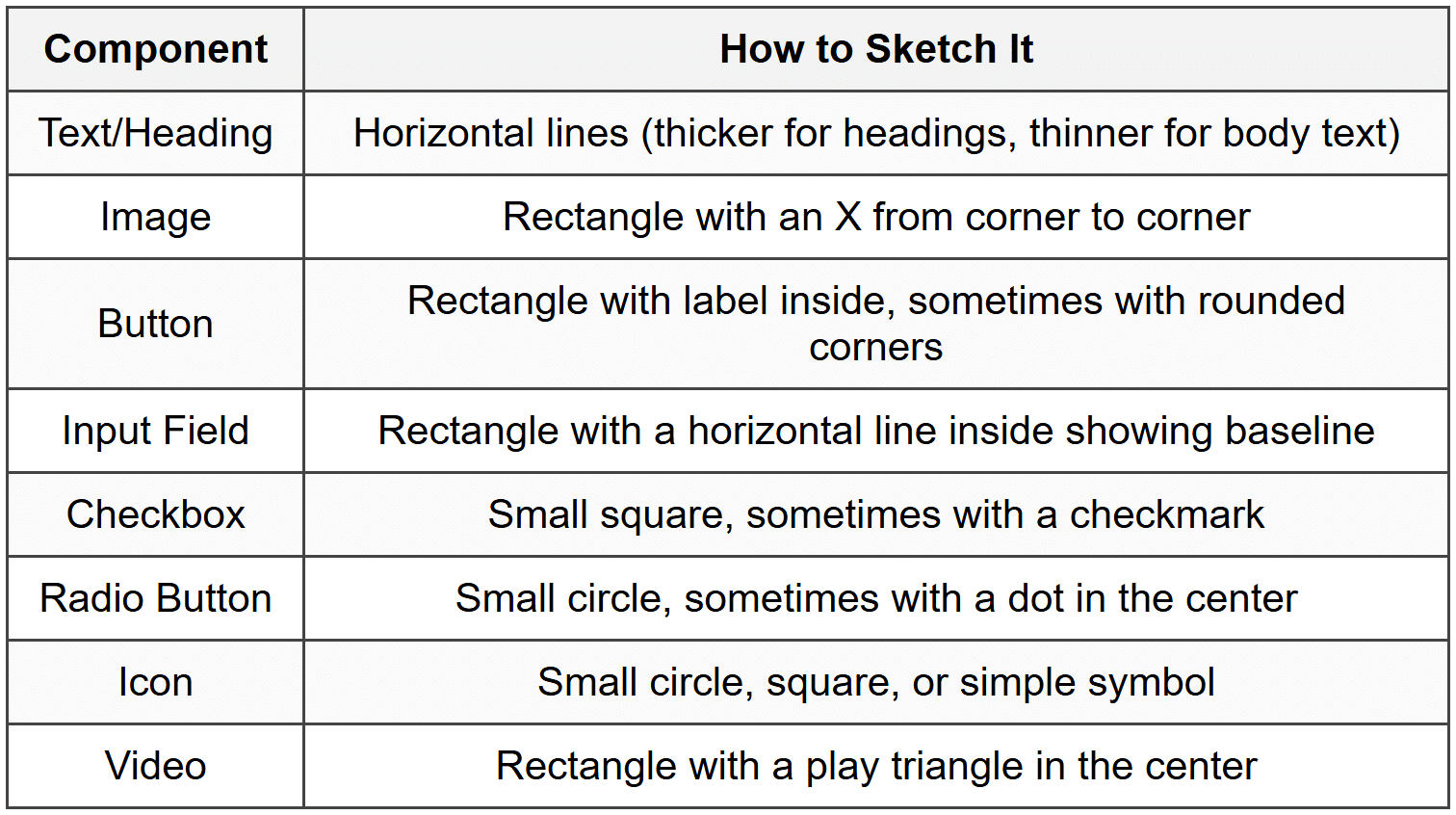
Sketching Shorthand for Components
Professional designers use visual shorthand to quickly represent these elements. Here's how to sketch common components:
Fundamental Sketching Techniques
Now that you know what to draw, let's talk about how to draw it. Good sketching isn't about artistic talent-it's about developing a set of techniques that help you think and communicate clearly.
The Quick Line Technique
Many beginners draw slowly and carefully, trying to make perfect lines. This actually works against you. Professional sketchers use quick, confident strokes. Here's why:
- Fast lines appear more confident and intentional
- You're less likely to overthink and get stuck on details
- Your hand develops muscle memory for common shapes
- The sketch maintains an appropriate level of roughness that signals "work in progress"
Practice drawing rectangles, circles, and lines with single, swift motions rather than slowly tracing them. If a line doesn't land perfectly, that's fine-it's a sketch, not a technical drawing.
The Big-to-Small Approach
Think of sketching like building a house. You start with the foundation and frame before worrying about where to hang pictures. Apply this principle to interface sketching:
- Draw the device frame: Sketch the overall screen or browser window boundaries
- Block out major sections: Divide the screen into primary areas (header, sidebar, main content, footer)
- Add component groups: Place groups of related elements within sections
- Define individual elements: Draw specific buttons, fields, and content items
- Add labels and annotations: Note what elements do or contain
This approach keeps you focused on structure and hierarchy rather than getting lost in details too early.
Using Boxes and Containers
Boxes are your best friend when sketching interfaces. They help you:
- Define boundaries between different interface sections
- Show visual hierarchy through size and placement
- Represent cards, panels, modals, and other containers
- Create alignment guides for placing elements
Don't be afraid to nest boxes within boxes. A typical interface might have a main container box, section boxes within it, card boxes within sections, and element boxes within cards. This nested structure mirrors how actual interfaces are built with HTML and CSS.
Indicating Interactivity
Since sketches are static, you need ways to show that elements are interactive. Common conventions include:
- Arrows: Show where a click leads or what connects to what
- Annotations: Small notes explaining what happens ("opens menu," "loads more," etc.)
- Multiple frames: Draw before-and-after states side by side
- Callout bubbles: Highlight important interactive details
- Numbered sequences: Show the order of steps in a user flow
Composition and Layout Principles
A well-sketched interface isn't just about drawing boxes and buttons correctly-it's about arranging them in ways that make sense to users. Let's explore the core principles that guide effective layout design.
Visual Hierarchy
Visual hierarchy is like the difference between a conversation where everyone shouts at once versus one where people take turns speaking. Your interface needs to guide users' attention in the right order.
In sketching, you create hierarchy through:
- Size: Larger elements naturally draw attention first
- Position: Elements at the top or center are noticed before those at edges
- Weight: Bolder lines or filled shapes stand out more than thin lines
- Spacing: Elements with more space around them feel more important
When sketching, exaggerate size differences to make hierarchy clear. If a heading should be more prominent than body text, draw it noticeably larger-not just slightly bigger.
The Grid System
Professional interfaces rarely place elements randomly. They use grid systems-invisible alignment guides that create order and consistency.
When sketching, imagine vertical and horizontal lines dividing your screen into columns and rows. Common grid approaches include:
- 12-column grid: Divide the screen width into 12 equal columns; elements span multiple columns (a sidebar might be 3 columns, main content 9 columns)
- 8-point grid: All spacing and element sizes are multiples of 8 pixels
- Modular grid: Both columns and rows create a grid of rectangular modules
You don't need to draw every grid line in your sketch. Instead, use light pencil marks or simply align elements visually. The goal is consistency-elements should line up with each other in predictable ways.
Whitespace and Breathing Room
Beginners often try to cram too much into each screen. This is like trying to fit an entire paragraph on a bumper sticker-technically possible but ineffective.
Whitespace (also called negative space) is the empty area between elements. It's not wasted space-it's a powerful design tool that:
- Helps users focus on one thing at a time
- Makes interfaces feel calmer and more sophisticated
- Creates relationships between elements (items close together seem related)
- Improves readability and scannability
In your sketches, consciously leave gaps between elements. If your sketch feels crowded, it will feel even more crowded when built with real content.
The F and Z Patterns
Eye-tracking studies show that people scan screens in predictable patterns:
The F-pattern is common for text-heavy content:
- Users scan horizontally across the top
- Move down the left side
- Scan horizontally again (shorter than first scan)
- Continue down the left side
The Z-pattern appears in simpler layouts:
- Scan across the top left to right
- Diagonal down to the bottom left
- Scan across the bottom left to right
When sketching, place your most important elements along these natural scan paths. For example, in an F-pattern layout, put key information and calls-to-action on the left side where eyes naturally travel.
Device-Specific Considerations
Sketching for a smartphone is fundamentally different from sketching for a desktop computer. Each device type comes with its own constraints, opportunities, and user expectations.
Mobile Sketching
Mobile devices are intimate, portable, and touch-based. These characteristics shape how you should approach mobile sketches:
Screen Real Estate
Mobile screens are small. This forces you to:
- Prioritize ruthlessly-show only what's essential
- Use progressive disclosure-hide secondary features behind taps
- Stack content vertically rather than side-by-side
- Make touch targets large enough (at least the size of a fingertip)
Thumb Zone
When sketching mobile interfaces, consider that most people hold phones with one hand. The bottom third of the screen is easiest to reach with the thumb, while the top corners are hardest. Place frequent actions in the comfortable thumb zone.
Common Mobile Patterns
- Bottom navigation bar: 3-5 primary sections accessible via tabs at the screen bottom
- Hamburger menu: Hidden side menu that slides in from the left
- Scrollable cards: Vertical feeds of content cards
- Modal overlays: Full-screen or partial-screen overlays for focused tasks
- Swipe gestures: Horizontal swipes for navigation or actions
Desktop Sketching
Desktop screens offer more space and support mouse/keyboard interactions, which changes your design approach:
Horizontal Space
Unlike mobile's vertical focus, desktop layouts can spread horizontally. Common patterns include:
- Multi-column layouts: Sidebar navigation with main content area
- Data tables: Spreadsheet-like displays with rows and columns
- Split views: Multiple panels showing different information simultaneously
- Hover interactions: Additional information appearing when mouse hovers over elements
Information Density
Desktop users can handle more visual information at once. You can:
- Show more options simultaneously rather than hiding them
- Use smaller text sizes (within reason)
- Include peripheral information like metadata, timestamps, or secondary actions
- Display broader context around primary content
Tablet Sketching
Tablets sit between mobile and desktop, which creates unique challenges:
- Orientation matters: Sketch both portrait and landscape versions when orientation significantly changes the experience
- Hybrid interactions: Support both touch and sometimes keyboard/stylus input
- Split-screen multitasking: Consider how your interface works alongside other apps
- Two-hand usage: Unlike phones, tablets are often held with both hands, changing reachability zones
Responsive Considerations
Most interfaces need to work across multiple devices. When sketching responsive layouts:
- Start with mobile-it forces you to prioritize (mobile-first approach)
- Identify breakpoints where layout significantly changes
- Sketch key screens at each breakpoint (usually mobile, tablet, desktop)
- Show how elements reflow, stack, or expand across breakpoints
- Note which features appear or disappear at different sizes
Common Layout Patterns
Just as architects have common building designs (ranch house, split-level, etc.), interface designers have established layout patterns that solve recurring problems. Learning these patterns gives you a vocabulary of proven solutions to draw from.
Single Column Layout
This is the simplest pattern-everything stacks vertically in one column.
Best for:
- Mobile interfaces
- Reading-focused content (articles, blogs)
- Linear processes (checkout flows, onboarding)
- Minimalist designs
When sketching: Focus on vertical rhythm and clear section breaks. Use varying content widths and whitespace to create visual interest within the constraint.
Sidebar Navigation Layout
A vertical sidebar (usually left-side) contains navigation, while the main content area fills the remaining space.
Best for:
- Web applications (email clients, project management tools)
- Content sites with many categories
- Admin dashboards
- Documentation sites
When sketching: Draw the sidebar narrow (about 1/5 to 1/4 of screen width) and indicate whether it's fixed or scrolls independently from the main content.
Grid of Cards
Content is organized into uniform cards arranged in rows and columns, like a Pinterest board or product gallery.
Best for:
- Product catalogs
- Image galleries
- News feeds
- Search results
When sketching: Draw 2-4 cards to establish the pattern, then use lighter lines or ellipses (···) to indicate the pattern continues. Note how many cards appear per row at different screen sizes.
Split View Layout
The screen divides into two (or more) equal or proportional sections that work together, like a list on the left and details on the right.
Best for:
- Email clients (message list and message detail)
- File browsers
- Master-detail relationships
- Comparison tools
When sketching: Show how selecting something in one pane affects the other. Use arrows or annotations to indicate this relationship.
Dashboard Layout
Multiple widgets or modules arranged in a grid, each showing different metrics or information.
Best for:
- Analytics tools
- Admin panels
- Personal dashboards
- Monitoring systems
When sketching: Draw containers for each widget with rough indications of content type (chart, table, number, etc.). Show how widgets might have different sizes within the grid.
Tabbed Interface
Content is organized into tabs, with only one tab's content visible at a time.
Best for:
- Related but distinct content sections
- Settings pages
- Product details with multiple views
- Compact mobile interfaces
When sketching: Draw the tab bar with labels, then sketch the content below. You can sketch multiple frames showing different tabs active, or use annotations to describe what each tab contains.
Sketching User Flows
Individual screen sketches are valuable, but interfaces don't exist in isolation. Users move through sequences of screens to accomplish goals. User flow sketching helps you think through these journeys.
What is a User Flow?
A user flow is the path a user takes to complete a specific task. Think of it like a choose-your-own-adventure book-each decision leads to a new page, and different paths lead to different outcomes.
For example, the user flow for "purchasing a product" might be:
- Browse product catalog
- View product details
- Add to cart
- Review cart
- Enter shipping information
- Enter payment information
- Confirm order
- See confirmation screen
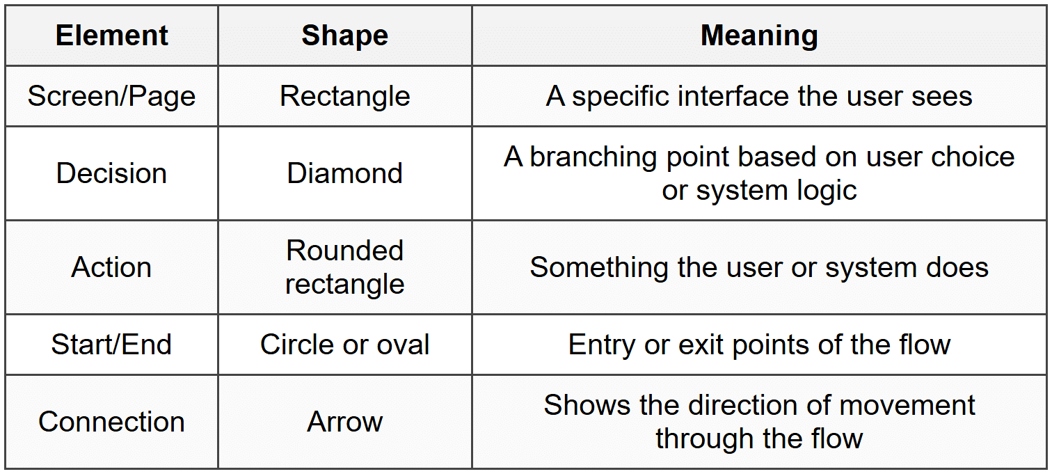
Flow Diagram Components
When sketching user flows, you'll use simple shapes to represent different elements:
Combining Flows with Screen Sketches
One effective technique is to draw small screen thumbnails connected by arrows. This shows both the user's journey and what they see at each step. Here's how to approach it:
- Draw small rectangles for each screen (about 2-3 inches tall)
- Sketch simplified versions of each screen inside these rectangles
- Connect screens with arrows showing the navigation path
- Label arrows with the action that triggers the transition ("tap Sign Up," "submit form," etc.)
- Use branching arrows to show different paths based on conditions
Happy Path vs. Alternative Paths
The happy path is the ideal journey where everything works perfectly. But real users encounter errors, change their minds, and take unexpected actions.
When sketching flows, consider:
- Error states: What happens if form validation fails? If payment is declined?
- Exit points: Where can users cancel or go back?
- Optional steps: Which parts of the flow can be skipped?
- Alternative routes: Are there multiple ways to reach the same goal?
You don't need to sketch every possible path in detail, but acknowledging major alternatives prevents you from designing dead ends.
Annotation and Communication
A sketch without context is like a map without labels-technically accurate but difficult to understand. Annotations transform your personal visual thinking into a tool for communicating with others.
Essential Annotations
Good annotations clarify without cluttering. Here's what to include:
Labels
Simple text identifying what elements are, especially when your sketching shorthand might be ambiguous:
- "Search bar"
- "User profile photo"
- "Call-to-action button"
Behavioral Notes
Explain what happens when users interact with elements:
- "Expands to show full post"
- "Opens calendar picker"
- "Filters results in real-time"
Content Indicators
Specify what content appears where:
- "Article headline goes here"
- "Shows 5 most recent notifications"
- "Displays user's current location"
Measurement Notes
When size or spacing is critical:
- "Full screen width"
- "Fixed at 60px height"
- "Minimum tap target: 44×44"
Conditional Logic
Explain when elements appear or change:
- "Only visible to logged-in users"
- "Appears after scrolling 200px"
- "Shows error message if field empty"
Annotation Techniques
How you add annotations affects sketch readability:
- Arrows and lines: Connect annotations to specific elements with simple lines or arrows
- Numbers: Use numbered callouts when you have multiple annotations; place corresponding numbers on elements
- Margin notes: Write explanatory notes in the margins rather than on top of the sketch
- Sticky notes: For longer explanations or questions, use physical sticky notes that can be moved or removed
- Color coding: Use different colored pens to distinguish types of annotations (though remember sketches should work in black and white)
Titling and Context
Each sketch should include:
- Title: What screen or feature does this show?
- Date: When was this sketched? (Important when you have multiple iterations)
- Version number or iteration: "v2," "Iteration 3," etc.
- Device context: "Mobile - Portrait," "Desktop - 1440px," etc.
- User state: "Logged out," "First-time user," "Admin view," etc.
This information typically goes at the top of the page or in a corner, like a title block on architectural drawings.
Iterating and Refining Sketches
Your first sketch will rarely be your best. The real value of sketching comes from rapid iteration-drawing multiple versions to explore possibilities and progressively improve your ideas.
The Diverge-Then-Converge Method
Professional designers often use a two-phase approach:
Divergence phase:
- Generate many different ideas quickly
- Don't judge or critique yet
- Explore wild variations, not just safe choices
- Set a timer (like 5-10 minutes) to maintain momentum
Convergence phase:
- Review all sketches and identify strengths
- Select the most promising directions
- Combine the best elements from different sketches
- Refine chosen concepts with more detailed sketches
Levels of Fidelity
As you iterate, your sketches naturally become more refined. Think of this as levels of detail:
Low Fidelity
Very rough, very fast-exploring basic structure:
- Simple boxes and lines
- No details, just placement
- Minimal annotations
- Takes seconds to minutes
Medium Fidelity
Clearer representation of actual interface:
- Recognizable components
- Size relationships more accurate
- Key labels and annotations
- Takes minutes to tens of minutes
High Fidelity
Detailed enough to guide implementation:
- All major elements present
- Accurate proportions and spacing
- Comprehensive annotations
- May include sample content
- Takes 30+ minutes
Start with low fidelity to explore options, then increase fidelity as you narrow down your direction. Don't invest in high-fidelity sketches until you're confident in the approach.
Testing Sketches with Others
Sketches are excellent tools for getting early feedback:
- Explain the context: Tell viewers what problem you're solving and who the users are
- Don't over-explain: See what people understand without detailed guidance
- Ask specific questions: "Is it clear what this button does?" rather than "What do you think?"
- Watch for confusion: Notice where people hesitate or misinterpret elements
- Gather input, not votes: You're not choosing by consensus; you're collecting information to make better decisions
The rough nature of sketches actually encourages more honest feedback-people feel comfortable critiquing something that obviously isn't finished.
Common Sketching Mistakes to Avoid
As you develop your sketching practice, watch out for these common pitfalls:
Getting Stuck on Details Too Early
Spending ten minutes perfecting the icons in a navigation bar before establishing overall layout is like choosing paint colors before building walls. Resist the urge to detail individual elements until the overall structure is solid.
Trying to Make It Too Pretty
Remember: you're not creating art for exhibition. A sketch that's "too pretty" can actually be counterproductive because:
- People hesitate to suggest changes to something that looks polished
- The aesthetics distract from evaluating function and structure
- You become emotionally attached and less willing to explore alternatives
Sketching Without Purpose
Random sketching is like wandering without a destination. Before you draw, clarify:
- What problem am I solving?
- Who is this for?
- What specific question am I trying to answer?
Ignoring Real-World Constraints
It's easy to sketch fantasy interfaces that would be impossible to build or use. Consider:
- Can this work with real content (not just ideal placeholder text)?
- Is there enough space for touch targets on mobile?
- Does this require technical capabilities that don't exist?
- Would this perform well with actual data volumes?
Working in Isolation
Sketching is a thinking tool, but it's also a communication tool. Share your sketches early and often with:
- Team members who'll implement your designs
- Stakeholders who need to approve direction
- Users or user representatives when possible
Not Documenting Decisions
You'll sketch many versions. Without notes about why you chose certain directions, you'll forget your reasoning. Add brief notes about:
- What problem each sketch addresses
- Why you rejected certain approaches
- What questions remain unresolved
- What assumptions you're making
Building Your Sketching Practice
Like any skill, sketching improves with regular practice. Here's how to develop your abilities systematically.
Sketching Exercises
Try these exercises to build your sketching muscles:
The Five-Minute Challenge
Set a timer for five minutes. Sketch as many variations of a simple screen as you can (like a login screen or search results). The time pressure prevents overthinking and encourages experimentation.
Reverse Engineering
Find an interface you use daily (your favorite app, a website you visit). Sketch it from memory. Then compare your sketch to the actual interface-what did you remember? What did you forget? This builds your understanding of interface patterns.
Component Library
Create a personal sketch library. Draw common interface elements over and over until you can reproduce them quickly and consistently. Think of it like practicing scales on a musical instrument.
Constraint Sketching
Give yourself unusual constraints: "Design a checkout flow with no text labels," or "Create a photo gallery that works without images loading." Constraints force creative problem-solving.
Daily UI Sketching
Sketch one interface concept every day for 30 days. Don't aim for perfection-aim for consistency. You'll see dramatic improvement by day 30.
Learning from Others
Study how experienced designers sketch:
- Look at published sketch examples (design blogs often share process work)
- Notice what level of detail they include and exclude
- Observe their annotation styles
- See how they show interaction and flow
Don't copy their style exactly-develop your own approach informed by multiple influences.
Creating a Sketching Habit
Make sketching a regular part of your process:
- Keep materials accessible: Paper and pen should always be within reach
- Sketch before designing: Before opening design software, sketch your ideas first
- Sketch during meetings: When discussing features or problems, draw while talking
- Sketch to understand: When you encounter a confusing interface, sketch it to analyze its structure
- Save your sketches: Keep a portfolio of your sketch work to see your progression over time
Transitioning from Sketch to Design
Eventually, your sketches need to evolve into more polished designs. Understanding this transition helps you know what to sketch and what to leave for later stages.
What Sketches Should Define
Your sketches should establish:
- Layout structure: Where major elements are positioned
- Content hierarchy: What's most important and how that's communicated
- Component types: What kind of interface elements you're using
- User flows: How screens connect and what triggers transitions
- Responsive behavior: How layouts adapt across devices
- Interaction patterns: How users accomplish tasks
What to Leave for Digital Design
Don't worry about these in sketches:
- Exact colors: Beyond basic grouping or emphasis, color decisions come later
- Typography details: Specific fonts, sizes, and spacing are refined digitally
- Pixel-perfect alignment: Precise measurements happen in design tools
- Actual copy: Lorem ipsum or placeholder labels are fine; copywriting is a separate process
- Visual polish: Shadows, gradients, textures, and other aesthetic details come later
Using Sketches as Design References
When moving to digital design tools, treat your sketches as blueprints:
- Keep sketches visible while designing (pin them to your wall or have them on a second monitor)
- Refer back to your annotations about behavior and logic
- Feel free to deviate when you discover better solutions during digital design
- If you get stuck during digital design, sketch new alternatives rather than endlessly tweaking pixels
The sketch isn't a contract you must follow exactly-it's a starting point that gives you direction and captures your initial thinking.
Final Thoughts
Sketching interface layouts is not about drawing ability-it's about thinking ability. Every line you draw is a decision made visible, every box is a question answered about structure, every annotation is insight captured before it fades from memory.
The designers who sketch regularly develop a superpower: they can think visually at the speed of conversation. They can explore ten ideas in the time it takes others to perfect one. They can communicate complex interactions with a few simple drawings.
Start sketching today. Don't wait until you feel ready or until you have the perfect pen. Grab whatever paper is nearby and draw a rectangle-that's a screen. Now fill it with your ideas. Make mistakes. Draw too many buttons. Forget important elements. Sketch something that would never work in reality. Then sketch again.
Your first hundred sketches will be rough. Your next hundred will be better. Your thousandth sketch will flow from your pen naturally, almost without thinking. That's when sketching transforms from a task you do into a way you think.
The interface you sketch today might become the application millions of people use tomorrow. Or it might end up crumpled in the recycling bin-and that's equally valuable, because that quick failure saved you from a slow one.
Now close this document, pick up a pen, and start sketching.


