Core UX Principles


Core UX Principles
Welcome to this foundational lesson on User Experience design! Whether you're designing a mobile app, a website, or even a physical product, understanding core UX principles will help you create experiences that people genuinely enjoy using. Think of UX principles as the building blocks-the fundamental truths that guide every design decision you'll make.
In this document, we'll explore the essential principles that make user experiences effective, intuitive, and delightful. These aren't just theoretical concepts-they're practical guidelines that professional designers use every single day.
What is User Experience (UX)?
Before diving into the principles, let's establish what we mean by User Experience. User Experience (UX) encompasses every aspect of a person's interaction with a product, service, or system. It's not just about how something looks-it's about how it works, how it feels, and whether it solves the user's problem effectively.
Imagine walking into a coffee shop. The UX includes:
- How easily you can find the entrance
- Whether the menu is readable and understandable
- How long you wait in line
- The friendliness of the staff
- The comfort of the seating
- The temperature of your coffee when it arrives
- Even the ease of finding the restroom
In digital design, UX works the same way. It's the complete journey a user takes, from first discovering your product to accomplishing their goal-and everything in between.
User-Centered Design
The foundation of all UX principles is user-centered design-the philosophy that users should be at the heart of every design decision. This might sound obvious, but it's surprisingly easy to design for yourself, your boss, or what you think looks cool, rather than for the actual people who will use your product.
Understanding Your Users
User-centered design begins with genuinely understanding who your users are. This means:
- Demographics: Age, location, occupation, education level
- Goals: What are they trying to accomplish?
- Pain points: What frustrates them about current solutions?
- Context: Where and when will they use your product?
- Technical comfort: Are they tech-savvy or beginners?
Think about designing a banking app. A 25-year-old digital native and a 65-year-old retiree will have very different expectations, comfort levels, and needs. User-centered design means you don't just pick one to design for-you understand the spectrum of your users and design accordingly.
Empathy in Design
Empathy is the ability to understand and share the feelings of another person. In UX design, empathy means putting yourself in your users' shoes. It's not about what you like or what's convenient for you as the designer-it's about truly understanding the user's perspective, challenges, and emotions.
For example, if you're designing a medical appointment booking system, empathy means recognizing that users might be stressed, in pain, or dealing with a health crisis. This context should influence everything from your tone of voice to how many steps are required to complete a booking.
Usability
Usability is the measure of how easy and efficient a product is to use. A highly usable product allows users to accomplish their goals quickly, without confusion or frustration. Usability consists of several key components:
Learnability
Learnability refers to how easy it is for users to accomplish basic tasks the first time they encounter your design. Can a new user figure out how to use your product without extensive instructions?
Consider a light switch. You don't need a manual to use one because the design is immediately obvious: flip up for on, flip down for off. This is excellent learnability. Now compare that to a complex TV remote with 50 buttons-the learnability is much lower.
In digital design, good learnability might mean:
- Using familiar icons (like a magnifying glass for search)
- Placing navigation where users expect it
- Using clear, descriptive labels instead of clever but ambiguous ones
- Providing helpful hints at the right moment
Efficiency
Once users have learned your design, efficiency measures how quickly they can perform tasks. An efficient design respects the user's time and removes unnecessary steps.
Think about filling out a form online. An inefficient design might:
- Ask for information across multiple pages when one would suffice
- Require you to type your address manually instead of auto-filling from your zip code
- Make you re-enter information you've already provided
An efficient design, by contrast, minimizes effort. For instance, e-commerce sites that remember your shipping address and payment information make repeat purchases much more efficient.
Memorability
Memorability asks: when users return to your product after not using it for a while, can they remember how to use it? Or do they have to re-learn everything?
Good memorability often comes from consistency and following established patterns. If your app's navigation works like most other apps, users won't forget how to use it-even after months away. But if you've invented a completely novel interaction pattern, users might struggle each time they return.
Error Prevention and Recovery
Good usability means preventing errors before they happen, and when errors do occur, making recovery easy and painless.
Error prevention strategies include:
- Disabling buttons that shouldn't be clicked (like "Submit" before a form is complete)
- Providing format examples (like showing "MM/DD/YYYY" in a date field)
- Using constraints (like dropdown menus instead of free-text fields when there are limited valid options)
- Offering confirmation dialogs for destructive actions (like "Are you sure you want to delete this?")
Error recovery means making it easy to fix mistakes:
- Providing clear, helpful error messages that explain what went wrong and how to fix it
- Offering an "Undo" option rather than making actions permanent
- Auto-saving work so nothing is lost if something goes wrong
- Keeping form data when there's an error, so users don't have to re-enter everything
Example: Gmail's "Undo Send" feature is brilliant error recovery. It recognizes that people often regret sending an email immediately after clicking send, so it provides a brief window to cancel.
Consistency
Consistency is one of the most powerful principles in UX design. When elements behave predictably and look similar across your product, users can transfer knowledge from one part to another. They don't have to re-learn how things work on every new screen.
Internal Consistency
Internal consistency means being consistent within your own product. This includes:
- Visual consistency: Using the same colors, fonts, button styles, and spacing throughout
- Functional consistency: Having interactions work the same way everywhere (like how clicking a logo always takes you home)
- Language consistency: Using the same terms for the same concepts (don't call something "My Account" on one page and "Profile" on another)
Think about a restaurant menu. If appetizers are formatted in one style, you expect all appetizers to follow that style. If suddenly one appetizer is formatted completely differently, you might wonder if it's actually an appetizer or something else entirely. The same principle applies to digital interfaces.
External Consistency
External consistency means aligning with patterns and conventions that exist in the broader world. Users come to your product with expectations based on their previous experiences with other products.
For example:
- Users expect links to be blue and underlined
- They expect the shopping cart icon to show their cart
- They expect to find navigation at the top or left of a website
- They expect the red "X" to mean close or delete
You can break these conventions, but you should have a very good reason to do so. Every time you deviate from expected patterns, you create a small moment of confusion for your users.
Feedback and Communication
Users need to know what's happening in your system at all times. Feedback is how your product communicates with users, letting them know that their actions have been registered and what's happening as a result.
Immediate Feedback
When a user takes an action, they should receive immediate acknowledgment. Silence creates uncertainty and anxiety. Did my click register? Is something loading? Did anything happen?
Examples of good immediate feedback:
- Buttons that change appearance when clicked (they appear pressed)
- Loading spinners when content is being fetched
- Progress bars showing how much longer a process will take
- Success messages after completing an action ("Your changes have been saved")
- Form fields that turn green when filled correctly
Imagine pressing an elevator button. If there's no light or beep to confirm your press, you'll probably press it again-maybe several more times. You need that feedback to feel confident your action registered.
System Status
Users should always understand what's happening with the system. This is especially important during longer processes. Consider these scenarios:
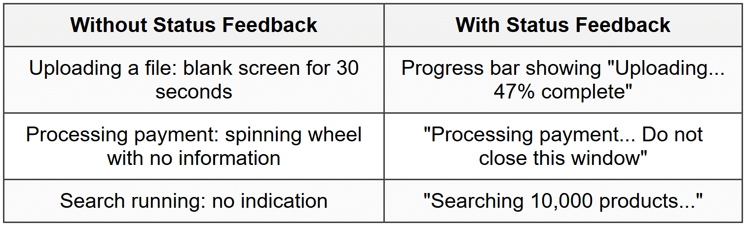
Good system status visibility reduces anxiety and helps users understand whether they should wait or if something has gone wrong.
Error Messages
When something goes wrong, your error messages should be:
- Human-readable: "We couldn't find that email address" instead of "Error 404: User not found in database"
- Specific: Explain exactly what went wrong, not just "An error occurred"
- Actionable: Tell users what they can do to fix the problem
- Polite: Never blame the user ("You entered the wrong password" vs. "That password doesn't match our records")
Simplicity and Clarity
One of the hardest challenges in design is keeping things simple. Simplicity doesn't mean removing features or making things basic-it means removing unnecessary complexity and making the essential elements shine through.
Progressive Disclosure
Progressive disclosure is a strategy for managing complexity by showing only the most important information or options first, and revealing additional details as needed.
Think about a car's dashboard. It always shows critical information: speed, fuel level, warning lights. But detailed trip statistics, settings, and diagnostics are hidden in menus. You can access them when needed, but they don't clutter the primary view.
In digital products, progressive disclosure might look like:
- A "Show more" link that expands to reveal additional details
- Advanced settings hidden under an "Advanced" section
- A simple form that only asks for more information if a certain option is selected
- Tooltips that provide extra information on hover, without cluttering the main interface
Visual Hierarchy
Visual hierarchy guides users' attention to the most important elements first. Using size, color, contrast, and positioning, you can communicate "read this first, then this, then this."
Imagine a newspaper front page. The main headline is largest, images draw the eye, subheadings are medium-sized, and body text is smallest. You immediately know what's most important. The same principle applies to digital design:
- Primary actions (like "Buy Now") should be more prominent than secondary actions (like "Add to Wishlist")
- Page titles should be larger than body text
- Important information should have more visual weight than supplementary details
Content and Clarity
Simple, clear language is crucial for good UX. This means:
- Using common words instead of jargon or technical terms (unless your users are technical)
- Keeping sentences short and direct
- Breaking up long paragraphs into scannable chunks
- Using descriptive labels instead of clever ones (users shouldn't have to guess what "Bazinga!" means)
Example: Instead of "Commence utilization of our revolutionary platform," write "Get started." Your users will thank you.
Accessibility
Accessibility means designing so that people with disabilities can use your product. But here's the beautiful thing: when you design for accessibility, you almost always make the experience better for everyone.
Why Accessibility Matters
Consider that users might have:
- Visual impairments: Blindness, low vision, color blindness
- Hearing impairments: Deafness or partial hearing loss
- Motor impairments: Difficulty using a mouse, tremors, limited dexterity
- Cognitive impairments: Dyslexia, attention disorders, memory issues
- Situational limitations: Bright sunlight making screens hard to read, noisy environments, using one hand while holding a baby
Accessibility isn't a niche concern-it affects millions of people, and at various points in our lives, most of us will experience some form of disability, whether temporary or permanent.
Accessible Design Practices
Key accessibility considerations include:
- Color contrast: Text should have sufficient contrast against its background so it's readable for people with low vision
- Don't rely on color alone: If red means error, also include an error icon or text label
- Keyboard navigation: Everything should be usable with just a keyboard (no mouse required)
- Alternative text: Images should have descriptive text for screen readers
- Captions and transcripts: Videos should have captions for deaf or hard-of-hearing users
- Clear focus indicators: Users should see which element is currently selected when navigating by keyboard
- Flexible text sizing: Users should be able to increase text size without breaking the layout
- Descriptive links: "Click here" tells screen reader users nothing; "Download the product guide" is much better
Many accessibility features benefit all users. Captions help people watching videos in noisy environments or when they need to be quiet. Good contrast helps everyone reading on their phones in bright sunlight. Clear, simple language helps non-native speakers and people in a hurry.
Affordances and Signifiers
These concepts, while sometimes confused, are crucial for creating intuitive interfaces.
Affordances
Affordances are the possible actions that can be performed on an object. A button affords clicking. A text field affords typing. A door handle affords pulling or pushing.
In the physical world, a flat metal plate on a door affords pushing (not pulling), while a handle affords pulling. In digital design, we need to create similar clarity about what actions are possible.
Signifiers
Signifiers are cues that communicate where actions should take place and what those actions are. A signifier tells you an affordance exists.
For example:
- A button's raised appearance (signifier) tells you it can be pressed (affordance)
- An underlined blue text (signifier) indicates you can click it to navigate (affordance)
- A cursor changing to a pointing hand (signifier) shows something is clickable (affordance)
- A text cursor blinking in a field (signifier) indicates you can type there (affordance)
The key is making signifiers clear and unambiguous. Users shouldn't have to wonder what's clickable or how to interact with elements on your page.
Recognition Over Recall
The human brain is much better at recognizing things than recalling them from memory. This principle suggests that you should minimize the information users need to remember.
Recognition vs. Recall
Consider the difference between:
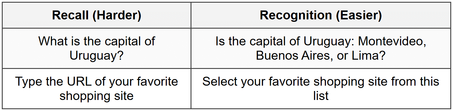
Recognition is easier because you're providing cues that trigger memory, rather than requiring users to retrieve information without help.
Applying This Principle
In design, this means:
- Using dropdown menus instead of requiring typed input when there are predefined options
- Showing previously entered addresses rather than making users type them again
- Displaying visual thumbnails of documents rather than just file names
- Keeping navigation visible rather than hiding it
- Using icons alongside text labels to aid recognition
- Providing search suggestions as users type
Every time you ask users to recall information, you're creating cognitive load. When possible, help them recognize instead.
Flexibility and Efficiency
A well-designed system serves both novice and expert users. Flexibility means providing multiple ways to accomplish tasks, allowing users to choose the method that suits them best.
Accelerators for Expert Users
As users become more experienced with your product, they often want faster ways to accomplish frequent tasks. Common accelerators include:
- Keyboard shortcuts: Power users love being able to press Ctrl+S to save instead of clicking through menus
- Customization: Allowing users to arrange their workspace or choose which features are most prominent
- Bulk actions: Instead of editing items one at a time, allow selecting and editing multiple items
- Recently used items: Providing quick access to frequently or recently accessed content
- Templates and presets: Saving common configurations for quick reuse
The key is that these efficiency features should be available for those who want them, but they shouldn't get in the way of novice users who are still learning the basics.
Multiple Paths to Success
Users have different preferences and mental models. Some prefer navigating through menus, others prefer using search, and still others prefer clicking through categories. When possible, support multiple approaches:
Example: An e-commerce site might let users find products by:
- Browsing category menus
- Using search
- Filtering by attributes (price, brand, rating)
- Viewing curated collections
- Looking at recommended items
Control and Freedom
Users need to feel in control of the interface. They should be able to explore without fear of doing something irreversible, and when they make mistakes (which they will), recovery should be straightforward.
Undo and Redo
Providing undo functionality is one of the most important ways to give users confidence. When people know they can reverse their actions, they're more willing to explore and try things. This leads to both learning and discovery.
Think about the difference between using pencil and pen. With a pencil, you have an eraser-you can experiment freely. With a pen, you're more cautious. Digital interfaces should feel more like pencils.
Clear Exit Paths
Users should always be able to escape from places they didn't intend to be. This means:
- Providing obvious "Cancel" or "Close" buttons
- Not trapping users in modal dialogs without a way out
- Allowing users to go back to previous screens
- Not forcing users through multi-step processes they don't want to complete
Avoiding Forced Actions
Users generally dislike being forced to do things, especially when it feels unnecessary. For example:
- Requiring account creation before letting users browse
- Forcing users to complete their profile before they can use the app
- Auto-playing videos with sound
- Blocking content with newsletter signup forms
While sometimes business requirements demand certain actions, respecting user autonomy and providing clear value exchange leads to better experiences and better outcomes.
Context and Environment
Good UX design considers not just the user, but the context in which they're using your product. The same person might have very different needs and capabilities depending on their environment and situation.
Device Context
Are users on a desktop computer with a large screen, keyboard, and mouse? Or are they on a phone with a small screen, using only their thumbs while standing on a crowded bus?
Context considerations include:
- Screen size: What can comfortably fit? What requires scrolling or multiple pages?
- Input method: Touch targets need to be larger than mouse click targets
- Connection speed: Is the user on fast Wi-Fi or spotty mobile data?
- Orientation: Portrait or landscape viewing?
Situational Context
Beyond device, consider the user's situation:
- Attention level: Are they focused or distracted?
- Time pressure: Do they have time to explore, or do they need something immediately?
- Emotional state: Are they relaxed or stressed?
- Environment: Quiet office or noisy street? Bright sunlight or dark room?
Example: A parking app might be used in several contexts:Each context might require different interface considerations and information priorities.
- At home, planning a trip, with time to compare options (relaxed, focused)
- In a car, looking for immediate parking, perhaps stressed about being late (urgent, distracted)
- Walking to the car later, trying to remember where they parked (moderate urgency)
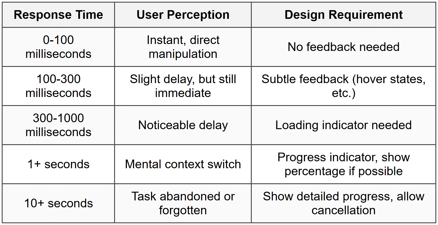
Performance and Response Time
Speed is a UX feature. The performance of your product directly affects the user experience, regardless of how beautiful or well-designed it is otherwise.
Response Time Guidelines
Users have different expectations for response times depending on the action:
Perceived Performance
Sometimes making something feel fast is as important as making it actually fast. Techniques include:
- Optimistic UI: Show the result immediately, then actually save in the background (like Facebook's instant "Like")
- Progressive loading: Show content as it becomes available rather than waiting for everything
- Skeleton screens: Show the layout structure while content loads, so users see progress
- Preloading: Anticipate what users might need next and load it in advance
A site that loads content progressively often feels faster than one that shows a loading spinner for three seconds then displays everything at once-even if the total time is the same.
Emotional Design
While functionality is crucial, the best user experiences also connect emotionally with users. Emotional design considers how your product makes people feel, not just what it helps them do.
The Three Levels of Design
Designer Don Norman described three levels at which design affects us:
- Visceral level: Immediate emotional impact based on appearance. This is the "wow" factor when you first see something beautiful
- Behavioral level: The pleasure (or frustration) of using something. Does it work well? Is it intuitive?
- Reflective level: The meaning and memories associated with the product. Your thoughts about it after use, and the story you tell others
Great UX design works on all three levels. It looks appealing, functions smoothly, and creates positive associations.
Building Trust
Trust is an emotional response that's critical for many products, especially those involving money, personal data, or important decisions. Build trust through:
- Transparency: Being clear about what you're doing with user data, what things cost, what to expect
- Reliability: Working consistently, not losing data, being available when needed
- Professional appearance: Polish and attention to detail signal care and competence
- Human touch: Showing there are real people behind the product, being helpful when things go wrong
Delight and Personality
While not always appropriate, small delightful moments can make a product memorable:
- A friendly animation when completing a task
- Clever, personality-filled copy that makes users smile
- Easter eggs for users who explore
- Celebrating user milestones
However, delight should never come at the expense of usability. A cute animation that plays every time you complete an action becomes annoying the tenth time you see it.
Putting It All Together
These core UX principles don't exist in isolation-they work together to create holistic experiences. In practice, you'll often need to balance competing principles:
- Simplicity vs. Flexibility: How do you keep things simple while still serving power users?
- Consistency vs. Innovation: When should you follow conventions, and when should you try something new?
- Speed vs. Polish: How much time do you spend perfecting details versus shipping quickly and iterating?
The art of UX design lies in understanding these principles deeply enough to know when to emphasize which ones, based on your specific users, context, and goals. There's rarely one "right" answer-but understanding these principles gives you a framework for making thoughtful, user-centered decisions.
As you continue your journey in UX design, you'll find yourself returning to these principles again and again. They're not rules to follow blindly, but rather wisdom accumulated from decades of designers observing what works and what doesn't. Use them as your foundation, but always test your assumptions with real users-they're the ultimate judges of whether your design succeeds.


