Constraints & Responsive Behavior


Constraints & Responsive Behavior
Imagine building a bookshelf that automatically adjusts its size based on the wall space available. If you move it to a smaller wall, the shelves contract gracefully. If you place it in a larger room, it expands to use the available space efficiently. This is exactly what constraints and responsive behavior achieve in design-they create intelligent layouts that adapt to different contexts and screen sizes.
In this document, we'll explore how constraints work, how they enable responsive behavior, and how you can use them to create designs that feel natural across any device or screen size.
Understanding Constraints
At their core, constraints are rules that define how elements relate to each other and to their containers. Think of them as invisible threads connecting different parts of your design, keeping everything organized and proportional even when sizes change.
What Are Constraints?
A constraint is a relationship between two objects that determines positioning and sizing. Instead of saying "this button is exactly 200 pixels from the left edge," constraints let you say "this button is always 20 pixels from the right edge, no matter how wide the screen is."
Consider a simple example:
Without constraints: "Place this image at coordinates (100, 50) with a width of 300px."
With constraints: "Pin this image 20px from the top, 20px from the left, and make it 50% of the container width."
The first approach breaks when the screen size changes. The second approach creates a responsive relationship that works everywhere.
Types of Constraint Relationships
Constraints typically define relationships along two main axes:
- Horizontal constraints - control left-right positioning and width
- Vertical constraints - control top-bottom positioning and height
For an element to be fully constrained, it needs enough information to determine both its position and size in both dimensions.
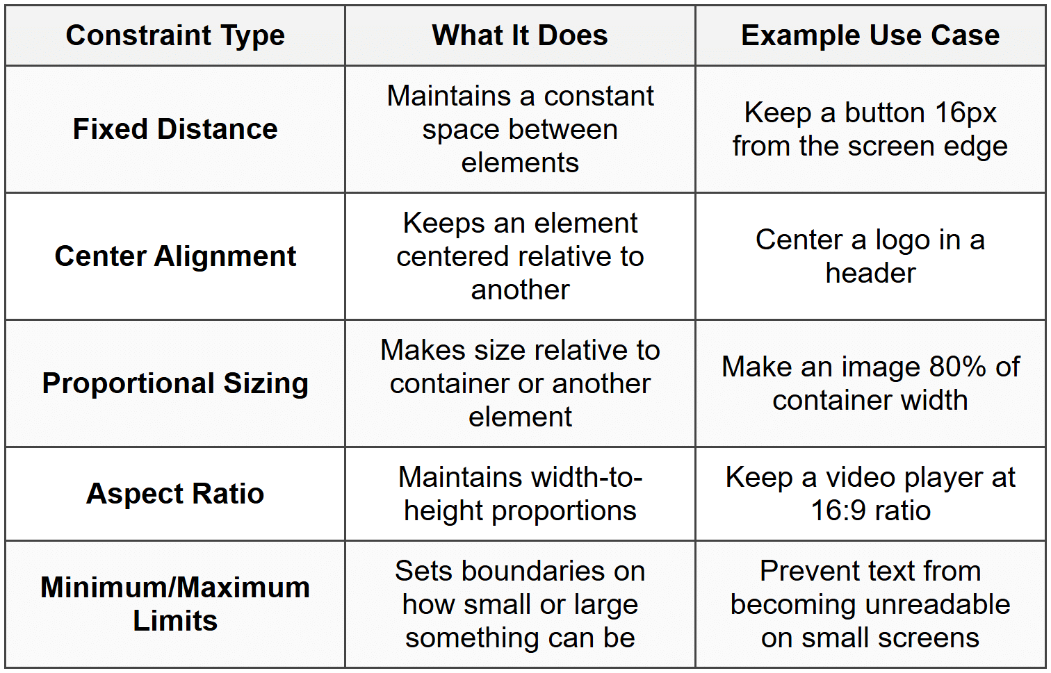
Common Constraint Types
How Constraints Create Position
Positioning with constraints is fundamentally different from traditional fixed positioning. Let's explore how constraints determine where elements appear on screen.
Pinning to Edges
The most basic constraint is pinning-attaching an element to one or more edges of its container. Think of it like pinning a poster to a wall with thumbtacks at specific corners.
When you pin an element to the left edge with a 20px constraint, you're saying: "No matter what happens to the container size, always keep this element 20 pixels from the left edge."
Example: A navigation menu pinned to the top and left edges will stay in the top-left corner even when the browser window resizes.
Opposing Constraints
Things get more interesting when you apply constraints to opposing edges. If you pin an element 20px from the left edge AND 20px from the right edge, the element must stretch or shrink to maintain both relationships.
This is incredibly powerful for responsive design:
- Pin a search bar 30px from both left and right edges → it automatically stretches to fill available width
- Pin a footer 0px from left, right, and bottom → it sticks to the bottom and spans full width
- Pin a sidebar 0px from top and bottom, 200px wide on the left → it creates a fixed-width column that spans full height
Center Positioning
Center constraints align the center point of one element with the center point of another. This is different from using opposing edge constraints, as the element doesn't necessarily stretch-it just stays centered.
You can center an element:
- Horizontally (centered left to right)
- Vertically (centered top to bottom)
- Both (dead center in the container)
Centering is particularly useful for icons, logos, modal dialogs, and loading indicators-elements that should remain visually balanced regardless of screen size.
How Constraints Control Size
Constraints don't just position elements-they also control how elements grow and shrink. This is where responsive behavior truly comes to life.
Fixed Size
The simplest approach is setting a fixed width or height. While this seems to contradict responsive design, fixed sizes have their place:
- Icons that should remain a consistent size for recognition
- Minimum touch targets on mobile devices (usually 44×44 pixels)
- Standardized UI components like checkboxes
However, relying too heavily on fixed sizes creates designs that don't adapt well.
Flexible Sizing with Opposing Constraints
As mentioned earlier, when you constrain opposite edges, the element's size becomes flexible. The element will automatically resize to satisfy both constraints.
Example: A card pinned 20px from the left and 20px from the right will be 40px narrower than its container. On a 375px mobile screen, it's 335px wide. On a 1920px desktop screen, it's 1880px wide.
Percentage-Based Sizing
Many design systems allow you to set sizes as percentages of the container. This creates proportional scaling:
- A hero image at 100% width always fills the container
- Three columns each at 33.33% width create equal divisions
- A sidebar at 25% width and content area at 75% width maintain their proportions
Percentage sizing works hand-in-hand with constraints to create fluid, scalable layouts.
Content-Based Sizing (Hug Content)
Sometimes you want an element to be exactly as large as its content-no more, no less. This is often called hug content or fit content sizing.
Imagine a button with text inside. If the button "hugs" its content:
- The button width adjusts automatically based on text length
- Short labels like "OK" create narrow buttons
- Longer labels like "Continue Shopping" create wider buttons
- The button always has just enough space, no wasted room
Content-based sizing is essential for creating components that work across different languages and content lengths.
Fill Container (Fill)
The opposite of hugging content is filling the container. The element expands to use all available space in the container.
This is commonly used for:
- Background elements that should cover entire areas
- Input fields that should use all available width
- Flexible spacers between fixed-size elements
Minimum and Maximum Constraints
Min/max constraints set boundaries on sizing. They're like guardrails that prevent elements from becoming too small or too large.
Real-world example: A text column might have:
• Minimum width: 280px (prevents text from being cramped on very small screens)
• Maximum width: 700px (prevents text lines from becoming too long to read comfortably)
• Default: 100% width between those limits
This ensures the column is responsive but remains readable at all sizes.
Aspect Ratio Constraints
An aspect ratio constraint maintains the proportional relationship between width and height. This is crucial for media content and certain UI components.
Understanding Aspect Ratios
An aspect ratio is expressed as width:height. Common ratios include:
- 16:9 - Standard widescreen video format
- 4:3 - Traditional screen format, still used for some content
- 1:1 - Perfect square, popular for profile pictures and Instagram posts
- 3:2 - Common photography ratio
- 21:9 - Ultra-widescreen format
Why Aspect Ratios Matter
When you embed a video, display a product image, or create a thumbnail, you often need to scale it responsively while preventing distortion. Aspect ratio constraints solve this perfectly.
Without an aspect ratio constraint:
- Images stretch or squash when containers resize
- Videos appear warped
- Visual elements lose their intended proportions
With an aspect ratio constraint:
- As width changes, height adjusts automatically (or vice versa)
- Content maintains its proper proportions
- Designs look professional at any size
Combining Aspect Ratios with Other Constraints
Aspect ratios work alongside other constraints. For example:
A video player with:
• Width: 100% of container (fills available width)
• Aspect ratio: 16:9
• Maximum width: 1280px
This creates a video player that scales with its container, never distorts, but doesn't grow beyond HD resolution width.
Responsive Behavior Fundamentals
Responsive behavior is what happens when your constrained design encounters different contexts-different screen sizes, orientations, or content amounts. Good responsive behavior feels natural and intentional.
What Makes Behavior "Responsive"?
A truly responsive design doesn't just shrink-it adapts intelligently. Think of water poured into different containers: it doesn't just compress; it takes the shape of each container while maintaining its essential properties.
Responsive design does the same:
- Elements reposition themselves appropriately
- Content reflows to remain readable
- Hierarchies adjust but remain clear
- Interactive elements stay accessible
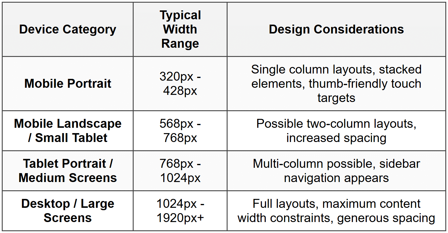
Screen Size Ranges
Different devices present different challenges. While specific pixel values vary, designers typically consider these categories:
Orientation Changes
Mobile devices and tablets can rotate between portrait (tall and narrow) and landscape (short and wide) orientations. Your constraints should accommodate both:
- Portrait orientation often requires stacked, single-column layouts
- Landscape orientation has more horizontal space but less vertical space
- Fixed heights can cause problems in landscape (elements may not fit)
- Flexible constraints that adapt to available space work better
Constraint Strategies for Responsive Design
Let's explore specific strategies for using constraints to create responsive behavior.
Stacking and Wrapping
Stacking means arranging elements vertically, one after another. This is the default responsive strategy for narrow screens where horizontal space is limited.
Wrapping means elements arranged horizontally will drop to a new line when they run out of space, like words in a paragraph.
Example: A row of product cards might display:
• 4 across on desktop (1920px wide)
• 3 across on tablet (1024px wide)
• 2 across on mobile landscape (768px wide)
• 1 stacked vertically on mobile portrait (375px wide)
This happens automatically when cards have minimum width constraints and are allowed to wrap.
Progressive Disclosure
Sometimes the best responsive strategy is to show or hide elements based on available space. This isn't strictly a constraint technique, but it works alongside constraints:
- Full navigation menu on desktop → Hamburger menu icon on mobile
- Visible sidebar on large screens → Hidden sidebar on small screens
- Detailed product information → Condensed summary with expandable details
Flexible Spacing
The space between elements should be just as responsive as the elements themselves. Consider using:
- Fixed minimum spacing - ensures elements never touch (e.g., minimum 8px gap)
- Proportional spacing - grows with container size (e.g., 5% of container width)
- Auto spacing - distributes available space evenly between elements
Spacing constraints prevent designs from feeling cramped on small screens or sparse on large screens.
Scaling Typography
Text needs special consideration in responsive design. While not always controlled by layout constraints, text sizing affects how constraints work:
- Too-small text on mobile devices becomes unreadable
- Fixed text sizes may overflow containers on small screens
- Text that's too large on small screens wastes precious space
Responsive typography often uses:
- Minimum font sizes for body text (typically 16px on mobile)
- Scaled heading sizes that adjust across breakpoints
- Line lengths constrained to 60-80 characters for optimal readability
Constraint Conflicts and Resolution
What happens when constraints contradict each other? Understanding constraint conflicts helps you create more reliable designs.
Types of Conflicts
A constraint conflict occurs when it's impossible to satisfy all constraints simultaneously. Common scenarios include:
- An element with a fixed width of 400px pinned 20px from both edges of a 300px container
- A container told to hug its content but also told to be 500px wide
- Minimum and maximum constraints that overlap (min 600px, max 400px)
Priority and Breaking
Design systems handle conflicts through priority levels. Some constraints are considered "required" while others are "optional" or "preferred."
When a conflict occurs:
- Required constraints are always satisfied
- Optional constraints are broken if necessary
- The system resolves to the closest possible solution
Example: If a button has a minimum width of 100px but is pinned 10px from both edges of an 80px container, the edges pins (if lower priority) might be violated to maintain the minimum width.
Avoiding Conflicts
The best approach is preventing conflicts in the first place:
- Use flexible sizing (hug or fill) instead of fixed sizes when possible
- Don't over-constrain-provide just enough constraints to position and size elements
- Test designs at extreme sizes (very small and very large)
- Use min/max constraints as guardrails rather than exact specifications
- Allow for content variation and overflow
Practical Constraint Patterns
Let's look at common design patterns and how constraints make them responsive.
The Centered Card Pattern
A common pattern is a content card centered in the viewport with margins on the sides.
Constraint setup:
- Card centered horizontally in container
- Card width: 100% with maximum 600px
- Horizontal padding: 20px minimum on each side
Behavior:
- On screens narrower than 640px: card fills width minus 40px padding (20px × 2)
- On screens wider than 640px: card stays at 600px and remains centered
- Result: readable content that doesn't stretch too wide
The Flexible Sidebar Pattern
A sidebar navigation alongside main content.
Constraint setup:
- Sidebar: pinned to left edge, fixed width (250px), fills height
- Main content: pinned 250px from left, 0px from right, fills height
- Alternative mobile: sidebar hidden, main content pinned 0px from both left and right
Behavior:
- Desktop: sidebar visible, content adjusts to remaining space
- Mobile: sidebar hidden or overlays content, main content uses full width
The Responsive Grid Pattern
Multiple items arranged in a grid that adjusts column count based on available width.
Constraint setup:
- Grid items: minimum width 280px, maximum width flexible
- Grid container: allows wrapping
- Gap between items: 16px fixed
Behavior:
- Container width 320px: 1 column (280px item + 20px margins)
- Container width 640px: 2 columns
- Container width 960px: 3 columns
- Items grow slightly to fill available space
The Sticky Header Pattern
A header that remains at the top while content scrolls.
Constraint setup:
- Header: pinned to top, 0px from left and right edges, fixed height (64px)
- Content area: pinned 64px from top (header height), fills remaining height
Behavior:
- Header always spans full width
- Content starts below header regardless of screen width
- Both areas adjust width as viewport changes
The Aspect-Ratio Media Pattern
Responsive images or videos that maintain proportions.
Constraint setup:
- Media container: width 100% of parent, aspect ratio 16:9
- Media element inside: fills container (100% width and height)
Behavior:
- Container width adjusts to parent
- Height automatically calculates to maintain 16:9 ratio
- Media scales proportionally without distortion
Constraints in Nested Structures
Real-world designs involve elements nested inside other elements. Understanding how constraints work through nested hierarchies is crucial.
Parent-Child Relationships
When you constrain an element, it's typically constrained relative to its parent container. The parent's size and position affect all children inside it.
Example hierarchy:
Page (viewport)
→ Container (max 1200px, centered)
→ Header (width 100% of container, height 80px)
→ Logo (pinned left, 20px padding)
→ Navigation (pinned right, 20px padding)
The logo and navigation are constrained to the header, which is constrained to the container, which is constrained to the page. Changes cascade through this hierarchy.
Constraint Propagation
When a parent container resizes:
- The parent's new size is calculated based on its constraints
- Each child recalculates based on its constraints to the parent
- If children have their own children, the process continues recursively
This is how a single viewport resize can appropriately adjust an entire complex layout.
Breaking Out of Constraints
Sometimes you need an element to "break out" of its parent's bounds-like a dropdown menu that extends beyond a navigation bar, or a tooltip that shouldn't be clipped.
This typically involves:
- Positioning the element relative to a different ancestor
- Using absolute positioning instead of constrained positioning
- Allowing overflow to be visible rather than hidden
Testing Responsive Behavior
Creating constraints is only half the battle-you need to verify they work as intended across different scenarios.
What to Test
Comprehensive responsive testing includes:
- Multiple screen widths - from 320px to 1920px and beyond
- Both orientations - portrait and landscape on mobile and tablet sizes
- Content variations - short and long text, few and many items, missing images
- Edge cases - extremely long words, unusual aspect ratios, minimal content
- Zoom levels - users often zoom content, which affects layout
Common Responsive Issues
Watch for these typical problems:
- Text overflow - text extending beyond containers or overlapping other elements
- Squashed elements - images or components compressed to unusable sizes
- Excessive white space - layouts that don't scale up well, leaving large empty areas
- Lost functionality - buttons or links positioned off-screen or too small to tap
- Broken alignment - elements that should align becoming misaligned at certain sizes
- Overlapping content - elements positioned on top of each other unintentionally
Iterative Refinement
Responsive design is rarely perfect on the first try. The process typically involves:
- Design with constraints at your primary target size
- Test at other sizes and identify issues
- Adjust constraints, priorities, or add conditional behavior
- Test again
- Repeat until behavior feels natural at all sizes
Constraints and Auto Layout
Constraints work hand-in-hand with auto layout systems to create truly dynamic, responsive designs. While constraints define relationships and boundaries, auto layout handles the distribution and arrangement of elements within those constraints.
How They Work Together
Think of auto layout as the engine that arranges multiple items, and constraints as the rules that govern how those items behave individually and collectively.
In an auto layout container:
- The container uses constraints to position and size itself within its parent
- Auto layout determines how children are arranged (stacked, distributed, etc.)
- Each child can have constraints that affect spacing, sizing, and positioning
- The combination creates flexible, intelligent layouts
Auto Layout with Flexible Constraints
When children in an auto layout have flexible constraints (hug or fill), the layout becomes highly adaptive:
Example: A button group in a horizontal auto layout:
• Button A: hugs content (adapts to text length)
• Button B: hugs content
• Spacer: fills remaining space
• Button C: fixed width (200px)
As the container resizes, Buttons A and B stay compact, Button C remains 200px, and the spacer grows or shrinks to fill leftover space, pushing Button C to the right.
Nested Auto Layouts
Complex responsive layouts often involve nested auto layouts-auto layout containers inside other auto layout containers, each with their own constraints:
- A vertical auto layout for the overall page structure
- Horizontal auto layouts for navigation bars and button groups
- Grid-based auto layouts for product listings
- Each level responds to its own constraints and the constraints of its children
This nesting creates sophisticated, multi-dimensional responsive behavior from simple, composable rules.
Real-World Application
Let's put all these concepts together by examining how a complete interface uses constraints for responsive behavior.
Example: A Blog Post Layout
Consider a typical blog post page with:
- A header with logo and navigation
- A featured image
- Article content with headings, paragraphs, and images
- A sidebar with related articles
- A footer
Desktop Constraints (1200px+)
Header:
- Pins to top, left, and right edges (0px)
- Fixed height: 80px
- Logo: pinned 40px from left, centered vertically
- Navigation: pinned 40px from right, centered vertically
Main content area:
- Centered horizontally
- Maximum width: 1200px
- Pinned 80px from top (header height)
- Fills remaining height
Featured image:
- Width: 100% of content area
- Aspect ratio: 21:9
- Maximum height: 500px
Article and sidebar:
- Horizontal auto layout with 40px gap
- Article: fills available space, maximum width 750px
- Sidebar: fixed width 300px
Footer:
- Pinned to bottom, left, and right (0px)
- Height: hugs content with minimum 120px
Tablet Constraints (768px - 1199px)
Most constraints remain similar, but:
- Main content area maximum width: 100% with 20px padding each side
- Article: 60% width
- Sidebar: 35% width (proportional instead of fixed)
- Gap between article and sidebar: 20px (reduced)
Mobile Constraints (320px - 767px)
More significant changes:
Header:
- Height: 64px (reduced)
- Navigation: hidden, replaced with menu icon pinned 16px from right
Layout switches to vertical:
- Vertical auto layout (stacking)
- Featured image: aspect ratio 16:9 (taller crop)
- Article: width 100% with 16px padding
- Sidebar: width 100% with 16px padding, appears below article
- All elements stack vertically with 24px gaps
Typography adjustments:
- Maximum line width: unconstrained (uses full width minus padding)
- Images in content: 100% width instead of floated beside text
Behavior During Transitions
As the viewport shrinks from 1200px to 320px:
- Content area narrows until 1200px → then padding takes over
- Sidebar shrinks proportionally alongside article → until 768px → then stacks below
- Header height remains 80px → until 768px → then becomes 64px
- Navigation remains visible → until 768px → then hides behind menu icon
- Spacing reduces gracefully at each breakpoint
The constraints ensure smooth, logical transformations rather than abrupt jumps.
Best Practices for Constraints
As you work with constraints and responsive behavior, these principles will help you create better designs:
Start with Content
Design your constraints around the content's actual needs, not arbitrary screen sizes. Consider:
- What's the minimum space this text needs to be readable?
- How large should this image be to convey information effectively?
- What's the comfortable maximum width for a paragraph?
Mobile First vs. Desktop First
There are two common approaches:
Mobile first: Design constraints for the smallest screen, then add enhancements for larger screens. This often results in cleaner, more focused designs.
Desktop first: Design for large screens, then adapt for smaller ones. This can work well when the desktop experience is primary, but risks over-complicated mobile layouts.
Neither is universally better-choose based on your primary audience and content type.
Use Semantic Spacing
Instead of arbitrary values, use consistent spacing scales. For example:
- 4px, 8px, 16px, 24px, 32px, 48px, 64px
This creates visual rhythm and makes your constraints more predictable and maintainable.
Prioritize Touch Targets
On mobile devices, interactive elements need minimum touch targets:
- At least 44×44 pixels for fingers to accurately tap
- Adequate spacing between tappable elements (at least 8px)
- Constraints should prevent buttons from shrinking below usable sizes
Test with Real Content
Lorem ipsum and placeholder text often hide constraint problems. Test with:
- Actual text in different languages (some languages require more space)
- Very short and very long text strings
- Missing images or delayed loading states
- Real user-generated content (which is often messy and unpredictable)
Embrace Flexibility
The best responsive designs use minimum fixed values and maximum flexibility. Instead of pixel-perfect layouts that break at unexpected sizes, create systems that gracefully adapt to any size.
Document Your Decisions
Complex constraint systems benefit from documentation:
- Why specific breakpoints were chosen
- What happens at edge cases
- Which constraints have priority
- How nested structures should behave
This helps maintain consistency as designs evolve.
Moving Forward
Understanding constraints and responsive behavior is fundamental to modern design. These concepts enable you to create interfaces that work beautifully across the vast landscape of devices, screen sizes, and contexts your users encounter.
As you practice applying constraints:
- Start simple-master basic positioning and sizing before tackling complex nested layouts
- Experiment frequently-try different constraint combinations to understand their effects
- Observe real websites and apps-notice how professional designs respond to different sizes
- Think in relationships-train yourself to see positioning and sizing as relative, not absolute
- Embrace iteration-responsive design rarely works perfectly on the first attempt
The power of constraints lies in their ability to encode design intelligence. Instead of creating separate designs for each possible screen size, you create a single flexible system that responds appropriately to any context. This is the essence of responsive design-not just making things fit, but making them adapt intelligently and maintain their purpose and usability everywhere.


