Creating Interactive Prototypes


Creating Interactive Prototypes
Imagine you're a chef inventing a new dish. Would you serve it at a grand opening without tasting it first? Of course not! You'd create samples, adjust the seasoning, and test different presentations. Similarly, in design, we don't jump straight from an idea to a final product. We create interactive prototypes - working models that let us test, refine, and perfect our designs before investing time and resources into full development.
Interactive prototypes are the bridge between static designs and fully functional products. They allow users to click, swipe, navigate, and experience the design as if it were real, even though it's just a simulation. This chapter will guide you through the process of creating prototypes that bring your designs to life and help you make better design decisions.
Understanding Interactive Prototypes
An interactive prototype is a clickable, navigable simulation of your product that mimics how the final version will work. Unlike static mockups or wireframes that show what screens look like, prototypes demonstrate how the product behaves when someone uses it.
What Makes a Prototype "Interactive"
Think of the difference between a photograph of a bicycle and an actual bicycle you can ride. The photograph shows you what it looks like, but only the real bicycle lets you experience how it works. Interactive prototypes are like that rideable bicycle - they let stakeholders and users experience the flow, feel the interactions, and understand the product's behavior.
Interactive elements in prototypes include:
- Clickable buttons that navigate to other screens
- Form inputs that accept text or selections
- Scrollable content areas that demonstrate information hierarchy
- Hover states that show feedback when users interact with elements
- Transitions and animations that reveal how screens connect
- Gestures like swiping, pinching, or dragging (for mobile designs)
Fidelity Levels in Interactive Prototypes
Not all prototypes need the same level of detail. The fidelity of a prototype refers to how closely it resembles the final product. Understanding fidelity helps you choose the right approach for your stage in the design process.
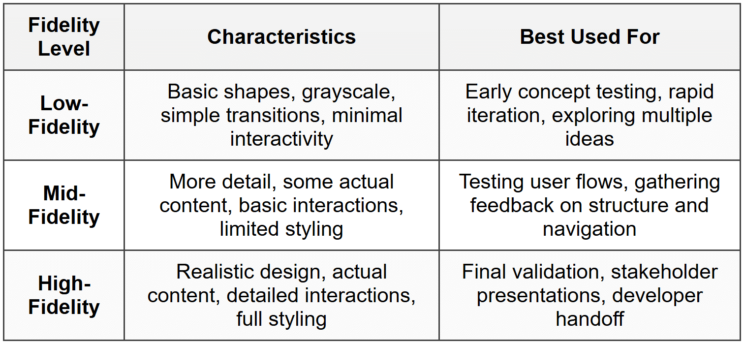
It's like building a house: you start with rough sketches, move to detailed blueprints, and eventually create a fully furnished model home. Each stage serves a different purpose.
Planning Your Prototype
Before you start connecting screens and adding interactions, you need a clear plan. Jumping straight into prototyping without planning is like trying to navigate a new city without a map - you might eventually get where you're going, but you'll waste a lot of time getting lost.
Defining Your Prototype's Purpose
Ask yourself what you're trying to learn or demonstrate with this prototype. Different purposes require different approaches:
- Concept validation: Does this idea solve the user's problem?
- Usability testing: Can users complete key tasks easily?
- Stakeholder buy-in: Will this convince decision-makers to approve the project?
- Technical feasibility: Can developers understand how to build this?
- Design exploration: Which of several approaches works best?
Your purpose determines the fidelity level, which interactions to include, and how much time to invest.
Identifying Key User Flows
A user flow is the path a person takes to complete a specific task in your product. Rather than prototyping every possible screen and interaction, focus on the most important flows that demonstrate core functionality.
For example, in an e-commerce app, key user flows might include:
- Browsing products by category
- Searching for a specific item
- Adding items to cart and checking out
- Creating an account or logging in
- Tracking an order
Start by listing the 3-5 most critical flows for your prototype. Map out the screens involved in each flow and the connections between them. This becomes your roadmap for building the prototype.
Determining Scope and Boundaries
One common mistake is trying to prototype everything. This leads to wasted effort and delays. Instead, be strategic about what you include and what you leave out.
Consider which interactions are:
- Essential: Must be included to demonstrate core functionality
- Important: Add value but aren't absolutely necessary
- Nice to have: Can be omitted without affecting your prototype's purpose
For instance, if you're testing a booking flow, you need functional date pickers and confirmation screens. You probably don't need to prototype the entire settings menu or help documentation.
Building Screen Connections
The foundation of any interactive prototype is connecting screens together. This is where your static designs start to come alive. Think of it like connecting train stations - each screen is a station, and your connections are the tracks that let users travel between them.
Creating Hotspots and Clickable Areas
A hotspot is an area on a screen that triggers an action when clicked. Most prototyping tools let you draw rectangular regions over buttons, links, images, or any other element that should be interactive.
Best practices for creating hotspots:
- Make hotspots the same size as the visual element (button, link, etc.)
- Don't make hotspots too small - users need adequate space to click or tap
- Ensure hotspots don't overlap unless intentionally creating layered interactions
- Use descriptive names for hotspots to keep your prototype organized
For mobile prototypes, remember that fingers are less precise than mouse cursors. Make touch targets at least 44×44 pixels (approximately 7-10mm) to accommodate comfortable tapping.
Linking Screens Together
Once you've defined hotspots, you connect them to destination screens. This creates the navigation structure of your prototype.
Common connection types include:
- Navigate to: Takes the user to a new screen
- Back: Returns to the previous screen
- Open overlay: Displays a modal or popup on top of the current screen
- Close overlay: Dismisses a modal and returns to the underlying screen
- Scroll to: Jumps to a specific section within the same screen
- Swap: Replaces one component with another (useful for showing state changes)
Managing Navigation Patterns
Consistent navigation patterns help users understand and predict how your prototype works. Think about how real products handle navigation:
Example: In most mobile apps, tapping the back arrow in the top-left corner returns you to the previous screen. This is a learned pattern users expect. If your prototype breaks this expectation, users will be confused.
Establish clear navigation rules early:
- How do users move forward through a flow?
- How do they go back?
- What happens when they click the logo or home icon?
- How do they close modals or dismiss popups?
- How do they access the main menu or settings?
Apply these rules consistently across all screens in your prototype.
Adding Interactions and Transitions
Connections tell your prototype where to go; interactions and transitions tell it how to get there. These details transform a basic clickable prototype into an experience that feels realistic and polished.
Understanding Interaction Triggers
An interaction trigger is the user action that initiates a response. Different triggers create different experiences:
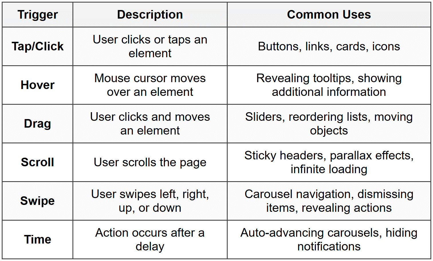
Choose triggers that match real-world expectations. Users expect to click buttons, hover over icons to see tooltips, and swipe through image galleries. Using unexpected triggers creates confusion.
Selecting Appropriate Transitions
A transition is the animation or effect that occurs when moving between screens or states. Transitions aren't just decorative - they help users understand spatial relationships and maintain context.
Common transition types:
- Instant: Screen changes immediately with no animation
- Fade: Old screen fades out while new screen fades in
- Slide: New screen slides in from a direction (left, right, up, down)
- Push: New screen pushes the old screen out of the way
- Dissolve: Gradual blend from one screen to another
- Scale: Screen grows or shrinks during transition
Transitions should reinforce hierarchy and direction:
Guideline: When moving deeper into a hierarchy (like opening a detail page), use a left-to-right slide or push. When going back, reverse the direction with a right-to-left transition. This creates a spatial metaphor users intuitively understand.
Timing and Easing
The speed and acceleration of transitions affect how they feel. Too fast feels jarring; too slow feels sluggish.
Most interfaces use transitions between 200-400 milliseconds. This is fast enough to feel responsive but slow enough for users to perceive the relationship between screens.
Easing refers to how animation speed changes over time:
- Linear: Constant speed throughout (often feels mechanical)
- Ease-in: Starts slow, ends fast (like an object falling)
- Ease-out: Starts fast, ends slow (like an object sliding to a stop)
- Ease-in-out: Starts slow, speeds up, then slows down (feels natural)
For most transitions, ease-out or ease-in-out creates the most natural, responsive feeling.
Micro-interactions
Micro-interactions are small, focused interactions that accomplish a single task and provide feedback. They're the details that make interfaces feel alive and responsive.
Examples of effective micro-interactions:
- A button changes color when you hover over it
- A heart icon fills with color when you favorite something
- A form field shakes when you enter invalid data
- A checkbox displays a smooth checkmark animation
- A "like" counter animates upward when incremented
These small details provide immediate feedback that confirms the user's action was registered. Without them, interfaces feel unresponsive and uncertain.
Simulating Dynamic Content
Real products don't have static content - information changes based on user actions, data, and context. Advanced prototypes simulate this dynamic behavior to create more realistic experiences.
Showing Different States
Most interface elements have multiple states that appear under different conditions:
- Default state: How the element normally appears
- Hover state: Appearance when cursor is over the element
- Active/pressed state: Appearance while being clicked
- Focused state: Appearance when selected for keyboard input
- Disabled state: Appearance when element is not interactive
- Loading state: Appearance while waiting for data
- Error state: Appearance when something goes wrong
- Success state: Appearance when action completes successfully
- Empty state: Appearance when there's no content to display
In your prototype, create separate screens or components for important states, then use interactions to switch between them.
Example: For a form submission, you might create four states: default form, loading spinner (after clicking submit), success message, and error message. Connect these with timed transitions or conditional logic to demonstrate the complete interaction.
Handling User Input
In a real product, forms accept text, dropdowns show selections, and toggles remember settings. While prototypes can't truly process data, you can simulate input behavior:
- Create duplicate screens showing forms with filled-in content
- Use overlays that appear "typed" into a field
- Show different screens based on which option a user selects
- Display toggle states (on/off) using swap interactions
Some advanced prototyping tools offer variables and conditional logic, letting you create more sophisticated simulations where content actually changes based on user actions.
Demonstrating Responsive Behavior
If your design needs to work across different screen sizes, create prototypes for key breakpoints:
- Mobile (320-428px width)
- Tablet (768-1024px width)
- Desktop (1280px+ width)
You don't need to prototype every possible screen size, just the main categories. This shows stakeholders and developers how the design adapts across devices.
Organizing Complex Prototypes
As your prototype grows, organization becomes crucial. A messy prototype is like a cluttered workshop - you'll waste time searching for things and might accidentally break connections.
Structuring Your Screens
Use a clear naming system and logical grouping for screens:
- Number screens sequentially: "01-Home", "02-Product-List", "03-Product-Detail"
- Group by flow: Create sections for onboarding, main features, settings, etc.
- Use descriptive names: "Checkout-Payment-Success" is clearer than "Screen 47"
- Mark variations: "Profile-Empty", "Profile-With-Content", "Profile-Loading"
Many prototyping tools let you create folders or frames to group related screens visually.
Documenting Interactions
Complex interactions can be hard to remember or explain to others. Add notes and annotations directly in your prototype file:
- Explain why certain transitions were chosen
- Note areas that need developer input
- Mark features that are out of scope for this prototype
- Indicate where real data will come from
- Document any special behaviors or edge cases
Creating a Starting Point
When sharing your prototype, make it clear where users should begin. Most tools let you designate a "home" or "start" screen that appears when someone first opens the prototype.
Consider creating a simple table of contents or menu screen that links to different user flows, especially for large prototypes with multiple independent sections.
Testing Your Prototype
Before sharing your prototype with stakeholders or test participants, thoroughly test it yourself. Think of this as a dress rehearsal before opening night.
Walking Through User Flows
Go through each planned user flow from start to finish, checking that:
- All links and buttons work as expected
- Transitions feel smooth and appropriate
- No dead ends exist (screens where users get stuck)
- Back buttons return to the correct previous screen
- Error and success states display properly
- The prototype loads quickly
Testing on Actual Devices
If you're prototyping a mobile app, test on real phones and tablets, not just on your computer. Screen size, touch interactions, and performance can reveal issues invisible on desktop.
Similarly, if designing for desktop, test in an actual browser at typical screen sizes.
Getting Fresh Eyes
After building a prototype, you know exactly how it works - you created it! This makes it hard to spot confusing elements or unclear interactions.
Ask a colleague who hasn't seen the prototype to try using it without any instructions. Watch where they get confused, what they expect to happen versus what actually happens, and where they click things that aren't interactive.
These observations help you identify gaps between your mental model and what users actually experience.
Sharing and Presenting Prototypes
A prototype is only valuable if others can access and understand it. How you share and present your work significantly impacts its effectiveness.
Choosing a Sharing Method
Most prototyping tools offer multiple sharing options:
- Live links: Share a URL that opens the prototype in a browser (easiest for most audiences)
- Embedded prototypes: Place the prototype directly in a webpage or document
- Downloadable files: Let users download and open locally (useful for offline access)
- Presentation mode: Present full-screen for group sessions
Consider your audience: Stakeholders might prefer a simple link, while developers might want access to the full design file.
Providing Context and Instructions
Don't just send a prototype link without explanation. Include:
- Purpose: What should viewers focus on or test?
- Scope: Which features are included vs. out of scope?
- Starting point: Where should they begin?
- Key flows: What paths should they try?
- Known issues: What's intentionally incomplete or simplified?
- Feedback method: How should they share their thoughts?
Facilitating User Testing Sessions
When using prototypes for user testing, set clear expectations:
"This is an early prototype, not a finished product. Some things might not work perfectly, and that's okay - we're testing ideas, not your abilities. Please think aloud as you interact with it, and let me know if anything feels confusing or doesn't work as you expect."
Record the session (with permission) so you can review interactions later. Take notes on:
- Where users hesitate or get confused
- What they expect to happen versus what actually happens
- Features they wish existed but aren't present
- Tasks they complete easily versus those where they struggle
Iterating Based on Feedback
The real value of prototyping comes from iteration - using what you learn to improve the design. Prototypes aren't meant to be perfect the first time; they're meant to reveal problems while they're still easy to fix.
Analyzing Feedback Patterns
After testing or reviews, you'll have a collection of feedback. Some of it will be useful; some will be contradictory or based on personal preference.
Look for patterns:
- If multiple people struggle with the same task, that's a real problem
- If one person mentions something no one else noticed, investigate but don't over-react
- If feedback conflicts, return to your original user research and project goals for guidance
Prioritize feedback that relates to core user needs and business goals over surface-level preferences.
Making Targeted Updates
Rather than rebuilding your entire prototype after each round of feedback, make focused changes that address specific issues:
Example: If users couldn't find the search function, you might make the search icon larger, move it to a more prominent position, or change it from an icon to a labeled button. Test that specific change before making additional modifications.
This targeted approach helps you understand which changes actually improve the experience versus which might accidentally create new problems.
Knowing When to Stop
You could iterate on a prototype forever, but at some point, you need to move forward. Stop prototyping when:
- Users can successfully complete key tasks without confusion
- Stakeholders agree the direction is correct
- Additional testing yields no new significant insights
- You're only making minor aesthetic tweaks rather than functional improvements
- The project timeline requires moving to development
Remember: prototypes are meant to reduce risk and answer questions, not to be perfect. Once you've validated your core assumptions and key interactions, you've achieved the prototype's purpose.
Preparing for Handoff
When your prototype is finalized, it often becomes a reference for developers who will build the real product. Make their job easier by preparing thorough documentation.
Annotating Interaction Details
Developers need to understand not just what happens, but the specific technical details:
- Exact transition duration (e.g., "300ms ease-out")
- Trigger conditions (e.g., "activates on scroll past 200px")
- Animation specifics (e.g., "fade opacity from 0 to 1")
- State change logic (e.g., "button disables after first click until form validates")
- Error handling behavior (e.g., "show error message below field, shake animation 2x")
Documenting Edge Cases
Your prototype likely shows the "happy path" - when everything works smoothly. But real products need to handle edge cases:
- What happens when there's no internet connection?
- How does the interface look with extremely long text?
- What if a user's name has special characters?
- How does the design handle zero results or empty states?
- What if an image fails to load?
Create supplementary screens or notes documenting these scenarios, even if they're not fully prototyped.
Linking to Design Assets
Provide clear connections between your prototype and the detailed design files developers will need:
- High-resolution assets (icons, images, illustrations)
- Typography specifications (fonts, sizes, line heights, weights)
- Color values (hex codes, RGB values)
- Spacing measurements (margins, padding, gutters)
- Component specifications (button styles, form elements, cards)
Many design tools can automatically generate some of this documentation, but review it to ensure completeness and accuracy.
Common Pitfalls to Avoid
Even experienced designers fall into these traps when creating interactive prototypes. Being aware of them helps you avoid wasted time and frustration.
Over-Prototyping
The most common mistake is spending too much time creating a prototype that's far more detailed than necessary. Remember: the goal is to answer questions and test ideas, not to build a pixel-perfect replica of the final product.
Ask yourself: "Will this level of detail help me make better decisions or gather better feedback?" If not, spend your time elsewhere.
Ignoring Technical Constraints
Prototyping tools can simulate interactions that might be difficult, expensive, or impossible to build in real life. Before investing heavily in a particular interaction pattern, consult with developers about feasibility.
It's disappointing to discover that your beautifully prototyped interaction can't actually be built within budget or timeline constraints.
Forgetting About Performance
Just because your prototype runs smoothly on your powerful computer doesn't mean the real product will perform well on users' devices. Consider performance implications:
- Heavy animations might lag on older phones
- Large images slow down loading times
- Complex interactions increase processing requirements
- Multiple simultaneous animations can overwhelm devices
Using Placeholder Content Poorly
Lorem ipsum text and generic placeholder images make prototypes feel fake and can hide real design problems. When possible, use realistic content:
- Actual product names, descriptions, and prices
- Real customer reviews or testimonials
- Authentic photographs rather than stock images
- Genuine data ranges (not just perfect scenarios)
Realistic content helps stakeholders and users connect with the design and often reveals layout or information hierarchy issues invisible with placeholder text.
Not Testing on Real Devices
Looking at a mobile prototype on your desktop screen doesn't give you an accurate feel for the experience. Touch targets that seem fine on a monitor might be too small on a phone. Interactions that work with a mouse might be awkward with a thumb.
Always test mobile prototypes on actual mobile devices before finalizing or presenting them.
Leveraging Prototyping Tools Effectively
While we haven't discussed specific tools by name, understanding general categories and capabilities helps you choose and use prototyping software effectively.
Understanding Tool Categories
Different types of tools excel at different tasks:
- Design-first tools: Start as design tools with prototyping capabilities added. Great for high-fidelity prototypes integrated with visual design work.
- Code-based tools: Use actual code to create prototypes. Offer maximum flexibility and realism but require programming knowledge.
- Specialized prototyping tools: Built specifically for creating interactive prototypes. Often easier to learn and faster for creating complex interactions.
- Presentation tools: Focus on clickable mockups and simple transitions. Good for quick, low-fidelity prototypes.
Learning Advanced Features
Once you're comfortable with basic prototyping, explore advanced capabilities that can make your prototypes more realistic:
- Variables: Store and manipulate data (like form inputs or user preferences)
- Conditional logic: Show different screens based on user actions or stored values
- Components: Create reusable elements that update everywhere when changed
- Animation timelines: Orchestrate complex multi-step animations
- Scroll effects: Create parallax scrolling or sticky elements
- Data binding: Connect design elements to real or simulated data sources
These features require more learning time but can dramatically increase the realism and testing value of your prototypes.
Balancing Tool Learning with Design Work
It's easy to get caught up learning every feature of a prototyping tool. But remember: tools are means to an end. A simple prototype built quickly with basic features is better than no prototype at all because you're still learning advanced techniques.
Learn new tool features when they solve specific problems you're facing, not just because they exist.
Prototyping for Different Contexts
The approach you take to prototyping should adapt based on what you're designing and who you're designing for.
Mobile vs. Desktop Prototypes
Mobile prototypes need special attention to:
- Touch interactions (tap, swipe, pinch, long-press)
- Gesture navigation
- Thumb-friendly placement of important controls
- Portrait and landscape orientations
- Variable screen sizes across devices
Desktop prototypes should consider:
- Hover states and cursor feedback
- Keyboard navigation and shortcuts
- Wider screen real estate and multi-column layouts
- Right-click context menus where appropriate
- Window resizing behavior
B2B vs. Consumer Products
Business software prototypes often need to demonstrate:
- Complex workflows with multiple steps
- Data management and table interactions
- Permission levels and user roles
- Integration points with other business tools
- Reporting and analytics interfaces
Consumer product prototypes might focus more on:
- Emotional appeal and delight
- Onboarding flows for first-time users
- Social features and sharing
- Personalization and recommendations
- Simple, intuitive navigation
Early-Stage vs. Late-Stage Prototypes
Early in a project, prototypes should be quick and disposable. Focus on exploring concepts, testing assumptions, and answering big questions about direction and approach.
Later, prototypes become more refined, serving as specifications for developers and validation for stakeholders. These require more detail, polish, and documentation.
Don't create late-stage prototypes too early - you'll waste time polishing ideas that might change significantly based on testing and feedback.
Integrating Prototypes into Your Design Process
Prototyping isn't a standalone activity - it's most effective when integrated throughout your design workflow.
Prototyping as Exploration
When you're deciding between multiple design directions, create quick low-fidelity prototypes of each option. This helps you feel how they work, not just how they look, making it easier to evaluate their strengths and weaknesses.
This exploratory prototyping is like sketching - quick, messy, and focused on ideas rather than polish.
Prototyping as Validation
Once you have a preferred direction, create a more detailed prototype to validate that it actually solves user problems. This prototype becomes a testing tool, helping you gather evidence that your design works before investing in development.
Prototyping as Communication
Prototypes help communicate your design vision to stakeholders, developers, and other designers. They're more effective than static images because they demonstrate behavior and flow, reducing misunderstandings and aligning everyone's mental models.
Prototyping as Specification
Near the end of the design phase, high-fidelity prototypes serve as interactive specifications for developers. They answer questions about interaction details, timing, transitions, and states that static documentation might miss.
By understanding these different purposes, you can choose the right type of prototype at the right time, maximizing value while minimizing wasted effort.
Creating interactive prototypes is both an art and a skill. Like any craft, you'll improve with practice. Your first prototypes might be simple and rough, but each one teaches you something about interaction design, user behavior, and tool capabilities. Start simple, focus on learning from each prototype you create, and gradually increase complexity as your skills grow. The goal isn't to create perfect prototypes - it's to create useful ones that help you make better design decisions and build better products.


