Designing Navigation Flows


Designing Navigation Flows
Imagine walking through a large shopping mall for the first time. Without clear signs, directories, and pathways, you'd feel lost and frustrated. The same principle applies to digital products. Navigation flows are the invisible pathways that guide users through your application or website, helping them accomplish their goals efficiently and intuitively.
In this document, we'll explore how to design effective navigation flows as part of the prototyping process. You'll learn how to map user journeys, create intuitive pathways, and build prototypes that demonstrate how users move through your design.
Understanding Navigation Flows
A navigation flow is the path a user takes through your digital product to complete a task or achieve a goal. It encompasses every screen, interaction, and decision point along the way. Think of it as choreographing a dance-each step must flow naturally into the next.
What Makes Up a Navigation Flow
Navigation flows consist of several key components:
- Entry points - Where users begin their journey (homepage, landing page, deep link)
- Screens or pages - Individual views users encounter along the way
- Actions - Buttons, links, gestures, or inputs that move users forward
- Decision points - Moments where the path branches based on user choices or conditions
- Exit points - Where users complete their task or leave the flow
Why Navigation Flows Matter in Prototyping
When you create a prototype, you're not just designing static screens-you're designing the experience of moving between them. Navigation flows help you:
- Visualize the complete user journey before building anything
- Identify potential problems or dead ends early
- Communicate your design intent to stakeholders and developers
- Test whether users can actually accomplish their goals
- Make informed decisions about information architecture
Types of Navigation Patterns
Different tasks require different navigation approaches. Understanding common patterns helps you choose the right structure for your users' needs.
Linear Navigation
Linear navigation guides users through a predetermined sequence of steps, one after another. Think of it like following a recipe-you complete step 1, then step 2, then step 3, without skipping around.
Best used for:
- Onboarding experiences
- Checkout processes
- Multi-step forms
- Tutorials or guided tours
- Setup wizards
Example: When signing up for a new email account, you might go through: Enter email → Create password → Verify phone number → Add profile photo → Complete
Hub and Spoke Navigation
In hub and spoke navigation, users return to a central hub (like a home screen or dashboard) before navigating to different sections. It's like a wheel where all paths lead back to the center.
Best used for:
- Mobile apps with distinct feature areas
- Dashboards with multiple tools
- Applications where tasks are independent of each other
Example: A banking app where you return to the home screen between checking your balance, transferring money, or paying bills
Hierarchical Navigation
Hierarchical navigation organizes content in parent-child relationships, like a tree structure. Users drill down into deeper levels of detail and can move back up through the hierarchy.
Best used for:
- E-commerce sites (categories → subcategories → products)
- Content-heavy websites
- File management systems
- Settings menus
Example: An online store: Home → Electronics → Smartphones → Brand → Model → Product Details
Tabbed Navigation
Tabbed navigation allows users to switch between different views or sections at the same hierarchical level without losing their place. It's like having multiple documents open on your desk that you can switch between.
Best used for:
- Displaying related content in different formats
- Comparing information side-by-side
- Mobile apps with 3-5 primary sections
Example: A social media app with tabs for Home, Discover, Notifications, and Profile
Modal or Overlay Navigation
Modal navigation temporarily interrupts the main flow to focus user attention on a specific task. Once completed (or dismissed), users return to where they left off.
Best used for:
- Quick actions that don't require a full page
- Confirmations or warnings
- Login or signup forms
- Filters or sorting options
Mapping User Journeys
Before you can design navigation flows in your prototype, you need to understand what paths users need to take. This starts with mapping user journeys.
Identifying User Goals
Every navigation flow begins with a user trying to accomplish something. Start by asking:
- What does the user want to achieve?
- What's their starting point?
- What information or actions do they need along the way?
- What does success look like?
For example, in a food delivery app, user goals might include:
- Browse restaurants near me
- Order food for delivery
- Track my order status
- Save favorite restaurants
Creating Flow Diagrams
A flow diagram (also called a flowchart or user flow) visually maps out the steps users take to complete a task. It uses simple shapes connected by arrows to show the path.
Common symbols used:
- Rectangles - Screens or pages
- Diamonds - Decision points (yes/no, if/then)
- Arrows - Direction of flow
- Rounded rectangles - Start and end points
Simple flow example for "Order Food":
Start → Open app → Browse restaurants → Select restaurant → Choose items → Add to cart → Review order → Enter delivery details → Confirm payment → Order placed → End
Accounting for Different Scenarios
Real users don't always follow the "happy path"-the ideal scenario where everything goes smoothly. Your navigation flows should account for:
- Alternative paths - Different ways to reach the same goal
- Error states - What happens when something goes wrong (payment fails, no internet connection)
- Edge cases - Unusual but possible situations (empty cart, out of stock items)
- Back navigation - Users changing their minds or correcting mistakes
For instance, in the food ordering flow, consider:
- What if the restaurant is closed?
- What if the delivery address is outside the service area?
- What if the user wants to edit their order before confirming?
- What if payment is declined?
Designing for Clarity and Efficiency
A well-designed navigation flow gets users where they need to go with minimal friction. Here are key principles to guide your design decisions.
The Three-Click Rule (and Why It's Really a Guideline)
You may have heard that users should be able to reach any content within three clicks. While this isn't a hard rule, it highlights an important principle: reduce unnecessary steps.
Instead of counting clicks, ask yourself:
- Is each step necessary and adding value?
- Does the user understand why they're being asked for this information?
- Could we combine steps without overwhelming the user?
- Are we asking for information we already have?
Progressive Disclosure
Progressive disclosure means revealing information and options gradually, as users need them, rather than all at once. This prevents overwhelming users while keeping advanced features accessible.
Example: A photo editing app might show basic adjustments (brightness, contrast) by default, with an "Advanced" button that reveals professional tools (curves, color grading) for users who need them.
Providing Clear Wayfinding
Users should always know:
- Where they are - Clear page titles, highlighted navigation items
- Where they came from - Breadcrumbs, back buttons that work predictably
- Where they can go - Clear labels, visual hierarchy, logical grouping
- How far they've progressed - Progress indicators for multi-step processes
Consistent Navigation Patterns
Once users learn how to navigate one part of your product, those same patterns should work throughout. Don't reinvent navigation for each section.
Keep consistent:
- Placement of navigation elements (top, bottom, side)
- Behavior of back buttons and gestures
- Terminology (don't call the same action different things)
- Visual styling of interactive elements
Building Navigation into Prototypes
Now that you understand navigation patterns and user flows, let's look at how to implement them in your prototypes.
Starting with Low-Fidelity Prototypes
Early in the design process, use low-fidelity prototypes to test navigation concepts quickly. These might be:
- Paper sketches with arrows showing connections
- Whiteboard diagrams mapping the flow
- Simple wireframes with basic clickable areas
At this stage, focus on:
- Getting the overall structure right
- Testing whether the flow makes logical sense
- Identifying missing steps or confusing transitions
Don't worry about visual polish-you're testing the path, not the scenery.
Linking Screens in Digital Prototypes
Most prototyping tools allow you to create hotspots or interactive areas that link screens together. When building these connections:
- Link every interactive element (buttons, links, icons) to appropriate destinations
- Ensure back buttons and navigation menus work from every screen
- Set up conditional logic for decision points (if user selects A, show screen X; if B, show screen Y)
- Test all paths yourself before sharing with others
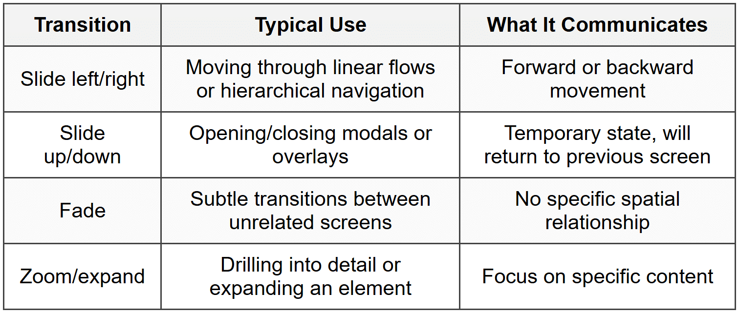
Adding Transitions and Micro-interactions
Transitions are the animations or effects that occur when moving between screens. They serve important navigation purposes:
- Provide continuity - Help users understand the relationship between screens
- Indicate direction - Sliding right suggests going back, sliding left suggests going forward
- Reduce cognitive load - Smooth transitions feel less jarring than abrupt jumps
- Communicate hierarchy - Modals sliding up from the bottom suggest a temporary overlay
Common transition types:
Prototyping Common Navigation Elements
Bottom Navigation Bar (Mobile)
When prototyping a bottom navigation bar:
- Include 3-5 primary sections (more becomes crowded)
- Show the active tab with visual distinction
- Make the navigation bar persistent across screens within the same hierarchy
- Link each tab icon to its respective home screen
Hamburger Menu
For slide-out navigation menus:
- Create the menu as a separate screen or overlay
- Link the hamburger icon to reveal the menu (slide-in from left)
- Link each menu item to its destination
- Provide a way to close the menu (close icon, tap outside, swipe gesture)
- Consider what happens when users navigate from the menu-does it close automatically?
Breadcrumbs
When implementing breadcrumb navigation:
- Show the full path: Home → Category → Subcategory → Current Page
- Make each level clickable except the current page
- Link each breadcrumb to the appropriate screen in your prototype
- Update the breadcrumb trail as users move deeper or back up
Testing Navigation Flows
The true test of your navigation design is whether real users can successfully complete their tasks. Testing prototypes reveals problems you might not notice yourself.
Usability Testing with Prototypes
When testing navigation flows, give participants realistic tasks and observe:
- Can they find the starting point? - Do users know where to begin?
- Do they follow the expected path? - Or do they try alternative routes?
- Where do they hesitate? - Pauses often indicate confusion
- Do they understand their options? - Are labels and buttons clear?
- Can they recover from mistakes? - Is it easy to go back or start over?
- Do they complete the task successfully? - Without needing help
Common Navigation Problems to Watch For
Through testing, look for these red flags:
- Dead ends - Screens with no clear way forward or back
- Circular loops - Users going in circles without making progress
- Unclear labels - Users clicking wrong options because names are confusing
- Missing paths - Users trying to do something that isn't possible
- Unexpected jumps - Transitions that disorient users
- Buried actions - Important options hidden too deep in the hierarchy
Iterating Based on Feedback
Testing isn't just about finding problems-it's about improving your design. After each round of testing:
- Identify patterns - One person's confusion might be unique, but if three people struggle at the same point, that's a problem
- Prioritize issues - Fix navigation blockers before minor refinements
- Propose solutions - Brainstorm multiple ways to address each problem
- Update your prototype - Implement the most promising solution
- Test again - Verify that your changes actually improved the experience
Advanced Navigation Considerations
Deep Linking
Deep linking allows users to jump directly to specific content within your app or site, bypassing the usual navigation hierarchy. This is like having a teleporter instead of walking through all the rooms.
When prototyping with deep links in mind:
- Consider what happens when users land on a deep page (do they have context?)
- Ensure navigation elements work properly regardless of entry point
- Test that users can navigate to related content from deep pages
Gestural Navigation
Mobile devices support various gestures for navigation:
- Swipe left/right - Move between items or screens at the same level
- Swipe down - Refresh content or reveal additional options
- Swipe up from bottom - Access system navigation or additional options
- Pinch - Zoom in/out or collapse/expand
- Long press - Reveal contextual menus or additional actions
When prototyping gestural navigation:
- Make sure gestures feel natural and match platform conventions
- Provide visual feedback when gestures are recognized
- Don't rely solely on gestures-offer button alternatives for discoverability
- Avoid conflicting gestures (two different actions for the same gesture)
Contextual Navigation
Contextual navigation changes based on the user's current situation, previous behavior, or the content they're viewing. This makes navigation feel intelligent and personalized.
Examples:
- A music app suggesting "Play Similar" when you finish an album
- An e-commerce site showing "Frequently bought together" on product pages
- A reading app offering "Continue reading" based on your last session
In prototypes, you can simulate contextual navigation by:
- Creating different versions of screens with personalized suggestions
- Adding conditional logic based on user paths in the prototype
- Including annotations that explain how the system would adapt in the real product
Search as Navigation
For content-rich products, search often becomes the primary navigation method. When prototyping search functionality:
- Show how search is accessed from different screens
- Prototype the search results screen with realistic results
- Demonstrate filtering or sorting options
- Show empty states (no results found) and suggested alternatives
- Consider autocomplete or suggestions as users type
Documentation and Handoff
Your navigation design doesn't end with the prototype. You need to communicate your intentions clearly to developers and stakeholders.
Annotating Navigation Flows
Add annotations to your prototype that explain:
- Interaction details - What triggers each transition
- Conditional logic - When different paths should be shown
- Animation specifics - Duration, easing, direction
- Edge cases - Unusual scenarios developers need to handle
- Platform differences - If navigation works differently on iOS vs. Android
Creating Navigation Specifications
In addition to your prototype, create a document that outlines:
- Navigation hierarchy - Overall structure and relationships between sections
- Primary navigation methods - Tabs, menus, gestures used throughout
- Standard transitions - Default animation types for different navigation actions
- Back button behavior - What happens when users go back from each screen type
- Navigation states - How navigation elements change based on context
Showing All States
Don't just prototype the happy path. Create screens showing:
- Loading states - What users see while content loads
- Empty states - Screens with no content yet (new user, no search results)
- Error states - What happens when things go wrong
- Success confirmations - Feedback after completing actions
Platform-Specific Navigation Patterns
Different platforms have established navigation conventions that users expect. Respecting these patterns makes your product feel familiar and easy to learn.
iOS Navigation Patterns
- Tab bar - Bottom navigation for primary app sections
- Navigation bar - Top bar with back button, title, and actions
- Hierarchical drilldown - Moving deeper with right-to-left transitions
- Modal sheets - Sliding up from bottom for focused tasks
- Swipe from left edge - Standard gesture to go back
Android Navigation Patterns
- Bottom navigation - For 3-5 top-level destinations
- Navigation drawer - Side menu for more extensive navigation
- Top app bar - With hamburger menu or back arrow
- Floating Action Button (FAB) - Primary action accessible from anywhere
- System back button - Hardware or software button that navigates back
Web Navigation Patterns
- Top horizontal navigation - Primary menu across the top
- Mega menus - Dropdown menus with multiple columns for complex sites
- Sidebar navigation - Vertical menu for web applications
- Breadcrumbs - Show hierarchical path
- Browser back/forward - Must work as users expect
Accessibility in Navigation
Navigation must work for everyone, including users with disabilities. Consider these factors when designing navigation flows:
Keyboard Navigation
Users who can't use a mouse rely on keyboard navigation. Ensure:
- All interactive elements can be reached with Tab key
- The focus order follows a logical sequence
- Current focus is clearly visible
- Users can activate elements with Enter or Space
- Users can close modals with Escape key
Screen Reader Support
For users with visual impairments using screen readers:
- Use clear, descriptive labels (not just icons)
- Provide skip links to bypass repetitive navigation
- Announce navigation changes and updates
- Use proper heading hierarchy to indicate structure
- Label navigation landmarks clearly
Motor Impairment Considerations
Users with limited motor control need:
- Large enough touch targets (minimum 44×44 pixels)
- Adequate spacing between interactive elements
- Navigation that doesn't require precise timing or complex gestures
- Alternative ways to access gesture-only features
Practical Tips for Prototyping Navigation
Start Simple, Add Complexity Gradually
Begin with core navigation paths for primary user goals. Once those work well, layer in:
- Alternative paths
- Edge cases
- Error handling
- Advanced features
Use Real Content When Possible
Navigation feels different with realistic content versus placeholder text. Use actual:
- Product names and descriptions
- Real article titles
- Authentic user names
- Realistic quantities and numbers
This helps you spot issues like truncated text, overwhelming choices, or confusing labels.
Test on Actual Devices
Navigation that works on your desktop monitor might feel completely different on a phone. Always test prototypes:
- On the actual device type (mobile, tablet, desktop)
- At the actual size it will be used
- With real fingers, not a mouse cursor
- In realistic environments (bright light, one-handed use, distractions)
Maintain a Navigation Inventory
As your prototype grows, keep track of:
- All screens and their purpose
- Connections between screens
- Unlinked screens that need connections
- Screens that serve similar purposes (consolidate if possible)
Version Your Prototypes
Navigation design is iterative. Save versions so you can:
- Compare different navigation approaches
- Return to previous versions if new ideas don't work
- Show stakeholders the evolution of your design
- Learn from what did and didn't work
Bringing It All Together
Designing navigation flows is about empathy-putting yourself in your users' shoes and creating paths that feel natural and effortless. Great navigation is often invisible; users accomplish their goals without thinking about how they got there.
As you build prototypes, remember that navigation is not just about connecting screens-it's about guiding human beings through an experience. Every button label, every transition, every path you create is an opportunity to reduce frustration and create moments of clarity.
Start with user goals, map out clear paths, choose appropriate navigation patterns, prototype with realistic interactions, and test relentlessly with real users. Your navigation design will evolve through iteration, and each version will teach you something new about how people move through digital spaces.
The skills you develop in designing navigation flows extend far beyond individual projects. You're learning to think systematically about user experience, to anticipate needs and problems, and to craft solutions that work for diverse audiences. These are the foundations of thoughtful, user-centered design.


