Creating Typography Hierarchy


Creating Typography Hierarchy
Imagine walking into a busy train station. Your eyes immediately find the large departure boards, then scan for your platform number, and finally read the smaller details about delays or gate changes. You didn't need anyone to tell you what to read first-the size and weight of the text did that for you. This is typography hierarchy at work, and it's one of the most powerful tools in a designer's toolkit.
Typography hierarchy is the system of organizing text so that readers instinctively know what's most important, what to read next, and how all the information relates to each other. In user interfaces, where people are often scanning quickly or looking for specific information, a well-designed hierarchy can mean the difference between a delightful experience and a frustrating one.
Understanding the Purpose of Hierarchy
Before diving into the techniques, let's understand why hierarchy matters so much in interface design. When you present text to a user, you're essentially asking them to process information. Without hierarchy, all text appears equally important-which means nothing feels important at all.
The Scanning Behavior
Users don't read interfaces the way they read books. Research shows that people scan web pages and apps in predictable patterns, looking for landmarks that help them navigate the content. Typography hierarchy creates these landmarks. Consider these key user behaviors:
- Selective attention: Users focus on what appears most prominent
- Goal-oriented scanning: People look for specific information, not reading everything
- Quick decisions: Users decide within seconds whether content is relevant
- Mental modeling: Visual hierarchy helps users understand the structure and relationships of information
Think of hierarchy as a tour guide for your content. Without it, your users are wandering through a museum with no map, no signs, and no sense of where to start.
Levels of Information
Most interfaces contain multiple levels of information that need to be distinguished from one another. A typical hierarchy includes:
- Primary information: The most important message or action (headlines, key data, primary buttons)
- Secondary information: Supporting details that provide context (subheadings, descriptions, metadata)
- Tertiary information: Additional details, fine print, or supplementary content (captions, footnotes, timestamps)
Each level should be visually distinct enough that users can immediately tell them apart, but still harmonious enough that they feel like part of the same design system.
The Tools of Typography Hierarchy
Creating effective hierarchy isn't about randomly making things bigger or bolder. It's about using specific typographic properties in deliberate, coordinated ways. Let's explore each tool in detail.
Size: The Most Powerful Tool
Size is perhaps the most intuitive way to create hierarchy. Larger text naturally draws the eye first. However, using size effectively requires more nuance than simply making headlines huge.
Establishing a Scale
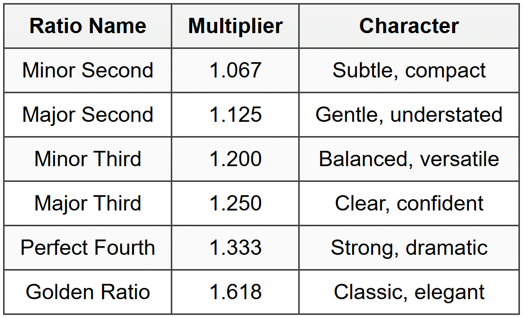
Professional designers use type scales-systematic progressions of sizes that create harmony and predictability. A common approach is to use ratios to determine sizes. For example:
Example Type Scale (1.25 ratio - Major Third):
Base size: 16px
Level 1: 16px × 1.25 = 20px
Level 2: 20px × 1.25 = 25px
Level 3: 25px × 1.25 = 31px
Level 4: 31px × 1.25 = 39px
Level 5: 39px × 1.25 = 49px
This mathematical approach ensures that your sizes feel related rather than arbitrary. Common ratios used in design include:
Practical Size Guidelines
While scales provide structure, you also need practical starting points for interface design:
- Body text: 14px to 18px for comfortable reading on screens
- Small text: 12px to 14px for captions and metadata (be careful going smaller-readability suffers)
- Subheadings: 1.2 to 1.5 times your body text size
- Headings: 1.5 to 2.5 times your body text size
- Display text: 2.5 times and above for hero sections and major callouts
Weight: Adding Emphasis Without Size
Font weight refers to the thickness of the letterforms. Most typefaces offer multiple weights, typically ranging from thin (100) to black or ultra (900). Weight is incredibly useful because it can create distinction without requiring more space.
Standard weights and their typical uses:
- Light (300): Large display text, elegant headlines where legibility isn't compromised
- Regular (400): Body text, the foundation of your typography
- Medium (500): Slightly emphasized text, subheadings in some designs
- Semibold (600): Strong emphasis, secondary headings, button labels
- Bold (700): Primary headings, important keywords, strong calls-to-action
- Heavy/Black (800-900): Major display headlines, use sparingly
A common mistake is jumping from regular to bold with nothing in between. Modern typefaces with multiple weights give you nuance. You might use regular for body text, medium for captions that need slight emphasis, semibold for subheadings, and bold for main headings.
Real-world example: In a product card, you might use:
• Product name: Semibold, 18px
• Price: Bold, 24px (most important information)
• Description: Regular, 14px
• Category tag: Medium, 12px
Color and Contrast: The Subtle Hierarchy Tool
Color isn't just about aesthetics-it's a powerful hierarchy tool. By varying the contrast between text and background, you can make some text recede and other text advance, all without changing size or weight.
Creating Depth with Color
Think of color in hierarchy as creating layers of depth:
- Primary text: Highest contrast (e.g., black or very dark gray on white)
- Secondary text: Medium contrast (e.g., medium gray on white)
- Tertiary text: Lower contrast (e.g., light gray on white)
Instead of using pure black (#000000) for text, many designers use dark grays like #1a1a1a or #2d2d2d for a softer appearance. Then secondary text might be #666666, and tertiary text #999999.
Accessibility Considerations
While creating hierarchy with color, you must maintain readability. The Web Content Accessibility Guidelines provide minimum contrast ratios:
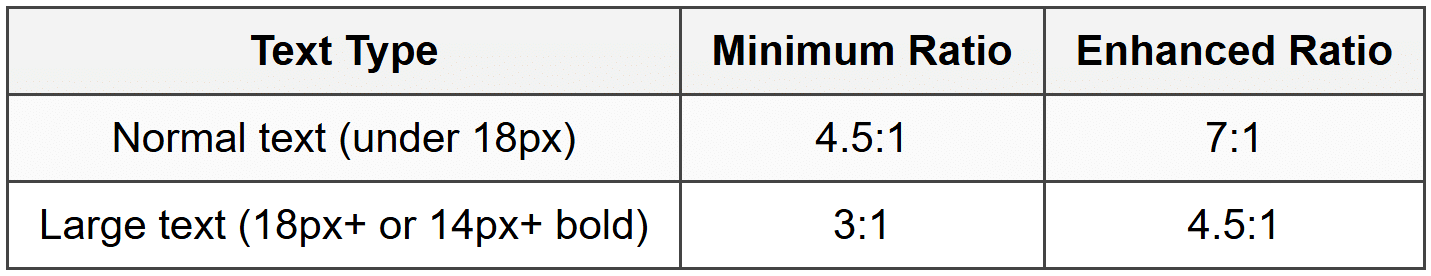
This means your tertiary, low-emphasis text still needs enough contrast to be readable. Never sacrifice accessibility for aesthetic-you can create hierarchy through other means if contrast becomes an issue.
Spacing: The Invisible Hierarchy Tool
White space-or negative space-is often overlooked, but it's one of the most elegant ways to create hierarchy. By controlling the space around and between text elements, you can group related information and separate distinct sections.
Vertical Spacing Principles
The space between elements communicates their relationship:
- Tight spacing (small gap): Elements are closely related
- Medium spacing: Elements are in the same section but distinct
- Large spacing: Elements belong to different sections
Practical application:
• Space between a heading and its paragraph: 8-12px
• Space between paragraphs: 16-24px
• Space between sections: 40-64px or more
A useful rule: the space before a heading should be larger than the space after it. This creates a visual connection between the heading and the content it introduces.
Line Height (Leading)
The vertical space between lines of text affects both readability and hierarchy. Different types of text benefit from different line heights:
- Body text: 1.4 to 1.6 times the font size (140-160% line height)
- Headings: 1.1 to 1.3 times the font size (tighter spacing emphasizes the headline as a unit)
- Small text: 1.5 to 1.7 times the font size (more space compensates for smaller size)
Longer lines of text need more line height to help the eye track back to the start of the next line. Shorter lines can use less line height.
Case and Capitalization
How you capitalize text subtly affects hierarchy and readability:
- Sentence case: Most readable, best for body text and most interfaces
- Title Case: Traditional for headings, feels formal
- ALL CAPS: Strong visual presence but harder to read, use sparingly for labels or short headings
- lowercase: Casual, friendly, but can seem unprofessional if overused
All caps text is harder to read because we recognize word shapes, and capitalization removes the distinctive ascenders and descenders that make words recognizable. If you use all caps, consider increasing letter-spacing (tracking) by 0.03 to 0.05em to improve readability.
Typeface Selection and Pairing
Using different typefaces can create hierarchy, but this requires care. Too many typefaces create chaos rather than clarity. A common approach is to use two typefaces: one for headings and one for body text.
Effective Pairing Strategies
When pairing typefaces for hierarchy:
- Contrast in personality: A serif for headings with a sans-serif for body (or vice versa) creates clear distinction
- Contrast in weight: A bold display face for headings with a lighter face for body text
- Same family, different weights: Using one typeface family but varying weights and styles (simplest and often most cohesive approach)
Many interfaces successfully use a single typeface family with multiple weights. For example, using a sans-serif like Inter or SF Pro across an interface, with weights from Regular (400) to Bold (700), creates a cohesive hierarchy without the complexity of pairing different typefaces.
Combining Tools for Effective Hierarchy
The real art of typography hierarchy is combining these tools harmoniously. Rarely will you use just one tool in isolation. Instead, you'll layer them to create clear, elegant distinction.
The Principle of Contrast
Effective hierarchy requires sufficient contrast between levels. The principle is simple: make different elements very different, not just slightly different. Subtle differences confuse users, making them wonder if the distinction is intentional or accidental.
Consider these two approaches:
Weak Contrast:
Heading: 18px, Semibold
Body: 16px, Regular
Strong Contrast:
Heading: 28px, Bold
Body: 16px, Regular
The weak contrast requires users to look carefully to distinguish the heading. The strong contrast makes the hierarchy instantly obvious.
Layering Multiple Variables
You can combine size, weight, color, and spacing to create distinct levels. A typical article layout might look like this:
Article Title:
• Size: 36px
• Weight: Bold (700)
• Color: Dark gray (#1a1a1a)
• Space below: 16px
Article Subtitle:
• Size: 20px
• Weight: Regular (400)
• Color: Medium gray (#666666)
• Space below: 32px
Section Heading:
• Size: 24px
• Weight: Semibold (600)
• Color: Dark gray (#1a1a1a)
• Space above: 40px
• Space below: 12px
Body Text:
• Size: 16px
• Weight: Regular (400)
• Color: Dark gray (#2d2d2d)
• Line height: 1.5
• Space below: 16px
Caption:
• Size: 14px
• Weight: Regular (400)
• Color: Medium gray (#666666)
• Space below: 8px
Notice how each level uses multiple tools working together. The article title is large, bold, and dark. The subtitle is medium-sized, regular weight, and lighter in color-creating clear secondary status without competing with the title. Body text is comfortable for reading, while captions are smaller and lighter, signaling their supplementary nature.
Consistency Creates Understanding
Once you establish hierarchy rules, apply them consistently throughout your interface. If all your section headings are 24px semibold with 40px space above, users will quickly learn to recognize that pattern. Inconsistency forces users to relearn the hierarchy on every screen, creating cognitive load.
This is why design systems and style guides are so valuable-they ensure hierarchy remains consistent across an entire product.
Hierarchy in Different Interface Contexts
Different types of interfaces have different hierarchy needs. Let's explore how to adapt hierarchy principles to common scenarios.
Navigation and Menus
Navigation systems need clear hierarchy to help users understand their options and current location. Consider a typical app navigation:
- Current page: Bold or medium weight, high contrast color
- Other navigation items: Regular weight, medium contrast
- Secondary navigation: Smaller size, lighter color
- Breadcrumbs or path indicators: Small, light, possibly with separators
The hierarchy should make the current location obvious while keeping other options visible and accessible.
Forms and Input Fields
Forms benefit from clear hierarchy between labels, input fields, help text, and error messages:
Form Field Label: Medium weight, clear contrast, positioned above or beside the input
Input text: Regular weight, high contrast for entered text
Placeholder text: Regular weight, low contrast to distinguish from entered text
Help text: Smaller size, medium contrast, positioned below the input
Error message: Small to medium size, bold or semibold, colored (usually red), positioned prominently
Error messages might break the normal hierarchy by using color to draw attention, ensuring users can't miss important feedback.
Cards and List Items
Cards pack multiple pieces of information into compact spaces, making hierarchy especially important. A product card might prioritize:
- Product name: Largest or boldest text
- Price: Bold or colored to stand out
- Key features: Medium size and weight
- Metadata (ratings, reviews, shipping): Smallest, lightest
The hierarchy reflects what users need to make decisions. In a music player card, the song title might be primary, with the artist name secondary, and the duration tertiary.
Data Tables
Tables present structured data where hierarchy helps users scan and compare information:
- Column headers: Bold or semibold, possibly all caps with letter spacing, clearly separated from data
- Primary data: Regular or medium weight, clear contrast
- Secondary data: Smaller or lighter, providing context
- Row separators: Subtle lines or spacing to group information
Some table cells might contain more important information (like totals or names) and can be made bold to create hierarchy within the table itself.
Buttons and Calls-to-Action
Buttons often need hierarchy to distinguish primary actions from secondary or tertiary ones:
- Primary button: Solid background, high contrast, bold text
- Secondary button: Outlined or ghost style, medium contrast
- Tertiary button: Text-only, appears as a link, lower emphasis
The typography inside buttons should be clear and readable, typically medium to semibold weight. Button text is often slightly smaller than body text but more prominent due to its container.
Common Mistakes and How to Avoid Them
Even experienced designers sometimes create hierarchy problems. Being aware of common pitfalls helps you avoid them.
Too Many Hierarchy Levels
Creating too many distinct levels confuses users rather than helping them. If you have six or seven different text styles on a single screen, the hierarchy becomes unclear. Aim for three to five distinct levels at most.
If you find yourself needing many levels, consider whether you can simplify the content structure itself. Perhaps some information can be combined or removed.
Insufficient Contrast Between Levels
When hierarchy levels are too similar, users can't distinguish between them. This often happens when designers make timid adjustments-increasing size by just 2px or using a weight that's barely heavier.
The solution: be bold with your distinctions. If you're going to make something bigger, make it noticeably bigger. If you're using weight to create hierarchy, skip from regular to semibold or bold, not to medium.
Using Too Many Tools at Once
You don't need to use every tool for every hierarchy level. Making a heading large, bold, colored, all caps, and in a different typeface is overkill. Two or three tools combined thoughtfully usually suffice.
The principle: use enough differentiation to be clear, but no more than necessary.
Ignoring Reading Flow
Hierarchy isn't just about making things different-it's about guiding users through content in a logical order. A common mistake is making secondary information more prominent than primary information simply because of its placement or treatment.
Always ask: what should users read or notice first? Second? Third? Then design your hierarchy to support that sequence.
Neglecting Mobile Considerations
Hierarchy that works on desktop might fail on mobile devices. Large headlines that look impressive on a wide screen might cause awkward line breaks on a phone. Very small tertiary text might become unreadable on smaller screens.
Consider responsive typography: adjusting sizes, weights, and spacing based on screen size. Your type scale might be more compressed on mobile, with less dramatic jumps between levels.
Overusing Color for Hierarchy
While color can support hierarchy, relying on it exclusively creates problems. Users with color blindness might not perceive the distinctions, and when content is printed or displayed in grayscale, the hierarchy disappears.
Always ensure your hierarchy works in grayscale first, then add color as an enhancement.
Testing and Refining Hierarchy
Creating effective hierarchy isn't a one-and-done process. It requires testing, observation, and refinement.
The Squint Test
A simple but effective technique: squint your eyes while looking at your design (or blur the screen if possible). When details become fuzzy, hierarchy becomes more obvious. You should still be able to distinguish different levels and understand the content structure.
If everything looks the same when squinted, your hierarchy is too weak. If some unexpected element stands out, it might be receiving too much emphasis.
The Five-Second Test
Show your design to someone for five seconds, then ask them what they remember. What did they notice first? Second? Third? Their answers reveal whether your hierarchy is working as intended.
If testers consistently miss important information or focus on the wrong elements, your hierarchy needs adjustment.
Reading Order Verification
Follow the visual weight of elements to see where your eye naturally travels. Does this path match the intended reading order? If your eye jumps around randomly or gets stuck, the hierarchy needs work.
Accessibility Testing
Use browser tools or dedicated software to verify contrast ratios. Check how your hierarchy works with screen readers. Ensure that your visual hierarchy is supported by proper HTML semantic structure (H1, H2, H3 tags, etc.).
A/B Testing
When possible, test different hierarchy approaches with real users. Track engagement, comprehension, and task completion. Data can reveal which hierarchy choices are most effective for your specific audience and context.
Building a Hierarchy System
Rather than making hierarchy decisions ad hoc, create a systematic approach you can apply consistently.
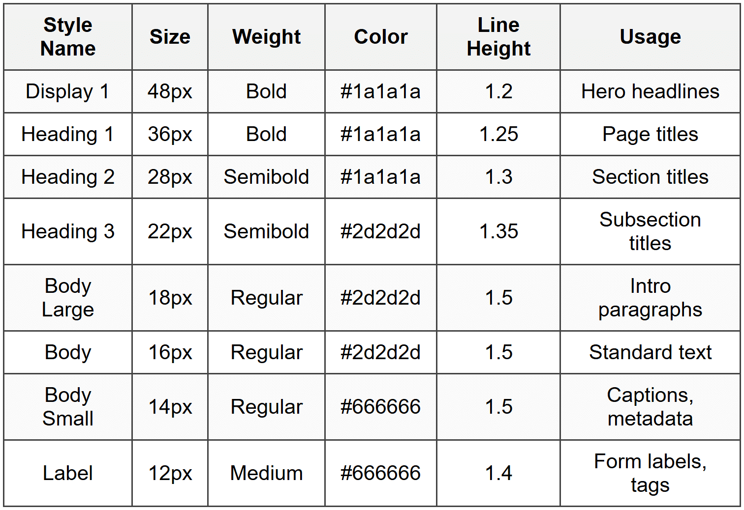
Document Your Type Scale
Create a clear reference showing all your text styles with their specific properties. This might look like:
Establish Spacing Rules
Define standard spacing values for consistency. Many designers use a base unit (often 4px or 8px) and create all spacing as multiples of that unit:
Spacing Scale (8px base unit):
xs: 8px
sm: 16px
md: 24px
lg: 32px
xl: 48px
xxl: 64px
Then establish rules like "section headings get xl spacing above and sm spacing below" or "paragraph spacing is sm."
Create Application Guidelines
Write down when to use each style. For example:
- Use Heading 1 only once per page for the main page title
- Use Heading 2 for major sections
- Use Heading 3 for subsections within those sections
- Use Body Large for introductory paragraphs or emphasis
- Use Body Small for supplementary information that's less critical
These guidelines prevent arbitrary style choices and ensure consistency across your interface.
Practical Examples of Hierarchy in Action
Let's look at how hierarchy works in specific, real-world scenarios.
Blog Post or Article
An article needs clear hierarchy to help readers navigate and understand content structure:
Article Title (Display/H1): 40px, Bold, Dark
Communicates the main topic immediately
Publication Date and Author (Metadata): 14px, Regular, Medium gray
Provides context without competing with the title
Intro Paragraph (Body Large): 18px, Regular, Dark
Slightly larger to draw readers in
Section Heading (H2): 28px, Semibold, Dark
Breaks content into scannable chunks
Body Paragraphs (Body): 16px, Regular, Dark
Comfortable reading experience
Subsection Heading (H3): 22px, Semibold, Dark
Organizes content within sections
Pull Quote: 24px, Regular or Medium, Accent color
Creates visual interest and emphasis
Captions (Small): 14px, Regular, Medium gray
Describes images without distracting
E-commerce Product Page
Product pages prioritize information that drives purchasing decisions:
Product Name: 32px, Bold, Dark
Clear identification of the product
Price: 28px, Bold, Dark or Accent color
Critical information for decision-making
Sale Price: 28px, Bold, Red or Green
Original Price: 20px, Regular, Strike-through, Medium gray
Shows value when on sale
Rating and Reviews: 14px, Medium, with star icons
Social proof without overwhelming
Short Description: 16px, Regular, Dark
Key product benefits
Specifications: 14px, Regular, Medium gray
Technical details for informed buyers
Call-to-Action Button: 16px, Semibold or Bold
Prominent and action-oriented
Shipping Info: 14px, Regular, Medium gray
Important but secondary information
Dashboard or Analytics View
Dashboards display data that users need to scan and compare quickly:
Page Title: 32px, Bold, Dark
Identifies the dashboard view
Metric Value: 36px, Bold, Dark or Colored
The most important data point
Metric Label: 14px, Medium, Medium gray
Explains what the number represents
Change Indicator: 16px, Semibold, Green or Red
Shows trends or changes
Time Period: 12px, Regular, Light gray
Contextual information
Card Heading: 18px, Semibold, Dark
Organizes different data sections
Table Headers: 14px, Semibold, Dark
Table Data: 14px, Regular, Dark
Structured data presentation
Responsive Hierarchy
Hierarchy must adapt to different screen sizes while maintaining its effectiveness. This is where responsive typography comes in.
Scaling Down for Mobile
On smaller screens, you typically need to:
- Reduce the overall type scale (smaller jumps between levels)
- Increase line height slightly to compensate for smaller screens
- Reduce the number of hierarchy levels displayed at once
- Adjust spacing to fit more content while maintaining breathing room
A heading that's 36px on desktop might become 28px on mobile. The relationship between heading and body text remains, but the absolute sizes shrink.
Viewport-Based Scaling
Some designers use viewport units (vw) or CSS clamp functions to create fluid typography that scales smoothly between minimum and maximum sizes. This ensures text remains proportionate across all screen sizes without awkward breakpoints.
Prioritization on Small Screens
Mobile screens have limited space, so hierarchy becomes even more critical. You might hide or de-emphasize tertiary information on mobile, using interaction (like accordions or tabs) to reveal it when needed. The visual hierarchy helps users understand what's most important in the limited space available.
Cultural and Contextual Considerations
Typography hierarchy isn't universal-it must adapt to cultural contexts and reading patterns.
Reading Direction
Left-to-right languages (English, Spanish, etc.) and right-to-left languages (Arabic, Hebrew) create different scanning patterns. Your hierarchy should account for these differences, particularly in the placement and alignment of primary information.
Character Density
Some languages require more space for the same content. German words are often longer than English equivalents, while Chinese characters pack more information into less space. Your type scale might need adjustment when localizing interfaces to maintain appropriate hierarchy across languages.
Industry and Audience Expectations
Different industries have different typography conventions. Financial applications might use more conservative, traditional hierarchy with lots of structure. Creative industry tools might use more dramatic, expressive hierarchy. Understanding your audience's expectations helps you create appropriate hierarchy.
The Relationship Between Hierarchy and Accessibility
Good typography hierarchy supports accessibility in multiple ways.
Screen Reader Compatibility
Visual hierarchy should be supported by proper HTML semantic structure. Using H1, H2, H3 tags correctly allows screen readers to understand and communicate the content structure to visually impaired users. Your visual design should reinforce what the code structure already communicates.
Cognitive Load Reduction
Clear hierarchy reduces cognitive load for all users, but especially benefits people with cognitive disabilities, attention disorders, or who are simply tired or distracted. When information structure is obvious, users can process content more easily.
Readability for All
The size, contrast, and spacing decisions in your hierarchy affect readability for users with low vision, dyslexia, or other reading challenges. Generous spacing, adequate size, and high contrast aren't just aesthetic choices-they're accessibility requirements.
Typography hierarchy is both an art and a science. It requires understanding principles and rules, but also developing sensitivity to how type feels and flows. As you practice creating hierarchy, you'll develop an intuition for what works-when to make something bolder, when to add space, when to use color.
The key is to always remember the purpose: guiding your users through content in a way that feels natural, effortless, and clear. When hierarchy works well, users don't notice it-they just find information easily and understand it quickly. That invisible effectiveness is the mark of excellent typography design.
Start with the fundamental tools-size, weight, color, spacing-and combine them thoughtfully. Test your work, get feedback, and refine. Over time, you'll build a personal understanding of hierarchy that serves your users and enhances every interface you create.


