Designing Inclusive Interfaces


Designing Inclusive Interfaces
Imagine walking into a building where the only entrance has a steep staircase. If you're using a wheelchair, carrying heavy luggage, or pushing a stroller, that building suddenly becomes inaccessible to you-not because you lack ability, but because the design failed to consider your needs. The same principle applies to digital interfaces. When we design inclusively, we create experiences that work for the widest possible range of people, regardless of their abilities, circumstances, or the technology they use.
Inclusive design isn't about creating separate experiences for different groups of people. Instead, it's about building one experience that accommodates human diversity from the start. This approach benefits everyone-not just people with permanent disabilities, but also those with temporary impairments (like a broken arm), situational limitations (like bright sunlight on a screen), or simply different preferences and contexts.
Understanding Disability and Diversity
Before we dive into design techniques, we need to shift our perspective on what disability means. Traditional views often see disability as a personal limitation, but modern thinking recognizes that disability emerges from the mismatch between a person and their environment.
The Spectrum of Ability
Human ability exists on a spectrum that changes throughout our lives and even throughout a single day. Consider vision: some people are born blind, others develop low vision over time, some experience temporary vision problems after eye surgery, and still others face situational vision challenges when trying to read a phone screen in bright sunlight. All of these scenarios require thoughtful design solutions.
We can categorize ability differences into three types:
- Permanent - Long-term conditions such as blindness, deafness, or mobility impairments
- Temporary - Short-term conditions like a broken bone, eye infection, or recovery from surgery
- Situational - Context-driven limitations like holding a baby (one-handed use), being in a loud environment, or having a slow internet connection
This framework helps us understand that accessibility features benefit far more people than we might initially assume. Captions designed for deaf users also help people watching videos in quiet libraries. Voice controls created for people with motor impairments help drivers keep their eyes on the road. Large touch targets that assist people with tremors also help anyone using a phone while walking.
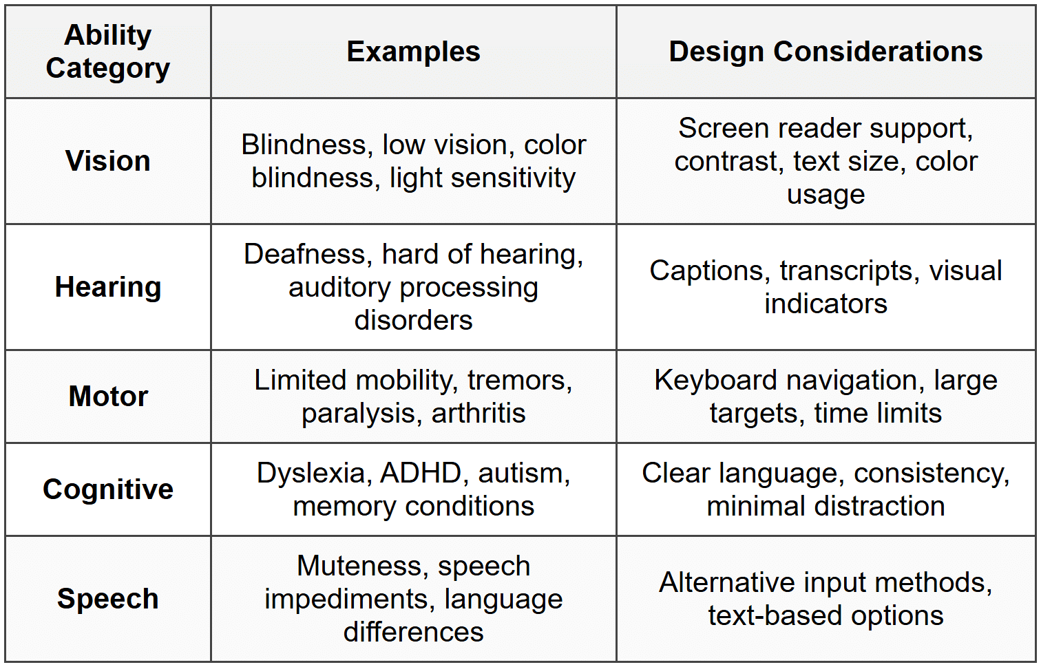
Categories of Abilities to Consider
When designing inclusive interfaces, we need to consider several categories of human ability:
Perceivable Design
The first principle of inclusive design is that information must be perceivable-users must be able to perceive the content and interface elements you present. If something is invisible or inaudible to a user, it might as well not exist.
Visual Accessibility
Visual accessibility goes far beyond simply making things bigger. It's about ensuring that visual information can be perceived by people with varying levels of vision, including those who use assistive technologies.
Color and Contrast
Color is a powerful design tool, but relying on color alone creates barriers. About 8% of men and 0.5% of women have some form of color vision deficiency (commonly called color blindness). Moreover, people with low vision need sufficient contrast to distinguish elements.
Key principles for color usage:
- Never use color as the only means of conveying information - If an error message is shown only in red text, someone who can't distinguish red won't recognize the error
- Maintain sufficient contrast ratios - Normal text should have at least a 4.5:1 contrast ratio against its background; large text needs at least 3:1
- Consider different types of color blindness - Test your designs using color blindness simulators to see how they appear to people with different types of color vision deficiency
- Use multiple visual cues - Combine color with icons, patterns, text labels, or position to convey meaning
Example: Instead of showing form validation with just red text for errors and green for success, add icons (✗ for errors, ✓ for success) and descriptive text that explains the issue. This ensures everyone understands the message regardless of color perception.
Text and Typography
Text is one of the most accessible forms of content because it can be transformed-enlarged, read aloud by screen readers, converted to braille, or translated. However, the way we present text matters enormously.
Typography best practices for inclusivity:
- Use relative sizing units - Allow text to scale when users adjust browser settings; avoid fixed pixel sizes that prevent resizing
- Maintain readable line lengths - Lines that are too long (over 80 characters) or too short (under 45 characters) are harder to read
- Provide adequate line spacing - Lines that are too close together blend visually; spacing of at least 1.5 times the text size improves readability
- Choose legible fonts - Some decorative fonts are beautiful but difficult to read, especially for people with dyslexia
- Left-align text for left-to-right languages - Justified text creates uneven spacing that can be disorienting for some readers
Images and Non-Text Content
Images, icons, graphs, and other non-text content need text alternatives so that people using screen readers or those unable to load images can access the same information.
The key is providing alternative text (alt text) that conveys the purpose and meaning of the image:
- Informative images - Describe what the image shows and why it matters
- Functional images (like buttons or links) - Describe what happens when activated, not what the image looks like
- Decorative images - Use empty alt text (alt="") so screen readers skip them
- Complex images (like charts or diagrams) - Provide both brief alt text and a longer description nearby
Example: For a search button with a magnifying glass icon:
Poor: alt="magnifying glass"
Better: alt="Search"
The user doesn't need to know what the icon looks like; they need to know what it does.
Auditory Accessibility
Any audio content must have visual alternatives. This isn't just for people who are deaf or hard of hearing-it also benefits people in quiet environments, those learning a new language, or anyone who prefers reading to listening.
- Captions - Synchronized text that includes dialogue and important sound effects
- Transcripts - Full text versions of audio content that users can read at their own pace
- Visual indicators - Don't rely solely on sounds for notifications or feedback; include visual cues
Good captions include not just dialogue but also speaker identification and non-speech information like "[door slams]" or "[tense music playing]" that provide context.
Operable Design
An interface is only truly accessible if people can actually operate it-interact with controls, navigate through content, and complete tasks. This requires thinking beyond the mouse and touchscreen.
Keyboard Accessibility
Many people cannot use a mouse or touchscreen. Some use only a keyboard, others use specialized input devices that emulate keyboard commands, and some use voice control or other assistive technologies that rely on keyboard-accessible interfaces.
Fundamental keyboard accessibility principles:
- All functionality must be keyboard accessible - Every action available by mouse should also work via keyboard
- Provide visible focus indicators - Users need to see which element currently has focus as they navigate with the Tab key
- Follow logical tab order - Focus should move through the interface in a sequence that makes sense, typically left-to-right and top-to-bottom
- Include skip links - Allow users to bypass repetitive content like navigation menus to reach main content quickly
- Avoid keyboard traps - Users should always be able to move focus away from any element using only the keyboard
Common keyboard shortcuts that users expect:
- Tab - Move focus forward through interactive elements
- Shift + Tab - Move focus backward
- Enter or Space - Activate buttons and links
- Arrow keys - Navigate within components like dropdown menus or radio button groups
- Escape - Close dialogs or cancel actions
Touch and Pointer Targets
For people with motor impairments, arthritis, tremors, or even just large fingers, small touch targets are extremely difficult or impossible to use accurately. But larger targets benefit everyone, especially on mobile devices.
Guidelines for touch targets:
- Minimum size - Make touch targets at least 44 × 44 pixels (about 9mm), which is roughly the size of an average fingertip
- Adequate spacing - Provide space between targets to prevent accidental activation of adjacent controls
- Expandable hit areas - The clickable/tappable area can be larger than the visible button or link
Timing and Motion
Time limits, animations, and moving content can create significant barriers for people who need more time to read, understand, or interact with content.
- Avoid automatic time limits when possible - If timeouts are necessary, warn users and provide easy ways to extend time
- Allow users to pause, stop, or hide moving content - Automatically playing carousels, scrolling text, or animations should be controllable
- Provide options to reduce motion - Some users experience dizziness or nausea from animations; respect the "prefers-reduced-motion" setting
- Don't trigger motion automatically - Unexpected movement can be disorienting or cause vestibular issues
Example: When designing a session timeout, don't just log users out after 10 minutes of inactivity. Instead, show a warning dialog at 9 minutes that says "Your session will expire in 1 minute. Would you like to continue?" with clear "Yes" and "No" buttons and no time limit on responding to that dialog.
Understandable Design
Information and interfaces must be understandable. This goes beyond just being technically accessible-content needs to be clear, predictable, and presented in ways that help users comprehend it.
Clear Language
Writing clearly benefits everyone, but it's essential for people with cognitive disabilities, those learning the language, and anyone unfamiliar with the subject matter.
Principles for clear communication:
- Use plain language - Choose simple, everyday words over jargon or technical terms when possible
- Keep sentences and paragraphs short - One idea per sentence makes content easier to process
- Define specialized terms - When technical language is necessary, explain it clearly
- Use active voice - "Click the button" is clearer than "The button should be clicked"
- Provide context - Don't assume users understand abbreviations, acronyms, or references
Consistent and Predictable Interfaces
When interfaces behave consistently and predictably, users can build mental models of how things work. This reduces cognitive load and prevents confusion.
- Use standard conventions - Follow established patterns for navigation, form design, and common interactions
- Be consistent within your interface - If a red button means "delete" in one place, it should mean "delete" everywhere
- Make similar things look similar - If multiple elements behave the same way, they should look the same
- Provide clear labels - Button text like "Submit" or "Cancel" is clearer than "OK" or "Done"
- Maintain consistent navigation - Keep menus and navigation in the same place on every page
Input Assistance and Error Prevention
Errors frustrate everyone, but they can be particularly challenging for users with cognitive disabilities. Good design helps prevent errors and makes recovery easy.
Strategies for better form design:
- Label every input clearly - Users should never have to guess what information to enter
- Provide clear instructions - Explain format requirements before users enter data, not after they make mistakes
- Use appropriate input types - Date pickers for dates, number inputs for numbers-this provides better mobile keyboards too
- Make error messages helpful - "Invalid date" is unhelpful; "Please enter date as MM/DD/YYYY" guides users to success
- Identify errors clearly - Point to exactly which field has a problem and explain how to fix it
- Allow error correction - Before users submit irreversible actions, let them review and confirm
Example: When a user enters an invalid email address:
Poor: "Error in form"
Better: "Email address is invalid. Please enter a valid email like name@example.com"
The better message identifies the problem field, explains what's wrong, and shows the expected format.
Robust and Compatible Design
Interfaces must be robust enough to work reliably with current and future technologies, including assistive technologies like screen readers, voice control software, and alternative input devices.
Semantic HTML
Using HTML elements according to their intended purpose (their semantics) is fundamental to creating accessible interfaces. Semantic HTML provides meaning that assistive technologies can understand and convey to users.
Key semantic elements and their purposes:
- Headings (h1-h6) - Create a clear content hierarchy; screen reader users often navigate by headings
- Buttons (<button>) - For actions like submitting forms or triggering functions
- Links (<a>) - For navigation to other pages or locations
- Lists (ul, ol, dl) - Group related items so screen readers can announce "list with 5 items"
- Forms and labels - Properly associate labels with form inputs so users know what each field is for
- Landmark regions - Elements like <nav>, <main>, <aside>, and <footer> help users understand page structure
Common mistakes to avoid:
- Using <div> or <span> for everything - These have no semantic meaning; use appropriate elements instead
- Creating buttons from <div> elements - This removes built-in keyboard support and screen reader announcements
- Skipping heading levels - Don't jump from h1 to h4; maintain a logical hierarchy
ARIA: Enhancing Accessibility
ARIA (Accessible Rich Internet Applications) is a set of attributes that can be added to HTML to provide additional information to assistive technologies. ARIA is particularly useful for complex interactive widgets that don't have native HTML equivalents.
The first rule of ARIA is: Don't use ARIA if native HTML can do the job. A real button element is better than a div with ARIA making it act like a button.
When ARIA is needed, common attributes include:
- aria-label - Provides a text label for elements that don't have visible labels
- aria-describedby - Links to additional descriptive text
- aria-expanded - Indicates whether a collapsible element is open or closed
- aria-live - Announces dynamic content changes to screen reader users
- role - Defines what an element is (like role="navigation" or role="dialog")
Example: For a custom accordion component:
<button aria-expanded="false" aria-controls="panel1">
Section Title
</button>
<div id="panel1" hidden>
Panel content...
</div>
The aria-expanded attribute tells screen readers whether the panel is open, and aria-controls indicates which panel the button controls.
Testing with Assistive Technologies
The only way to truly know if your interface is accessible is to test it with the tools that people actually use. This includes:
- Screen readers - Software that reads content aloud (like NVDA, JAWS, or VoiceOver)
- Screen magnifiers - Tools that enlarge portions of the screen
- Voice control - Software that allows operation entirely by voice commands
- Keyboard-only navigation - Trying to use your interface without a mouse
Even basic testing can reveal major issues. Try navigating your interface using only the Tab key and Enter. Can you reach everything? Is the focus visible? Does the order make sense?
Inclusive Design Patterns
Let's explore specific design patterns and how to implement them inclusively. These are common interface elements that appear in countless applications.
Forms and Data Entry
Forms are critical touchpoints where accessibility problems often emerge. An inaccessible form can prevent users from signing up, purchasing products, or accessing services.
Best practices for accessible forms:
- Always use label elements - Every input needs a label that's programmatically associated with it
- Group related fields - Use fieldset and legend for groups like address or payment information
- Indicate required fields clearly - Don't rely on color or asterisks alone; include the word "required" in the label
- Provide helpful placeholder text sparingly - Placeholders disappear when typing starts and are often hard to read; they're not a substitute for labels
- Make error messages specific and actionable - Tell users exactly what went wrong and how to fix it
Navigation and Menus
Navigation is how users move through your interface. Accessible navigation ensures everyone can find and reach the content they need.
- Provide multiple navigation methods - Include a search function, site map, and clear menu structure
- Make the current location clear - Use breadcrumbs and highlight the current page in navigation menus
- Ensure dropdown menus work with keyboard - Users should be able to open, navigate, and close menus without a mouse
- Keep navigation consistent - Don't change the location or structure of navigation between pages
Modal Dialogs
Modal dialogs interrupt the user's workflow to focus attention on something important. They must be implemented carefully to remain accessible.
Accessible modal requirements:
- Trap focus within the modal - When open, keyboard navigation should cycle through only the modal's contents
- Move focus to the modal when it opens - Usually to the first interactive element or the close button
- Return focus when closed - Focus should return to the element that triggered the modal
- Allow easy dismissal - The Escape key should close the modal
- Provide a clear close button - Don't make users hunt for how to dismiss the dialog
- Use appropriate ARIA roles - role="dialog" or role="alertdialog" helps screen readers understand the context
Data Tables
Tables are excellent for presenting structured data, but they can be confusing for screen reader users if not properly marked up.
- Use actual table elements - Don't fake tables with divs and CSS
- Include table headers - Use <th> elements with scope attributes to identify row and column headers
- Provide a caption - Use <caption> to give the table a title
- Keep tables simple - Avoid merged cells and nested tables when possible
Cultural and Linguistic Inclusion
Inclusive design extends beyond disability to encompass cultural diversity, language differences, and global perspectives.
Internationalization and Localization
Designing for a global audience requires thinking about how content will adapt to different languages and cultural contexts.
- Design for text expansion - Translated text can be 30-50% longer than English; leave room for growth
- Support right-to-left languages - Languages like Arabic and Hebrew read from right to left
- Avoid text in images - Text in images is difficult to translate and can't be resized
- Use appropriate date and number formats - Different regions use different formats for dates, times, and currency
- Be mindful of cultural symbols and colors - Symbols and colors carry different meanings in different cultures
Literacy and Education Levels
Not everyone reads at the same level. Some users may have limited literacy, may be children, or may be reading in a second language.
- Supplement text with visuals - Icons, illustrations, and images can support comprehension
- Break content into digestible chunks - Use headings, lists, and short paragraphs
- Provide definitions and explanations - Don't assume familiarity with specialized terms
- Offer content at multiple reading levels - When possible, provide simplified versions of complex content
Practical Implementation Strategies
Understanding inclusive design principles is just the beginning. Implementing them effectively requires integrating accessibility into your entire design and development process.
Start with Accessibility
Accessibility is far easier and cheaper to build in from the start than to retrofit later. Make it part of your initial planning and design phase.
- Include accessibility in requirements - Make accessibility a defined project requirement, not an afterthought
- Consider diverse users in personas - Include users with disabilities in your user research and personas
- Annotate designs with accessibility notes - Document heading levels, alt text, keyboard behavior, and ARIA requirements in design specs
Test Early and Often
Regular testing catches problems when they're still easy to fix.
- Automated testing - Use tools to catch common issues like missing alt text or low contrast
- Manual testing - Use keyboard navigation, screen readers, and other assistive technologies
- User testing - Include people with disabilities in your user testing
- Regular audits - Schedule periodic accessibility reviews to maintain standards
Document and Share Knowledge
Build organizational knowledge about accessibility so it becomes part of your team's culture.
- Create pattern libraries - Document accessible implementations of common components
- Develop style guides - Include accessibility guidelines in your design system
- Share learnings - When you solve an accessibility challenge, document it for others
- Provide training - Help team members understand why accessibility matters and how to implement it
The Business and Ethical Case
Inclusive design isn't just the right thing to do-it's also good for business and often legally required.
Reaching More Users
Over one billion people worldwide have some form of disability. That's a significant audience that inaccessible designs exclude. Beyond permanent disabilities, accessible design benefits:
- Older adults with age-related changes in vision, hearing, or motor control
- People with temporary injuries or illnesses
- Anyone in challenging situations (bright sunlight, noisy environments, slow connections)
- Users of diverse devices and assistive technologies
Legal Requirements
Many countries have laws requiring digital accessibility. In the United States, the Americans with Disabilities Act (ADA) applies to websites. The European Union has the European Accessibility Act. Other regions have similar legislation. Failure to comply can result in lawsuits and significant penalties.
Better for Everyone
Features designed for accessibility often benefit all users. Captions help people in loud or quiet environments. Keyboard shortcuts speed up interactions for power users. Clear language and simple layouts reduce cognitive load for everyone. Good contrast improves readability for all users, not just those with low vision. This concept-that accessible design improves experiences universally-is sometimes called the "curb cut effect," named after how sidewalk curb cuts designed for wheelchairs help people with strollers, luggage, bicycles, and more.
Moving Forward
Designing inclusive interfaces is an ongoing practice, not a one-time checkbox. Technology evolves, standards improve, and we continuously learn more about how diverse users interact with our designs.
The key is to build empathy and awareness into your design process. Think about the person who can't see your carefully chosen colors, the person who can't use a mouse, the person who needs more time to process information, or the person using a screen reader to navigate your interface. When you design with these real people in mind-not as edge cases but as valued users-you create better experiences for everyone.
Start small if you need to. Pick one aspect of accessibility to focus on, learn it well, implement it consistently, and then build from there. Test your interfaces with keyboard navigation. Run them through accessibility checkers. Learn to use a screen reader. Every step toward greater inclusivity makes your work more valuable and more usable.
Remember that inclusive design is fundamentally about respect-respect for human diversity, respect for different ways of interacting with technology, and respect for every person's right to access information and services. When we design inclusively, we acknowledge that there's no single "normal" way to be human, and we create digital spaces that welcome everyone.


