Mobile UX Basics


Mobile UX Basics
Welcome to the world of mobile user experience design! As you begin your journey into mobile app design, understanding the fundamentals of mobile UX is essential. Mobile devices have become the primary way many people interact with digital products, and designing for these small, touch-based screens requires a unique approach that differs significantly from desktop design.
In this document, we'll explore the core principles and practices that make mobile experiences intuitive, efficient, and delightful. Think of mobile UX design as creating a conversation between the user and the device-one that should feel natural, responsive, and considerate of the user's context and needs.
Understanding the Mobile Context
Before diving into specific design principles, it's crucial to understand how people use mobile devices differently from desktop computers. This context shapes every decision you'll make as a mobile UX designer.
The Mobile Mindset
Mobile users are often:
- On the move - using apps while walking, commuting, or waiting in line
- Distracted - surrounded by environmental stimuli and interruptions
- Task-focused - looking to accomplish specific goals quickly
- Impatient - expecting instant responses and minimal friction
- One-handed - frequently operating the device with a single hand
Imagine someone checking a weather app while rushing to catch a bus. They don't want to navigate through multiple screens or decipher complex interfaces-they need the temperature and forecast immediately. This scenario exemplifies the mobile context: users need information quickly, with minimal effort, often in less-than-ideal conditions.
Physical Constraints
Mobile devices present unique physical limitations that directly impact UX design:
- Screen size - Limited real estate means prioritizing content ruthlessly
- Touch targets - Fingers are less precise than mouse cursors
- Network connectivity - Users may experience varying connection speeds
- Battery life - Heavy processes drain power quickly
- Environmental factors - Glare, movement, and ambient noise affect usability
Core Mobile UX Principles
Simplicity and Focus
The cardinal rule of mobile UX is simplicity. With limited screen space and users who are often multitasking, every element on the screen must earn its place.
Progressive disclosure is a technique where you reveal information gradually, showing only what's necessary at each step. Think of it like a conversation where you don't overwhelm someone with all the details at once-you provide information as it becomes relevant.
Example: A food delivery app might first show you restaurant options, then reveal the menu when you select a restaurant, followed by customization options only after you choose a dish. Each screen presents one clear decision point.
Clarity Over Cleverness
While creative interfaces can be tempting, mobile UX prioritizes clarity and familiarity. Users shouldn't need to figure out how your interface works-the interaction should feel natural and obvious.
Consider standard patterns:
- A hamburger menu (three horizontal lines) indicates a navigation menu
- A magnifying glass icon represents search functionality
- A heart icon typically means "favorite" or "like"
- A shopping cart indicates e-commerce functionality
These conventions exist because users have learned them across many apps. Deviating from established patterns creates cognitive load-the mental effort required to understand and use your interface.
Immediate Feedback
Mobile interfaces must respond to user actions instantly. When someone taps a button, they need visual confirmation that their action registered. This is like the satisfying "click" feeling when pressing a physical button-it confirms the action succeeded.
Feedback mechanisms include:
- Visual changes - buttons changing color when pressed
- Animations - smooth transitions between states
- Haptic feedback - subtle vibrations confirming actions
- Sound effects - audio cues for important actions
- Progress indicators - showing that processes are underway
Touch Interface Design
Understanding Touch Targets
Unlike mouse cursors that can be pixel-precise, human fingers are relatively large and imprecise input tools. This fundamental difference shapes how we design interactive elements for mobile.
The generally accepted minimum touch target size is 44 × 44 pixels (or approximately 7-10mm). This ensures that most users can comfortably and accurately tap elements without frustration. Think of this like designing doorknobs-they need to be large enough for hands of various sizes to grip comfortably.
Thumb Zones
When holding a phone, certain areas of the screen are easier to reach than others. This concept, called thumb zones, divides the screen into three areas:
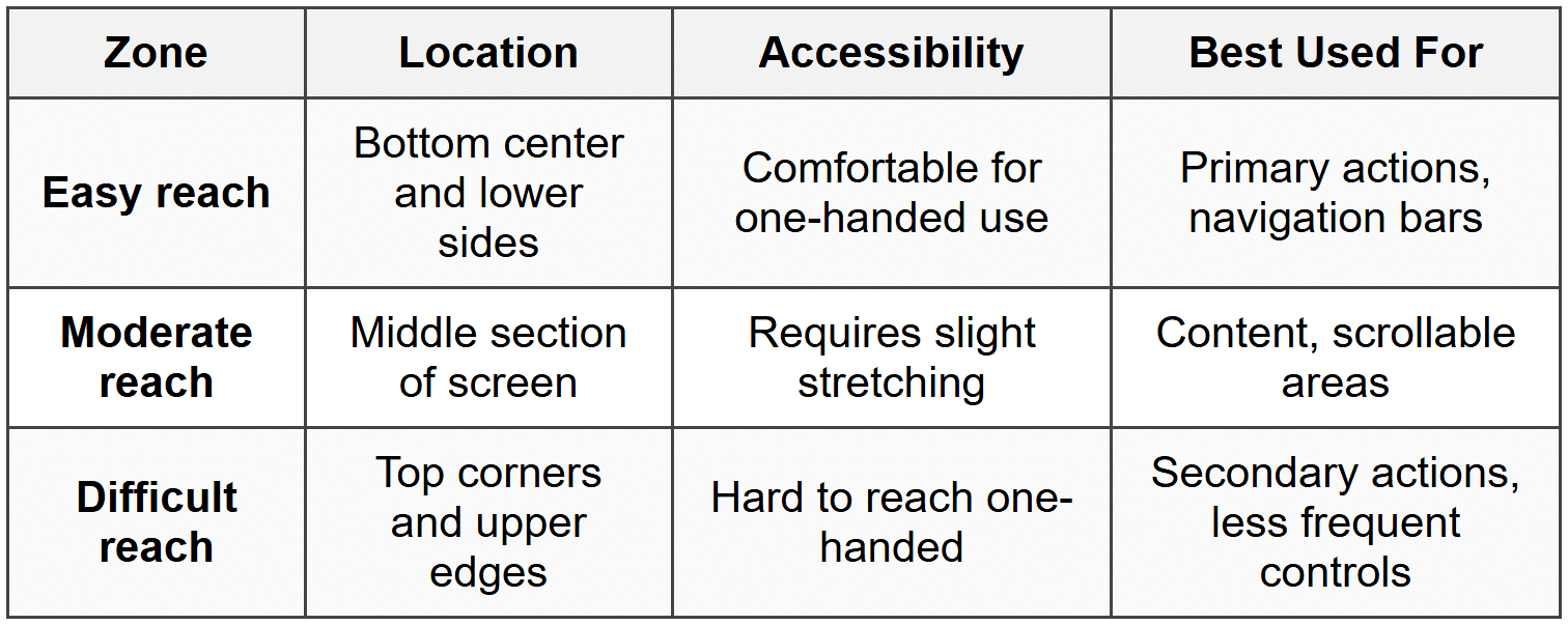
This is why many apps place navigation tabs at the bottom of the screen rather than the top-it's simply easier for users to reach. Social media apps typically position their main navigation (home, search, profile) in this easy-reach zone.
Gesture Design
Touch interfaces support various gestures beyond simple taps. Each gesture has become associated with specific actions through widespread adoption:
- Tap - Select, activate, or open
- Double-tap - Zoom in or like (context-dependent)
- Long press - Reveal additional options or enter edit mode
- Swipe - Navigate, dismiss, or reveal hidden content
- Pinch - Zoom in (spread fingers) or out (pinch together)
- Pull to refresh - Update content by dragging down from the top
When implementing gestures, ensure they're discoverable-users should either intuitively understand them or be gently taught through onboarding or visual cues.
Navigation Patterns
Common Navigation Structures
Navigation in mobile apps requires careful consideration because screen space is limited. You can't display everything simultaneously like on a desktop website. Here are the most common navigation patterns:
Tab Bar Navigation
A tab bar displays 3-5 main sections as icons with labels at the bottom (or sometimes top) of the screen. This pattern provides:
- Constant visibility of main sections
- One-tap access to primary features
- Clear indication of current location
Example: A fitness app might have tabs for Workout, Progress, Nutrition, Community, and Profile-each accessible with a single tap from anywhere in the app.
Hamburger Menu
The hamburger menu (≡) hides navigation options behind an icon, revealing them when tapped. This pattern:
- Saves screen space by hiding options
- Can accommodate many navigation items
- Works well for secondary or less-frequently used features
However, hiding navigation comes with a tradeoff-users must take an extra step to access these options, and "out of sight, out of mind" applies. Features buried in hamburger menus typically see less engagement.
Stack Navigation
Stack navigation (also called hierarchical navigation) works like a stack of cards-you drill deeper into content, and you can always go back up the stack. Each screen pushes onto the stack, and the back button pops it off.
This pattern is perfect for exploring related content progressively:
Store Home → Category → Product → Product Details → Reviews
Maintaining Context
Users should always know where they are within your app. Provide clear indicators through:
- Highlighting - Show which tab or section is currently active
- Breadcrumbs - Display the navigation path (though use sparingly on mobile)
- Screen titles - Clearly label each screen's purpose
- Consistent back buttons - Always provide a clear way to return to the previous screen
Content and Layout
Information Hierarchy
Information hierarchy is the art of organizing content so users can easily identify what's most important. On mobile, where space is precious, this becomes even more critical.
Establish hierarchy through:
- Size - Larger elements attract attention first
- Color and contrast - Bold colors draw the eye
- Position - Items at the top are noticed first
- White space - Surrounding an element with space makes it prominent
- Typography - Different font weights and sizes create structure
Think of a newspaper front page: the largest headline catches your attention first, followed by subheadings, then body text. Mobile screens should follow this same principle, but even more deliberately.
Scannable Content
Mobile users rarely read everything-they scan for relevant information. Design for scanning by:
- Using short paragraphs (2-3 sentences maximum)
- Breaking content into digestible chunks
- Employing bullet points and lists for easy scanning
- Leading with key information first
- Using descriptive headings that convey meaning
Vertical Scrolling
Mobile users are comfortable with vertical scrolling-in fact, it's often preferable to cramming everything above the fold. The fold refers to the initial visible area before scrolling, a concept borrowed from newspapers.
However, avoid horizontal scrolling except in specific contexts like image galleries or card carousels. Horizontal scrolling feels unnatural and is easy to trigger accidentally.
Cards and Containers
Cards are rectangular containers that group related information. They work exceptionally well on mobile because they:
- Create clear boundaries between content items
- Are easily scannable
- Adapt well to different screen sizes
- Feel interactive and tappable
Cards can contain images, text, actions, and more-think of them as self-contained units of information that users can quickly evaluate and act upon.
Forms and Input
Minimizing Input Effort
Typing on mobile is slower and more error-prone than on physical keyboards. Respect your users' time and patience by minimizing required input:
- Only ask for essential information - Every field you remove increases completion rates
- Use appropriate input types - Numeric keyboards for numbers, email keyboards for email addresses
- Provide smart defaults - Pre-fill information when possible
- Offer selections over typing - Dropdown menus, date pickers, and buttons reduce errors
- Remember previous entries - Auto-complete based on user history
Example: Instead of asking users to type their country, state, and city, use the device's location services to detect it, then allow them to confirm or adjust.
Form Design Best Practices
When forms are necessary, design them thoughtfully:
- One column layouts - Single-column forms are easier to complete on mobile
- Vertical label placement - Place labels above fields, not beside them
- Large input fields - Make tap targets generous, minimum 44 pixels tall
- Clear labels - Use descriptive labels that remain visible when users type
- Inline validation - Provide immediate feedback about errors as users complete fields
- Progress indicators - Show how many steps remain in multi-step forms
Error Handling
When errors occur, help users fix them quickly:
- Highlight which fields have errors
- Explain what went wrong in plain language
- Suggest how to fix the problem
- Preserve the user's previous input
- Place error messages near the relevant field
Instead of saying "Invalid input," say "Please enter a 10-digit phone number" or "Your password must include at least one number." Be specific and helpful.
Performance and Loading
Speed Matters
Mobile users expect near-instant responses. Research consistently shows that slow-loading apps lead to abandonment. Every second of delay decreases user satisfaction and engagement.
Performance isn't just a technical concern-it's a UX issue. Consider these strategies:
- Optimize images - Use appropriate file sizes and formats
- Lazy loading - Load content as users scroll to it
- Prioritize above-the-fold content - Load visible content first
- Cache content - Store frequently accessed data locally
- Minimize initial load - Start fast, load additional features progressively
Loading States
When content takes time to load, never leave users wondering if something is happening. Loading indicators communicate that the system is working:
- Spinners - For indeterminate waits (unknown duration)
- Progress bars - For determinate waits (known duration)
- Skeleton screens - Gray placeholder boxes showing content structure
- Animated placeholders - Subtle animations suggesting content is loading
Skeleton screens are particularly effective because they show the shape of incoming content, making the wait feel shorter. They're like seeing the outline of a building while it's being constructed-you understand what's coming.
Offline Considerations
Mobile users don't always have reliable internet connections. Design for these scenarios:
- Clearly indicate when the app is offline
- Allow basic functionality to work without connectivity
- Cache recently viewed content
- Queue actions to be completed when connection returns
- Provide helpful messages about connectivity requirements
Typography and Readability
Font Sizes
Small screens don't mean small text. In fact, mobile text often needs to be larger than desktop text because:
- Viewing distance is shorter
- Screens are smaller
- Users are often in motion or distracted
- Lighting conditions vary
General guidelines for mobile typography:
- Body text - Minimum 16 pixels
- Small text - Never below 12 pixels
- Line spacing - At least 1.5 times the font size
- Line length - 30-40 characters optimal for readability
Font Choices
Select typefaces that remain clear at various sizes and weights:
- Choose legible fonts designed for screen reading
- Ensure sufficient contrast between text and background
- Limit font variations - typically 2-3 fonts maximum
- Use system fonts when possible for faster loading and native feel
Think of typography as the voice of your interface-it should be clear, consistent, and appropriate for the message.
Visual Design Principles
Color and Contrast
Color serves multiple purposes in mobile UX: it creates hierarchy, conveys meaning, guides attention, and establishes brand identity. However, color must be used thoughtfully:
- Maintain sufficient contrast - Ensure text is readable against backgrounds
- Don't rely solely on color - Some users have color vision deficiencies
- Use color consistently - Establish color meanings (e.g., red for errors, green for success)
- Consider context - Colors appear different in bright sunlight versus dim rooms
White Space
White space (also called negative space) is the empty area between elements. It's not wasted space-it's a crucial design tool that:
- Improves comprehension by reducing clutter
- Creates visual hierarchy
- Provides breathing room for touch targets
- Makes interfaces feel more premium and thoughtful
Think of white space like silence in music-it gives the notes meaning and impact. A screen crammed with elements is like a conversation where everyone talks at once: overwhelming and incomprehensible.
Consistency
Consistent design reduces cognitive load by creating predictable patterns. Users learn your interface once and apply that knowledge throughout the app:
- Visual consistency - Similar elements look similar
- Functional consistency - Similar elements behave similarly
- Internal consistency - Patterns within your app match each other
- External consistency - Your app follows platform conventions
Accessibility Fundamentals
Designing for Everyone
Accessibility means designing products that work for people with diverse abilities. On mobile, this includes users who have:
- Visual impairments (low vision, color blindness, or blindness)
- Motor impairments (difficulty with precise movements)
- Hearing impairments
- Cognitive differences
Accessible design isn't a separate consideration-it improves the experience for everyone. Curb cuts in sidewalks help wheelchair users, but they also benefit people with strollers, luggage, or bicycles.
Key Accessibility Practices
- Adequate text size - Support system-level text sizing preferences
- Sufficient contrast ratios - Ensure text is readable with at least 4.5:1 contrast
- Touch target sizing - Maintain minimum 44 × 44 pixel targets
- Screen reader support - Provide text alternatives for visual elements
- Non-color indicators - Use icons, patterns, or text alongside color
- Captions and transcripts - Provide alternatives to audio content
- Keyboard navigation - Ensure all functions work without touch
Onboarding and First Impressions
The Importance of First Use
Users form opinions about your app within seconds of first opening it. Onboarding is the process of introducing new users to your app and helping them achieve early success.
Effective onboarding:
- Shows value quickly-don't make users wait
- Teaches by doing rather than through lengthy tutorials
- Requests permissions in context, when needed
- Personalizes the experience when appropriate
- Allows users to skip or return later
Progressive Onboarding
Rather than front-loading all instructions, progressive onboarding teaches features as users encounter them. This approach:
- Reduces initial overwhelm
- Provides contextual learning
- Improves information retention
- Lets users start using the app immediately
Example: A photo editing app might show a quick tip about the first tool a user selects, rather than explaining all 20 tools upfront.
Notifications and Interruptions
Respecting User Attention
Mobile notifications are powerful but must be used judiciously. Every notification interrupts the user's life, so ensure each one provides genuine value.
Ask yourself:
- Is this notification time-sensitive?
- Does it require immediate action?
- Would the user want to know this now?
- Could this wait until the user opens the app?
Types of Notifications
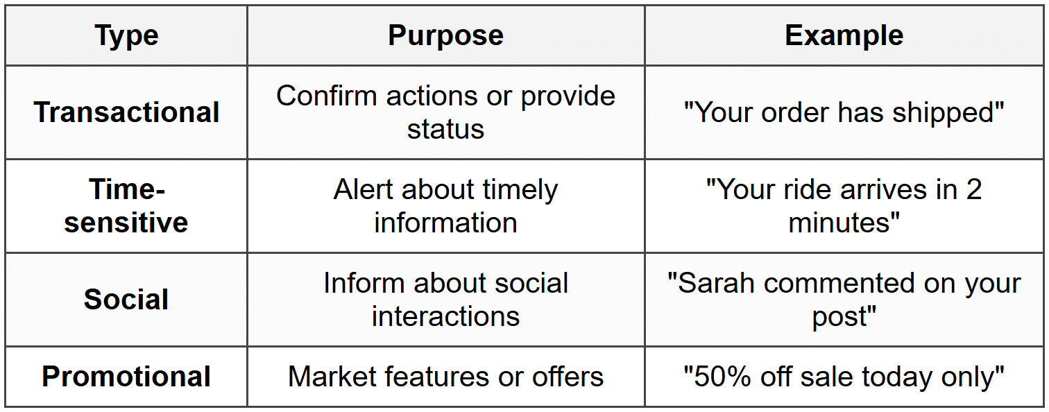
Be especially cautious with promotional notifications-overuse leads to users disabling notifications entirely or uninstalling your app.
Notification Best Practices
- Always ask permission - Explain why notifications are valuable
- Provide granular controls - Let users choose notification types
- Use actionable language - Enable quick responses from notifications
- Respect quiet hours - Don't disturb users at inappropriate times
- Make them useful - Include relevant information and clear next steps
Testing and Iteration
The Importance of Real Devices
Desktop browsers and simulators are useful during development, but nothing replaces testing on actual mobile devices. Real devices reveal:
- Actual touch interaction challenges
- True performance characteristics
- How content appears in various lighting conditions
- Real-world network behavior
- Device-specific quirks and limitations
Observing Real Users
User testing involves watching people use your app while thinking aloud. This reveals:
- Where users get confused or stuck
- Features that go unnoticed
- Unexpected usage patterns
- Emotional responses to the experience
Even testing with 5 users can uncover most major usability issues. The goal isn't statistical significance-it's discovering problems and understanding user behavior.
Analytics and Behavior
Complement user testing with analytics data that shows how people actually use your app:
- Which features are most and least used
- Where users abandon tasks or flows
- How long tasks take to complete
- Common navigation paths
However, analytics show what happens, not why. Combine quantitative data with qualitative research for complete understanding.
Platform Considerations
iOS and Android Differences
While many UX principles apply universally, iOS and Android have distinct conventions that users expect. Respecting these platform patterns makes your app feel native and intuitive.
Key differences include:
- Navigation patterns - iOS uses bottom tab bars; Android traditionally used top tabs and navigation drawers
- Back button behavior - Android has a system back button; iOS relies on screen-level back buttons
- Action placement - iOS places primary actions in the top right; Android often uses floating action buttons
- Typography - Each platform has recommended system fonts and sizing
- Gestures - Platform-specific gestures users expect to work
Rather than creating identical designs for both platforms, adapt your design to feel native to each ecosystem while maintaining your brand identity and core functionality.
Microinteractions and Delight
The Small Details Matter
Microinteractions are small, focused interactions that accomplish a single task. They're the tiny moments that make an interface feel alive and responsive:
- A button that animates when pressed
- A pull-to-refresh gesture with playful animation
- A subtle vibration confirming a successful action
- An empty state with a friendly illustration and helpful message
These details don't change core functionality, but they significantly impact how users feel about your app. They transform functional interactions into delightful experiences.
Purpose Over Decoration
Every microinteraction should serve a purpose beyond looking pretty:
- Provide feedback - Confirm actions completed successfully
- Guide attention - Draw eyes to important elements
- Explain changes - Show how interface elements relate
- Maintain context - Connect screens and states
Animation purely for decoration slows down the interface and frustrates users. Every motion should communicate something meaningful.
Bringing It All Together
Mobile UX design is a discipline that balances user needs, technical constraints, and business goals. The principles we've explored-simplicity, clarity, efficiency, and delight-guide every decision you make as a designer.
Remember that great mobile experiences:
- Respect users' time and attention
- Adapt to diverse contexts and conditions
- Prioritize essential tasks and information
- Feel natural and intuitive
- Work for everyone, regardless of ability
- Perform reliably across situations
As you design mobile experiences, constantly return to empathy for your users. Test your designs on real devices in realistic conditions. Observe how people actually use your app, not just how you intended them to use it. Iterate based on feedback and data.
Mobile UX is not about cramming desktop experiences onto smaller screens-it's about designing for the unique context, capabilities, and constraints of mobile devices. When done well, mobile experiences can be even more powerful and personal than their desktop counterparts, because they're with users wherever they go, ready to help in moments of need.


