Designing Mobile Interfaces


Designing Mobile Interfaces
Welcome to this guide on designing mobile interfaces! If you've ever used a smartphone app and thought "this just feels right," you've experienced good interface design. On the flip side, if you've ever struggled to tap a tiny button or couldn't figure out how to get back to the previous screen, you've encountered poor interface design. In this document, we'll explore what makes mobile interfaces work well and how you can design experiences that feel natural and intuitive to users.
Mobile interface design is different from designing for desktop computers or tablets. Your users are holding a device in their hand, often using just one thumb while standing on a crowded train or walking down the street. They have limited screen space, their attention is divided, and they expect things to work quickly and smoothly. Understanding these constraints and designing for them is what separates good mobile interfaces from frustrating ones.
Understanding the Mobile Context
Before we dive into specific design elements, we need to understand the unique context in which people use mobile devices. Think about your own phone usage: you probably check it dozens of times a day, often for just a few seconds at a time. You might use it while waiting in line, during TV commercials, or even while walking. This behavior is drastically different from sitting down at a desk to use a computer.
The One-Handed Reality
Most people hold their phones with one hand and navigate with their thumb. This simple fact has enormous implications for interface design. Try holding your phone right now with one hand and notice which parts of the screen your thumb can comfortably reach without stretching or adjusting your grip.
The screen can be divided into three zones of thumb comfort:
- Easy reach zone: The bottom third of the screen, particularly the bottom corners opposite to your holding hand
- Stretch zone: The middle portion of the screen that requires some thumb extension
- Difficult zone: The top portion of the screen, especially the far top corner, which requires hand repositioning
This is why many popular apps place their most important navigation controls at the bottom of the screen rather than at the top. When you see apps with tab bars at the bottom showing Home, Search, and Profile icons, that's thumb-friendly design in action.
Screen Size Considerations
Mobile devices come in various sizes, from compact phones with 5-inch screens to large devices with 7-inch displays. Your interface needs to work well across this range. Unlike desktop design where you have abundant space, every pixel on a mobile screen is precious real estate.
Here's what this means practically:
- You can't show as much information at once
- You need to prioritize what's most important
- Navigation must be simplified and streamlined
- Text must be readable without zooming
Interruption and Distraction
Mobile users are frequently interrupted. They might start a task, get a phone call, switch to another app, and then return to yours minutes or hours later. Your interface should help users quickly understand where they are and what they were doing. Clear headers, obvious navigation, and the ability to save progress are essential.
Touch Targets and Tap Areas
When you click a mouse on a desktop computer, you're controlling a tiny, precise cursor. But when you tap a mobile screen, you're using your finger, which is much larger and less precise. This fundamental difference changes everything about how we design interactive elements.
Minimum Touch Target Size
Your finger pad is roughly 10-14 millimeters wide. When it touches a screen, the contact area is even larger due to the soft tissue spreading out. This means interactive elements like buttons need to be large enough for reliable tapping.
The generally accepted minimum touch target size is 44×44 pixels (or about 7-10 millimeters squared). However, bigger is often better, especially for primary actions. Think about the large buttons in banking apps when you confirm a transfer-that's intentional design to prevent accidental taps.
Practical Example: Imagine designing a calculator app. Each number button should be at least 44×44 pixels, with comfortable spacing between buttons. If you make the buttons smaller to fit more on screen, users will constantly tap the wrong numbers, leading to frustration.
Spacing Between Interactive Elements
It's not enough to make individual buttons large-you also need adequate spacing between them. When buttons are too close together, users will accidentally tap the wrong one. A good rule of thumb is to provide at least 8 pixels of spacing between adjacent touch targets, though more is better for critical actions.
Consider a row of social sharing buttons. If they're packed tightly together, a user trying to share on one platform might accidentally tap the wrong icon. Generous spacing prevents these mistakes and creates a more relaxed, confident user experience.
Visual Affordances
On mobile interfaces, users need to quickly identify what they can tap or interact with. This is called affordance-the property of an object that shows users how to interact with it. A door handle affords pulling or pushing; a button affords pressing.
In mobile interfaces, clear affordances include:
- Buttons that look like buttons (raised appearance, distinct color, clear boundaries)
- Underlined or colored text for links
- Icons that universally represent their function (magnifying glass for search, home icon for home screen)
- Clear contrast between interactive and non-interactive elements
Navigation Patterns
Navigation on mobile is like creating a map for a small building versus a large city. You have limited space to show directions, so you need to be strategic. Mobile navigation patterns have evolved over years of trial and error, and certain patterns have emerged as standards because they work well.
Bottom Navigation Bar
The bottom navigation bar (also called a tab bar) is one of the most common mobile navigation patterns. It displays 3-5 main sections of an app as icons with labels at the bottom of the screen. Because it's in the easy-reach thumb zone, it's incredibly convenient.
Characteristics of good bottom navigation:
- Uses 3-5 items (more than 5 becomes crowded and confusing)
- Shows clear, recognizable icons
- Includes short, descriptive labels
- Indicates the current section with highlighting or color
- Remains visible as users navigate within each section
Real-world analogy: Think of bottom navigation like the main floors of a department store. Ground floor for clothing, second floor for electronics, third floor for home goods. You can jump between these main sections anytime, and within each section, you can explore different departments.
Hamburger Menu
The hamburger menu is an icon with three horizontal lines (≡) that opens a hidden navigation drawer. It's useful when you have many navigation options and don't want to overwhelm the main screen.
However, the hamburger menu has significant drawbacks:
- It hides navigation options, making them less discoverable
- It requires an extra tap to access
- Users often forget what's hidden inside it
Use the hamburger menu for secondary navigation options, account settings, or infrequently accessed features-not for your primary navigation. If users need to access something frequently, it shouldn't be hidden behind a hamburger menu.
Gesture-Based Navigation
Modern mobile interfaces increasingly rely on gestures-swipes, pinches, and drags. Swiping left to go back, pulling down to refresh, or pinching to zoom are now natural actions for most users.
Key principles for gesture navigation:
- Use standard gestures that users already know
- Provide visual feedback when a gesture is recognized
- Offer alternative button-based navigation for the same actions
- Don't rely solely on gestures without any visual hints
For example, many apps let you swipe left on a list item to reveal delete or archive options. This is efficient for experienced users, but these apps also typically offer the same actions through buttons or menus for users who don't discover the gesture.
Navigation Hierarchy
Mobile apps typically use a hierarchical navigation structure-think of it like a tree where you move from general to specific. You start at a home screen, tap into a category, then into a subcategory, then into specific content.
Essential elements for clear hierarchical navigation:
- Clear back button: Usually in the top-left corner, letting users return to the previous screen
- Page title: Shows users where they are in the hierarchy
- Consistent placement: Navigation elements should appear in the same location throughout the app
Content Layout and Typography
Designing content for mobile screens is like creating a newspaper for a narrow column. You need to make every word count and organize information so it's scannable and easy to digest in small chunks.
The F-Pattern and Single Column Layout
On desktop, users often scan content in an F-pattern-across the top, down the left side, and partially across again. On mobile, the screen is too narrow for this pattern. Instead, mobile content typically follows a single-column vertical layout.
This means:
- Content flows vertically in one column
- Users scroll down to see more (vertical scrolling is natural and expected)
- The most important content should be "above the fold" (visible without scrolling)
- Complex multi-column layouts should be avoided
Readable Typography
Text on mobile screens must be readable without zooming. If users have to pinch and zoom to read your content, your design has failed. Here are the key typography principles for mobile:
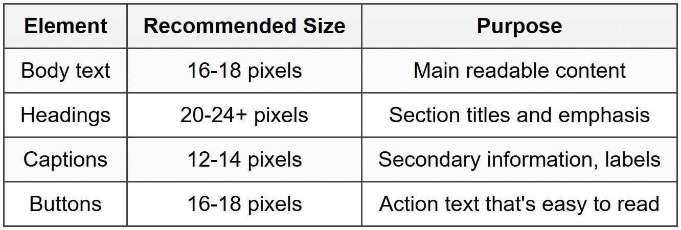
Beyond size, consider these typography factors:
- Line height: Use 1.4-1.6 times the font size for comfortable reading
- Line length: Aim for 40-60 characters per line for optimal readability
- Contrast: Ensure sufficient contrast between text and background (dark text on light background or vice versa)
- Font choice: Use system fonts when possible-they're optimized for the device and load instantly
Progressive Disclosure
Progressive disclosure is the principle of showing users only what they need at any given moment, revealing additional details as needed. This is crucial on mobile where screen space is limited.
Example: Instead of showing a long list of product specifications immediately, you might show the key features with a "See full specifications" button that expands to reveal more details. This keeps the initial view clean while making additional information available.
Techniques for progressive disclosure include:
- Expandable sections (accordions)
- "Show more" buttons
- Stepwise forms that reveal fields progressively
- Tooltips or info icons for additional context
Forms and Input Methods
Filling out forms on mobile devices can be tedious and error-prone. Typing on a touchscreen keyboard is slower than on a physical keyboard, and the keyboard itself takes up half the screen. Good mobile form design minimizes typing and makes input as easy as possible.
Input Field Design
Every input field on mobile should be designed with these principles:
- Large tap targets: Input fields should be at least 44 pixels tall for easy tapping
- Clear labels: Place labels above fields, not inside them (labels inside fields disappear when users start typing)
- Appropriate keyboard: Show the right keyboard type for each field (numeric for phone numbers, email keyboard for email addresses)
- Visual feedback: Highlight the active field so users know where they're typing
Minimizing Text Input
The best mobile form is one that requires minimal typing. Consider these alternatives to text input:
- Selection controls: Use buttons, checkboxes, radio buttons, or dropdown menus instead of text fields when options are predefined
- Date pickers: Use native date picker interfaces rather than forcing users to type dates
- Location services: Auto-detect location instead of asking users to type their address
- Autofill: Support autofill for common fields like name, email, and address
- Smart defaults: Pre-select the most common options to reduce decision-making
Form Validation and Error Handling
Nothing is more frustrating than filling out a long form, tapping submit, and then discovering you made an error at the beginning. Good mobile forms validate input as users go and make errors impossible or immediately obvious.
Best practices for form validation:
- Inline validation: Check each field as users complete it, showing errors immediately
- Clear error messages: Don't just say "invalid input"-explain what's wrong and how to fix it
- Prevent errors: Disable the submit button until all required fields are complete
- Visual indicators: Use color and icons to show valid and invalid fields
- Keep data: If submission fails, preserve what users typed-never make them re-enter everything
Visual Hierarchy and Information Architecture
With limited screen space, establishing clear visual hierarchy becomes crucial. Visual hierarchy is about organizing and prioritizing content so users immediately understand what's most important and where to look next.
Size and Scale
The simplest way to create hierarchy is through size. Larger elements naturally draw more attention. Your most important content-headings, primary calls to action, featured items-should be larger than supporting content.
Think of a news app: the headline of the top story is largest, subheadings are medium-sized, and body preview text is smallest. This size relationship immediately tells users what's most important.
Color and Contrast
Color directs attention powerfully. A brightly colored button on a neutral background immediately draws the eye. Use color strategically:
- Primary actions: Use your app's primary color for the most important button on each screen
- Secondary actions: Use more neutral colors for less critical options
- Destructive actions: Use red or warning colors for actions like delete or cancel
- Content emphasis: Use color sparingly to highlight key information
White Space
White space (also called negative space) is the empty space around elements. It might seem wasteful on small mobile screens, but it's actually essential. White space creates breathing room, reduces visual clutter, and helps separate different pieces of content.
Analogy: Think of white space like pauses in a conversation. Without pauses, words run together and become incomprehensible. White space gives your interface those necessary pauses.
Use white space to:
- Separate different sections of content
- Create focus around important elements
- Make the interface feel less cramped and overwhelming
- Improve readability of text blocks
Grouping and Proximity
Related items should be grouped together visually. This is the principle of proximity-things that are close together are perceived as related, while things spaced apart are seen as separate.
For example, in a profile screen, group all personal information together, contact information together, and settings together. Use spacing, dividing lines, or background colors to reinforce these groupings.
Feedback and Responsiveness
Mobile interfaces must provide constant feedback to let users know the system is responding to their actions. Without feedback, users feel uncertain and might tap multiple times, thinking their first tap didn't register.
Immediate Visual Feedback
Every tap, swipe, or interaction should produce immediate visual feedback. This can be:
- Highlight effect: The tapped element briefly changes color or appearance
- Animation: Smooth transitions between states
- Ripple effect: A circular wave emanates from the tap point
- State changes: Buttons change appearance when tapped (pressed state)
This feedback should be instantaneous-within 100 milliseconds of the tap. Any longer and users will wonder if the tap registered.
Loading States
When content takes time to load, users need to know the app is working. Never leave users staring at a blank or frozen screen. Instead, provide clear loading indicators:
- Spinners: Animated circular icons indicating activity
- Progress bars: For operations where progress can be measured
- Skeleton screens: Placeholder boxes showing the structure of upcoming content
- Pull-to-refresh: Visual indicator of the refresh action
If loading will take more than a few seconds, consider showing progress or even entertainment (like tips or interesting facts) to make the wait feel shorter.
Confirmation and Error Messages
When users complete an important action, confirm it clearly. When something goes wrong, explain what happened and what users can do about it.
Good confirmation messages:
- Are brief and specific ("Photo saved to your gallery" not just "Success")
- Appear immediately after the action
- Don't require dismissal unless necessary (they can disappear automatically)
Good error messages:
- Explain what went wrong in plain language
- Suggest how to fix the problem
- Provide an action button if appropriate ("Try again" or "Check connection")
- Never blame the user or use technical jargon
Accessibility Considerations
Accessible design isn't a special category-it's good design that works for everyone, including people with visual, motor, hearing, or cognitive impairments. Mobile accessibility is particularly important because phones are often people's primary computing device.
Touch Accessibility
The 44×44 pixel minimum touch target we discussed earlier isn't arbitrary-it's an accessibility requirement. People with motor impairments, tremors, or limited dexterity need larger touch targets to reliably tap what they intend.
Additional touch accessibility considerations:
- Provide ample spacing between interactive elements
- Don't require precise gestures or multi-finger interactions for essential functions
- Allow alternative methods for gesture-based actions
- Avoid time-based interactions that disappear quickly
Visual Accessibility
Not everyone sees your interface the way you do. People have varying degrees of visual acuity, color blindness, or complete blindness. Design for this diversity:
- Color contrast: Maintain sufficient contrast between text and backgrounds (at least 4.5:1 for normal text)
- Color independence: Never rely solely on color to convey information (use icons, labels, or patterns too)
- Text size: Support system-level text size adjustments
- Screen reader support: Ensure all interactive elements have descriptive labels for screen reader users
Content Accessibility
Make your content understandable and navigable:
- Use clear, simple language
- Provide text alternatives for images and icons
- Structure content with proper headings
- Ensure logical navigation order when using assistive technologies
Performance and Optimization
A beautifully designed interface is worthless if it's slow or unresponsive. Mobile devices have less processing power than desktop computers, and users are often on slower cellular connections. Performance is a design consideration, not just a technical one.
Perceived Performance
How fast your app feels is often more important than how fast it actually is. This is called perceived performance. You can make interfaces feel faster through design techniques:
- Instant feedback: Respond to taps immediately, even if the actual operation takes longer
- Optimistic updates: Show the result of an action immediately, assuming success
- Skeleton screens: Show the layout structure while content loads
- Progressive loading: Display content as it arrives rather than waiting for everything
- Animation and transitions: Use smooth animations to mask loading times
Example: When you "like" a post on social media, the heart icon turns red immediately, even though the app is still sending that information to the server. This makes the interaction feel instant, even though technically it takes time to complete.
Image and Asset Optimization
Images are often the largest files in mobile apps and can significantly slow down performance. Optimize them carefully:
- Use appropriate image sizes for different screen densities
- Compress images without visible quality loss
- Load images progressively (low quality first, then high quality)
- Use modern image formats that are smaller
- Lazy-load images that aren't immediately visible
Offline Functionality
Mobile users frequently lose connection or have slow, unreliable connections. Design for this reality:
- Cache recently viewed content for offline access
- Clearly indicate when content is cached versus live
- Allow users to continue basic functions offline
- Queue actions when offline and sync when connection returns
- Provide helpful messaging when features require connectivity
Platform-Specific Considerations
The two dominant mobile platforms-iOS and Android-have their own design guidelines and user expectations. While core design principles remain the same, certain interface elements and patterns differ between platforms.
Respecting Platform Conventions
Users of each platform are accustomed to certain patterns. For example, iOS typically places navigation at the bottom of the screen, while Android historically used top navigation. iOS uses a back button in the top-left corner, while Android has a system-level back button.
When designing for multiple platforms, you have two approaches:
- Platform-specific design: Create different interfaces that follow each platform's conventions
- Cross-platform design: Use a unified design that works reasonably well on both platforms
Neither approach is universally better. Platform-specific design feels more native but requires more work. Cross-platform design is more efficient but might feel slightly foreign on each platform.
System UI Elements
Both platforms provide standard UI components-buttons, switches, sliders, pickers, and more. These components are designed to work well on their respective platforms and users already know how to use them.
Using system components has advantages:
- Automatically looks and feels native
- Updates automatically when the OS updates
- Includes built-in accessibility support
- Requires less design and development work
Custom components can differentiate your app and provide unique functionality, but should be used thoughtfully and shouldn't reinvent standard interactions.
Designing for Different Use Cases
Mobile interfaces serve many different purposes, and design priorities shift based on the app's primary use case.
Productivity and Task-Focused Apps
For apps where users need to complete specific tasks efficiently:
- Minimize steps to complete common tasks
- Provide keyboard shortcuts and quick actions
- Remember user preferences and previous choices
- Support multiple ways to accomplish the same task
- Make frequently used features easily accessible
Content and Media Apps
For apps focused on content consumption:
- Maximize content area, minimize chrome (UI elements)
- Support immersive, distraction-free viewing
- Make navigation unobtrusive but easily accessible
- Optimize for one-handed scrolling and navigation
- Provide intuitive gestures for common actions
Social and Communication Apps
For apps built around communication:
- Make creating and sharing content quick and easy
- Provide immediate feedback on interactions
- Surface new activity prominently
- Balance engagement with respectful notifications
- Support various communication modes (text, images, video)
Testing and Iteration
Even following all best practices, you won't get everything right on the first try. Good mobile interface design requires testing with real users and continuously improving based on feedback and data.
Prototype Testing
Before building your interface fully, create interactive prototypes and test them with users. Watch people try to complete tasks and notice where they struggle, get confused, or succeed easily. This reveals problems while they're still easy to fix.
Key things to observe during testing:
- Can users find what they're looking for?
- Do they understand what interactive elements do?
- Can they complete tasks without assistance?
- Where do they hesitate or show confusion?
- What do they try to tap that isn't interactive?
Analytics and Usage Data
Once your app is in users' hands, data reveals how they actually use it:
- Which features are used most and least?
- Where do users abandon tasks?
- What paths do users take through the app?
- Which screens have the highest engagement?
- Where do error rates spike?
This data should inform design iterations. If users consistently abandon a form at a certain field, that field needs redesigning. If a feature is buried in navigation and rarely used, maybe it needs to be more prominent-or maybe it's not actually valuable and can be removed.
Continuous Improvement
Mobile interface design is never "done." User needs evolve, platforms update, and better solutions emerge. The best mobile apps continuously refine their interfaces based on user feedback, testing, and data.
Approach design as an ongoing process:
- Regularly review analytics and user feedback
- Test new ideas with small user groups before full rollout
- Make incremental improvements rather than massive redesigns
- Document what works and what doesn't for future reference
- Stay informed about evolving platform capabilities and conventions
Bringing It All Together
Designing effective mobile interfaces requires balancing many considerations: the physical constraints of small touchscreens, the context of distracted mobile usage, platform conventions, accessibility needs, performance requirements, and user expectations. But at the heart of good mobile design is empathy for your users and a commitment to making their experience as smooth and intuitive as possible.
Remember these core principles as you design:
- Design for thumbs and one-handed use
- Make touch targets large enough and well-spaced
- Create clear navigation that users can understand instantly
- Prioritize content and minimize unnecessary elements
- Provide immediate feedback for every interaction
- Optimize for performance and variable network conditions
- Make your interface accessible to all users
- Test with real users and iterate based on feedback
Mobile interface design is both an art and a science. The science comes from understanding human capabilities and limitations, platform requirements, and established best practices. The art comes from applying these principles creatively to solve specific problems and create delightful experiences. With practice and attention to detail, you'll develop an intuition for what makes mobile interfaces work well, and you'll be able to create experiences that feel effortless and natural to users.


