E-commerce Website Project


E-commerce Website Project
Welcome to one of the most exciting and practical design projects you'll encounter in your learning journey. An e-commerce website is where design meets business, user experience meets conversion, and creativity meets functionality. Think of designing an e-commerce site like designing a physical store, but with superpowers-you control the lighting, the layout, the checkout experience, and even how products whisper their appeal to potential buyers.
In this document, we'll walk through the complete process of designing an e-commerce website from the ground up. Whether you're designing for fashion, electronics, handmade crafts, or digital products, the fundamental principles remain the same. Let's build something that not only looks beautiful but actually helps people buy with confidence.
Understanding E-commerce Design Fundamentals
Before we dive into wireframes and color palettes, we need to understand what makes e-commerce design unique. Unlike a portfolio site or a blog, an e-commerce website has one primary goal: facilitate transactions. Every design decision should either directly or indirectly support this goal.
The Three Pillars of E-commerce Design
Think of e-commerce design as a three-legged stool. Remove any leg, and the whole thing collapses:
- Trust - Users need to feel safe entering their payment information and personal details
- Clarity - Users should never feel confused about what to do next or what they're buying
- Efficiency - The path from browsing to buying should be as smooth as sliding down a water slide
Imagine walking into a physical store where the lights flicker randomly, products have no price tags, and the cashier is nowhere to be found. That's what a poorly designed e-commerce site feels like. Our job is to create the digital equivalent of a well-lit, organized store with friendly, helpful staff.
User Psychology in Online Shopping
Online shopping is fundamentally different from in-store shopping because users can't touch, feel, or try products. They rely entirely on what you show them. This creates specific psychological needs:
- Visual confirmation - Multiple high-quality images from different angles
- Social proof - Reviews, ratings, and testimonials from other buyers
- Risk reduction - Clear return policies, guarantees, and secure payment badges
- Instant answers - Detailed specifications, size guides, and FAQs
Your design must address all these needs without creating visual clutter or overwhelming the user. It's a delicate balance, like cooking a complex dish where every ingredient matters.
Research and Planning Phase
Great e-commerce design starts long before you open your design software. The research phase determines whether your final product will be a wild guess or an informed solution.
Defining Your Target Audience
Who are you designing for? "Everyone" is not an answer. An e-commerce site selling skateboarding gear to teenagers will look and function very differently from one selling business software to executives.
Create detailed user personas that include:
- Demographics - Age, location, income level, occupation
- Technical comfort - Are they tech-savvy or do they struggle with complex interfaces?
- Shopping habits - Do they research extensively or buy impulsively?
- Device preferences - Primarily mobile, desktop, or tablet users?
- Pain points - What frustrates them about current shopping experiences?
Example Persona: Sarah, 32, busy marketing manager who shops mostly on her phone during lunch breaks. She values quick checkout, clear product information, and reliable delivery. She's frustrated by sites that require account creation before browsing or have complicated checkout flows.
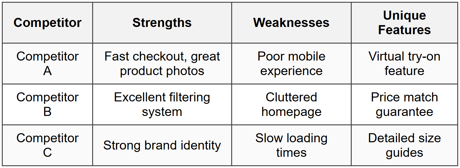
Competitive Analysis
Study successful e-commerce sites in your niche and adjacent markets. Don't copy them-learn from them. Create a comparison table to identify patterns:
Feature Prioritization
E-commerce sites can have hundreds of features, but you can't implement everything at once. Use the MoSCoW method to prioritize:
- Must Have - Product listings, shopping cart, checkout, payment processing, user accounts
- Should Have - Product search, filtering, reviews, wishlist, order tracking
- Could Have - Product comparison, live chat, social sharing, gift wrapping
- Won't Have (for now) - Augmented reality, AI recommendations, subscription boxes
This prioritization keeps your project focused and prevents feature creep-the endless addition of "just one more thing" that delays launch indefinitely.
Information Architecture and User Flows
Before designing a single pixel, you need to map out how users will navigate through your site. Think of this as creating a map before building a shopping mall.
Site Structure
A typical e-commerce site architecture includes these main sections:
- Homepage - The welcoming entrance that sets expectations
- Category pages - Organized collections of products (e.g., Men's Shoes, Women's Accessories)
- Product listing pages - Display multiple products with filtering and sorting
- Product detail pages - Comprehensive information about individual products
- Shopping cart - Review items before purchase
- Checkout flow - Shipping, payment, and confirmation steps
- User account area - Order history, saved addresses, wishlist, preferences
- Support pages - FAQ, contact, shipping policy, returns
Critical User Flows
Map out the key journeys users take through your site. Here are the most important ones:
New Visitor Discovery Flow
Homepage → Category browsing → Product listing → Product detail → Add to cart → Continue shopping or checkout
This flow assumes the user is exploring and discovering products. They need clear navigation, attractive product presentations, and gentle encouragement toward purchase without being pushy.
Returning Customer Quick Purchase Flow
Homepage/Landing page → Search → Product detail → Add to cart → Quick checkout (saved info) → Confirmation
This flow assumes familiarity and intent. The user knows what they want and values speed above all else.
Gift Buyer Flow
Homepage → Gift guide/category → Product filtering → Product detail → Add to cart → Gift options → Checkout with different shipping address → Confirmation
This user has unique needs like gift wrapping, gift messages, and shipping to multiple addresses.
Navigation Design Patterns
Your navigation system is the backbone of user experience. Common patterns include:
- Mega menus - Dropdown panels showing categories, subcategories, and featured items all at once. Great for sites with many products.
- Hamburger menus - The three-line icon that hides navigation. Works well on mobile but controversial on desktop.
- Sticky headers - Navigation that follows users as they scroll. Keeps key actions always accessible.
- Breadcrumbs - The trail showing where users are in the site hierarchy (Home → Men → Shoes → Running). Helps users understand context and backtrack easily.
The best navigation is invisible-users shouldn't think about it, they should just find what they need.
Wireframing Your E-commerce Site
Wireframes are the blueprints of web design. They're intentionally simple, focusing on layout and functionality rather than colors and images. Think of them as the stick-figure sketches before painting a masterpiece.
Homepage Wireframe Essentials
Your homepage is the digital storefront window. It should accomplish several goals simultaneously:
- Establish brand identity - What makes this store unique?
- Showcase key products or categories - What's new, popular, or on sale?
- Provide clear navigation paths - Where can users go from here?
- Build trust - Why should users buy from you?
- Highlight value propositions - Free shipping, easy returns, quality guarantees
A typical homepage wireframe includes:
- Header with logo, navigation, search, cart icon, and account access
- Hero section with primary promotional banner or featured products
- Category tiles or featured collections (usually 3-6 prominent options)
- Featured or trending products grid
- Trust signals (customer reviews, security badges, delivery information)
- Footer with links to policies, help, social media, and newsletter signup
Product Listing Page Wireframe
This page shows multiple products within a category. The challenge is presenting enough information to interest users without overwhelming them.
Key components:
- Filtering sidebar or panel - Price range, size, color, brand, ratings, etc.
- Sorting options - Most popular, newest, price low-to-high, highest rated
- Product grid or list - Typically 3-4 columns on desktop, 2 on tablet, 1 on mobile
- Each product card shows - Image, name, price, quick view option, sometimes ratings
- Pagination or infinite scroll - How users access more products
- Active filters display - Show what filters are applied with easy removal
Product Detail Page Wireframe
This is where conversions happen or die. The product detail page must answer every possible question and eliminate every doubt.
Critical elements:
- Product images - Main large image with thumbnail gallery, zoom capability
- Product title and price - Clear, prominent, with sale price if applicable
- Variant selectors - Size, color, quantity pickers
- Add to cart button - Large, obvious, contrasting color
- Product description - Benefits, features, specifications
- Shipping and return information - Delivery time estimates, return window
- Customer reviews - Ratings, written reviews, verified purchase badges
- Related products - "You might also like" or "Complete the look"
- Trust indicators - Security badges, warranties, authenticity guarantees
Checkout Flow Wireframe
The checkout is the finish line of your e-commerce race. Many users abandon carts here, so every element must reduce friction.
Best practices for checkout wireframes:
- Progress indicator - Show steps like "Cart → Shipping → Payment → Confirmation"
- Guest checkout option - Don't force account creation
- Order summary - Always visible, showing items, quantities, and total
- Form simplicity - Only ask for essential information
- Auto-fill support - Design for browser auto-complete and address lookup
- Error handling - Clear, helpful error messages near the problem field
- Security reassurance - Encryption badges, secure payment icons
- Save and return option - Email cart link for completion later
The ideal checkout feels like a gentle downhill walk, not an obstacle course.
Visual Design and Branding
Now that you have your wireframes, it's time to add the visual personality that makes your e-commerce site memorable and trustworthy.
Color Psychology for E-commerce
Colors aren't just decoration-they influence emotions and purchasing decisions. Choose your palette strategically:
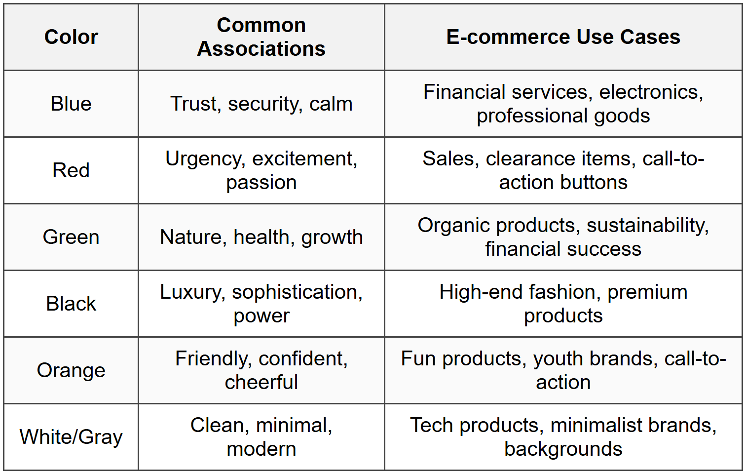
Your color scheme should include:
- Primary brand color - Used in logo, headers, major brand elements
- Secondary color - Supports primary, adds variety
- Accent color - For call-to-action buttons, typically high contrast
- Neutral colors - Grays, whites, blacks for text and backgrounds
- System colors - Success (green), error (red), warning (yellow), info (blue)
Typography Choices
Typography in e-commerce must balance personality with readability. Users will read product descriptions, prices, checkout instructions-make sure they can.
Recommended typography system:
- Heading font - Can have more personality, used for titles and categories
- Body font - Highly readable, used for descriptions and interface text
- System font - For form inputs and data display
Font size hierarchy should be clear:
Hero headline: 48-72px
Page titles: 32-48px
Section headings: 24-32px
Subheadings: 18-24px
Body text: 16-18px
Small text: 12-14px (for disclaimers, captions)
Never go below 14px for any text users need to read comfortably.
Product Photography Standards
Images are the most important visual element in e-commerce. They replace the physical experience of touching and examining products.
Establish standards for product images:
- Background - Usually white or transparent for consistency and focus
- Aspect ratio - Consistent across all products (typically square 1:1 or portrait 3:4)
- Multiple angles - Front, back, sides, detail shots (minimum 3-5 images per product)
- Zoom capability - High resolution allowing users to see texture and details
- Lifestyle images - Show product in use or context
- Size reference - Images showing product held or worn to indicate scale
Call-to-Action Button Design
The "Add to Cart" button might be the most important design element on your entire site. It should be impossible to miss.
Effective CTA button characteristics:
- Size - Large enough to tap easily on mobile (minimum 44×44 pixels)
- Color - High contrast with surrounding elements
- Text - Action-oriented ("Add to Cart" not "Submit")
- Position - Above the fold on product pages
- State changes - Visual feedback on hover, click, and success
- Loading states - Indication when processing
Responsive Design for E-commerce
More than half of e-commerce traffic typically comes from mobile devices. Your design must work beautifully on screens of all sizes.
Mobile-First Approach
Design for mobile first, then enhance for larger screens. This ensures the core experience works on the most constrained device.
Mobile design priorities:
- Vertical scrolling - Embrace it; mobile users expect to scroll
- Thumb-friendly zones - Place important actions in easy-to-reach areas
- Simplified navigation - Hamburger menus and collapsible sections
- Single column layouts - Stack elements vertically
- Larger touch targets - Buttons and links need more space than desktop
- Simplified forms - Break long forms into steps
- Mobile payment options - Apple Pay, Google Pay integration
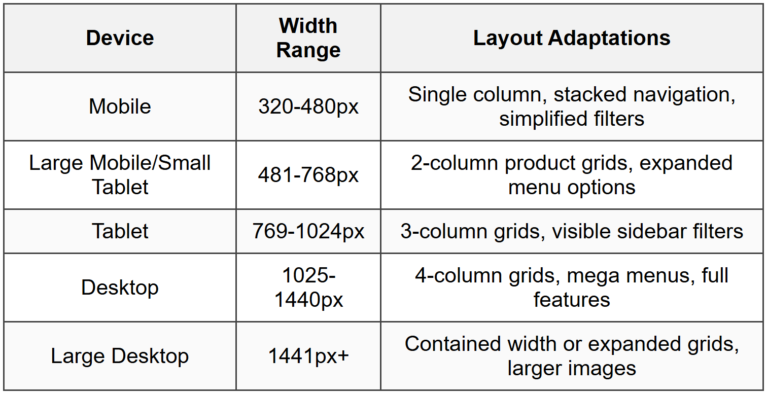
Breakpoint Strategy
Plan how your design adapts at different screen widths. Common breakpoints:
Touch Interactions
Mobile users interact differently than desktop users. Design for fingers, not cursors:
- Swipe gestures - For image galleries and product carousels
- Pull to refresh - Natural gesture for updating content
- Long press - For additional options without cluttering interface
- Tap targets - Minimum 44×44 pixels with adequate spacing
- Avoid hover - Don't hide critical information behind hover states
Shopping Cart and Checkout Design
The cart and checkout experience can make or break your conversion rate. This is where design directly impacts revenue.
Shopping Cart Best Practices
The shopping cart should be accessible from anywhere and provide complete control:
- Persistent cart icon - Shows item count, always visible in header
- Mini-cart preview - Dropdown showing cart contents without leaving current page
- Easy editing - Update quantities, remove items, save for later
- Thumbnail images - Visual confirmation of items
- Clear pricing - Item price, subtotal, taxes, shipping, final total
- Promotional code field - Apply discounts without friction
- Shipping calculator - Estimate costs before checkout
- Continue shopping link - Easy path back to browsing
Checkout Flow Optimization
The ideal checkout flow balances thoroughness with speed. Every additional step increases abandonment risk.
Single-page vs. multi-step checkout:
- Single-page - All information on one long page. Feels faster, better for simple purchases, can feel overwhelming.
- Multi-step - Divided into sections (Shipping → Payment → Review). Feels organized, shows progress, better for complex orders.
Essential checkout elements:
- Guest checkout option - Never force account creation before purchase
- Order summary - Sticky or always visible showing items and total
- Express checkout - One-click options for returning customers
- Address validation - Autocomplete and verification to prevent errors
- Multiple payment options - Credit cards, PayPal, digital wallets
- Security indicators - SSL certificate, payment security badges
- Contact information - Support number or chat if users have questions
- Clear error messages - Helpful, specific guidance when something goes wrong
Form Design for Checkout
Forms are necessary but often frustrating. Design them to feel effortless:
- Single column layout - Natural reading and tab order
- Logical grouping - Related fields together (name fields, address fields)
- Smart defaults - Pre-fill known information, default to most common choices
- Inline validation - Check fields as users complete them, not just on submit
- Clear labels - Above or inside fields, never ambiguous
- Required field indicators - Asterisks or "optional" labels
- Appropriate input types - Numeric keyboards for phone numbers, date pickers for dates
- Password visibility toggle - Let users verify what they typed
Confirmation and Follow-up
The purchase isn't complete until the user feels confident their order succeeded:
- Confirmation page - Clear message that order was received
- Order number - Unique identifier prominently displayed
- Order details - What was purchased, shipping address, payment method
- Next steps - What happens now, when to expect shipping confirmation
- Confirmation email - Immediate email with all order details
- Account creation option - After purchase, invite guests to save their information
Trust and Credibility Design Elements
E-commerce requires strangers to trust you with their money and personal information. Design elements that build this trust are not optional-they're essential.
Security Indicators
Visible security reassurance throughout the experience:
- SSL certificate - HTTPS in the URL with padlock icon
- Payment security badges - Verified by Visa, Mastercard SecureCode, PayPal
- Security seals - Norton, McAfee, or other trusted third-party certifications
- Privacy policy link - Easily accessible, especially near data collection points
- Secure checkout messaging - "Your payment information is encrypted and secure"
Social Proof
People trust other people more than they trust businesses. Leverage this:
- Customer reviews - Star ratings and written reviews on product pages
- Review verification - "Verified purchase" badges add credibility
- User photos - Customer-submitted images showing real-world use
- Testimonials - Quotes from satisfied customers with names and photos
- Trust metrics - "Over 10,000 happy customers" or "4.8 out of 5 stars"
- Media mentions - "As featured in..." with publication logos
- Social media presence - Active social channels with engaged followers
Transparency and Policies
Clear, accessible information about your business practices:
- Shipping information - Costs, timeframes, tracking availability
- Return policy - Clear terms, easy-to-understand conditions
- Price guarantees - Price matching, lowest price promises
- Contact information - Real address, phone number, email
- About page - Company story, values, team information
- FAQ section - Answers to common questions
Search and Filtering Systems
When users know what they want, search gets them there. When they're browsing, filters help narrow options. Both are critical for large product catalogs.
Search Functionality
A powerful search feature can dramatically improve conversions:
- Prominent placement - Search bar visible on every page, typically in header
- Autocomplete suggestions - Show popular searches and products as user types
- Typo tolerance - Understand common misspellings and variations
- Synonym recognition - "sneakers" should find "athletic shoes"
- Search results page - Show products, categories, and content that match
- No results handling - Suggest alternatives, show popular items, offer help
- Search history - Recent searches for quick re-access
- Visual search - Upload image to find similar products (advanced feature)
Filtering Interface
Filters help users narrow hundreds of products down to the few that match their needs:
Common filter categories:
- Price range - Slider or preset ranges ($0-$50, $50-$100, etc.)
- Brand - Checkbox list of available brands
- Size - Depends on product type (clothing, shoes, etc.)
- Color - Color swatches or names
- Rating - Minimum star rating filter
- Availability - In stock, ships in 24 hours, etc.
- Features - Product-specific attributes
- Category refinement - Subcategories within current category
Filter interface design considerations:
- Desktop - Sidebar with all filters visible or expandable sections
- Mobile - Slide-out panel or modal with filters
- Active filters - Show what's currently applied with easy removal
- Result count - Update product count as filters are applied
- Clear all option - Remove all filters with single action
- Filter persistence - Remember filters if user navigates away
Sorting Options
Allow users to organize results in ways that matter to them:
- Most popular/Best sellers
- Newest arrivals
- Price: Low to high
- Price: High to low
- Highest rated
- Most reviewed
- Relevance (for search results)
Accessibility in E-commerce
Accessible design isn't just ethical-it's smart business. Millions of potential customers have disabilities, and accessible sites work better for everyone.
Key Accessibility Principles
Design that works for users with various abilities:
- Keyboard navigation - All functions accessible without a mouse
- Screen reader compatibility - Proper HTML structure, alt text, ARIA labels
- Color contrast - Text readable against backgrounds (minimum 4.5:1 ratio)
- Focus indicators - Clear visual indication of keyboard focus position
- Text alternatives - Alt text for images, transcripts for audio/video
- Flexible text sizing - Design works when users increase text size
- Clear language - Simple, straightforward instructions and labels
- Error identification - Clear indication of what went wrong and how to fix it
Accessible Product Images
Product images need descriptive alt text that conveys what sighted users see:
Poor: alt="product image"
Better: alt="red sneaker"
Best: alt="Nike Air Max 90 red athletic sneaker with white swoosh, side view"
Form Accessibility
Forms require special attention for accessibility:
- Label association - Every input has a properly connected label
- Error messages - Announced by screen readers, clearly associated with problem fields
- Required fields - Indicated by more than just color (asterisk or text)
- Fieldsets and legends - Group related fields with proper semantics
- Instructions - Provided before the field, not just in placeholder text
Performance and Loading States
Speed is a feature. Every second of loading time costs conversions. Design with performance in mind from the start.
Perceived Performance
How fast your site feels can be as important as how fast it actually is:
- Progressive loading - Show content as it becomes available rather than waiting for everything
- Skeleton screens - Show page structure with placeholder blocks before content loads
- Lazy loading - Load images as user scrolls to them, not all at once
- Optimistic UI - Show success immediately, handle actual processing in background
- Loading indicators - Clear feedback when system is processing
Image Optimization
Product images are essential but can be massive files:
- Appropriate formats - JPEG for photos, PNG for graphics with transparency, WebP for modern browsers
- Responsive images - Serve different sizes for different screen sizes
- Compression - Balance quality and file size
- Thumbnail optimization - Small images for grid views, full size only when needed
- Lazy loading - Load images outside viewport only when user scrolls to them
Loading State Design
Design for the in-between moments when content is loading:
- Add to cart button - Show spinner, disable button, change text to "Adding..."
- Product grids - Skeleton cards showing where products will appear
- Image galleries - Placeholder showing image dimensions before load
- Search results - Progressive display as results come in
- Checkout processing - Clear indication that payment is processing (prevent double-clicks)
Testing and Iteration
Your first design is never your best design. E-commerce design improves through continuous testing and refinement.
Usability Testing
Watch real users interact with your design. Their confusion, hesitation, and questions reveal problems you'd never catch alone.
Test critical user tasks:
- Find a specific product using search
- Browse a category and use filters
- View product details and understand what's included
- Add items to cart and modify quantities
- Complete the checkout process
- Find shipping and return policy information
- Access customer service help
Observe where users:
- Hesitate or seem confused
- Click or tap the wrong element
- Ask questions about what to do next
- Express frustration or satisfaction
- Abandon tasks without completing them
A/B Testing
Test variations of design elements to see what performs better:
Testable elements:
- Call-to-action buttons - Color, size, text, position
- Product page layout - Image placement, description length, feature emphasis
- Checkout flow - Single page vs. multi-step, field order, guest checkout prominence
- Homepage hero - Banner style, messaging, imagery
- Pricing display - With or without strikethrough, monthly vs. annual
- Trust signals - Badge placement, review prominence, security messaging
Important: Test one variable at a time to understand what drives results.
Analytics and Metrics
Numbers tell stories about user behavior:
Key metrics to monitor:
- Conversion rate - Percentage of visitors who make a purchase
- Cart abandonment rate - How many add items but don't complete purchase
- Average order value - Typical amount spent per transaction
- Time on site - How long users spend browsing
- Bounce rate - Percentage leaving after viewing only one page
- Search usage - How many users search vs. browse
- Mobile vs. desktop performance - Conversion rates by device
- Filter usage - Which filters are most popular
Use this data to identify problems and opportunities for improvement.
Real-World Project Workflow
Let's put everything together with a realistic project timeline for designing an e-commerce website.
Week 1-2: Discovery and Research
- Stakeholder interviews to understand business goals
- User research and persona development
- Competitive analysis and feature audit
- Define product catalog structure and categories
- Establish technical requirements and constraints
- Create project brief and design goals document
Week 3-4: Information Architecture and Wireframes
- Map site structure and navigation hierarchy
- Create user flow diagrams for key journeys
- Develop wireframes for core pages (home, listing, product, cart, checkout)
- Review with stakeholders and iterate based on feedback
- Define content requirements for each page type
Week 5-6: Visual Design
- Establish brand guidelines (if not existing)
- Create mood boards and style explorations
- Design high-fidelity mockups of key pages
- Define component library (buttons, forms, cards, etc.)
- Review designs with stakeholders and iterate
- Create responsive versions (mobile, tablet, desktop)
Week 7-8: Prototyping and Testing
- Build interactive prototype of critical flows
- Conduct usability testing with target users
- Analyze results and identify issues
- Refine designs based on user feedback
- Validate accessibility compliance
- Prepare design handoff documentation
Week 9-10: Design System and Handoff
- Complete component library with all states
- Document interaction patterns and behaviors
- Provide specifications for developers
- Create responsive breakpoint guidelines
- Define animation and transition principles
- Support development team during implementation
Post-Launch: Monitor and Optimize
- Track analytics and conversion metrics
- Gather user feedback through surveys and reviews
- Identify pain points and opportunities
- Plan and execute A/B tests
- Continuously iterate and improve
Remember: This timeline is flexible. Real projects adapt based on scope, resources, and discovery findings. The process matters more than perfect adherence to schedule.
Common Pitfalls and How to Avoid Them
Learn from common mistakes so you don't have to make them yourself.
Overcomplicating Navigation
Problem: Too many menu items, categories, and subcategories overwhelming users.
Solution: Limit top-level categories to 5-7 items. Use clear, specific names. Provide search as an alternative path.
Hiding Prices
Problem: Making users click through multiple pages to see how much something costs.
Solution: Always show price on product listing pages and prominently on product detail pages.
Forcing Account Creation
Problem: Requiring users to create an account before checkout.
Solution: Offer guest checkout. Allow account creation after successful purchase.
Poor Product Information
Problem: Vague descriptions, missing specifications, insufficient images.
Solution: Provide detailed descriptions, multiple images, specifications table, and sizing information.
Complicated Checkout
Problem: Too many steps, too many form fields, unclear progress.
Solution: Minimize required information. Show progress. Allow editing without going back.
Ignoring Mobile Users
Problem: Desktop-focused design that's cramped or broken on mobile.
Solution: Design mobile-first. Test on actual devices. Optimize for touch interaction.
Inadequate Search
Problem: Search that only finds exact matches or returns no results.
Solution: Implement smart search with typo tolerance, synonyms, and helpful no-results pages.
Missing Trust Signals
Problem: No reviews, security badges, or return policy visible.
Solution: Prominently display trust elements throughout the experience, especially at decision points.
Bringing It All Together
Designing an e-commerce website is like orchestrating a symphony-every element must work in harmony to create a beautiful experience. Your visual design attracts users, your information architecture guides them, your product pages convince them, and your checkout completes the transaction.
The best e-commerce designs feel invisible. Users don't think about the interface-they focus on the products. They don't struggle with navigation-they flow naturally from browsing to buying. They don't worry about security-they trust your site instinctively.
This level of seamlessness comes from careful attention to every detail, from button colors to error messages, from image quality to loading states. It comes from understanding your users deeply and designing specifically for their needs, not for generic "best practices" that may not fit your context.
As you work on your e-commerce project, remember that you're not just creating screens-you're designing someone's shopping experience. You're building trust between a business and its customers. You're solving real problems that frustrate real people every day.
Start with research, move thoughtfully through wireframes and visual design, test with real users, and iterate continuously. Your first version won't be perfect, and that's okay. E-commerce design is an ongoing process of learning, testing, and improving.
Now you have the foundational knowledge to create an effective e-commerce website. The rest comes from practice, observation, and the willingness to learn from both successes and failures. Happy designing!


