Creating Low-Fidelity Wireframes


Creating Low-Fidelity Wireframes
Imagine you're planning to build a house. Before you start pouring concrete and raising walls, you'd probably sketch out a rough floor plan on paper-just simple boxes and lines showing where the kitchen goes, how many bedrooms you need, and where the doors should be. You wouldn't worry about what color the walls are or what style of doorknobs to use. That's essentially what low-fidelity wireframing is in the world of design.
Low-fidelity wireframes are simplified, basic representations of a digital product's layout and structure. They're the design equivalent of that rough house sketch-quick, simple, and focused on the big picture rather than the fine details. In this document, we'll explore what makes wireframes "low-fidelity," why they're so valuable, and how to create effective ones that will serve as the foundation for your design projects.
Understanding Low-Fidelity Wireframes
A low-fidelity wireframe (often called a "lo-fi wireframe") is a basic visual guide that represents the skeletal framework of a digital interface. Think of it as a blueprint that shows where elements should go without getting caught up in colors, images, fonts, or any visual styling.
What Makes a Wireframe "Low-Fidelity"?
The term "fidelity" refers to how closely something resembles the final product. Low-fidelity means it's intentionally simple and rough. Here are the characteristics that define low-fidelity wireframes:
- No color - typically just black, white, and shades of gray
- Simple shapes - boxes, lines, and basic geometric forms
- Placeholder content - lorem ipsum text or simple labels instead of real content
- No detailed typography - just basic text to indicate where copy will go
- No images - just boxes with an "X" or icon to show where images will be placed
- Minimal detail - just enough to communicate layout and structure
- Quick to create - can be made in minutes rather than hours
The Purpose of Starting Low-Fidelity
You might wonder why designers deliberately create something rough and unfinished-looking. The answer lies in the design process itself. Low-fidelity wireframes serve several critical purposes:
- Focus on structure first - By removing visual distractions, you can concentrate on whether the layout actually makes sense
- Rapid iteration - Since they're quick to make, you can try multiple ideas without investing too much time in any single direction
- Early feedback - Stakeholders and team members can review and comment on the basic structure before you invest time in visual design
- Prevent premature attachment - When something looks polished, people (including you) become emotionally attached to it and resist necessary changes
- Communication tool - They help teams align on functionality and user flow before arguing about button colors
Essential Elements of Low-Fidelity Wireframes
Even though low-fidelity wireframes are simple, they still need to communicate specific information about your design. Let's look at the key elements you'll typically include.
Layout Structure
The layout structure is the foundation of your wireframe. This includes:
- Container boundaries - The overall frame or canvas that represents the screen or page
- Major sections - Headers, navigation areas, content zones, sidebars, and footers
- Grid systems - Invisible guides that help align elements consistently
- Spacing and padding - Rough approximations of how much space exists between elements
Think of the layout structure as the rooms in your house blueprint. You're showing that there's a kitchen, a living room, and bedrooms-not worrying about what furniture goes where yet.
Content Placeholders
Content placeholders indicate where different types of content will appear:
- Text blocks - Represented by horizontal lines or simple "lorem ipsum" text
- Headlines and titles - Shown as shorter, bolder lines or simple text labels
- Image placeholders - Boxes with an "X" through them or a simple image icon
- Video placeholders - Boxes with a play button symbol
- Lists - Stacked horizontal lines or bullet points
Interactive Elements
Even at low fidelity, you need to show where users will interact with your interface:
- Buttons - Simple rectangles or rounded rectangles with labels
- Input fields - Rectangles with placeholder text or labels
- Checkboxes and radio buttons - Simple squares and circles
- Dropdown menus - Rectangles with a down arrow symbol
- Links - Underlined text or text in a distinct style
- Navigation menus - Simple text lists or labeled boxes
Annotations and Labels
Sometimes a simple box isn't enough to communicate your intent. Annotations are notes you add to explain what's happening:
- Element labels - "Search bar," "User profile," "Main navigation"
- Interaction notes - "Clicking here opens a modal," "This section scrolls"
- Content descriptions - "Featured blog posts appear here"
- Dimension notes - "Fixed width: 1200px" or "Full width"
Starting Your Wireframe: Preparation Steps
Before you start drawing boxes and lines, a little preparation will make the process much smoother and more effective.
Define Your Objectives
Ask yourself what you're trying to accomplish with this particular screen or page:
- What is the primary goal of this page?
- What action do you want users to take?
- What information must users see immediately?
- What can be secondary or hidden until needed?
Example: For a product page, your primary objective might be "Help users understand the product and add it to their cart." This immediately tells you that product images, descriptions, price, and an "Add to Cart" button are essential elements.
Understand Your Content Requirements
Make a list of the content that needs to appear on your screen. You don't need the actual content yet, just an inventory:
- What text sections are needed? (headlines, body copy, captions)
- What images or media will be included?
- What data needs to be displayed? (prices, dates, statistics)
- What user-generated content might appear? (reviews, comments)
Consider Your Users' Mental Models
Users come to your interface with expectations based on their past experiences. A mental model is what users think they know about how something should work.
For instance, users expect:
- Navigation to be at the top or left side of a page
- A logo in the top-left corner that links to the homepage
- A search function in the top-right area
- Shopping cart icons in the top-right corner of e-commerce sites
While you can break these conventions when you have good reason, acknowledging them helps you create wireframes that feel intuitive.
Choose Your Canvas Size
Decide what device or screen size you're designing for first. Common starting points include:
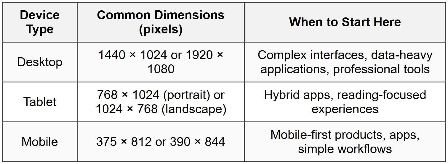
Many designers follow a mobile-first approach, starting with the smallest screen and then expanding to larger sizes. This forces you to prioritize the most important content and features.
Building Your First Low-Fidelity Wireframe
Now let's walk through the actual process of creating a low-fidelity wireframe. We'll use a practical example: designing a blog post page.
Step 1: Establish the Basic Frame
Start by creating your artboard or frame-this is the container that represents your screen. If you're working on a desktop design at 1440 × 1024, create a rectangle of those dimensions.
Give your frame a light background (usually white or very light gray) so your wireframe elements will be visible against it.
Step 2: Block Out Major Sections
Divide your frame into the major sections your page needs. For our blog post example, you might have:
- Header - Usually spanning the full width at the top
- Navigation area - Often within or just below the header
- Main content area - The largest section where the blog post lives
- Sidebar - (Optional) Additional content or navigation
- Footer - Information at the bottom of the page
Use simple rectangles to represent each section. At this stage, you're just roughing out the basic zones. Don't worry about exact measurements-rough proportions are fine.
Tip: Use a subtle gray fill or light gray stroke (border) to differentiate these sections without making them too prominent. Remember, we're keeping things low-fidelity.
Step 3: Add Navigation Elements
Within your header or navigation section, add the elements users need to move around:
- A rectangle representing the logo (you might write "LOGO" inside it or just leave it as a box)
- Simple rectangles or text labels for menu items (Home, About, Blog, Contact)
- A search icon or box if your site needs search
- Account/login elements if relevant
Keep everything aligned and evenly spaced. Even in low-fidelity wireframes, alignment matters because it communicates structure.
Step 4: Design the Content Hierarchy
Now focus on your main content area. For a blog post, you need to establish a clear visual hierarchy-making sure the most important elements stand out.
Start with the largest, most important element and work your way down:
- Blog post title - A thick horizontal line or simple text in a larger size
- Metadata - Author name, date, reading time (smaller text or thinner lines)
- Featured image - A large rectangle with an "X" through it
- Body content - Multiple horizontal lines representing paragraphs, with spacing between them
- Subheadings - Slightly thicker lines breaking up the body content
- Secondary images - Smaller image placeholders within the content
The size and spacing of elements should reflect their importance. The title should be noticeably larger than body text. Images should be prominent enough to break up text but not so large they dominate everything else.
Step 5: Include Interactive Elements
Add elements that users can interact with:
- Social sharing buttons - Small labeled rectangles or simple icons
- Comment section - Text input field represented as a rectangle, plus a "Submit" button
- Related posts - Boxes showing where other blog posts will be recommended
- Newsletter signup - Input field and button
Each interactive element should be clearly distinguishable from static content. Buttons might have a border or fill, while input fields might be outlined rectangles.
Step 6: Add the Footer
Your footer typically contains:
- Additional navigation links
- Social media links (simple icon placeholders)
- Copyright information
- Contact information
Keep this section simple and organized. Group related items together.
Step 7: Annotate When Necessary
Add brief notes to clarify anything that might not be obvious:
- "Author bio appears here with photo"
- "Comments load dynamically"
- "Sticky navigation-stays visible while scrolling"
Place annotations near the elements they describe, using arrows or lines to connect them if needed.
Common Wireframing Patterns and Conventions
Certain patterns appear again and again in wireframes because they represent common interface solutions. Learning these conventions will speed up your wireframing process.
Grid-Based Layouts
Most modern interfaces use grid systems to organize content. A grid is an invisible structure of columns and rows that helps align elements consistently.
Common grid configurations include:
- 12-column grid - Very flexible; elements can span any number of columns (1, 2, 3, 4, 6, or 12)
- 8-column grid - Simpler, good for less complex layouts
- 4-column grid - Often used for mobile designs
You don't need to show grid lines in your final wireframe, but using them as guides ensures everything aligns properly.
Card-Based Layouts
Cards are rectangular containers that group related information. They're everywhere-in social media feeds, product listings, news sites, and dashboards.
In a wireframe, a card is simply:
- A rectangle (the card container)
- An image placeholder at the top or side
- A headline
- Some body text (represented by lines)
- Perhaps a button or link at the bottom
Cards can be arranged in rows, grids, or scrollable lists.
Hero Sections
A hero section is a large, prominent area usually at the top of a page, designed to grab attention immediately. In wireframes, you'd show:
- A large rectangle (often spanning the full width)
- A large headline (thick line or simple text)
- A subheadline (thinner line below the headline)
- A prominent call-to-action button
- Often a large background image placeholder
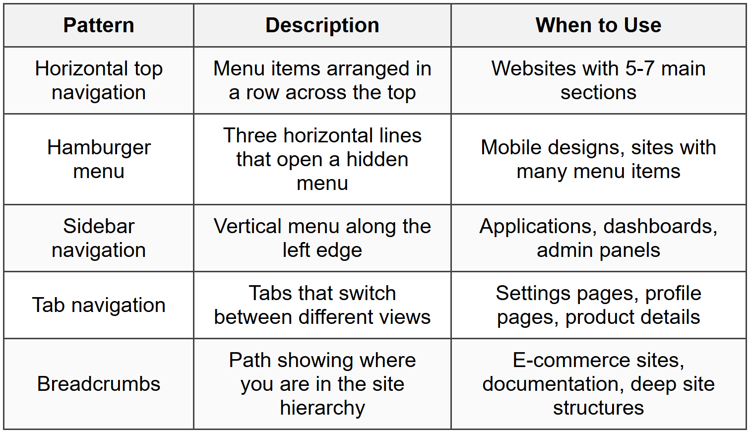
Navigation Patterns
Several standard navigation patterns appear in wireframes:
Form Layouts
Forms are common in almost every interface. In wireframes, forms consist of:
- Field labels - Text identifying what information goes in each field
- Input fields - Rectangles where users type information
- Helper text - Small text below fields explaining what's needed
- Required field indicators - Often an asterisk (*) next to the label
- Buttons - "Submit," "Cancel," "Next," etc.
- Grouping - Related fields grouped together visually
Keep forms simple in wireframes. Show the structure and flow, not every possible validation state or error message.
Best Practices for Low-Fidelity Wireframing
Following these practices will help you create wireframes that communicate clearly and support your design process effectively.
Maintain Consistent Spacing
Even though you're working at low fidelity, consistent spacing makes your wireframes easier to understand. Use the same amount of padding inside elements, the same margins between sections, and regular intervals in your grid.
Think of spacing like rhythm in music-it creates a sense of order and predictability that helps people process information.
Use Realistic Proportions
While your wireframes don't need pixel-perfect accuracy, they should use realistic proportions. If your button is tiny compared to everything else on the screen, people viewing your wireframe might assume it's unimportant-even if that's not your intent.
Similarly, if you show a headline that takes up half the screen, reviewers will point out that it's too large, derailing the conversation from more important structural issues.
Focus on One Screen State at a Time
When you're creating wireframes, focus on the default state first-what users see when they first land on the screen with no interactions yet.
After you've established the default state, you can create additional wireframes showing:
- Hover states
- Active/selected states
- Empty states (when there's no content yet)
- Loading states
- Error states
But don't try to show all these states in one wireframe-it creates confusion.
Don't Over-Polish
Remember that the goal of low-fidelity wireframes is speed and flexibility. If you find yourself spending 30 minutes aligning elements to the exact pixel or choosing between different shades of gray, you're working at too high a fidelity level.
The wireframe should look somewhat rough and unfinished-this signals to viewers (and yourself) that everything is still open to change.
Work at the Right Level of Detail for Your Audience
Different situations call for different levels of detail:
- Early exploration - Very rough, just basic boxes and labels
- Team discussion - Slightly more detail, enough to have meaningful conversations about layout and functionality
- Client presentation - Still low-fidelity, but neat and clearly labeled so non-designers can understand
- Developer handoff - More annotations and specifications, though you might be ready to move to higher fidelity at this point
Label Unclear Elements
If a box or icon might not be immediately obvious, add a simple label. Write "Search" next to your search box, "User Avatar" next to that circle in the corner, or "Featured Products" above that section.
These labels take seconds to add and prevent confusion later.
Show Content Priority Through Size and Position
The visual hierarchy in your wireframe should reflect the content hierarchy. Important elements should be:
- Larger in size
- Positioned higher on the page (people scan from top to bottom)
- Given more space around them (breathing room draws attention)
- More visually distinct (darker, bolder, or with stronger borders)
Creating Wireframes for Different Screen Sizes
Responsive design means your interface needs to work across multiple screen sizes. Your wireframes should account for this from the beginning.
The Mobile-First Approach
Many designers start with mobile wireframes because:
- Mobile screens have the least space, forcing you to prioritize ruthlessly
- It's easier to expand a mobile design to desktop than to compress a desktop design to mobile
- Mobile traffic often exceeds desktop traffic for many types of sites
When creating mobile wireframes, consider:
- Vertical scrolling - Mobile users expect to scroll, so single-column layouts work well
- Touch targets - Interactive elements need to be large enough to tap with a finger (roughly 44 × 44 pixels minimum)
- Simplified navigation - Often using hamburger menus or bottom navigation bars
- Stacked content - Things that sit side-by-side on desktop often stack vertically on mobile
Adapting to Tablet Sizes
Tablet wireframes often represent a middle ground:
- More screen space than mobile, so you can show more content
- Still touch-based, so elements need to be tap-friendly
- Can support two-column layouts in some cases
- Navigation might expand from hamburger menus to horizontal tabs or sidebars
Desktop Wireframes
Desktop screens offer the most space, allowing for:
- Multi-column layouts
- Persistent navigation that doesn't need to be hidden
- Sidebars with supplementary content
- More content visible without scrolling
- Hover interactions (since desktop users have mice)
Showing Breakpoints in Wireframes
A breakpoint is a screen width where your layout changes significantly. Common breakpoints might be:
- 0-480px (small mobile)
- 481-768px (large mobile/small tablet)
- 769-1024px (tablet/small desktop)
- 1025px+ (desktop)
You don't need to wireframe every single pixel width, but showing key breakpoints (typically mobile, tablet, and desktop) helps everyone understand how the design adapts.
Common Mistakes to Avoid
Being aware of these pitfalls will help you create more effective wireframes and avoid wasting time.
Adding Too Much Detail Too Soon
The most common mistake is treating low-fidelity wireframes like high-fidelity mockups. If you're choosing specific fonts, adding actual images, or perfecting shadows and colors, you've gone too far.
Remember: restraint is your friend in low-fidelity work. Save the polish for later stages.
Forgetting About Real Content
While you use placeholder content in wireframes, don't ignore the reality of what content will actually appear. If your real headlines will be 8-10 words long, don't design for 3-word headlines. If you'll have paragraphs of text, don't show just two lines.
Ask yourself: "Will real content actually fit comfortably in this space?"
Neglecting Edge Cases
Your wireframe might look great with perfectly sized content, but what happens when:
- A user has a very long name?
- There are zero items in a list?
- There are hundreds of items in a list?
- An image doesn't load?
- Text is in a language that uses longer words?
You don't need to wireframe every edge case, but thinking about them helps you create more robust designs.
Inconsistent Element Sizes
If your buttons are different sizes on different parts of the wireframe without good reason, it creates confusion. Are they different because they have different importance, or did you just not notice?
Establish some basic rules for yourself: "Primary buttons are this size, secondary buttons are that size" and stick to them.
Skipping Annotations for Complex Interactions
A wireframe can't always show how something works. If clicking a button opens a modal dialog, that interaction happens over time-you can't show it in a single static wireframe.
When you have complex interactions, add notes: "Clicking 'Learn More' opens details panel below" or "This section collapses on mobile."
Working in Isolation
Wireframes are communication tools. Creating them alone in a dark room and then presenting them as finished solutions is a missed opportunity.
Share rough wireframes early. Sketch them on paper and show your team. Get feedback when changes are still easy to make. The goal isn't to create perfect wireframes-it's to create the best possible foundation for your final design.
From Wireframes to the Next Stage
Low-fidelity wireframes are a means to an end, not the final product. Understanding what comes next helps you know when your wireframes are "done enough."
When to Stop Wireframing
Your wireframes are ready to move forward when:
- The overall structure and layout are clearly defined
- All necessary content areas are accounted for
- Navigation and user flows make sense
- Stakeholders and team members agree on the basic approach
- You have enough detail that the next designer or developer knows what to build
You don't need every pixel perfect. You don't need every possible screen state documented. You need enough clarity to move forward confidently.
Transitioning to High-Fidelity Design
After low-fidelity wireframes come approved, the next step is typically high-fidelity mockups or prototypes. This is where you add:
- Real or realistic content
- Actual typography (font choices, sizes, weights)
- Color schemes and branding
- Images, icons, and illustrations
- Detailed spacing and measurements
- Visual effects (shadows, gradients, etc.)
Your low-fidelity wireframes serve as the blueprint for this high-fidelity work. Good wireframes make the high-fidelity stage much faster because all the difficult structural decisions are already made.
Creating a Wireframe Library
As you create more wireframes, you'll notice that certain patterns repeat. You can save time by creating a personal wireframe library-a collection of reusable components like:
- Common button styles
- Form field layouts
- Card templates
- Navigation patterns
- Footer layouts
- Image placeholder symbols
These reusable elements help you work faster while maintaining consistency across your wireframes.
Practical Tips for Efficient Wireframing
These practical tips will help you work more efficiently and create better results.
Use Keyboard Shortcuts
Learn the keyboard shortcuts for your wireframing tool. Being able to quickly create shapes, duplicate elements, align objects, and adjust spacing without reaching for your mouse saves enormous amounts of time.
Name Your Layers and Frames
Even in simple wireframes, organizing your work pays off. Name your frames things like "Homepage - Desktop" or "Product Page - Mobile" rather than leaving them as "Frame 1," "Frame 2," etc.
Group related elements together and name the groups. This makes it easy to find and edit specific parts of your wireframe later.
Work with Components
If your wireframing tool supports components (reusable elements), use them. Create a component for your header once, then reuse it across all your wireframes. When you need to update the header, changing the component updates it everywhere.
Start with Templates
Many wireframing tools offer templates for common page types (landing pages, product pages, dashboards, etc.). These templates aren't meant to be used exactly as-is, but they provide a solid starting point that you can customize.
There's no shame in starting with a template-professionals use them all the time.
Iterate Quickly
One huge advantage of low-fidelity wireframes is how fast you can create variations. If you're not sure whether approach A or approach B works better, create both. It might only take 10 minutes, and seeing them side-by-side often makes the answer obvious.
Get Comfortable with "Good Enough"
Perfectionism is the enemy of wireframing. Your wireframe doesn't need to be beautiful-it needs to be clear and functional. If something is 90% aligned instead of 100%, that's fine. You're not building the final product yet; you're exploring ideas.
Set a time limit for yourself. If you're spending more than 30-60 minutes on a wireframe for a single screen, you're probably over-thinking it.
Conclusion
Low-fidelity wireframes are one of the most powerful tools in a designer's toolkit. They let you explore ideas quickly, communicate concepts clearly, and make fundamental structural decisions before investing time in visual design. By keeping things simple-just boxes, lines, and basic shapes-you maintain flexibility and keep everyone focused on what matters most: does this layout actually work?
The key to effective low-fidelity wireframing is understanding that it's not about creating something polished or impressive-looking. It's about thinking through problems, trying different solutions, and building a solid foundation for the design work that follows. Master the basics covered in this document-understanding layout structure, using consistent patterns, maintaining realistic proportions, and knowing when to add detail and when to hold back-and you'll find that wireframing becomes a natural, intuitive part of your design process.
Every expert designer started exactly where you are now, learning to communicate ideas with simple shapes and building confidence with each wireframe they created. Start simple, iterate often, and remember that even rough sketches have immense value when they communicate clear ideas.


