Inclusive Design Principles


Inclusive Design Principles
Imagine walking into a building where the only way to enter is by climbing a steep flight of stairs. For many people, this wouldn't be an issue, but for someone using a wheelchair, pushing a stroller, or recovering from an injury, those stairs become an insurmountable barrier. Now imagine that same building with a gently sloped ramp alongside the stairs. Suddenly, everyone can enter comfortably. That ramp doesn't just help wheelchair users-it benefits parents with strollers, delivery workers with carts, elderly people with walkers, and even someone carrying heavy boxes.
This is the heart of inclusive design: creating experiences that work for the widest possible range of people, regardless of their abilities, circumstances, or backgrounds. In web and mobile design, inclusive design means building digital products that everyone can use, understand, and benefit from.
What Is Inclusive Design?
Inclusive design is a design methodology that considers the full range of human diversity with respect to ability, language, culture, gender, age, and other forms of human difference. It's not about creating separate experiences for different groups of people-it's about designing one experience that accommodates as many people as possible from the start.
Think of inclusive design as the opposite of designing for the "average" user. The truth is, there is no average user. People interact with digital products in countless different ways:
- Someone might use a screen reader because they're blind
- Another person might navigate entirely with a keyboard because they have limited hand mobility
- Someone else might need larger text because of low vision or age-related vision changes
- A user might be in a loud environment where they can't hear audio
- Another might be in bright sunlight where low-contrast designs become impossible to read
- Someone might be accessing your site on a slow internet connection
- A person might be learning a new language and need simpler vocabulary
Inclusive design recognizes all these scenarios and many more, building flexibility and choice into every aspect of the design process.
Inclusive Design vs. Accessibility
You might wonder how inclusive design differs from accessibility. While closely related, they're not quite the same thing:
Accessibility typically refers to meeting specific technical standards and legal requirements that make digital products usable by people with disabilities. It's often focused on compliance with guidelines like WCAG (Web Content Accessibility Guidelines).
Inclusive design is a broader philosophy that encompasses accessibility but goes further. It's about considering the full spectrum of human diversity throughout the entire design process, not just adding accessibility features at the end.
Think of it this way: accessibility is the floor-the minimum standard you must meet. Inclusive design is the aspiration-the goal of creating experiences that truly work for everyone. Accessibility asks "Can people with disabilities use this?" Inclusive design asks "How can we design this so it works brilliantly for the greatest number of people?"
Core Principles of Inclusive Design
Inclusive design rests on several fundamental principles that guide designers in creating more universal experiences. Let's explore each of these principles in depth.
1. Recognize Exclusion
The first principle is to actively recognize when and how our designs exclude people. Exclusion often happens unintentionally because designers naturally design for people like themselves. If your design team consists entirely of young, tech-savvy people without disabilities, they might unconsciously create designs that work perfectly for young, tech-savvy people without disabilities-and poorly for everyone else.
Exclusion occurs when we solve problems using our own biases. For example:
- Designing buttons that require precise mouse clicks excludes people with motor impairments or those using touch screens
- Using color alone to convey information excludes people who are colorblind
- Creating video content without captions excludes deaf users and anyone in a sound-sensitive environment
- Requiring phone verification excludes people without consistent access to mobile phones
- Using idioms or cultural references excludes people from different linguistic or cultural backgrounds
To recognize exclusion, you need to understand the various types of exclusion:
Permanent, Temporary, and Situational Disabilities
One powerful framework for understanding exclusion is the spectrum of abilities. Disabilities and limitations aren't just permanent conditions-they can be temporary or situational:
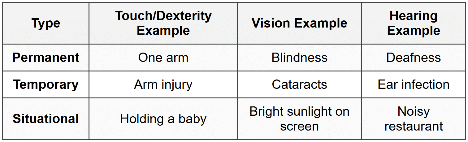
This framework reveals an important truth: when you design for permanent disabilities, you're actually designing for a much larger group. Captions don't just help deaf users-they help anyone watching video in a quiet library or a noisy gym. Large, easy-to-tap buttons don't just help people with motor impairments-they help anyone using their phone while walking or anyone with cold hands wearing gloves.
2. Learn From Diversity
Human beings are wonderfully diverse. The second principle of inclusive design is to actively seek out and learn from this diversity rather than trying to design around it or ignore it.
This means:
- Including diverse voices in your design process: Involve people with different abilities, ages, cultural backgrounds, and technological comfort levels in user research and testing
- Listening to lived experiences: People with disabilities are experts in their own experience. Their insights about barriers and solutions are invaluable
- Challenging assumptions: Question your assumptions about how people use technology and why they make certain choices
- Recognizing that you don't know what you don't know: Stay humble and curious about experiences different from your own
For example, when designing a mobile banking app, you might discover through diverse user research that:
- Some users need high contrast modes for vision reasons
- Others need simplified language because they're not native speakers or have cognitive differences
- Some users rely entirely on voice commands because they have both vision and motor impairments
- Many elderly users feel anxious about making mistakes and need clear "undo" options and confirmations
- People with cognitive disabilities benefit from consistent navigation patterns and clear visual hierarchies
Each of these insights makes your design better not just for one group, but for everyone. Clear language and "undo" options benefit all users. High contrast modes help in bright sunlight. Voice commands are useful when driving.
3. Solve For One, Extend To Many
This principle suggests that when you solve a problem for someone with a constraint or disability, you often end up creating something that benefits a much wider audience. This is sometimes called the curb-cut effect, named after the curb cuts in sidewalks.
Curb cuts were originally mandated to help wheelchair users navigate sidewalks, but they ended up helping:
- Parents with strollers
- Travelers with rolling luggage
- Delivery workers with hand trucks
- Cyclists
- Elderly people who have trouble with steps
- Anyone who temporarily needs them (like someone on crutches)
Digital design has countless examples of the curb-cut effect:
Example: Email Clients and Image Alt Text
When email clients started blocking images by default for security reasons, alt text (originally created for screen readers) suddenly became visible to all users. This made emails with proper alt text more effective for everyone.
Example: Voice Interfaces
Voice assistants were initially developed to help people with visual or motor impairments. Now millions of people use them while driving, cooking, exercising, or simply because they're convenient.
Example: Autocomplete and Predictive Text
These features were designed to help people with motor impairments who found typing difficult. Now they speed up typing for everyone and are standard features on virtually all devices.
When you're designing, ask yourself: "Who has the most difficulty with this task?" Then design for that person. The solution will likely benefit everyone.
4. Design for Flexibility
No single design can perfectly suit every individual, so inclusive design embraces flexibility and user control. This means creating systems that can adapt to different needs and preferences rather than forcing everyone into the same rigid experience.
Flexibility in design manifests in many ways:
- Multiple ways to accomplish tasks: Provide keyboard shortcuts alongside mouse controls, offer both voice and text input, allow both touch and click interactions
- Customizable interfaces: Let users adjust text size, color schemes, contrast levels, and layout density
- Content in multiple formats: Offer transcripts for audio content, audio descriptions for visual content, and text alternatives for all media
- Adjustable timing: Allow users to extend time limits, pause animations, or control autoplay features
- Progressive disclosure: Provide simple defaults with options to access more complex features for those who need them
Example: YouTube Video Player
YouTube's video player demonstrates flexibility beautifully. Users can:
• Turn captions on or off
• Adjust playback speed (useful for people with cognitive disabilities or non-native speakers)
• Change video quality based on connection speed
• Use keyboard shortcuts for all controls
• Choose between theater mode, full screen, or default view
• Enable auto-generated transcripts
Flexibility respects that people have different needs at different times. Someone might prefer dark mode at night and light mode during the day. They might want larger text when tired or when viewing from a distance. They might want detailed information sometimes and simplified summaries other times.
5. Design for Consistency and Predictability
Consistency and predictability are crucial for inclusive design because they reduce cognitive load and help people navigate with confidence. When interfaces behave in expected ways, people can focus on their tasks rather than figuring out how the interface works.
This principle is especially important for:
- People with cognitive disabilities who may struggle with learning new patterns
- Elderly users who may be less familiar with digital conventions
- Screen reader users who rely on predictable structures to navigate
- Anyone under stress or working quickly who doesn't have time to figure out novel interfaces
Consistency applies to several aspects of design:
Visual Consistency
- Use the same colors and styles for similar elements throughout your design
- Position navigation elements in the same location on every page
- Use consistent iconography and labeling
- Maintain consistent spacing and layout patterns
Functional Consistency
- Make similar elements behave in similar ways
- Use standard interaction patterns that people already know
- Keep button placements consistent (for example, always put "Next" on the right and "Back" on the left)
- Use familiar conventions (like underlining links or using a shopping cart icon for e-commerce)
Content Consistency
- Use the same terminology for the same concepts throughout your interface
- Maintain consistent heading structures and content hierarchies
- Apply consistent tone of voice in all written content
Predictability doesn't mean boring design. It means that innovative or creative elements are balanced with familiar patterns so users always have a path forward.
Practical Applications of Inclusive Design
Now let's explore how these principles translate into concrete design decisions across different aspects of web and mobile design.
Color and Contrast
Color is a powerful design tool, but relying on color alone creates barriers. Approximately 8% of men and 0.5% of women have some form of color vision deficiency (often called color blindness).
Inclusive practices for color:
- Never use color as the only way to convey information: If links are only distinguished by color, some users won't see them. Add underlines or other visual indicators
- Ensure sufficient contrast: Text should have enough contrast against its background. Light gray text on white backgrounds may look elegant but becomes invisible to people with low vision or in bright sunlight
- Test your color choices: Use tools to simulate how your designs appear to people with different types of color vision deficiency
- Use patterns in addition to colors: In charts and graphs, combine color with patterns, textures, or labels
- Consider both light and dark modes: What works in one mode might not work in another
Example: Form Validation
Bad: Turning a text field red when there's an error (colorblind users might not notice)
Good: Turning the field red AND adding an error icon AND displaying an error message in text
Typography and Readability
Text is the foundation of most digital interfaces, so inclusive typography is essential. Your text needs to work for people with vision impairments, cognitive differences, and varying reading abilities.
Inclusive typography practices:
- Allow text resizing: Never prevent users from zooming or increasing text size. Your design should remain functional when text is enlarged up to 200%
- Choose readable fonts: Sans-serif fonts are generally easier to read on screens. Avoid decorative fonts for body text
- Use adequate line height: Text that's too tightly spaced is difficult to read. Line height should typically be at least 1.5 times the font size for body text
- Limit line length: Very long lines of text are hard to read. Aim for 50-75 characters per line for optimal readability
- Use appropriate font sizes: Body text should generally be at least 16 pixels. Smaller text becomes difficult to read, especially on mobile devices
- Provide adequate spacing: Space between paragraphs, sections, and interactive elements helps people parse information and reduces misclicks
Navigation and Information Architecture
How people find and move through your content is critical to inclusive design. Navigation needs to work across different devices, assistive technologies, and cognitive abilities.
Inclusive navigation practices:
- Create clear hierarchies: Use proper heading levels (h1, h2, h3) in logical order. Screen reader users often navigate by headings, jumping from one to the next
- Provide multiple ways to find content: Include search functionality, clear menu structures, breadcrumbs, and related content links
- Make interactive elements obvious: Buttons should look like buttons. Links should be clearly distinguishable. Users shouldn't have to guess what's clickable
- Use descriptive labels: "Click here" tells users nothing. "Download the 2024 annual report (PDF, 2MB)" is clear and informative
- Ensure keyboard accessibility: All interactive elements should be reachable and usable with just a keyboard. Many people can't use a mouse
- Provide skip links: Let users skip repetitive navigation to get directly to main content
- Make focus indicators clear: When users navigate with a keyboard, they need to see where they are. Don't remove focus outlines without providing better alternatives
Example: Breadcrumb Navigation
Home → Products → Laptops → Gaming Laptops
This breadcrumb trail helps everyone understand where they are in the site structure, but it's especially helpful for people using screen readers or those with cognitive disabilities who might lose track of their location.
Forms and Input
Forms are where many digital interactions happen-purchasing products, creating accounts, submitting information. They're also where exclusion often occurs if not designed carefully.
Inclusive form design practices:
- Label everything clearly: Every form field needs a visible, permanent label. Placeholder text that disappears when typing isn't sufficient
- Group related fields: Use fieldsets to group related information logically
- Provide helpful hints: Explain format requirements before users make mistakes (not after)
- Make error messages specific and helpful: "Invalid input" doesn't help anyone. "Password must be at least 8 characters" does
- Allow for variety in input: Don't force specific formats unless absolutely necessary. Accept phone numbers with or without spaces and dashes
- Support autofill: Use proper HTML input types so browsers and password managers can help users complete forms
- Don't make required fields frustrating: Only mark fields as required if they truly are. Consider what information you actually need
Example: Password Creation
Exclusive approach: "Password invalid" after submission
Inclusive approach: Clear upfront requirements + real-time feedback showing which requirements are met + option to view password while typing + support for password managers
Images and Media
Visual and audio content enriches digital experiences, but only when everyone can access it. Inclusive design ensures that no one misses important content because it's trapped in an inaccessible format.
Inclusive media practices:
- Provide alt text for images: Describe images for people who can't see them. Decorative images should have empty alt attributes so screen readers skip them
- Make alt text meaningful: Don't just say "image"-describe what's important about the image in context
- Caption all videos: Captions help deaf users, non-native speakers, and anyone in a sound-sensitive environment
- Provide transcripts: Full transcripts of audio and video content help people who are deaf-blind and make content searchable and skimmable
- Add audio descriptions: For video content where visual information is important, provide audio descriptions of what's happening on screen
- Don't autoplay audio or video: Unexpected sound can be jarring, disorienting for screen reader users, or embarrassing in public spaces
- Provide controls: Let users pause, stop, and control volume for any media
Mobile and Touch Interfaces
Mobile devices present unique inclusive design challenges and opportunities. They're used in diverse contexts-while walking, in bright sunlight, with one hand, with gloves on-and by people with varying motor abilities.
Inclusive mobile design practices:
- Make touch targets large enough: Buttons and links should be at least 44×44 pixels (about the size of a fingertip). Small targets are frustrating for everyone and impossible for people with motor impairments
- Provide adequate spacing: Space touch targets so people don't accidentally tap the wrong thing
- Support both orientations: Your design should work in both portrait and landscape unless there's a compelling reason to lock orientation
- Design for one-handed use: Place important actions within easy thumb reach. Consider that people hold phones differently
- Avoid gesture-only interactions: If you use swipe gestures, provide button alternatives. Some people can't perform complex gestures
- Consider connection speed: Not everyone has fast internet. Optimize images and minimize data requirements
- Support system settings: Respect user preferences for text size, motion, and color schemes
Interactive Elements and Feedback
Interactive elements need to communicate what they are, what they do, and what happened after interaction. This feedback is crucial for people using assistive technologies or those with cognitive differences.
Inclusive interaction practices:
- Make states clear: Show when buttons are enabled, disabled, loading, or completed
- Provide feedback for actions: Confirm when actions complete successfully or fail. Don't leave users wondering if something happened
- Allow undo: Let people reverse actions rather than making them fear mistakes
- Give users time: Don't impose tight time limits unless absolutely necessary, and allow extensions
- Minimize cognitive load: Don't make users remember information from previous screens. Keep important information visible
- Be careful with animations: Some people experience vestibular disorders where motion causes nausea or dizziness. Provide options to reduce motion and respect the prefers-reduced-motion setting
Language and Content
The words you choose and how you structure content profoundly affect inclusivity. Clear, simple language benefits everyone but is essential for people with cognitive disabilities, people learning a new language, and people under stress.
Writing Inclusively
Inclusive content practices:
- Use plain language: Write clearly and simply. Avoid jargon, idioms, and unnecessarily complex vocabulary
- Be concise: Respect people's time and cognitive energy. Say what needs to be said, then stop
- Structure content clearly: Use headings, lists, and short paragraphs. Break up dense text
- Put important information first: Don't bury key information in long paragraphs
- Define specialized terms: If you must use technical language, define it
- Be specific: "Click the blue Save button in the top right corner" is clearer than "Click Save"
- Use active voice: "Click the button" is clearer than "The button should be clicked"
- Be culturally aware: Avoid idioms and cultural references that might not translate across cultures
Inclusive Language About People
How we talk about people matters. Inclusive design extends to the language we use when referring to diverse groups.
- Use person-first or identity-first language as appropriate: Some prefer "person with a disability" (person-first), while others prefer "disabled person" (identity-first). When possible, follow individual or community preferences
- Avoid euphemisms: Terms like "differently abled" or "special needs" can seem patronizing. Be direct and respectful
- Don't use disability as metaphor: Avoid phrases like "falling on deaf ears" or "turning a blind eye"
- Use gender-inclusive language: Use "they" as singular, avoid assuming gender, use terms like "users" or "people" rather than "guys"
- Be internationally minded: Not everyone uses the same date formats, measurement systems, or currency
Testing and Validation
Inclusive design isn't something you can verify by looking at your design on your computer. You need to test with real people using diverse devices and assistive technologies.
Testing Approaches
- Test with real users: Include people with disabilities, elderly users, non-native speakers, and people with varying technical skills in your testing
- Use assistive technologies: Learn to use screen readers, voice control, and keyboard-only navigation yourself
- Test on real devices: Don't rely only on simulators. Test on actual phones, tablets, and computers
- Test in different contexts: Try using your design in bright sunlight, in a quiet library, while multitasking, or with one hand
- Use automated tools: Accessibility checkers can catch many issues, but they can't catch everything. Combine automated testing with manual testing
- Review analytics: Look for patterns that might indicate problems, like high abandonment rates on certain pages
Common Issues to Check
- Can you navigate the entire site using only a keyboard?
- Is focus always visible as you tab through the page?
- Do images have appropriate alt text?
- Are there sufficient color contrast ratios?
- Does the site work when zoomed to 200%?
- Do videos have captions?
- Are form errors clearly explained?
- Can you understand the content without seeing colors?
- Does the site respect reduced motion preferences?
- Are time limits adjustable or avoidable?
The Business Case for Inclusive Design
Beyond being the right thing to do ethically, inclusive design makes business sense. When you design inclusively, you:
- Reach a larger audience: Over 1 billion people worldwide have some form of disability. That's a significant market
- Improve SEO: Many inclusive design practices (like proper heading structure and alt text) also improve search engine optimization
- Reduce legal risk: Accessibility lawsuits are increasing. Designing inclusively from the start is less expensive than retrofitting later
- Enhance brand reputation: Companies known for inclusive design build positive brand associations
- Create better products for everyone: As we've seen with the curb-cut effect, inclusive design improvements benefit all users
- Increase customer satisfaction and retention: When products are easier to use, people use them more and recommend them to others
Moving Forward With Inclusive Design
Inclusive design is not a checkbox or a one-time fix. It's an ongoing commitment to understanding and serving the full diversity of human needs. Here are key mindsets to embrace:
Start Early
Inclusive design is most effective and least expensive when integrated from the beginning of a project. Retrofitting accessibility into finished designs costs more time and money than building it in from the start. Consider inclusivity during:
- Initial concept development
- User research planning
- Information architecture
- Visual design
- Development
- Testing and refinement
Embrace Iteration
You won't get everything right the first time, and that's okay. Inclusive design is a learning process. Each project teaches you something new about human diversity and needs. Build feedback loops into your process, stay curious, and continuously improve.
Advocate and Educate
Inclusive design requires organizational commitment. Whether you're a designer, developer, content creator, or project manager, you can:
- Share what you learn about inclusive design with your team
- Push back against decisions that exclude people
- Include inclusive design in project requirements and timelines
- Celebrate inclusive design wins
- Make it easy for others to practice inclusive design by providing resources and tools
Remember the Human Impact
Behind every principle and practice we've discussed are real people trying to accomplish real tasks. When you make a button easier to tap, you're helping someone who might have arthritis or tremors. When you add captions to a video, you're including someone who might be deaf or studying in a library. When you use clear language, you're reducing anxiety for someone who might already feel overwhelmed.
These aren't abstract users or edge cases-they're parents, students, professionals, friends, and family members. Your design decisions directly affect their ability to participate in digital life, which increasingly means participating in society itself.
Inclusive design is ultimately about respect-respect for the diversity of human experience and respect for each person's right to access, understand, and benefit from the digital products we create. By embracing these principles, you're not just building better websites and apps; you're building a more inclusive digital world.


