Practical Accessibility Implementation


Practical Accessibility Implementation
Welcome to this comprehensive guide on implementing accessibility in web and mobile design. Accessibility isn't just a nice-to-have feature-it's about ensuring that everyone, regardless of their abilities, can access and use digital products effectively. Think of accessibility like building ramps alongside staircases: both get people to their destination, but different people need different paths.
In this document, we'll explore practical, hands-on techniques for making your designs accessible. You'll learn not just what to do, but how to do it and why it matters.
Understanding the Foundation of Accessibility
Before diving into implementation, let's establish what accessibility means in practical terms. When we talk about accessible design, we're considering people with various disabilities:
- Visual impairments - including blindness, low vision, and color blindness
- Auditory impairments - ranging from partial hearing loss to complete deafness
- Motor impairments - affecting the ability to use a mouse or touchscreen precisely
- Cognitive impairments - including learning disabilities, memory issues, or attention disorders
- Temporary disabilities - such as a broken arm or eye strain
- Situational limitations - like trying to use a phone in bright sunlight or in a loud environment
Think of your website or app as a public building. Just as a physical space needs multiple ways to navigate-elevators, ramps, stairs, clear signage-digital spaces need multiple ways to perceive and interact with content.
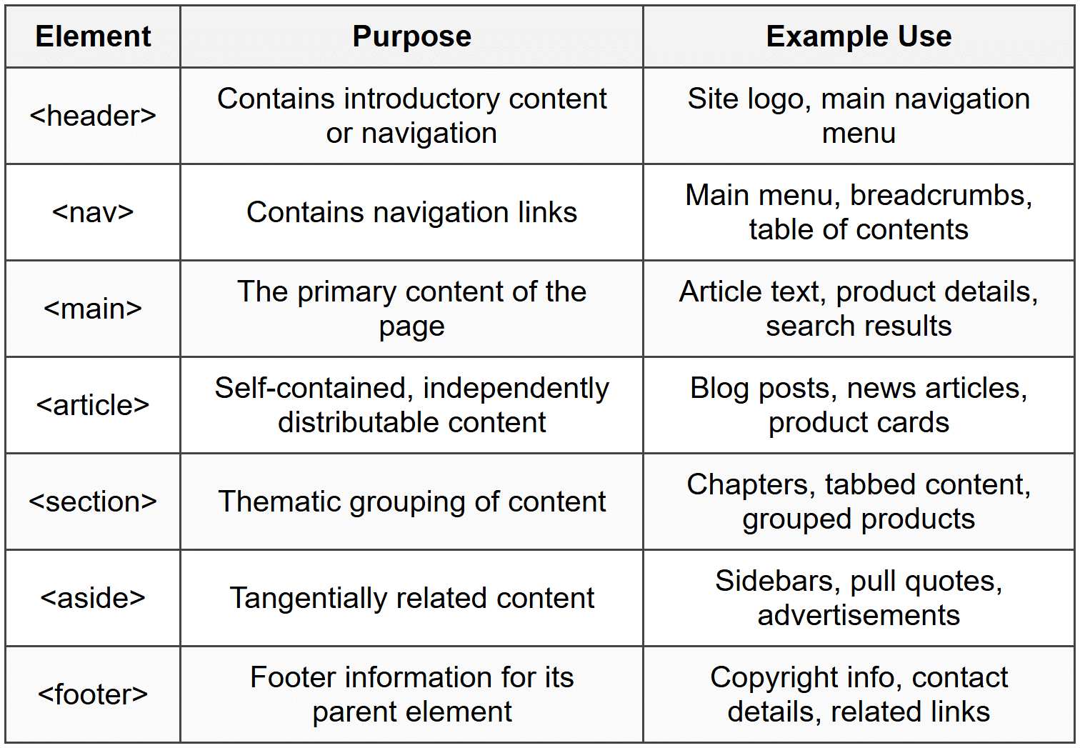
Semantic HTML: The Foundation of Accessible Web Content
Semantic HTML is like using the proper ingredients in a recipe. You could technically make a cake using only flour and water, but it wouldn't be very good. Similarly, you could build a website using only div and span elements, but it wouldn't be accessible.
Why Semantic HTML Matters
Screen readers-software that reads web content aloud to people with visual impairments-rely heavily on HTML structure to understand and navigate pages. When you use semantic HTML, you're providing a roadmap that assistive technologies can follow.
Essential Semantic Elements
Proper Heading Hierarchy
Headings (h1 through h6) create an outline of your page. Think of them like a book's table of contents-each level represents a different depth of organization.
Correct Heading Structure:
<h1>Main Page Title</h1>
<h2>First Major Section</h2>
<h3>Subsection</h3>
<h3>Another Subsection</h3>
<h2>Second Major Section</h2>
<h3>Subsection</h3>
Important rules for headings:
- Use only one h1 per page-it represents the main topic
- Don't skip heading levels (don't jump from h2 to h4)
- Don't choose headings based on visual size-use CSS for styling
- Headings should accurately describe the content that follows
ARIA: Enhancing Accessibility When HTML Falls Short
ARIA (Accessible Rich Internet Applications) is like adding translation notes to your HTML. When semantic HTML alone can't fully describe what something does, ARIA fills in the gaps.
The First Rule of ARIA
The most important rule is: Don't use ARIA if you can use native HTML instead. ARIA should supplement HTML, not replace it. For example:
Bad approach:
<div role="button" tabindex="0">Click me</div>
Good approach:
<button>Click me</button>
Common ARIA Attributes
aria-label provides an accessible name when visible text isn't sufficient:
<button aria-label="Close navigation menu">
<svg>...X icon...</svg>
</button>
aria-labelledby references another element to provide a label:
<h2 id="shipping-heading">Shipping Information</h2>
<div aria-labelledby="shipping-heading">
Address fields...
</div>
aria-describedby provides additional descriptive information:
<input type="password" aria-describedby="password-requirements">
<p id="password-requirements">Must be at least 8 characters</p>
aria-live announces dynamic content changes:
<div aria-live="polite">
Item added to cart
</div>
The aria-live attribute has three values:
- off - no announcements (default)
- polite - announces when the user is idle
- assertive - announces immediately (use sparingly!)
ARIA Roles
Roles define what an element is or does. Modern semantic HTML often makes roles unnecessary, but they're useful for custom components:
- role="navigation" - identifies navigation areas (though <nav> is preferred)
- role="search" - marks a search region
- role="alert" - for important, time-sensitive information
- role="dialog" - for modal dialogs
- role="tablist", role="tab", role="tabpanel" - for tab interfaces
ARIA States and Properties
These communicate the current state of interactive elements:
<button aria-expanded="false" aria-controls="menu-list">
Menu
</button>
<ul id="menu-list" aria-hidden="true">
<li>Home</li>
<li>About</li>
</ul>
Common state attributes include:
- aria-expanded - whether a collapsible element is expanded (true/false)
- aria-hidden - hides content from assistive technology
- aria-disabled - indicates a disabled element
- aria-checked - state of checkboxes or radio buttons
- aria-selected - indicates selection in lists or tabs
Keyboard Accessibility
Imagine trying to use a computer with your mouse unplugged. Many users navigate this way every day-whether due to motor impairments, preference, or efficiency. Your interface must be fully usable with just a keyboard.
Focus Management
Focus is like a spotlight that highlights which element is currently active. Users navigate using specific keys:
- Tab - moves focus forward
- Shift + Tab - moves focus backward
- Enter - activates buttons and links
- Space - activates buttons, checks checkboxes
- Arrow keys - navigate within components like dropdown menus
- Escape - closes modals or cancels actions
Making Elements Focusable
Interactive elements should naturally receive keyboard focus. Some elements are focusable by default (buttons, links, form inputs), while others need help.
The tabindex attribute controls focus behavior:
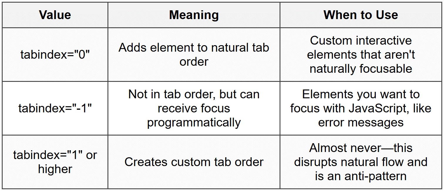
Example of custom interactive element:
<div role="button" tabindex="0" onkeypress="handleKey(event)">
Custom Button
</div>
Focus Indicators
Focus indicators are the visual outline that appears around focused elements. Never remove focus indicators without providing an alternative! Think of them as the cursor of keyboard navigation-removing them is like making the mouse cursor invisible.
If the default browser focus outline doesn't match your design, create a custom one that's at least as visible:
Good practice: Enhance the default focus style
Never: Remove it entirely with outline: none without a replacement
Skip Links
Skip links are like express elevators in a tall building. They let keyboard users jump past repetitive content (like navigation menus) straight to the main content.
<body>
<a href="#main-content" class="skip-link">Skip to main content</a>
<header>...navigation...</header>
<main id="main-content">...</main>
</body>
Skip links are often visually hidden until focused, appearing only when a keyboard user tabs to them.
Focus Trapping
When a modal dialog opens, focus should be trapped inside it-users shouldn't be able to tab to content behind the modal. Think of it like a conversational detour: you finish the current topic before moving on.
When implementing modal dialogs:
- Move focus to the modal when it opens (often to the close button or first interactive element)
- Prevent tabbing outside the modal
- When the modal closes, return focus to the element that opened it
- Allow closing with the Escape key
Color and Visual Accessibility
Color accessibility is about more than just making things "look nice"-it's about ensuring information is perceivable by everyone, including people with color blindness or low vision.
Color Contrast Ratios
Contrast ratio measures the difference in brightness between text and its background. It's expressed as a ratio like 4.5:1, where higher numbers mean more contrast.
Minimum contrast requirements:
- Normal text - minimum 4.5:1 ratio
- Large text (18pt+ or 14pt+ bold) - minimum 3:1 ratio
- User interface components and graphics - minimum 3:1 ratio
- Enhanced contrast (AAA level) - 7:1 for normal text, 4.5:1 for large text
Think of contrast like the volume on a speaker. If the volume (contrast) is too low, some people won't be able to hear (see) the content clearly.
Don't Rely on Color Alone
Never use color as the only way to convey information. About 8% of men and 0.5% of women have some form of color blindness.
Bad: "Required fields are shown in red"
Good: "Required fields are marked with an asterisk (*) and shown in red"
Examples of combining color with other indicators:
- Error messages: Use color + icon + descriptive text
- Charts: Use color + patterns/textures + labels
- Links: Use color + underline
- Form validation: Use color + icons + text descriptions
Text Considerations
Readable text is accessible text. Follow these guidelines:
- Use sufficient font size (16px minimum for body text)
- Maintain adequate line height (1.5 times font size minimum)
- Limit line length (45-75 characters per line is optimal)
- Avoid all-caps text for long passages (harder to read)
- Left-align text for Western languages (justified text creates uneven spacing)
- Provide sufficient spacing between paragraphs
Images and Alternative Text
Images are invisible to screen readers unless you provide alternative text. Think of alt text as a verbal description you'd give someone over the phone.
Writing Effective Alt Text
The alt attribute serves different purposes depending on the image's function:
Informative Images
Describe the content and function:
<img src="https://cn.edurev.in/hart.png" alt="Bar chart showing sales increased 25% from 2022 to 2023">
Decorative Images
Use empty alt text (but include the attribute!):
<img src="https://cn.edurev.in/ecorative-border.png" alt="">
Functional Images
Describe the action, not the image:
<img src="https://cn.edurev.in/agnifying-glass.png" alt="Search">
Not: <img src="https://cn.edurev.in/agnifying-glass.png" alt="Magnifying glass icon">
Complex Images
For complex images like detailed charts or infographics, provide a short alt text and a longer description elsewhere:
<img src="https://cn.edurev.in/rg-chart.png" alt="Company organizational chart" aria-describedby="org-description">
<div id="org-description">
Detailed description of organizational structure...
</div>
Alt Text Guidelines
- Be concise-aim for under 150 characters
- Don't start with "image of" or "picture of"-it's already implied
- Include text that appears in the image
- Provide context relevant to the surrounding content
- For images of text, include the exact text
- Don't include file names or URLs
Forms and Input Accessibility
Forms are the primary way users interact with web applications. An inaccessible form is like a door with no handle-you can see it, but you can't use it.
Labels and Form Fields
Every form input must have an associated label. The label element creates a programmatic relationship that assistive technologies can understand:
Method 1: Explicit association (recommended)
<label for="email-address">Email Address</label>
<input type="email" id="email-address" name="email">
Method 2: Implicit association
<label>
Email Address
<input type="email" name="email">
</label>
Placeholder Text vs. Labels
Placeholder text is not a substitute for labels. Placeholders disappear when you start typing, have low contrast, and aren't reliably read by screen readers.
Bad:
<input type="text" placeholder="Enter your name">
Good:
<label for="name">Name</label>
<input type="text" id="name" placeholder="e.g., John Smith">
Grouping Related Inputs
Use fieldset and legend to group related form controls:
<fieldset>
<legend>Shipping Address</legend>
<label for="street">Street</label>
<input type="text" id="street">
<label for="city">City</label>
<input type="text" id="city">
</fieldset>
This is especially important for radio button groups:
<fieldset>
<legend>How would you like to receive updates?</legend>
<label><input type="radio" name="updates" value="email"> Email</label>
<label><input type="radio" name="updates" value="sms"> Text message</label>
<label><input type="radio" name="updates" value="none"> No updates</label>
</fieldset>
Required Fields
Indicate required fields in multiple ways:
<label for="username">
Username <span aria-label="required">*</span>
</label>
<input type="text" id="username" required aria-required="true">
Include a note at the form's beginning explaining your notation:
<p>Fields marked with an asterisk (*) are required.</p>
Error Messages and Validation
When validation fails, provide clear, helpful error messages:
- Clearly identify which field has the error
- Explain what went wrong
- Suggest how to fix it
- Make errors programmatically associated with the field
<label for="phone">Phone Number</label>
<input type="tel" id="phone" aria-invalid="true" aria-describedby="phone-error">
<span id="phone-error" role="alert">
Please enter a valid phone number in the format: (555) 555-5555
</span>
The aria-invalid attribute tells assistive technologies the field has an error, while aria-describedby connects the error message to the field.
Autocomplete Attributes
The autocomplete attribute helps users fill forms faster and reduces errors. It's especially helpful for users with cognitive disabilities:
<input type="text" id="fname" autocomplete="given-name">
<input type="text" id="lname" autocomplete="family-name">
<input type="email" id="email" autocomplete="email">
<input type="tel" id="phone" autocomplete="tel">
Multimedia Accessibility
Video and audio content need text alternatives, just like images. Think of it like providing subtitles at a movie theater-some people need them to understand the content.
Captions vs. Subtitles
These terms are often confused but have distinct meanings:
- Captions - include all audio information, including sound effects and speaker identification (for deaf users)
- Subtitles - translate dialogue only (for users who don't speak the language)
Video Accessibility Requirements
Accessible video content should include:
- Captions - synchronized text version of spoken dialogue and important sounds
- Transcripts - complete text version of all audio and visual information
- Audio descriptions - narration describing important visual information
- Keyboard controls - play, pause, volume, etc., must be keyboard accessible
Adding Captions to Video
Use the track element within a video tag:
<video controls>
<source src="https://cn.edurev.in/ideo.mp4" type="video/mp4">
<track kind="captions" src="https://cn.edurev.in/aptions-en.vtt" srclang="en" label="English" default>
<track kind="captions" src="https://cn.edurev.in/aptions-es.vtt" srclang="es" label="Spanish">
<track kind="descriptions" src="https://cn.edurev.in/escriptions.vtt" srclang="en" label="English Descriptions">
</video>
The kind attribute specifies the track type:
- captions - for closed captions
- subtitles - for subtitle translations
- descriptions - for audio descriptions
- chapters - for navigation markers
Audio-Only Content
Podcasts and audio files need transcripts. A transcript should include:
- All spoken content
- Speaker identification
- Important non-speech sounds
- Time markers for long content
Mobile Accessibility Considerations
Mobile accessibility adds unique challenges because of smaller screens, touch interfaces, and varied usage contexts (like using a phone in bright sunlight or while walking).
Touch Target Sizes
Touch targets should be large enough for fingers, not just mouse pointers. Think of it like designing buttons for someone wearing mittens.
Recommended touch target sizes:
- Minimum: 44 × 44 pixels (iOS guideline)
- Recommended: 48 × 48 pixels (Android guideline)
- Adequate spacing between targets (at least 8 pixels)
If visual design requires smaller elements, increase the touch area invisibly:
A small icon might be 24 × 24 pixels visually,
but the tappable area should extend to 48 × 48 pixels
Orientation and Zoom
Don't lock orientation to portrait or landscape only-allow both unless it's essential to functionality (like a camera app). Never disable zoom or restrict scaling:
Bad:
<meta name="viewport" content="width=device-width, initial-scale=1, maximum-scale=1, user-scalable=no">
Good:
<meta name="viewport" content="width=device-width, initial-scale=1">
Mobile Screen Reader Gestures
Mobile screen readers use gestures different from desktop navigation:
- Swipe right - move to next element
- Swipe left - move to previous element
- Double tap - activate element
- Two-finger swipe - scroll
- Rotor gestures - access different navigation modes
Test your mobile designs with VoiceOver (iOS) or TalkBack (Android) enabled to ensure proper navigation flow.
Responsive Design and Accessibility
Responsive design supports accessibility by adapting to different screen sizes and user preferences. Key principles:
- Content should reflow at different screen sizes without horizontal scrolling
- Text should remain readable when zoomed to 200%
- Interactive elements should remain accessible at all breakpoints
- Information hierarchy should be maintained across screen sizes
Navigation and Wayfinding
Good navigation is like clear signage in a building-it helps everyone find their way, but it's essential for people who can't see the big picture at once.
Consistent Navigation
Keep navigation patterns consistent across your site or app:
- Navigation menus in the same location on each page
- Similar elements appearing in the same order
- Consistent naming for the same functions
- Predictable behavior for interactive elements
Multiple Navigation Methods
Provide several ways to find content:
- Primary navigation menu - main site structure
- Search functionality - direct access to specific content
- Breadcrumbs - show current location in hierarchy
- Site map - overview of all pages
- Related links - contextual navigation
Breadcrumb Navigation
Breadcrumbs show users where they are in the site structure:
<nav aria-label="Breadcrumb">
<ol>
<li><a href="/">Home</a></li>
<li><a href="/products">Products</a></li>
<li><a href="/products/laptops">Laptops</a></li>
<li aria-current="page">MacBook Pro</li>
</ol>
</nav>
The aria-current="page" attribute marks the current location.
Descriptive Link Text
Link text should make sense out of context. Screen reader users often navigate by jumping from link to link, hearing only the link text.
Bad: "Click here for more information"
Good: "Learn more about accessibility testing"
Bad: "Read more"
Good: "Read more about semantic HTML"
Data Tables
Tables organize related information into rows and columns. When properly marked up, screen readers can navigate tables cell-by-cell while announcing row and column headers.
Simple Table Structure
Use th elements for header cells and td for data cells:
<table>
<caption>Monthly Sales Report</caption>
<thead>
<tr>
<th>Month</th>
<th>Sales</th>
<th>Target</th>
</tr>
</thead>
<tbody>
<tr>
<td>January</td>
<td>$45,000</td>
<td>$50,000</td>
</tr>
</tbody>
</table>
The caption element provides a title for the table, giving context before users navigate the data.
Complex Tables
For tables with multiple header levels or irregular structures, use scope or headers attributes:
<th scope="col">Column Header</th> - applies to entire column
<th scope="row">Row Header</th> - applies to entire row
<th scope="colgroup">Header for Column Group</th>
<th scope="rowgroup">Header for Row Group</th>
Avoiding Layout Tables
Never use tables for page layout-that's what CSS is for. Tables should only contain tabular data. Screen readers announce tables as data tables, which creates confusion when they're used for layout.
Testing for Accessibility
Testing is crucial because you can't fix what you don't know is broken. Comprehensive accessibility testing combines automated tools, manual testing, and real user feedback.
Automated Testing Tools
Automated tools catch many common issues quickly:
- Browser extensions - scan pages for accessibility violations
- Contrast checkers - verify color contrast ratios
- HTML validators - ensure proper markup
- Linting tools - catch issues during development
However, automated tools only catch about 30-40% of accessibility issues. They can't evaluate whether alt text is meaningful or if the keyboard navigation order makes sense.
Manual Testing Checklist
Test these aspects manually:
- Keyboard navigation
- Unplug your mouse and navigate the entire site
- Can you reach all interactive elements?
- Is the focus indicator always visible?
- Is the tab order logical?
- Screen reader testing
- Use NVDA or JAWS (Windows), VoiceOver (Mac/iOS), or TalkBack (Android)
- Navigate by headings-does the structure make sense?
- Are images and icons properly described?
- Do forms have clear labels and error messages?
- Zoom and text resize
- Zoom the page to 200%-is content still readable?
- Does horizontal scrolling appear unnecessarily?
- Do elements overlap or disappear?
- Color and contrast
- Use a contrast checker on all text
- View the site in grayscale-is information still conveyed?
- Can you distinguish all interactive elements?
Testing with Real Users
Nothing replaces testing with actual users who have disabilities. They'll discover issues and usage patterns you'd never anticipate. Include people with various disabilities in your user testing:
- Screen reader users
- Keyboard-only users
- People with low vision who use magnification
- Users with cognitive disabilities
- People with motor impairments
Common Accessibility Mistakes to Avoid
Let's explore frequent accessibility errors and how to fix them:
Missing or Poor Alt Text
Wrong: <img src="https://cn.edurev.in/hoto123.jpg"> - no alt attribute
Wrong: <img src="https://cn.edurev.in/og.jpg" alt="image"> - meaningless alt text
Right: <img src="https://cn.edurev.in/og.jpg" alt="Golden retriever puppy playing with a ball">
Empty Links or Buttons
Wrong: <a href="/search"><svg>...</svg></a>
Right: <a href="/search" aria-label="Search"><svg>...</svg></a>
Low Contrast Text
Wrong: Light gray text (#999) on white background - 2.8:1 ratio
Right: Dark gray text (#595959) on white background - 7:1 ratio
Non-Descriptive Link Text
Wrong: Download the report <a href="report.pdf">here</a>
Right: <a href="report.pdf">Download the annual sales report (PDF, 2MB)</a>
Inaccessible Custom Components
Wrong: <div onclick="toggleMenu()">Menu</div>
Right: <button onclick="toggleMenu()" aria-expanded="false">Menu</button>
Missing Form Labels
Wrong: <input type="text" placeholder="Email">
Right: <label for="email">Email</label><input type="text" id="email">
Progressive Enhancement and Accessibility
Progressive enhancement is a strategy that starts with a solid, accessible foundation and adds enhanced features for capable browsers. Think of it like building a house: start with a strong foundation, then add improvements.
The Three Layers
- HTML - semantic, accessible content structure (works everywhere)
- CSS - visual presentation (enhances the experience)
- JavaScript - interactive behavior (adds advanced functionality)
Each layer should work independently. If JavaScript fails to load or is disabled, the core functionality should still work through HTML forms and links.
Example: Progressive Enhancement in Practice
Consider a filtering interface for products:
Base layer (HTML):
Traditional form with checkboxes and a submit button
Enhanced layer (JavaScript):
Live filtering without page reload
Result:
Everyone can filter products, but modern browsers get a smoother experience
Accessibility in Modern Web Applications
Single-page applications and complex interactive interfaces present unique accessibility challenges because content changes without page reloads.
Managing Focus During Dynamic Updates
When content changes dynamically, users need to know what happened and where to go next:
- After submitting a form, move focus to the success message or error summary
- When opening a modal, move focus into the modal
- When closing a modal, return focus to the triggering element
- After deleting an item, move focus to a logical next element
Announcing Dynamic Changes
Use ARIA live regions to announce content changes:
<div role="status" aria-live="polite" aria-atomic="true">
3 items added to cart
</div>
The aria-atomic attribute tells screen readers whether to announce just the changed part (false) or the entire region (true).
Route Changes in Single-Page Applications
When routes change without page reloads, screen reader users don't get the automatic announcement of a new page. Handle this by:
- Updating the page title
- Moving focus to the main heading of the new view
- Optionally announcing the route change with a live region
Accessibility Documentation and Handoff
Designers and developers must communicate accessibility requirements clearly. When handing off designs, include:
- Heading structure - which text blocks are headings and their levels
- Focus order - the intended keyboard navigation sequence
- Interactive states - how elements look when hovered, focused, active, disabled
- Alt text suggestions - descriptions for images
- ARIA requirements - any necessary ARIA attributes
- Error states - how validation errors should appear and be announced
- Contrast ratios - documentation that colors meet requirements
Think of accessibility annotations like assembly instructions for furniture-without them, something important might get built incorrectly.
Maintaining Accessibility Over Time
Accessibility isn't a one-time checkbox-it's an ongoing commitment. As you add features and update content, maintain accessibility through:
Regular Audits
- Schedule quarterly accessibility reviews
- Test new features before release
- Monitor for regressions after updates
Team Training
- Include accessibility in onboarding for designers and developers
- Share real user feedback with the team
- Celebrate accessibility improvements
Accessibility Champions
- Designate team members to specialize in accessibility
- Create internal guidelines and resources
- Review pull requests for accessibility concerns
User Feedback Channels
- Provide clear ways for users to report accessibility issues
- Respond to accessibility feedback promptly
- Prioritize accessibility bugs alongside other critical issues
The Business Case for Accessibility
Beyond the moral and legal imperatives, accessibility makes business sense:
- Larger audience - Over 1 billion people worldwide have disabilities
- Better SEO - Semantic HTML and clear content structure improve search rankings
- Improved usability for everyone - Clear navigation, good contrast, and keyboard support benefit all users
- Legal compliance - Avoid lawsuits and meet regulatory requirements
- Brand reputation - Demonstrates commitment to inclusion and social responsibility
- Future-proofing - Works better with emerging technologies and devices
Remember: accessibility is not about perfect compliance with every guideline-it's about removing barriers and creating inclusive experiences. Start where you are, test with real users, iterate based on feedback, and continuously improve. Every step toward better accessibility makes your product more usable for everyone.


