Practice Questions :Thinking Geographically

SECTION I: MULTIPLE CHOICE
Directions
Answer all 20 questions in this section. Each question has four answer choices (A, B, C, D). Select the best answer for each question. Questions may include data tables, maps, statistics, and other stimulus materials that require analysis and application of geographic concepts.
Question 1
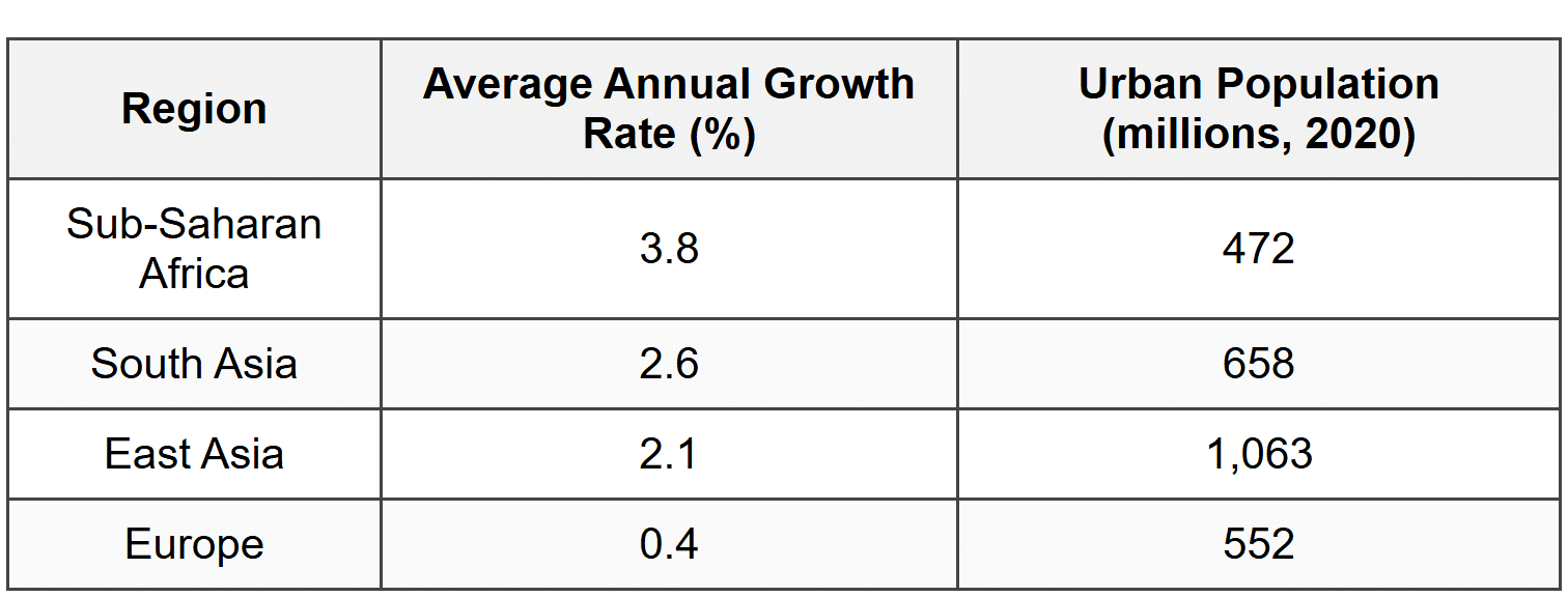
Based on the data in Table 1, which region is experiencing the most rapid urbanization relative to its current urban population size?
- Sub-Saharan Africa, because it has both the highest growth rate and represents significant demographic transition
- South Asia, because its absolute urban population exceeds that of Sub-Saharan Africa
- East Asia, because it has the largest total urban population in 2020
- Europe, because its stable growth rate indicates completion of urbanization processes
Question 2
A geographer uses a map with a scale of 1:250,000 to measure the distance between two cities. On the map, the cities are 8 centimeters apart. What is the actual ground distance between the two cities?
- 2 kilometers
- 20 kilometers
- 200 kilometers
- 2,000 kilometers
Question 3
Which geographic concept is best illustrated by the spatial pattern shown in this choropleth map?
- Distance decay, showing how economic relationships weaken over geographic distance
- Regional disparities in economic development between the Global North and Global South
- Spatial diffusion of industrialization from core to periphery regions
- Absolute location as a determinant of resource availability
Question 4
A researcher studying migration patterns uses GPS tracking data, census records, and qualitative interviews with migrants. This approach best exemplifies which geographic methodology?
- Quantitative analysis exclusively focused on statistical patterns
- Mixed methods combining spatial data with human perspectives
- Remote sensing technology applied to demographic studies
- Cartographic modeling without ground-truthing verification
Question 5
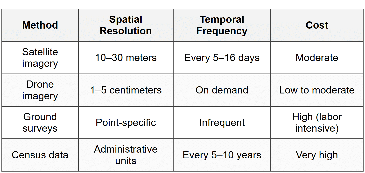
A researcher needs to monitor weekly changes in agricultural land use across a 500-square-kilometer region with detailed precision. Based on the data in Table 2, which method would be most appropriate?
- Census data, because it covers large administrative regions comprehensively
- Satellite imagery, because it provides regular temporal coverage at moderate spatial resolution
- Drone imagery, because it offers the highest spatial resolution available
- Ground surveys, because they provide the most accurate point-specific measurements
Question 6
The Prime Meridian and the Equator are both examples of which type of geographic reference?
- Relative location indicators that depend on cultural perception
- Arbitrary lines established by international convention for spatial reference
- Natural boundaries determined by Earth's physical characteristics
- Topographic features that define climatic zones
Question 7
This scenario best demonstrates the application of which geographic technology?
- Remote sensing to detect land use patterns from aerial imagery
- Geographic Information Systems (GIS) for spatial analysis and pattern identification
- Global Positioning System (GPS) for real-time navigation assistance
- Cartographic generalization to simplify complex transportation networks
Question 8
Which statement best describes the relationship between map scale and the level of detail shown?
- Large-scale maps (e.g., 1:10,000) show greater detail over smaller areas than small-scale maps (e.g., 1:1,000,000)
- Small-scale maps provide more detailed information because they cover larger geographic areas
- Map scale has no relationship to the amount of detail that can be displayed
- All maps regardless of scale can show the same level of detail through digital zoom functions
Question 9
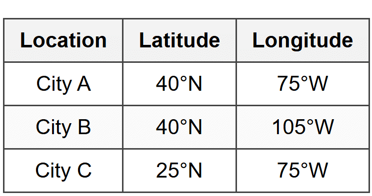
Based on the coordinates in Table 3, which two cities share a similar characteristic that would affect their relative locations?
- Cities A and B are located along the same line of latitude, placing them at similar distances from the Equator
- Cities A and C are positioned along the same meridian, giving them identical time zones
- Cities B and C are equidistant from the Prime Meridian
- All three cities are in the Eastern Hemisphere based on their coordinate positions
Question 10
A geographer describes a location as "approximately 50 kilometers north of the state capital, near the intersection of two major highways." This description is an example of which concept?
- Absolute location using mathematical coordinates
- Relative location using reference points and distances
- Site characteristics describing physical terrain
- Situation analysis examining regional connectivity
Question 11
The differences among these projections best illustrate which challenge in geographic representation?
- The impossibility of accurately representing Earth's three-dimensional curved surface on a two-dimensional map without some distortion
- The political bias inherent in all cartographic products regardless of projection method
- The technical limitations of satellite imagery in capturing polar regions
- The cultural differences in how societies perceive spatial relationships
Question 12
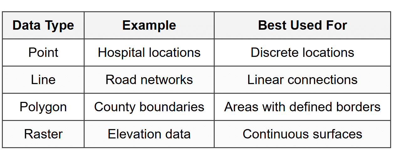
A researcher wants to analyze how temperature varies continuously across a metropolitan region. Based on Table 4, which data type would be most appropriate for this analysis?
- Point data, because temperature can be measured at weather station locations
- Line data, because temperature changes along elevation gradients
- Polygon data, because cities are bounded areas with distinct borders
- Raster data, because temperature varies continuously across space without discrete boundaries
Question 13
Which of the following best describes the concept of "scale" as it applies to geographic analysis beyond map representation?
- The physical size of the region being studied
- The level of geographic organization at which a phenomenon is examined, from local to global
- The ratio between distance on a map and distance on the ground
- The amount of detail visible in satellite imagery
Question 14
This research approach best demonstrates which aspect of thinking geographically?
- Using field observations exclusively to understand landscape patterns
- Integrating multiple data layers to analyze spatial relationships and disparities
- Prioritizing qualitative data over quantitative measurements
- Focusing on absolute location rather than relative accessibility
Question 15
A geographer studying climate change examines global temperature patterns, regional precipitation changes, national carbon emissions policies, and local urban heat island effects. This multi-level approach best exemplifies which concept?
- Spatial diffusion from core to periphery
- Scale analysis examining phenomena at multiple levels of geographic organization
- Distance decay showing reduced interaction over space
- Absolute location determining environmental outcomes
Question 16
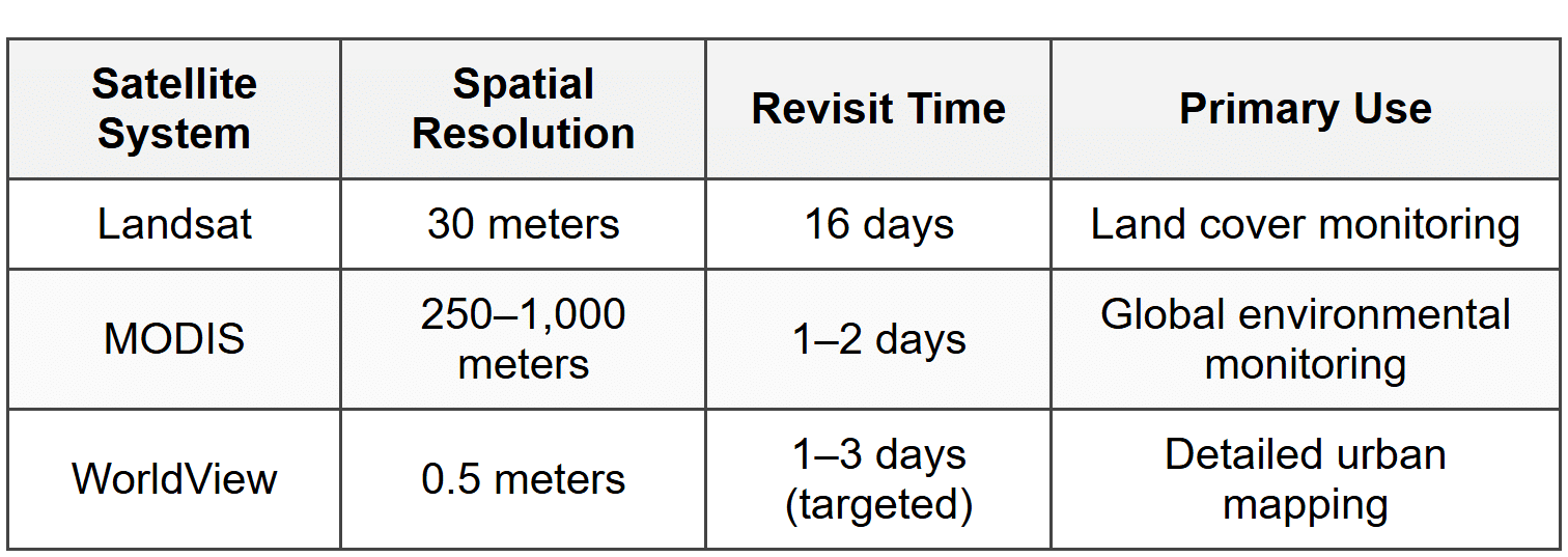
A researcher needs to monitor daily changes in Arctic sea ice extent across the entire polar region. Based on Table 5, which satellite system would be most appropriate?
- Landsat, because its moderate resolution balances detail with coverage
- MODIS, because its frequent revisit time and broad coverage enable daily monitoring of large areas
- WorldView, because its high resolution provides the most accurate measurements
- None of these systems, because satellite imagery cannot penetrate cloud cover in polar regions
Question 17
A map shows the distribution of coffee shops in a city using dots, with each dot representing one location. The map reveals clustering in the downtown core and near university campuses, with sparse distribution in residential suburbs. This pattern best illustrates which geographic concept?
- Hierarchical diffusion spreading from large cities to smaller towns
- Spatial concentration reflecting the relationship between land use and consumer demand
- Distance decay showing reduced interaction across space
- Environmental determinism linking physical terrain to economic activity
Question 18
One limitation of using this classification scheme is that it:
- Fails to show absolute location of individual vaccination sites
- Obscures variation within categories, such as differences between counties at 40% and 49%
- Cannot represent data over time, only a single time period
- Requires satellite imagery to validate ground-level patterns
Question 19
A geographer states that "the site of Singapore includes a natural deep-water harbor at the southern tip of the Malay Peninsula, while its situation places it along major shipping routes between the Indian and Pacific Oceans." This statement best distinguishes between:
- Absolute location and relative location as complementary spatial reference systems
- Site characteristics (physical attributes of a place) and situation (location relative to other places and connections)
- Formal regions and functional regions in spatial organization
- Map scale and geographic scale in spatial analysis
Question 20
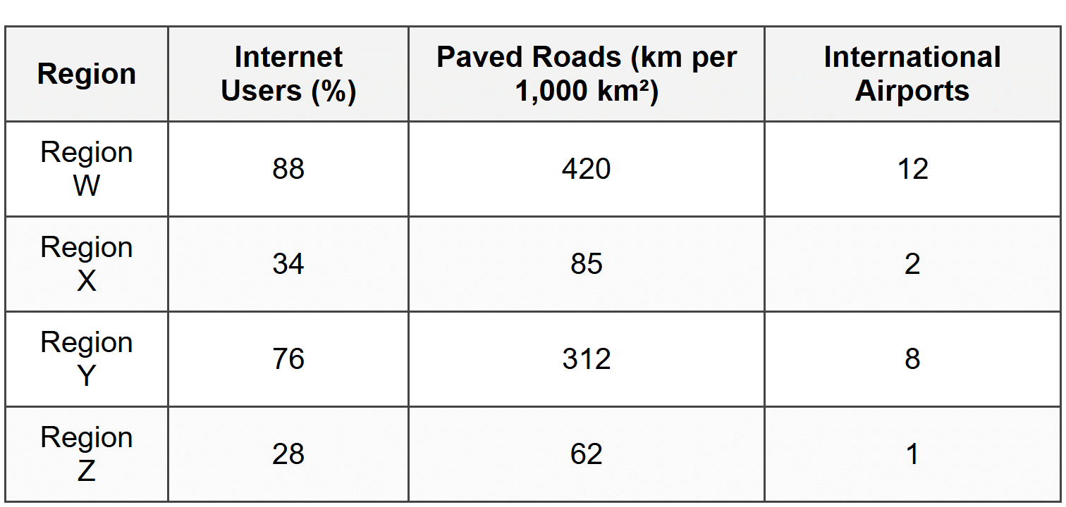
Based on the data in Table 6, which conclusion about spatial interaction and connectivity is most strongly supported?
- Regions W and Y demonstrate higher levels of infrastructure development that facilitate both physical and digital connectivity
- Region X has the greatest potential for economic growth due to lower infrastructure costs
- All regions show equal capacity for participating in global networks
- Physical infrastructure (roads and airports) is more important than digital infrastructure (internet) for regional development
SECTION II: FREE RESPONSE
Directions
Answer both questions in this section. Each question has three parts (A, B, C). Write your responses in complete sentences. Use specific examples and appropriate geographic terminology. The questions may include stimulus materials such as maps, data tables, or images that you must reference in your responses.
FRQ 1
A population density map of Country X uses a choropleth classification scheme. The map divides the country into five density categories measured in people per square kilometer: Very Low (0-25), Low (26-100), Medium (101-300), High (301-800), and Very High (over 800). The spatial pattern shows Very High density concentrated in three coastal metropolitan areas and along a major river valley in the interior. The central highland region and northern border areas show Very Low density. Medium density appears in a transitional zone surrounding the high-density coastal regions.
- Define the geographic concept of population density as represented in this map.
- Explain how the classification scheme used in this map (five categories with specified ranges) affects the interpretation of spatial patterns of population distribution.
- Analyze how the spatial pattern shown in this map reflects the relationship between physical geography and human settlement patterns, using at least one specific example from the map description.
FRQ 2
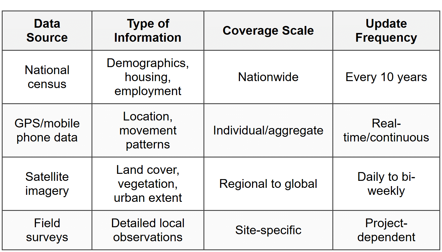
- Identify one advantage and one disadvantage of using satellite imagery for geographic research, based on the information in Table 7.
- Explain how the concept of scale applies to the different data sources shown in Table 7, referencing at least two specific examples.
- Evaluate the importance of using multiple data sources for understanding a complex geographic phenomenon such as urbanization, providing a specific example of how combining data sources would improve analysis.
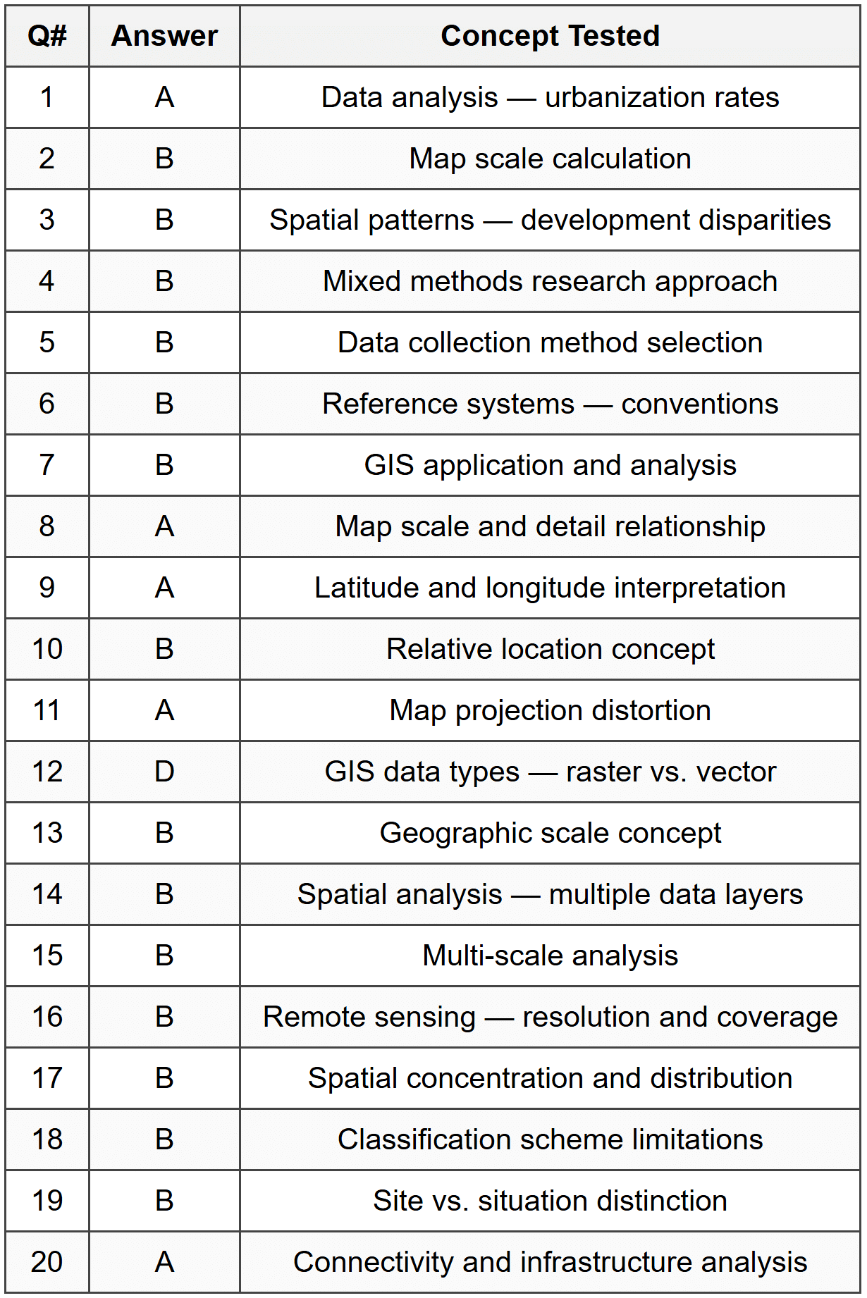
ANSWER KEY
Part A: Multiple Choice Answer Table
Part B: Free Response Detailed Answers
FRQ 1 - Answer Key
Part A: Define population density
Model Answer: Population density is the measurement of the number of people per unit of area, typically expressed as people per square kilometer or square mile. In this map, it quantifies how concentrated or dispersed the population is across different regions of Country X, with values ranging from under 25 people per km² in sparsely populated areas to over 800 people per km² in densely populated urban centers. This measurement allows geographers to identify spatial patterns of human settlement and compare population concentrations across different regions.
Part B: Explain classification scheme effects
Model Answer: The five-category classification scheme with specified ranges simplifies the continuous variation in population density into discrete groups, making spatial patterns more visible but also obscuring fine-grained differences within categories. For example, a region with 99 people per km² (Low) will appear the same as one with 26 people per km² (also Low), even though the first is nearly four times as dense. This generalization helps viewers quickly identify broad patterns-such as the concentration of Very High density in coastal areas-but masks important variations that might exist within each category. Additionally, the choice of category boundaries (e.g., 100 vs. 101) is somewhat arbitrary and can significantly affect how regions are perceived and compared. A different classification scheme with different thresholds could create a visibly different map from the same underlying data.
Part C: Analyze physical geography and settlement relationship
Model Answer: The spatial pattern revealed in the map demonstrates that physical geographic features significantly influence human settlement patterns by affecting accessibility, resource availability, and habitability. Specifically, the concentration of Very High population density along coastal areas and a major river valley reflects how these physical features facilitate economic activity, transportation, and resource access. Coastal locations provide access to maritime trade routes, fishing resources, and moderate climates, making them attractive for large urban populations and commercial activity. Similarly, the river valley in the interior likely provides freshwater, fertile soils for agriculture, and a natural transportation corridor, supporting higher population densities than surrounding areas. In contrast, the central highland region shows Very Low density, suggesting that mountainous terrain, higher elevations, and potentially harsher climates create barriers to dense settlement and agricultural development. The transitional zone of Medium density surrounding high-density coastal regions illustrates urban expansion patterns and suburban development radiating outward from core metropolitan areas. This pattern exemplifies how human populations concentrate in locations where physical geography provides the greatest advantages for settlement, economic development, and connectivity.
FRQ 2 - Answer Key
Part A: Identify advantage and disadvantage of satellite imagery
Model Answer: One advantage of using satellite imagery for geographic research is its ability to provide regular, repeated coverage of large areas (regional to global scale) with relatively frequent updates (daily to bi-weekly), allowing researchers to monitor environmental changes, land cover transformations, and urban expansion over time without being physically present in the study area. One disadvantage is that satellite imagery may be limited by cloud cover, atmospheric conditions, or the resolution constraints that make it difficult to capture fine-scale details or observe human activities that occur indoors or under vegetation canopy, and the technology requires specialized training and software to properly interpret the data.
Part B: Explain concept of scale in data sources
Model Answer: The concept of scale refers to the level of geographic detail or the size of the area being examined, and the different data sources in Table 7 operate at distinctly different scales that determine what phenomena they can effectively measure. For example, national census data operates at a large geographic scale (nationwide coverage) but provides information aggregated to specific administrative units like counties or census tracts, making it useful for understanding broad demographic patterns but unable to capture individual-level variations or precise locations. In contrast, GPS/mobile phone data operates at an individual scale, tracking specific locations and movements of individual devices in real-time, which provides extremely fine spatial and temporal resolution for understanding human mobility patterns but may not be representative of entire populations. Satellite imagery typically operates at a regional to global scale, covering large areas but with spatial resolution measured in meters (meaning each pixel represents a specific area on the ground), making it excellent for monitoring landscape-level changes like deforestation or urban sprawl but inadequate for identifying specific buildings or individuals. Field surveys operate at the most local, site-specific scale, providing detailed qualitative and quantitative observations of particular locations but lacking the spatial coverage to make generalizations about larger regions. Understanding these scale differences is critical because patterns visible at one scale may not be apparent at another-for instance, neighborhood-level segregation visible in census tract data might not be apparent in national-level statistics, and individual movement patterns captured by GPS might not match aggregate flow patterns visible in satellite imagery.
Part C: Evaluate importance of multiple data sources
Model Answer: Using multiple data sources is essential for understanding complex geographic phenomena like urbanization because no single data source can capture all relevant dimensions of spatial, temporal, social, and environmental processes simultaneously. Different data sources provide complementary perspectives that, when combined, create a more complete and accurate understanding than any single source alone. For example, when studying urbanization, combining satellite imagery with census data and field surveys provides a comprehensive analysis: Satellite imagery reveals the physical expansion of urban land cover over time, showing how much area has transitioned from agricultural or natural land to built-up surfaces, and can track this change continuously between census periods. National census data provides demographic information about population growth, migration patterns, housing characteristics, and socioeconomic changes within specific neighborhoods or districts, explaining who is driving urban growth and how urban populations are changing in composition. Field surveys offer ground-level observations about housing quality, informal settlements, local economic activities, and residents' perceptions of urban change-information that neither satellites nor census questionnaires can effectively capture. By integrating these three sources, researchers can answer questions that would be impossible with any single source: for instance, they could identify areas of rapid physical expansion visible in satellite data, cross-reference with census data to determine if population growth matches physical growth (indicating infill development versus sprawl), and use field surveys to understand whether this growth represents formal planned development or informal squatter settlements. This multi-source approach also provides validation and error-checking-if satellite data shows urban expansion in an area where census data shows no population increase, this discrepancy signals either data quality issues or interesting phenomena like ghost cities or industrial zones that warrant further investigation. The integration of multiple data sources operating at different scales and capturing different types of information is therefore fundamental to robust geographic analysis of complex, multifaceted phenomena.


