Assignment : Information Architecture


Section 1: Multiple Choice Questions
- Q1. You are designing a mobile banking app and need to organize features such as account balance, fund transfer, bill payments, transaction history, and customer support. Which Information Architecture principle should guide your primary navigation structure?
- Alphabetical ordering of all features
- Grouping by user tasks and mental models
- Placing all features on a single scrollable page
- Organizing by technical implementation complexity
- Q2. A website has three main categories: Products, Services, and About Us. Under Products, there are subcategories for Electronics, Clothing, and Home Goods. Each subcategory has individual product pages. What type of Information Architecture structure does this represent?
- Sequential structure
- Matrix structure
- Hierarchical structure
- Database structure
- Q3. During a card sorting exercise for an e-learning platform, 15 out of 20 participants grouped "Video Lectures" and "Live Classes" together, while the remaining 5 placed them in separate categories. What should you conclude from this result?
- Discard the minority grouping entirely as it represents user error
- There is strong agreement suggesting these items belong together in the IA
- Card sorting has failed and should be repeated with different participants
- Create separate navigation paths for different user types
- Q4. You are designing a recipe website where users should be able to find content by cuisine type, cooking time, dietary restrictions, and difficulty level simultaneously. Which Information Architecture approach is most appropriate?
- Strict hierarchical structure with one primary categorization
- Sequential navigation through each filter in a predetermined order
- Faceted navigation allowing multiple classification schemes
- Flat structure with all recipes on a single page
- Q5. A news app shows a breadcrumb trail: Home > Technology > Artificial Intelligence > Current Article. The user clicks on "Technology" in the breadcrumb. What Information Architecture principle does this breadcrumb implementation support?
- Providing visual hierarchy through typography
- Enabling users to understand their location and navigate upward in the hierarchy
- Reducing the number of clicks required to reach content
- Implementing a sequential navigation pattern
Section 2: Conceptual Understanding
- Q1. Define Information Architecture in the context of website and mobile app design. Explain why it is considered a foundational element of user experience design.
- Q2. Compare and contrast open card sorting and closed card sorting methods. In what scenarios would you choose one method over the other?
- Q3. Explain the relationship between navigation systems and Information Architecture. How do global navigation, local navigation, and contextual navigation each serve different purposes within an IA framework?
- Q4. What is the difference between user-centered organization schemes and content-centered organization schemes? Provide two examples of each.
Section 3: Situational / Applied Questions
- Q1. You have been hired to redesign the Information Architecture for a university website that currently has over 500 pages organized inconsistently. Faculty complain they cannot find departmental resources, students struggle to locate course registration information, and prospective students abandon the site without finding admission requirements. Describe the step-by-step research and design process you would follow to create an effective IA for this website, including at least three specific user research methods you would employ.
- Q2. An e-commerce company selling outdoor equipment has organized their products into categories: Camping, Hiking, Climbing, Water Sports, and Winter Sports. User analytics show that 40% of users search for products by activity, 35% browse by product type (tents, backpacks, ropes, etc.), and 25% filter by brand. How would you restructure the Information Architecture to accommodate these different user mental models while maintaining a coherent navigation system?
- Q3. You are designing a mobile health app that needs to serve three distinct user groups: patients tracking their conditions, caregivers managing multiple patients, and healthcare providers reviewing patient data. Each group has different goals, workflows, and information needs. Describe how you would structure the Information Architecture to serve all three audiences effectively without creating confusion or redundancy.
Section 4: Skill Demonstration Task
You are tasked with creating the Information Architecture for a new meal planning and grocery delivery app called "FreshWeek".
App Purpose: Help users plan weekly meals, generate shopping lists, and order groceries for delivery.
Core Features to Organize:
- Browse recipes (searchable by cuisine, dietary needs, cooking time, ingredients)
- Weekly meal planner calendar
- Auto-generated shopping lists based on planned meals
- Grocery ordering and checkout
- Saved favorite recipes
- Nutritional information tracking
- User profile and preferences
- Order history and tracking
- Household management (multiple users, dietary restrictions)
- Budget tracking for grocery spending
Your Deliverable:
- Create a site map showing the hierarchical structure of the app with at least three levels of depth
- Identify and label the primary navigation elements (what appears in the main menu)
- Indicate which features would be grouped together and explain your rationale based on user mental models
- Specify at least two cross-linking opportunities where content should be accessible from multiple paths
- Write a brief explanation (150-200 words) justifying your organizational decisions based on IA principles
Present your site map in a clear text-based hierarchical format or detailed description, as you cannot create visual diagrams in this format.
Section 5: Self-Reflection
- Q1. Reflect on a website or mobile app you have used recently that had confusing or frustrating navigation. Identify at least two specific Information Architecture problems that contributed to the poor user experience. How would you redesign the IA to solve these problems?
- Q2. Information Architecture requires balancing business goals, user needs, and technical constraints. Describe a situation where these three factors might conflict in an IA project. How would you approach resolving such a conflict?
- Q3. After learning about Information Architecture principles, what aspects of IA design do you find most challenging? What strategies will you use to strengthen your skills in these areas?
Answer Key
Section 1 - MCQ Answers
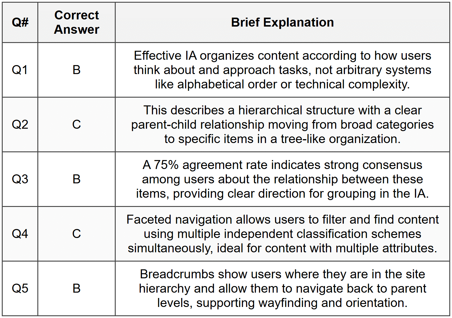
Section 2 Answers
Q1: Information Architecture is the structural design of shared information environments, encompassing the organization, labeling, navigation, and search systems that help users find and manage information effectively. In website and mobile app design, IA serves as the blueprint that determines how content is grouped, where users can find it, and how they move through the digital product. It is foundational to user experience because without clear, logical organization, even beautifully designed interfaces become unusable. IA directly impacts findability, usability, and user satisfaction by creating mental models that match user expectations and reduce cognitive load during navigation.
Q2: Open card sorting allows participants to create and name their own categories while organizing content cards, revealing natural mental models and terminology users employ. Closed card sorting provides predefined categories and asks participants to sort content into these existing groups, testing whether a proposed structure makes sense to users. Open card sorting is ideal during early research phases when exploring how users conceptualize information and what labels resonate with them, particularly when starting a new project without existing constraints. Closed card sorting is appropriate when evaluating or refining an existing structure, testing specific organizational hypotheses, or when certain categories must remain fixed due to business or technical requirements. Open sorting generates richer insights but requires more analysis, while closed sorting provides clearer validation of specific structural decisions.
Q3: Navigation systems are the implementation mechanisms that allow users to move through the structure created by Information Architecture. Global navigation appears consistently across the site or app, providing access to top-level categories and core features from anywhere, directly reflecting the primary organizational structure of the IA. Local navigation appears within specific sections or categories, helping users explore related content within a particular branch of the hierarchy without losing context. Contextual navigation appears inline with content, providing links to related information or next steps based on what the user is currently viewing. Together, these navigation types transform the abstract IA structure into tangible pathways users can follow, with global navigation supporting broad movement across the hierarchy, local navigation enabling deep exploration within sections, and contextual navigation creating meaningful connections across the structure.
Q4: User-centered organization schemes structure content according to how users think about and approach information, such as organizing by task, user type, or user goals. Examples include organizing a banking app by common tasks like "Pay Bills" and "Transfer Money" rather than by account types, or structuring a company website with sections for different audiences like "For Patients" and "For Healthcare Providers." Content-centered organization schemes structure information based on inherent properties of the content itself, such as format, topic, or chronology. Examples include organizing a media library alphabetically by title or by content type (videos, articles, podcasts), or arranging blog posts in reverse chronological order. User-centered schemes prioritize ease of use and align with user mental models, while content-centered schemes emphasize objective characteristics of the information itself.
Section 3 Answers
Q1 Model Response: To redesign the university website IA, I would follow this process: First, conduct a content inventory to document all 500+ pages and identify redundant, outdated, or trivial content for potential removal. Second, perform stakeholder interviews with faculty, administrators, students, and prospective students to understand their specific goals and pain points. Third, conduct user research through surveys and user interviews with representatives from each audience group to identify their primary tasks and how they mentally categorize university information. Fourth, analyze existing website analytics to identify popular pages, common search terms, and navigation patterns that reveal current user behavior. Fifth, facilitate card sorting sessions with 20-30 participants from different user groups using both open and closed methods to understand natural groupings and test potential organizational schemes. Sixth, create user personas and journey maps for key audience segments to ensure the IA supports their most critical tasks. Seventh, develop multiple IA concepts using hierarchical structures with clear audience-based or task-based top-level categories. Eighth, validate the proposed structure through tree testing to ensure users can successfully find key information. Finally, create a detailed site map, navigation specifications, and labeling system that reflects research findings, then prototype and usability test the new structure before full implementation.
Q2 Model Response: To accommodate multiple user mental models, I would implement a faceted navigation system combined with multiple access points to the same content. The primary global navigation would feature a hybrid approach with three main entry points: "Shop by Activity" (Camping, Hiking, Climbing, Water Sports, Winter Sports), "Shop by Product" (Tents, Backpacks, Clothing, Footwear, Ropes, etc.), and "Shop by Brand" (listing major brands alphabetically). Each entry point would lead to the same product database but organized through different lenses. On product listing pages, I would implement faceted filters allowing users to refine by activity, product type, brand, price, rating, and features simultaneously regardless of their entry point. The homepage would prominently feature all three navigation paths with clear visual distinction. Search functionality would be robust, recognizing both product names and activity contexts. Breadcrumb navigation would adapt to show the path users took, whether by activity, product type, or brand. Product pages would include cross-links showing "More Camping Gear," "More Backpacks," and other products from the same brand, creating a web structure that supports all mental models. This approach honors user diversity while maintaining a coherent underlying IA structure.
Q3 Model Response: I would design a role-based Information Architecture with a unified core structure but customized entry points and views for each user type. Upon initial login, users would select their primary role (patient, caregiver, or provider), which would personalize their dashboard and navigation. The underlying IA would organize information into common domains: Health Records, Monitoring & Tracking, Communication, Appointments, and Account Settings. For patients, the dashboard would prioritize personal health tracking, upcoming appointments, messages from providers, and medication reminders, with navigation focused on "My Health," "My Care Team," and "My Appointments." Caregivers would access a dashboard showing multiple patient profiles they manage, with the ability to switch between them, navigation emphasizing "Patients I Care For," "Tasks & Reminders," and "Family Communication." Healthcare providers would see an aggregated view of their patient panel with navigation structured around "My Patients," "Clinical Tools," "Messages," and "Schedule." All three interfaces would access the same underlying data structure but present it through role-appropriate lenses. Shared features like messaging would adapt their interface based on role context. A role-switching mechanism would allow users with multiple roles (such as a healthcare provider who is also a caregiver) to toggle perspectives. This approach prevents duplication while ensuring each user group sees information organized according to their specific workflows and priorities.
Section 4 - Sample Demonstration
FreshWeek App Site Map:
Level 1 - Primary Navigation (Bottom Tab Bar):
- Home
- Recipes
- Meal Plan
- Shop
- Profile
Level 2 & 3 - Hierarchical Structure:
Home
- This Week's Overview (dashboard view)
- Quick Actions (shortcuts to frequent tasks)
- Suggested Recipes (personalized)
- Budget Summary
Recipes
- Browse All
- By Cuisine
- By Dietary Needs
- By Cooking Time
- By Main Ingredient
- Search Recipes
- My Favorites
- Recently Viewed
- Individual Recipe Page
- Ingredients & Instructions
- Nutritional Information
- Add to Meal Plan (button)
- Add Ingredients to Shopping List (button)
Meal Plan
- Weekly Calendar View
- Add Meals to Days
- View Planned Meals by Day
- Breakfast
- Lunch
- Dinner
- Snacks
- Generate Shopping List (from all planned meals)
- Weekly Nutrition Summary
Shop
- Shopping List
- Auto-generated from Meal Plan
- Manually Added Items
- Organize by Category/Aisle
- Browse Groceries
- By Category
- Deals & Specials
- Cart & Checkout
- Order History
- Track Current Order
Profile
- Account Settings
- Household Management
- Family Members
- Dietary Restrictions per Person
- Preferences
- Favorite Cuisines
- Disliked Ingredients
- Budget Settings & Tracking
- Delivery Address & Payment Methods
Cross-Linking Opportunities:
- From any Recipe page, users can directly "Add to Meal Plan" (cross-link to Meal Plan section) or "Add Ingredients to Shopping List" (cross-link to Shop section)
- From Meal Plan calendar, tapping any planned meal links back to the full Recipe page with all details
Rationale (185 words): This IA structure is designed around the core user journey: discover recipes, plan meals, generate shopping lists, and purchase groceries. The five primary navigation items reflect distinct user tasks that align with mental models revealed in user research for similar apps. Recipes and Meal Plan are separated because users engage with them at different times-browsing recipes is exploratory while meal planning is decisional. The Shop section consolidates all purchasing activities, with the shopping list automatically populated from the meal plan, reducing friction in the workflow. Faceted navigation within Recipes accommodates different search strategies users employ. Cross-linking between sections creates a seamless flow from recipe discovery to meal planning to shopping, preventing users from getting stuck in isolated sections. The Profile section houses less-frequent but important account and household management features, keeping primary navigation focused on core tasks. The Home dashboard provides an at-a-glance overview for returning users while offering quick access to common actions. This structure balances depth of content organization with ease of navigation, ensuring users can both explore broadly and complete specific tasks efficiently.
Section 5 - Reflection Guidance
Q1 Sample Response: Recently I used a government services website to renew a professional license, and the experience was frustrating due to poor Information Architecture. The first problem was ambiguous labeling-the main navigation had categories like "Services," "Resources," and "Information," which were too vague to distinguish from each other. I clicked through all three before finding license renewal buried under "Services," then "Professional Services," then "Healthcare Professionals," requiring four clicks from the homepage. This violated the principle of clear, distinct labels and created unnecessary hierarchy depth. The second problem was lack of search functionality and no site map, forcing me to navigate exclusively through the confusing hierarchy. To redesign this IA, I would first implement task-based top-level navigation with specific labels like "Renew a License," "Apply for a License," and "Verify a License" that match user goals directly. Second, I would flatten the hierarchy by consolidating related services and reducing nested levels. Third, I would add robust search with autocomplete showing common tasks, and include a comprehensive site map for users who prefer to browse the full structure. These changes would align the IA with user mental models and reduce the cognitive load of finding common services.
Q2 Sample Response: In designing an e-commerce site for a retail company, business goals, user needs, and technical constraints might conflict in several ways. The business might want to prominently feature high-margin products and promotional partnerships, pushing specific categories to the top of navigation regardless of user demand. Users, however, need intuitive organization that matches their shopping mental models and easy access to frequently purchased items. Meanwhile, technical constraints might limit the number of navigation items that can be displayed responsively on mobile devices or restrict the complexity of filtering systems due to database query performance. To resolve such conflicts, I would take a data-driven, user-centered approach while acknowledging business realities. First, I would conduct user research including analytics review and card sorting to understand actual user behavior and mental models, presenting this data to stakeholders to make the business case for user-centered IA. Second, I would seek compromise solutions such as featuring business-priority items in secondary placements like homepage banners or recommendation widgets rather than distorting the main navigation structure. Third, I would work closely with technical teams early in the process to understand constraints and explore creative solutions, such as progressive enhancement or strategic caching to support richer filtering. By involving all stakeholders in collaborative design sessions and presenting options with their tradeoffs clearly articulated, I would facilitate decisions that balance all three factors rather than optimizing for just one.
Q3 Sample Response: After learning about Information Architecture principles, I find two aspects particularly challenging. First, balancing simplicity with comprehensiveness-I tend to want to accommodate every possible user path and content relationship, which can lead to overly complex structures with too many navigation options. I recognize that effective IA requires making difficult decisions about what to prioritize and what to make less prominent, which means accepting that some user paths will require more clicks. Second, I struggle with moving from abstract IA concepts to concrete labeling that users will instantly understand. What seems clear to me as a designer may be ambiguous jargon to users. To strengthen my skills, I will practice several strategies. For managing complexity, I will use the "three-click rule" as a guideline and regularly ask "Can I simplify this?" during design iterations, forcing myself to justify every level of hierarchy. I will also conduct more tree testing exercises to validate whether my structures actually help users find content efficiently. For labeling, I will make card sorting and user vocabulary research mandatory in my process, collecting actual terms users employ rather than assuming I know how they think. I will also practice writing multiple label variations for each category and testing them with users before finalizing. Finally, I will study IA patterns from successful sites in different domains to build my mental library of proven solutions I can adapt to new contexts.


