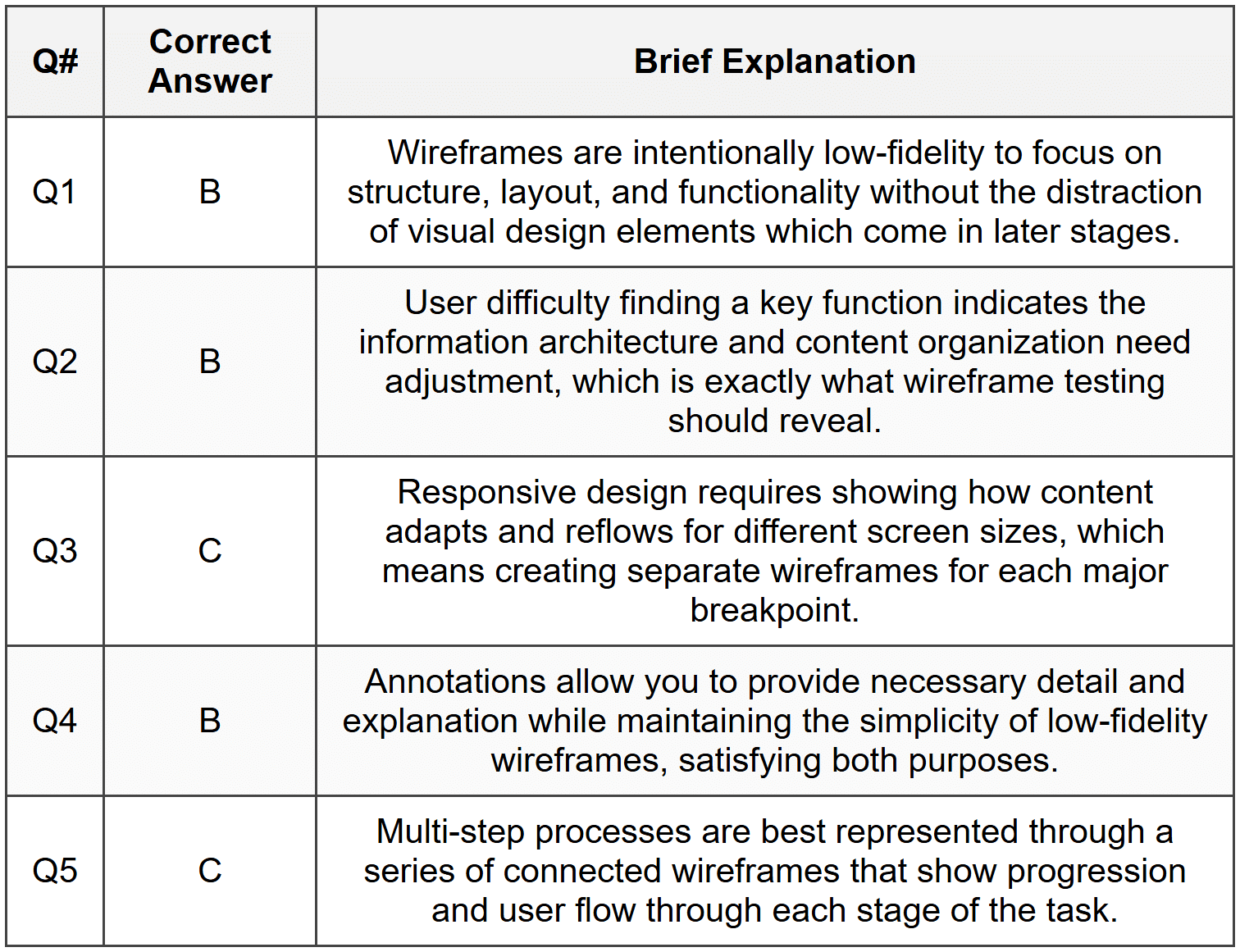
Assignment : Wireframing


Section 1: Multiple Choice Questions
- Q1. You are designing a mobile app for a food delivery service. During the wireframing stage, your client requests to see the final color scheme and brand fonts. What is the most appropriate response?
- Immediately add colors and fonts to make the client happy
- Explain that wireframes focus on structure and layout, and visual design comes later
- Create a high-fidelity mockup instead of a wireframe
- Skip wireframing and move directly to development
- Q2. A wireframe shows a navigation menu with five items, but when tested with users, they struggle to find the search function. What does this indicate about the wireframe?
- The wireframe is complete and ready for development
- The information architecture needs revision to improve findability
- Users need more training on how to use the interface
- The wireframe should include animation details
- Q3. When creating wireframes for both desktop and mobile versions of a website, which approach best demonstrates responsive design principles?
- Create identical layouts for both versions
- Only wireframe the desktop version and let developers figure out mobile
- Design separate wireframes showing how content reflows and adapts to each screen size
- Use the same wireframe but rotate it for mobile view
- Q4. You receive feedback that your low-fidelity wireframe is too basic and lacks detail. However, stakeholders need to approve the overall structure before visual design begins. What should you do?
- Convert it to a high-fidelity mockup immediately
- Add annotations and notes explaining functionality while keeping the wireframe simple
- Apologize and start over with pixel-perfect designs
- Ignore the feedback since low-fidelity is standard practice
- Q5. During a wireframing session, you need to show how a user progresses through a multi-step checkout process. Which wireframing technique would be most effective?
- Create a single wireframe with all steps on one screen
- Write a text description instead of visual wireframes
- Develop a series of connected wireframes showing each step and user flow
- Only wireframe the final confirmation page
Section 2: Conceptual Understanding
- Q1. Define wireframing and explain its primary purpose in the website and mobile app design process. Why is it considered a critical step before visual design?
- Q2. Distinguish between low-fidelity and high-fidelity wireframes. Provide two specific scenarios where each type would be most appropriate.
- Q3. Explain the concept of information hierarchy in wireframing. How do designers use visual weight and placement to establish hierarchy without using color or detailed graphics?
- Q4. What role do annotations play in wireframes, and what type of information should they typically contain? Provide three examples of useful annotations.
Section 3: Situational / Applied Questions
- Q1. You are wireframing a mobile banking app homepage. The client wants to include account balance, recent transactions, bill pay, fund transfer, ATM locator, customer service chat, promotional offers, and security settings. How would you prioritize and organize these elements in your wireframe? Justify your decisions based on user needs and mobile design principles.
- Q2. A team member suggests skipping wireframing to save time and going directly to high-fidelity mockups in Figma. The project deadline is tight, and stakeholders are eager to see visual designs. Evaluate this suggestion and provide a reasoned argument for or against it, considering project risks and benefits.
- Q3. You are creating wireframes for an e-commerce product page that needs to work seamlessly on desktop, tablet, and mobile devices. Describe how you would approach wireframing for these three breakpoints, specifically addressing navigation, product images, description, reviews, and the purchase button.
Section 4: Skill Demonstration Task
Create a detailed wireframe plan for a fitness tracking mobile app home screen. You do not need to draw the actual wireframe, but you must provide a complete written specification that a designer could use to create it.
Your deliverable must include:
- A list of all UI elements that should appear on the home screen (navigation, content sections, buttons, etc.)
- A description of the layout structure and how elements are organized spatially
- Information hierarchy - identify which elements should be most prominent and why
- At least five annotations explaining functionality or interaction behavior
- Consideration for responsive design - note how the layout would adapt from portrait to landscape orientation
- Justification for your design decisions based on user goals (someone wanting to quickly check their daily fitness progress)
Section 5: Self-Reflection
- Q1. Reflect on your current understanding of wireframing. What aspects of the wireframing process do you feel confident about, and which areas require further practice or study?
- Q2. Consider a website or app you use frequently. If you were to create a wireframe of its main screen, what challenges would you face in representing its structure without visual design elements? What would this exercise teach you?
- Q3. How do you think wireframing skills complement other design abilities such as visual design, user research, and prototyping? Identify two specific ways improving your wireframing skills could enhance your overall design capability.
Answer Key
Section 1 - MCQ Answers
Section 2 Answers
Q1: Wireframing is the process of creating simplified, schematic visual representations of a website or app interface that focus on structure, layout, information hierarchy, and functionality without detailed visual design. Its primary purpose is to establish the skeletal framework of a digital product, allowing designers, stakeholders, and developers to agree on content placement, user flow, and interaction patterns before investing time in visual design. It is critical because it enables early detection of usability issues, facilitates communication among team members, reduces costly revisions later in the process, and ensures everyone shares a common understanding of the product structure.
Q2: Low-fidelity wireframes are basic, simplified representations typically created with simple shapes, boxes, and placeholder text, often sketched on paper or using basic digital tools. They lack detail and focus purely on layout and content placement. High-fidelity wireframes are more detailed and refined, showing precise spacing, actual content, detailed UI components, and closer-to-final layouts, though still without color or brand elements. Low-fidelity wireframes are most appropriate during early brainstorming sessions when exploring multiple layout options quickly, or when gathering initial stakeholder feedback on overall structure. High-fidelity wireframes are most appropriate when the basic structure is approved and the team needs to specify exact spacing, content requirements, and detailed interactions before moving to visual design, or when creating documentation for developers.
Q3: Information hierarchy in wireframing refers to the arrangement and visual emphasis of elements to guide users' attention and communicate relative importance of content. Designers establish hierarchy through size (larger elements attract more attention), position (top and left areas typically receive priority in Western interfaces), spacing (more whitespace around elements increases prominence), grouping (related items placed together), and density (isolated elements stand out more than clustered ones). Without color or detailed graphics, wireframes rely on these spatial and structural relationships, using boxes of different sizes, strategic placement, and visual weight created through borders, fills, and typography variations to show what content should dominate and what should be secondary.
Q4: Annotations in wireframes are explanatory notes that provide additional context, clarification, and specifications that cannot be conveyed through the visual representation alone. They typically contain information about functionality, interactions, dynamic behavior, content requirements, and design rationale. Examples include: describing what happens when a user clicks a button (e.g., "Opens modal dialog with form validation"), specifying conditional display logic (e.g., "This section only appears for logged-in users"), clarifying content specifications (e.g., "Headline maximum 60 characters, truncates with ellipsis"), explaining data sources (e.g., "Pulls from user profile database"), and noting responsive behavior (e.g., "On mobile, this menu collapses into hamburger icon").
Section 3 Answers
Q1: For a mobile banking app homepage wireframe, prioritization should follow user needs and task frequency. The account balance should be most prominent at the top since checking balance is the primary user task. Recent transactions should appear immediately below as secondary priority. Fund transfer and bill pay, being frequent actions, should be accessible as primary action buttons. The ATM locator and customer service chat should be easily accessible but not dominate the screen, perhaps through a persistent bottom navigation or clearly labeled buttons. Promotional offers should be de-emphasized or placed lower on the page to avoid cluttering essential banking functions. Security settings should be accessible through a profile or menu icon rather than the homepage. This organization follows mobile design principles of progressive disclosure, prioritizing primary tasks, and minimizing cognitive load by presenting the most-needed information first.
Q2: While the suggestion to skip wireframing may seem time-saving, it carries significant risks that likely outweigh short-term schedule benefits. Against this approach: wireframing helps identify structural and usability problems early when they are inexpensive to fix; skipping this step often leads to expensive revisions during or after visual design when stakeholders realize layout issues; wireframes facilitate focused feedback on functionality and flow without the distraction of aesthetics; they serve as essential documentation for developers; and they help prevent scope creep by establishing clear content and functional requirements. However, a compromise position might be appropriate: if the project is very small, follows established patterns, or is iterating on an existing design, creating rapid low-fidelity wireframes (even just sketches) could provide wireframing benefits without significant time investment. The key is not to skip structural planning entirely but to scale the wireframing effort appropriately to project complexity and risk.
Q3: Wireframing for responsive e-commerce product pages requires considering how each element adapts across breakpoints. For desktop (wide screen), the wireframe would show a multi-column layout: large product image gallery on the left (approximately 60% width), product title, price, description, and purchase button on the right column, with reviews displayed below in a two-column format and navigation in a horizontal header. For tablet (medium screen), the wireframe would show the product image remaining prominent but reduced to 50% width, product information alongside it, with reviews reflowing to a single column below, and navigation remaining horizontal but possibly condensed. For mobile (small screen), the wireframe must show a single-column vertical layout: product image at full width at top, followed by title and price, then a sticky purchase button or add-to-cart action, scrolling down to description in collapsed/expandable sections, then reviews, with navigation converting to a hamburger menu. Each wireframe should annotate touch targets being minimum 44×44 pixels on mobile, image galleries showing swipe functionality, and content prioritization ensuring purchase path remains clear across all devices.
Section 4 - Sample Demonstration
Fitness Tracking Mobile App Home Screen - Wireframe Specification
UI Elements List:
- Top navigation bar with app logo (left), notifications icon (right), and profile icon (right)
- Daily progress summary card showing steps, calories, and active minutes
- Circular progress indicator for daily step goal
- Quick action buttons: Start Workout, Log Food, Log Water
- Recent activity feed (last 3 activities with date/time)
- Weekly summary graph showing 7-day trend
- Bottom tab navigation: Home, Activity, Progress, Profile
- Motivational message or achievement badge (conditional)
Layout Structure:
The screen follows a single-column vertical scroll layout. The top navigation is fixed at 60px height. Immediately below is the daily progress card (占 approximately one-third of visible screen) featuring the circular step progress indicator as the dominant visual element, centered, with current step count displayed inside and goal beneath. Below this are three equal-width quick action buttons arranged horizontally. The recent activity feed follows, with each activity as a card showing exercise type icon, duration, and calories. The weekly graph appears next, displaying a simple bar chart. Bottom tab navigation is fixed at screen bottom, 70px height.
Information Hierarchy:
- Primary: Circular step progress indicator - largest element, centrally positioned, as this is the main daily goal users check
- Secondary: Daily summary metrics and quick action buttons - immediately accessible without scrolling
- Tertiary: Recent activity feed - available with minimal scroll, provides context
- Quaternary: Weekly trend graph - for users wanting deeper insight, requires scroll
Annotations:
- "Circular progress indicator updates in real-time from device pedometer; tapping opens detailed step breakdown"
- "Quick action buttons launch respective logging flows; Start Workout opens exercise type selector sheet"
- "Recent activity feed pulls from last 7 days; shows only completed activities with sync status icon"
- "Weekly graph displays selected metric (toggleable between steps, calories, active minutes) with date labels on x-axis"
- "If user achieves goal or milestone, motivational message card appears between progress and quick actions with dismiss option"
Responsive Design Consideration:
In portrait orientation (standard), all elements display as described above. In landscape orientation, the daily progress card adapts to a horizontal layout with the circular indicator on the left (40% width) and summary metrics displayed vertically on the right (60% width), maximizing use of horizontal space. Quick action buttons remain horizontal. The activity feed and graph stack below but with reduced vertical spacing to accommodate the shorter viewport. Bottom navigation remains fixed but buttons may show icons only without labels to save space.
Design Justification:
The design prioritizes immediate visibility of daily progress, as research shows fitness app users primarily want to quickly check if they are meeting goals. The large circular indicator provides at-a-glance status. Quick action buttons support the three most common logging tasks, reducing navigation depth. Recent activity provides motivational reinforcement through showing accomplishment. The progressive disclosure approach (scroll for more detail) prevents overwhelming users while still providing depth for engaged users. Fixed bottom navigation ensures core app sections remain accessible regardless of scroll position. This structure supports the primary user goal of checking daily progress in under 3 seconds while enabling quick task completion.
Section 5 - Reflection Guidance
Q1 Sample Response: I feel confident about understanding the fundamental purpose of wireframing and why it focuses on structure rather than visual design. I understand the value of using simple shapes and placeholders to communicate layout ideas. However, I need more practice in creating wireframes for complex responsive layouts, particularly understanding how to effectively show content reorganization across different screen sizes without creating confusion. I also need to improve my annotation skills to ensure wireframes communicate interactive behaviors clearly to developers. Additionally, I want to develop better judgment about when to use low-fidelity versus high-fidelity wireframes for different project contexts and stakeholder needs.
Q2 Sample Response: If I were to wireframe the Instagram home feed, I would face challenges in representing the infinite scroll behavior, the dynamic nature of content (posts vary in type: photos, videos, carousels), and interactive elements like double-tap to like without using actual visual content. I would need to show how stories appear at the top, how the feed displays different post types using placeholder boxes with annotations, and how navigation works through the bottom tab bar. This exercise would teach me how to abstract complex, content-driven interfaces into structural elements, how to communicate dynamic and conditional content in static wireframes, and the importance of annotations in explaining interactions that cannot be shown visually. It would also highlight the challenge of representing personalized, algorithm-driven content in a standardized wireframe format.
Q3 Sample Response: Wireframing skills form a foundation that enhances other design capabilities by forcing designers to think structurally and systematically before getting caught up in aesthetics. First, strong wireframing improves visual design by ensuring designers start with solid information architecture and hierarchy, meaning visual design choices can focus on enhancement rather than problem-solving, resulting in more coherent final designs. Second, wireframing skills enhance prototyping because understanding how to break down interfaces into component parts and flows makes creating interactive prototypes more efficient and better structured. A designer who wireframes well can rapidly iterate on structure in prototypes, testing multiple organizational approaches before committing to detailed interactive design, ultimately creating more user-centered products through better-informed iteration.


