Assignment : Visual Design Fundamentals


Section 1: Multiple Choice Questions
- Q1. A designer is creating a mobile app interface for a financial services company. They need to establish a clear visual hierarchy to guide users' attention from the account balance to action buttons. Which combination of visual design principles would be most effective?
- Use equal font sizes for all elements and rely on color alone to differentiate importance
- Apply larger font size and bold weight to the balance, medium size for labels, and use contrast and proximity for grouping action buttons
- Place all elements in a single horizontal row with identical styling to maintain consistency
- Use decorative fonts for headings and remove all whitespace to maximize content visibility
- Q2. When selecting a color palette for a wellness mobile application, the designer wants to evoke feelings of calm and trust while ensuring accessibility. What approach best balances these requirements?
- Use bright neon colors throughout to create energy and excitement
- Apply pastel blues and greens as primary colors while ensuring all text-background combinations meet WCAG contrast ratio of at least 4.5:1
- Use only grayscale colors to avoid any emotional associations
- Select colors based solely on current design trends without considering psychological impact
- Q3. A designer notices that users are having difficulty distinguishing between clickable and non-clickable elements on a website. Which visual design strategy would most effectively resolve this usability issue?
- Make all text elements the same color and size to maintain visual consistency
- Apply consistent visual affordances such as button styling, hover states, and underlines for links while using color and typography to reinforce interactivity
- Remove all interactive elements and rely solely on text instructions
- Use random colors for different interactive elements to create visual interest
- Q4. An e-commerce website displays product images with inconsistent aspect ratios, creating a chaotic visual appearance. How should the designer address this while maintaining visual harmony?
- Stretch all images to fit identical square containers regardless of distortion
- Display images in their original sizes without any standardization
- Establish a consistent grid system with defined aspect ratios, use object-fit properties to crop images proportionally, and maintain consistent spacing
- Remove all product images to eliminate the inconsistency problem
- Q5. A mobile app design uses five different font families across various screens. Users report that the interface feels disjointed and unprofessional. What typographic approach would best improve visual coherence?
- Continue using all five fonts but make them all the same size
- Establish a type system with maximum two font families, creating clear hierarchy through weight, size, and spacing variations
- Use a different font for each word to maximize visual variety
- Replace all fonts with handwritten scripts to add personality
Section 2: Conceptual Understanding
- Q1. Explain the concept of visual hierarchy in interface design. Describe three specific techniques designers use to establish hierarchy and explain why this principle is critical for user experience.
- Q2. What is the difference between alignment and proximity in visual design? Provide an example of how each principle would be applied differently in a mobile app layout.
- Q3. Define white space (negative space) and explain its functional role in digital interface design. Why might inexperienced designers incorrectly view white space as wasted space?
- Q4. Describe the 60-30-10 color rule in interface design. How does this rule help maintain visual balance, and what types of elements would typically use each percentage?
Section 3: Situational / Applied Questions
- Q1. You are designing a dashboard for a project management tool that displays multiple data types: task lists, calendar events, team notifications, and progress charts. Users have complained the current design feels overwhelming. Using visual design fundamentals, describe how you would reorganize this interface to improve scanability and reduce cognitive load. Address at least three specific design principles in your response.
- Q2. A client presents you with their brand colors: bright red (#FF0000) and bright yellow (#FFFF00). They want these colors used prominently throughout their website. Identify the potential visual design and accessibility issues with this palette and propose a solution that respects the brand while addressing these concerns.
- Q3. You are conducting a design review of a mobile app and notice inconsistent spacing throughout: some elements are 8px apart, others 12px, 15px, 20px, and 25px with no apparent system. Explain why this is problematic and describe how you would establish a spacing system that creates visual rhythm and consistency.
Section 4: Skill Demonstration Task
Create a detailed visual design specification document for a single screen of a mobile banking app: the account overview screen. Your specification should include:
- A written description of the layout structure and grid system you would use
- Typography specifications including font families, sizes, weights, and line heights for headings, body text, labels, and numbers
- Color palette definition with specific hex codes, including primary, secondary, accent colors, and their intended uses
- Spacing and padding system with defined increments
- Description of how you've applied visual hierarchy to prioritize the account balance over secondary information
- Explanation of how your design choices support both aesthetic appeal and functional usability
Present this as a structured written document using lists and clear headings. This should serve as a guide that a developer could reference during implementation.
Section 5: Self-Reflection
- Q1. Evaluate your current understanding of visual design fundamentals. Which principle (hierarchy, contrast, alignment, proximity, repetition, color, typography, or white space) do you find most challenging to apply effectively, and why?
- Q2. Reflect on a website or mobile app you use regularly. Identify one visual design decision that works exceptionally well and one that creates confusion or friction. What design principles are being applied successfully or violated in each case?
- Q3. How has learning about visual design fundamentals changed the way you perceive digital interfaces? Describe a specific insight or "aha moment" you've experienced, and explain how you plan to apply this understanding in future design work.
Answer Key
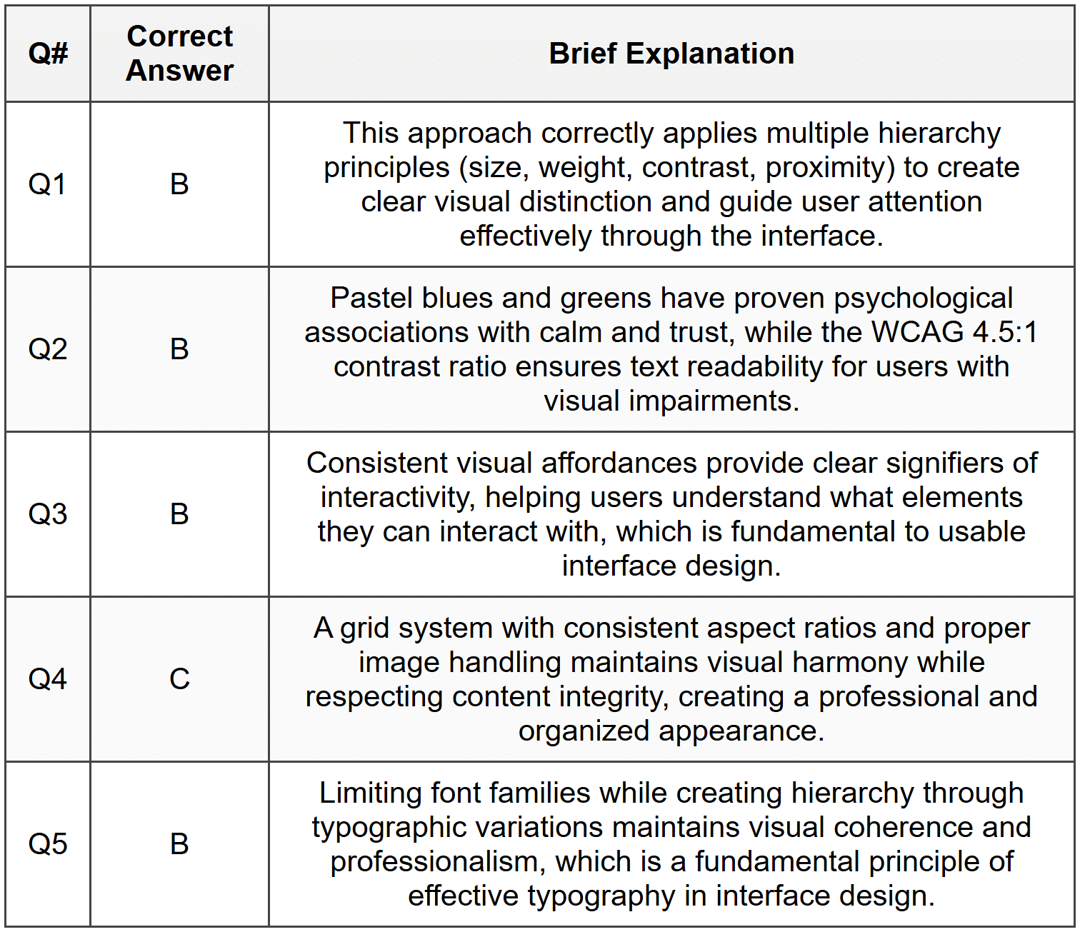
Section 1 - MCQ Answers
Section 2 Answers
Q1 Answer: Visual hierarchy is the arrangement and presentation of design elements in order of importance, guiding users' attention through the interface in a deliberate sequence. Three techniques include: (1) Size and scale-making important elements larger draws attention first, such as using larger headings for primary content; (2) Contrast-using color, weight, or style differences to make key elements stand out, like bold call-to-action buttons against neutral backgrounds; (3) Position and placement-placing critical information in prominent locations like the top-left or center of the screen where users naturally look first. Visual hierarchy is critical because it reduces cognitive load, helps users find information quickly, and guides them through tasks efficiently without confusion.
Q2 Answer: Alignment refers to the positioning of elements along common edges or centers to create visual order and connection. Proximity refers to the spatial relationship between elements, where items placed close together are perceived as related. In a mobile app, alignment might be applied by lining up all form field labels along a left edge to create visual order, while proximity would be applied by grouping a text input field close to its label and adding more space before the next field group to show they are separate items. Alignment creates structure; proximity creates relationships.
Q3 Answer: White space, also called negative space, is the empty area around and between design elements. Its functional role includes improving readability by giving text room to breathe, creating visual separation between different content sections, directing focus to important elements by isolating them, and contributing to an overall aesthetic of sophistication and clarity. Inexperienced designers often view white space as wasted because they equate design value with filling every pixel, failing to understand that empty space actively contributes to visual communication, hierarchy, and user comprehension. They may feel pressure to "use all available space" without recognizing that restraint improves usability.
Q4 Answer: The 60-30-10 rule is a color distribution guideline where 60% of the interface uses a dominant color (usually neutral, for backgrounds and large areas), 30% uses a secondary color (for supporting elements and content areas), and 10% uses an accent color (for calls-to-action, highlights, and interactive elements). This rule maintains visual balance by preventing any single color from overwhelming the design while ensuring enough variety for visual interest. The dominant color typically applies to backgrounds and containers, the secondary color to content cards or navigation elements, and the accent color to buttons, links, and elements requiring user attention.
Section 3 Answers
Q1 Model Response: To improve this overwhelming dashboard, I would apply the following visual design principles: (1) Grouping and Proximity: Organize related information into distinct sections using cards or containers with consistent spacing-tasks in one area, calendar in another, notifications separate, and charts grouped together. This helps users mentally categorize information. (2) Visual Hierarchy: Establish clear importance levels by making the most critical information (like urgent tasks or today's events) larger and more prominent, while secondary information uses smaller text and lighter colors. Use a clear typographic hierarchy with distinct heading levels. (3) White Space: Add generous padding within cards and margins between sections to give each content type room to breathe, reducing visual density. (4) Color Coding: Use a consistent, limited color system to distinguish data types-perhaps blue for tasks, green for calendar, orange for notifications-but sparingly to avoid creating new chaos. This systematic approach transforms overwhelming information into organized, scannable sections.
Q2 Model Response: The primary issues with bright red and bright yellow are: (1) Accessibility: Bright yellow text on white backgrounds fails WCAG contrast requirements, making content unreadable for many users including those with visual impairments; bright red and yellow combinations can be problematic for colorblind users; (2) Visual Fatigue: These highly saturated colors used extensively create eye strain and make extended use uncomfortable; (3) Professionalism: Overuse of bright primaries can appear unprofessional or childish depending on context. My solution would be: Create a refined palette using these brand colors strategically-use deeper, desaturated versions of red and yellow for primary and secondary colors (like #C62828 and #F9A825), reserve the bright versions for small accent uses like icons or call-to-action buttons, establish a neutral gray scale for backgrounds and body text, and ensure all text-background combinations meet at least WCAG AA standards (4.5:1 for normal text). This respects brand identity while solving functional problems.
Q3 Model Response: Inconsistent spacing is problematic because it creates visual chaos, makes the interface feel unprofessional and unpolished, prevents users from developing predictable mental models of the layout, and suggests lack of attention to detail that may erode trust. To establish a proper spacing system, I would: (1) Define a base unit (commonly 4px or 8px) that all spacing derives from; (2) Create a spacing scale using multiples of this base-for example: 4px, 8px, 16px, 24px, 32px, 48px, 64px; (3) Assign specific use cases to each increment: 4px for tight groupings within a component, 8px for standard padding within elements, 16px for spacing between related items, 24-32px for section spacing, 48-64px for major layout separations; (4) Document these values as design tokens that both designers and developers reference; (5) Apply this system consistently throughout the entire app. This creates visual rhythm and predictability that users subconsciously recognize, improving perceived quality and usability.
Section 4 - Sample Demonstration
Visual Design Specification: Mobile Banking App - Account Overview Screen
1. Layout Structure and Grid System
- Grid: 4-column grid with 16px gutters and 20px side margins
- Layout follows a vertical flow with clear sections: header, account balance card, quick actions, recent transactions list
- All content respects safe areas for notched devices (44px top, 34px bottom)
- Maximum content width: full screen width minus margins
2. Typography Specifications
- Font families: Primary-San Francisco (iOS) / Roboto (Android); Numeric-SF Mono / Roboto Mono for account numbers and balances
- Account balance (large display): 36px, Bold (700), line height 40px
- Section headings (e.g., "Recent Transactions"): 20px, Semibold (600), line height 28px
- Account name/labels: 14px, Medium (500), line height 20px
- Body text/transaction descriptions: 16px, Regular (400), line height 24px
- Secondary text/timestamps: 14px, Regular (400), line height 20px, 70% opacity
- Button text: 16px, Semibold (600), line height 24px
3. Color Palette
- Primary Brand: #1565C0 (deep blue)-used for primary buttons, active states, key interactive elements
- Secondary: #37474F (dark blue-gray)-used for headings and important text
- Accent Positive: #2E7D32 (green)-used for positive amounts, deposits, gains
- Accent Negative: #C62828 (red)-used for negative amounts, withdrawals, expenses
- Background Primary: #FFFFFF (white)-main screen background
- Background Secondary: #F5F5F5 (light gray)-card backgrounds
- Text Primary: #212121 (near black)-main content text
- Text Secondary: #757575 (medium gray)-supporting text, labels
- Dividers: #E0E0E0 (light gray)-separating elements
4. Spacing and Padding System
- Base unit: 8px
- Scale: 8px, 16px, 24px, 32px, 48px
- Screen margins: 20px (horizontal)
- Card padding: 16px (all sides)
- Spacing between cards: 16px
- Spacing between list items: 12px
- Section spacing (e.g., between balance card and transactions): 24px
- Button padding: 12px vertical, 24px horizontal
- Top safe area: 48px from screen top to first content
5. Visual Hierarchy Application
- The account balance is the primary focal point: positioned prominently in the upper third, uses the largest text size (36px), bold weight, and monospaced font for clarity and emphasis
- Account name appears above balance in smaller, medium-weight text (14px) to provide context without competing for attention
- Balance is contained in a card with subtle elevation (shadow) to separate it from background and emphasize importance
- Quick action buttons use secondary size (16px) and are arranged horizontally below balance with clear iconography
- Recent transactions use progressively smaller text (16px for amounts, 14px for descriptions) and are separated by subtle dividers
- Temporal information (dates, times) appears in smallest size (14px) with reduced opacity (70%) to indicate lowest hierarchy
6. Aesthetic and Functional Integration
These design choices support both aesthetics and usability by: creating immediate clarity about account status through prominent balance display; reducing cognitive load through consistent spacing rhythm and clear information grouping; ensuring accessibility through high-contrast text (all combinations meet WCAG AA); providing intuitive color coding where green/red immediately communicate positive/negative transactions; maintaining brand identity through consistent use of primary blue while keeping interface clean and professional; using appropriate font weights and sizes to guide eye movement naturally from most to least important information; and ensuring touch targets for buttons meet minimum 44×44px requirements for mobile usability.
Section 5 - Reflection Guidance
Q1 Sample Response: I find the principle of white space most challenging to apply effectively. My initial instinct as a designer is to fill available space with content, features, or decorative elements because I equate visual activity with value. I struggle with the discipline of restraint-leaving areas intentionally empty feels uncomfortable, as though I'm not fully utilizing the canvas. This challenge stems partly from client or stakeholder pressure to "use all the space" and partly from my own internalized belief that more information equals more utility. However, I'm learning that white space actually serves critical functions: it improves readability, creates breathing room that reduces overwhelm, establishes elegant simplicity, and ironically makes the content that is present more impactful. My goal is to practice intentional restraint, starting each design with generous spacing and only reducing it when absolutely necessary, rather than my current approach of filling first and editing later.
Q2 Sample Response: I regularly use Spotify, and one visual design decision that works exceptionally well is their use of contrast and color hierarchy in the Now Playing screen. The album artwork is prominently displayed and large, creating an immediate visual focal point, while playback controls use clear iconography with adequate size and spacing for easy interaction. The color scheme dynamically adapts to the album art, creating visual harmony while maintaining text readability through intelligent contrast adjustments. This successfully applies hierarchy, contrast, and color theory principles. Conversely, one area that creates friction is the main library view where playlists, artists, albums, and podcasts all appear in similar-sized tiles with minimal visual distinction. The lack of clear typographic hierarchy and excessive visual similarity makes scanning difficult-I often have to read multiple labels before finding what I want. This violates the principle of visual hierarchy and insufficient use of grouping/proximity to distinguish content types. Stronger categorization through spacing, headers, or visual differentiation would significantly improve scanability.
Q3 Sample Response: Learning visual design fundamentals has fundamentally changed how I perceive interfaces-I've developed what I call "designer vision" where I can't help but analyze design decisions everywhere. My key insight came when studying alignment and grid systems: I suddenly recognized that professional websites and apps aren't arbitrarily arranged but follow invisible structural frameworks. I had an "aha moment" examining Apple's website and realizing that every element aligns to a precise grid, creating the sense of polish and intentionality I'd always felt but couldn't articulate. This awareness extends beyond digital-I now notice visual hierarchy in restaurant menus, proximity grouping in retail store layouts, and color psychology in brand packaging. In future design work, I plan to apply this understanding by starting every project with structural foundations (grid, spacing system, typography scale) before adding content, rather than arranging elements intuitively. I'll also practice the discipline of justifying every design decision against established principles rather than relying on subjective preference. This systematic approach should elevate my work from "looks nice" to "functions effectively with intentional visual communication."


