Assignment : UI Components


Section 1: Multiple Choice Questions
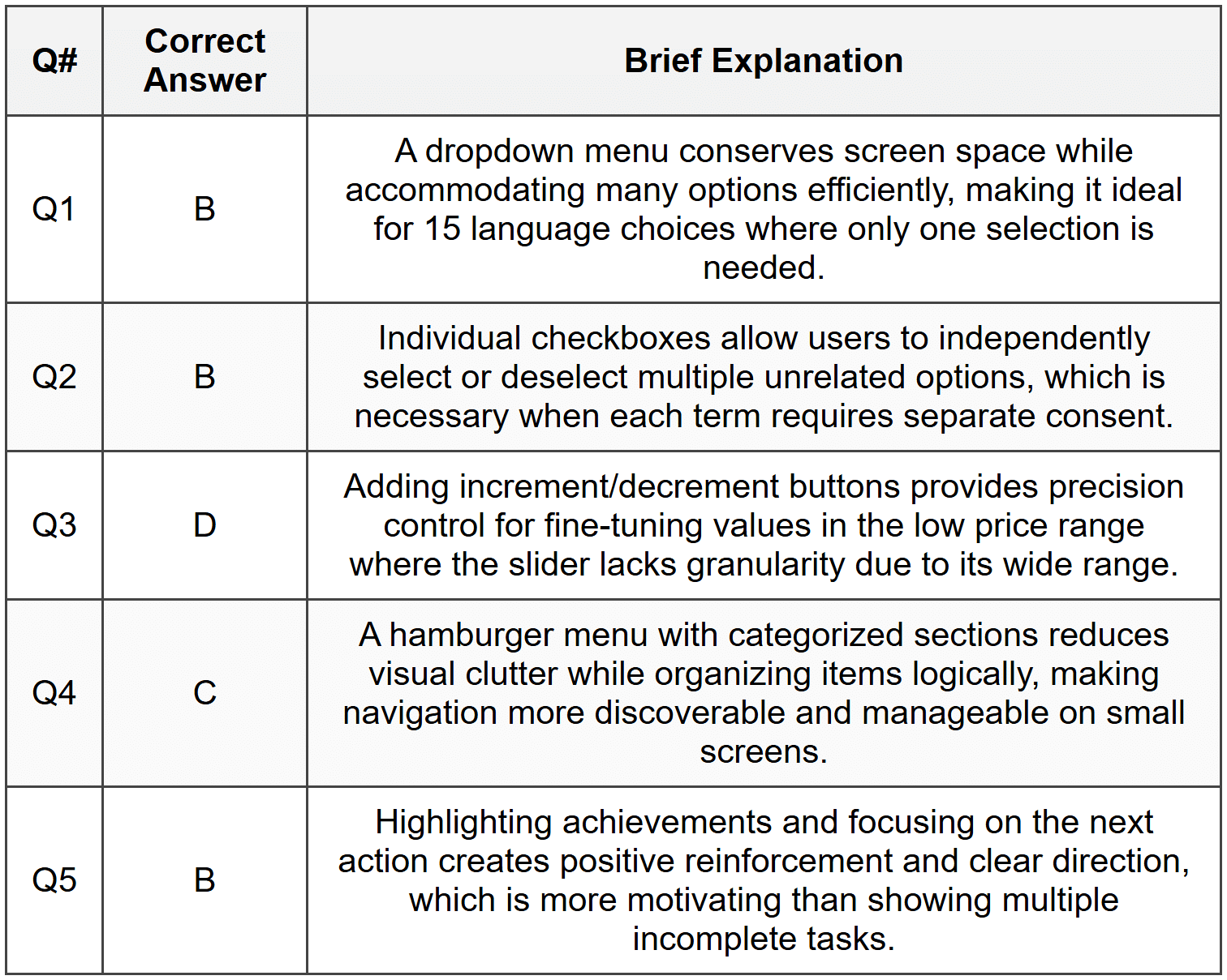
- Q1. A mobile app requires users to select their preferred language from a list of 15 options. Which UI component would provide the best user experience while conserving screen space?
- A series of radio buttons arranged vertically
- A dropdown menu (spinner)
- A horizontal scrolling list of buttons
- A grid of toggle switches
- Q2. You are designing a form where users need to agree to multiple independent terms (privacy policy, marketing emails, data sharing). Which component combination is most appropriate?
- Radio buttons grouped together
- Individual checkboxes for each option
- A single toggle switch for all terms
- A dropdown menu with multi-select
- Q3. An e-commerce app displays a product price slider ranging from $0 to $5000. Users complain they cannot accurately select prices between $10 and $50. What is the best solution?
- Increase the slider width to fill the entire screen
- Replace the slider with text input fields for min and max values
- Use a logarithmic scale for the slider
- Add increment/decrement buttons alongside the slider
- Q4. A navigation bar needs to accommodate 8 main sections in a mobile app. When tested, users struggle to locate specific sections. Which design decision would most improve usability?
- Reduce font size to fit all items on one line
- Use icons only without text labels
- Implement a hamburger menu with categorized sections
- Create a two-row navigation bar
- Q5. A fitness app uses progress bars to show workout completion. Users report feeling discouraged when seeing multiple incomplete bars. Which redesign would better support user motivation?
- Remove the progress bars entirely
- Show only completed workouts with checkmarks and highlight the next workout
- Use red color for incomplete workouts to create urgency
- Display all progress bars but reduce their size
Section 2: Conceptual Understanding
- Q1. Explain the difference between a modal dialog and a bottom sheet in mobile interfaces. Describe one scenario where each would be the better choice.
- Q2. What are the key considerations when choosing between a tab bar and a segmented control for navigation in a mobile application?
- Q3. Describe how the principle of affordance applies to button design. Provide three specific visual characteristics that make a button appear clickable.
- Q4. Why is consistent spacing important in UI component layouts? Explain how it affects both aesthetics and usability.
Section 3: Situational / Applied Questions
- Q1. You are designing a restaurant booking app. Users need to select a date, time, party size, and special requirements. Map out which UI components you would use for each input field and justify your choices based on user experience principles.
- Q2. A social media app currently uses a floating action button (FAB) for creating new posts. User testing reveals that 30% of users don't notice this button. Propose two alternative designs that might improve discoverability while maintaining clean visual design.
- Q3. You are tasked with designing a settings page for a mobile banking app that includes approximately 25 different settings across categories like Security, Notifications, Display, and Privacy. Describe how you would organize these settings using appropriate UI components to ensure easy navigation and prevent overwhelming the user.
Section 4: Skill Demonstration Task
Design a Component Specification Document
Create a detailed specification for a custom star rating component that will be used across a movie review website and mobile app. Your specification should include:
- Visual description (size, color states, spacing)
- Interaction behavior (how users select ratings, hover states, touch targets for mobile)
- Accessibility considerations (keyboard navigation, screen reader support)
- Responsive behavior (how it adapts from mobile to desktop)
- Edge cases (half-star ratings, read-only vs interactive states, no rating state)
Format your specification as a structured document with clear headings and bullet points. Include descriptions of at least 4 different states the component can have.
Section 5: Self-Reflection
- Q1. Reflect on a mobile app or website you use frequently. Identify one UI component that you find particularly well-designed and explain what makes it effective. Then identify one component that frustrates you and suggest how it could be improved.
- Q2. What aspects of UI component design do you find most challenging? Is it choosing the right component for a task, ensuring accessibility, maintaining consistency, or something else? Explain why.
- Q3. How has your understanding of UI components changed after studying this chapter? Identify one specific principle or guideline you will apply in your future design work.
Answer Key
Section 1 - MCQ Answers
Section 2 Answers
Q1: A modal dialog is an overlay that appears above the main content and blocks interaction with the underlying interface until dismissed. It demands immediate attention and is used for critical actions like confirmations or errors. A bottom sheet slides up from the bottom of the screen and can be either modal or allow interaction with content behind it. Bottom sheets are better for mobile contexts where users need to view options or details without completely losing context of the main screen (like sharing options), while modals are better for critical decisions that require full user focus (like confirming account deletion).
Q2: A tab bar typically appears at the bottom of mobile apps (or top on desktop) and provides navigation between distinct app sections, remaining visible across different views. A segmented control is used to switch between different views or filters within the same context or screen. Tab bars are chosen when you have 3-5 primary app sections that users switch between frequently. Segmented controls are preferred when you have 2-3 variations of the same content type (like switching between list view and map view, or filtering between categories on the same page).
Q3: Affordance refers to the perceived actionability of an element-how clearly an object communicates how it should be used. In button design, affordance is created through: (1) dimensional appearance using shadows or borders that make the button appear raised or clickable; (2) shape convention, typically rectangular with rounded corners that signals interactivity; (3) color contrast that distinguishes the button from the background, making it stand out as an interactive element rather than static text.
Q4: Consistent spacing creates visual rhythm and hierarchy, making interfaces easier to scan and understand. From an aesthetic perspective, it creates balance and professionalism. For usability, consistent spacing helps users predict where to find information, reduces cognitive load by establishing patterns, and ensures adequate touch targets on mobile devices. Inconsistent spacing can make interfaces feel chaotic, make it harder to distinguish between grouped and separate elements, and create accidental taps when elements are too close together.
Section 3 Answers
Q1: For the restaurant booking app, I would use:
- Date selection: A calendar picker (date picker component) that opens when users tap the date field. This provides visual context for available dates and makes it easy to select dates relative to today.
- Time selection: A dropdown menu or time picker wheel showing available reservation times (e.g., 5:00 PM, 5:30 PM, 6:00 PM). This constrains choices to actual availability and prevents errors.
- Party size: A number stepper (increment/decrement buttons) or dropdown for 1-10 guests. Steppers work well for small ranges and make the numeric nature clear.
- Special requirements: A text area (multi-line text input) for dietary restrictions or accessibility needs. This allows free-form input since requirements vary widely and can't be predicted with preset options.
These choices prioritize preventing user errors through constrained inputs while allowing necessary flexibility where needed.
Q2: Two alternative designs to improve FAB discoverability:
- Alternative 1: Replace the FAB with a prominent button in the top navigation bar labeled "Create Post" with an icon. This follows established patterns from popular apps and places the action in a predictable location where users look for primary actions.
- Alternative 2: Use an empty state design that displays a large "Create your first post" button with visual prominence when the user's feed is empty or when they first open the app. For subsequent visits, maintain a persistent "New Post" option in the bottom tab bar as one of the main navigation items.
Both alternatives increase visibility by placing the action in high-attention areas and using familiar patterns.
Q3: For organizing 25 settings across multiple categories in a banking app, I would use:
- Main structure: A grouped list with expandable sections (accordion pattern) or a scrollable page with clear section headers for Security, Notifications, Display, and Privacy.
- Individual settings: Use toggle switches for binary on/off settings (like "Enable biometric login" or "Push notifications"). Use list items with disclosure indicators (chevron arrows) for settings that open sub-pages with multiple options (like "Language preferences" or "Notification types").
- Visual hierarchy: Use dividers between categories, slightly larger/bold text for category headers, and adequate spacing to create clear visual groups.
- Search functionality: Include a search bar at the top to help users quickly find specific settings without scrolling through all categories.
This approach prevents overwhelming users by chunking information into logical categories and using progressive disclosure to hide complexity until needed.
Section 4 - Sample Demonstration
Star Rating Component Specification
1. Visual Description
- Component consists of 5 star icons arranged horizontally
- Star size: 32×32 pixels on desktop, 44×44 pixels on mobile (minimum touch target)
- Spacing: 8 pixels between stars on desktop, 12 pixels on mobile
- Color states:
- Unselected: Light gray (#CCCCCC)
- Selected: Gold (#FFB400)
- Hover (desktop): Darker gold (#FFA500)
- Disabled/Read-only: Selected stars in muted gold (#D4A574), unselected in very light gray (#E8E8E8)
- Icon style: Filled stars for selected state, outlined stars for unselected state
2. Interaction Behavior
- Desktop interaction:
- On hover, highlight the hovered star and all stars to the left to preview the rating
- On click, set the rating and maintain the selected state
- Keyboard navigation: Use arrow keys to move between stars, Enter/Space to select
- Mobile interaction:
- Tap a star to select that rating level
- No hover state; immediate visual feedback on tap
- Touch target extends beyond visible star to ensure 44×44 pixel minimum
- Interactive mode: Stars are clickable/tappable and change state on interaction
- Read-only mode: Stars display a rating but do not respond to interaction; cursor shows default pointer, not hand cursor
3. Accessibility Considerations
- ARIA label: "Rate this movie, 0 to 5 stars" with current rating announced
- Each star has role="radio" within a radiogroup, with current selection marked as checked
- Screen reader announces "3 out of 5 stars" for current rating
- Keyboard navigation supported with focus indicators (visible outline on focused star)
- Color is not the only indicator-filled vs outlined shapes provide non-color distinction
- Minimum contrast ratio of 3:1 between selected stars and background
4. Responsive Behavior
- Mobile (320-767px): 44×44 pixel stars with 12px spacing, stacked below movie title if needed
- Tablet (768-1023px): 36×36 pixel stars with 10px spacing, inline with content
- Desktop (1024px+): 32×32 pixel stars with 8px spacing, hover effects enabled
- Component maintains left alignment but can be centered through parent container
- Total component width adjusts based on star size and spacing to remain proportional
5. Edge Cases and States
- State 1 - No rating: All stars appear outlined in light gray; placeholder text "Not yet rated" appears to the right
- State 2 - Half-star ratings: Component can display 3.5 stars by showing half-filled star icon for partial values when in read-only mode displaying aggregate ratings
- State 3 - Interactive editing: User can change their previously submitted rating; component shows current rating on load and allows modification
- State 4 - Disabled state: Stars appear in muted colors with 50% opacity, cursor shows "not-allowed" icon, and tooltip explains "You must watch the movie to rate it"
- State 5 - Error state: If rating submission fails, component shows red outline with error message below
- State 6 - Loading state: During submission, stars show subtle animation or spinner overlay to indicate processing
Section 5 - Reflection Guidance
Q1 Sample Response: I frequently use Spotify, and one UI component I find particularly well-designed is the playback control bar at the bottom of the screen. It remains persistently visible across all screens, uses universally recognized icons (play, pause, skip), and provides at-a-glance information about the currently playing song with album art. The progress bar is also interactive-I can tap anywhere to skip to that point in the song. What makes this effective is its consistency, accessibility, and the way it balances providing essential controls without consuming too much screen space.
One component that frustrates me is the search filter system in a shopping app I use. After applying multiple filters (size, color, price range), there's no clear visual summary of active filters, and removing them requires going back into the filter menu. A better design would show active filters as removable chips or tags above the product grid, allowing quick removal with a tap on an X icon. This would provide better visibility of system status and give users more direct control.
Q2 Sample Response: I find ensuring accessibility the most challenging aspect of UI component design. While I can usually identify the right component for a task based on familiar patterns, thinking through how someone using a screen reader, keyboard-only navigation, or other assistive technologies will interact with the component requires a different mindset. It's challenging because accessibility isn't always visible in the final design-it requires understanding ARIA labels, focus management, and semantic HTML, which are technical concerns beyond visual design. I recognize this is an area where I need to improve by testing with actual accessibility tools and learning from WCAG guidelines rather than treating accessibility as an afterthought.
Q3 Sample Response: Before studying this chapter, I often chose UI components based primarily on aesthetics or what I'd seen in other apps, without deeply considering the specific user needs and context. My biggest takeaway is the importance of matching component affordances to user expectations and task requirements. For example, I now understand why a slider might be wrong for precise value entry even though it looks modern, and why sometimes a simple text input is more appropriate. One specific principle I will apply is progressive disclosure-using components like expandable sections, steppers, and modals to reveal complexity only when needed, rather than overwhelming users with all options at once. This helps create cleaner interfaces that scale better as feature sets grow.


