Assignment : Design Systems


Section 1: Multiple Choice Questions
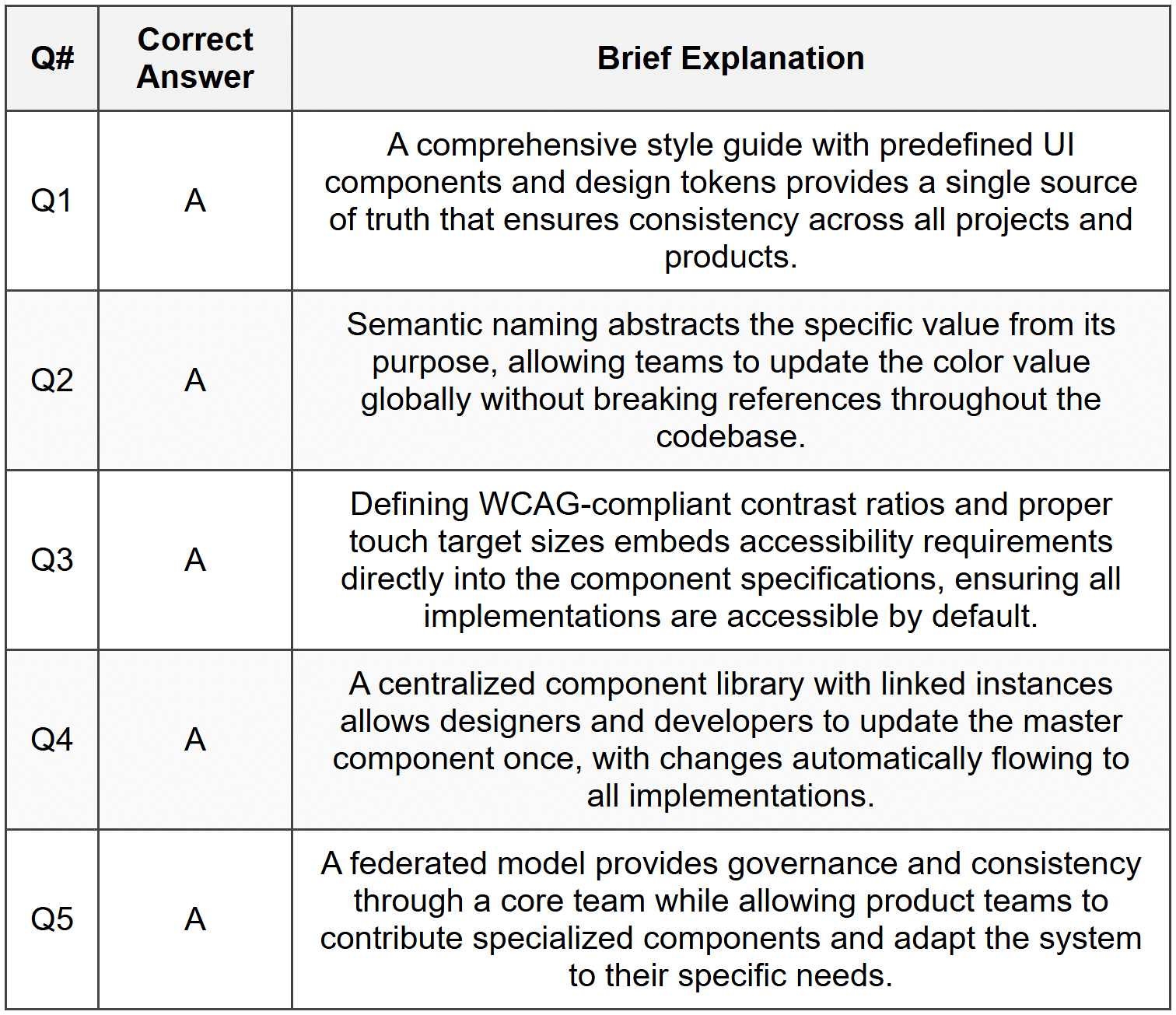
- Q1. A design team is working on multiple digital products simultaneously and notices inconsistencies in button styles, colors, and spacing across different projects. Which core component of a design system would best address this issue?
- A comprehensive style guide with predefined UI components and design tokens
- A project management tool to track design tasks
- Individual designer portfolios showcasing their work
- A collection of user feedback forms
- Q2. When implementing design tokens in a design system, what is the primary advantage of using semantic naming conventions like "color-primary-action" instead of "color-blue-500"?
- Semantic names allow teams to change the underlying value without updating component references throughout the system
- Semantic names are shorter and easier to type
- Semantic names automatically generate documentation
- Semantic names eliminate the need for design reviews
- Q3. A mobile app development team wants to ensure their design system remains accessible. Which approach best demonstrates proper implementation of accessibility principles within a design system?
- Defining color contrast ratios that meet WCAG standards and including touch target sizes of at least 44×44 pixels in component specifications
- Using bright colors throughout the interface to make elements stand out
- Creating components that only work with mouse input
- Focusing exclusively on visual aesthetics without functional considerations
- Q4. A company's design system includes a card component used across web and mobile platforms. The design team needs to update the card's border radius from 4px to 8px. What characteristic of a well-structured design system makes this update efficient?
- Centralized component library where updating the master component automatically propagates changes to all instances
- Individual designers manually updating each card instance in their projects
- Creating entirely new components for each variation needed
- Documenting the change in a PDF and emailing it to all team members
- Q5. When scaling a design system for a growing organization with multiple product teams, which governance model best balances consistency with team autonomy?
- A federated model with a core design system team and designated representatives from each product team who contribute components and provide feedback
- Allowing each team to create completely independent design systems without any coordination
- Having a single designer make all decisions without input from other teams
- Eliminating all design standards to maximize creative freedom
Section 2: Conceptual Understanding
- Q1. What is a design system and how does it differ from a simple style guide? Explain the key components that make up a comprehensive design system.
- Q2. Explain the concept of design tokens and describe how they contribute to maintaining consistency across different platforms (web, iOS, Android).
- Q3. Why is documentation an essential part of a design system? What types of information should be included in component documentation?
- Q4. Describe the relationship between atomic design methodology and design systems. How do atoms, molecules, and organisms help structure a component library?
Section 3: Situational / Applied Questions
- Q1. Your organization is launching a new mobile app while maintaining an existing website. The CEO wants both platforms to feel like part of the same brand, but the mobile app needs gesture-based interactions that don't exist on the web. How would you structure your design system to accommodate platform-specific needs while maintaining brand consistency? Describe your approach to creating shared and platform-specific components.
- Q2. A developer on your team wants to create a button variant that doesn't exist in the current design system because they believe it would improve user experience in a specific context. As the design system owner, how would you handle this request? Outline the evaluation process you would use to decide whether to add this component to the system or recommend an alternative approach.
- Q3. You've been tasked with auditing an existing product suite of five different applications to create a unified design system. During your audit, you discover that the same button type has been implemented in eight different ways across the applications. Describe the step-by-step process you would follow to consolidate these variations into a coherent component system, including how you would handle stakeholder concerns about changing existing designs.
Section 4: Skill Demonstration Task
You are creating the foundation for a design system for a fintech mobile application that will also have a web version. Your task is to design the documentation for a primary button component.
Deliverables:
- Create a complete component specification document in HTML table format that includes:
- Component name and description
- Visual properties (height, padding, border radius, typography)
- Color specifications for different states (default, hover, pressed, disabled)
- Minimum touch/click target size
- Accessibility requirements (contrast ratio, keyboard navigation)
- Define at least 4 design tokens that would be used in this button component (e.g., spacing, color, typography), using semantic naming conventions
- List 3 usage guidelines that specify when this button should and should not be used
- Describe how this button component would adapt between mobile and web platforms
Section 5: Self-Reflection
- Q1. Reflect on a digital product you use frequently (website or app). Can you identify elements of consistency that suggest the presence of a design system? What inconsistencies have you noticed that might indicate the lack of a robust design system?
- Q2. What aspects of creating and maintaining a design system do you find most challenging? Is it the technical implementation, the documentation process, getting stakeholder buy-in, or ensuring adoption across teams?
- Q3. How would you measure the success of a design system implementation? What metrics or indicators would demonstrate that the design system is providing value to both the design team and the organization?
Answer Key
Section 1 - MCQ Answers
Section 2 Answers
Q1: A design system is a comprehensive collection of reusable components, patterns, guidelines, and standards that govern how digital products are designed and built. While a style guide typically focuses on visual elements like colors, typography, and logo usage, a design system is much broader and includes functional UI components (buttons, forms, navigation), interaction patterns, code snippets, accessibility standards, content guidelines, and design principles. Key components of a comprehensive design system include: design tokens (foundational variables for spacing, colors, typography), a component library (reusable UI elements), pattern documentation (common interface solutions), design principles (guiding philosophies), and governance guidelines (processes for contribution and updates).
Q2: Design tokens are named entities that store visual design attributes such as colors, spacing values, font sizes, and animation durations. They serve as the foundational layer of a design system by creating a single source of truth for design decisions. Design tokens contribute to cross-platform consistency by abstracting design values from their implementation. For example, a token named "spacing-medium" might translate to 16px on web, 16pt on iOS, and 16dp on Android. When design decisions change, updating the token value automatically propagates the change across all platforms. This abstraction allows different platforms to interpret values according to their technical requirements while maintaining visual consistency.
Q3: Documentation is essential because it transforms a component library from a collection of visual elements into a usable system that teams can implement consistently. Without proper documentation, components may be misused, implemented inconsistently, or duplicated unnecessarily. Component documentation should include: a description of the component's purpose and use cases, visual examples showing all states and variations, technical specifications (dimensions, spacing, colors), code snippets for implementation, accessibility requirements, usage guidelines specifying when to use or avoid the component, responsive behavior across different screen sizes, and interaction specifications describing hover states, animations, and transitions.
Q4: Atomic design methodology, developed by Brad Frost, provides a hierarchical structure for organizing design system components based on their complexity. Atoms are the smallest building blocks (buttons, inputs, labels, icons) that cannot be broken down further. Molecules are simple combinations of atoms that function together (a search field combining an input and button). Organisms are more complex combinations of molecules and atoms that form distinct sections of an interface (a header containing logo, navigation, and search). This methodology helps structure a component library by providing clear categories and relationships between components, making it easier to build, maintain, and scale the system. It encourages reusability by ensuring that complex components are built from simpler, foundational elements.
Section 3 Answers
Q1: I would structure the design system using a three-tier approach: Core Foundation (shared across all platforms) including brand colors, typography scales, spacing system, and core design principles; Cross-Platform Components (adapted but consistent) such as buttons, cards, and form elements that maintain visual consistency while respecting platform conventions; and Platform-Specific Patterns for gestures and interactions unique to mobile (swipe actions, pull-to-refresh) or web (hover states, keyboard shortcuts). The design tokens would be platform-agnostic at the foundation level, with platform-specific implementations. For example, a "primary button" would share the same color token and corner radius token, but the mobile version would include larger touch targets (minimum 44×44 pixels) and potentially different feedback animations. Documentation would clearly indicate which components are universal and which have platform-specific variations, with visual examples from both contexts.
Q2: I would implement a structured contribution process: First, I would schedule a meeting with the developer to understand the specific use case and user experience problem they're trying to solve. Second, I would evaluate whether existing components could be configured or combined to meet the need. Third, if a new variant is genuinely needed, I would assess whether this is a one-off edge case or a pattern that might appear across other contexts. Fourth, I would involve other designers and product teams to gather input on whether they have similar needs. If the component should be added, I would create proper documentation, ensure it meets accessibility standards, and add it through the formal contribution process with appropriate review. If it's too specific, I would work with the developer to create a local variation while documenting why it exists outside the system. This approach balances flexibility with governance, preventing design system bloat while remaining responsive to legitimate needs.
Q3: My consolidation process would follow these steps: Step 1 - Audit and Document: Catalog all eight button variations with screenshots, specifications, and usage contexts to understand why variations emerged. Step 2 - Analyze Patterns: Identify legitimate differences (primary vs. secondary actions, different sizes) versus inconsistencies (slight color variations, spacing differences). Step 3 - Define Standard: Create a unified button component with documented variants (primary, secondary, tertiary) and sizes (small, medium, large) based on actual functional needs. Step 4 - Stakeholder Alignment: Present findings to product teams, showing how consolidation improves consistency and reduces maintenance while preserving necessary functionality. Address concerns about existing designs by proposing a phased migration plan. Step 5 - Migration Plan: Prioritize high-traffic or actively developed applications for immediate updates, while scheduling lower-priority applications for gradual transition. Step 6 - Implementation Support: Provide designers and developers with updated component libraries, code snippets, and migration guides to ease the transition.
Section 4 - Sample Demonstration
Primary Button Component Specification
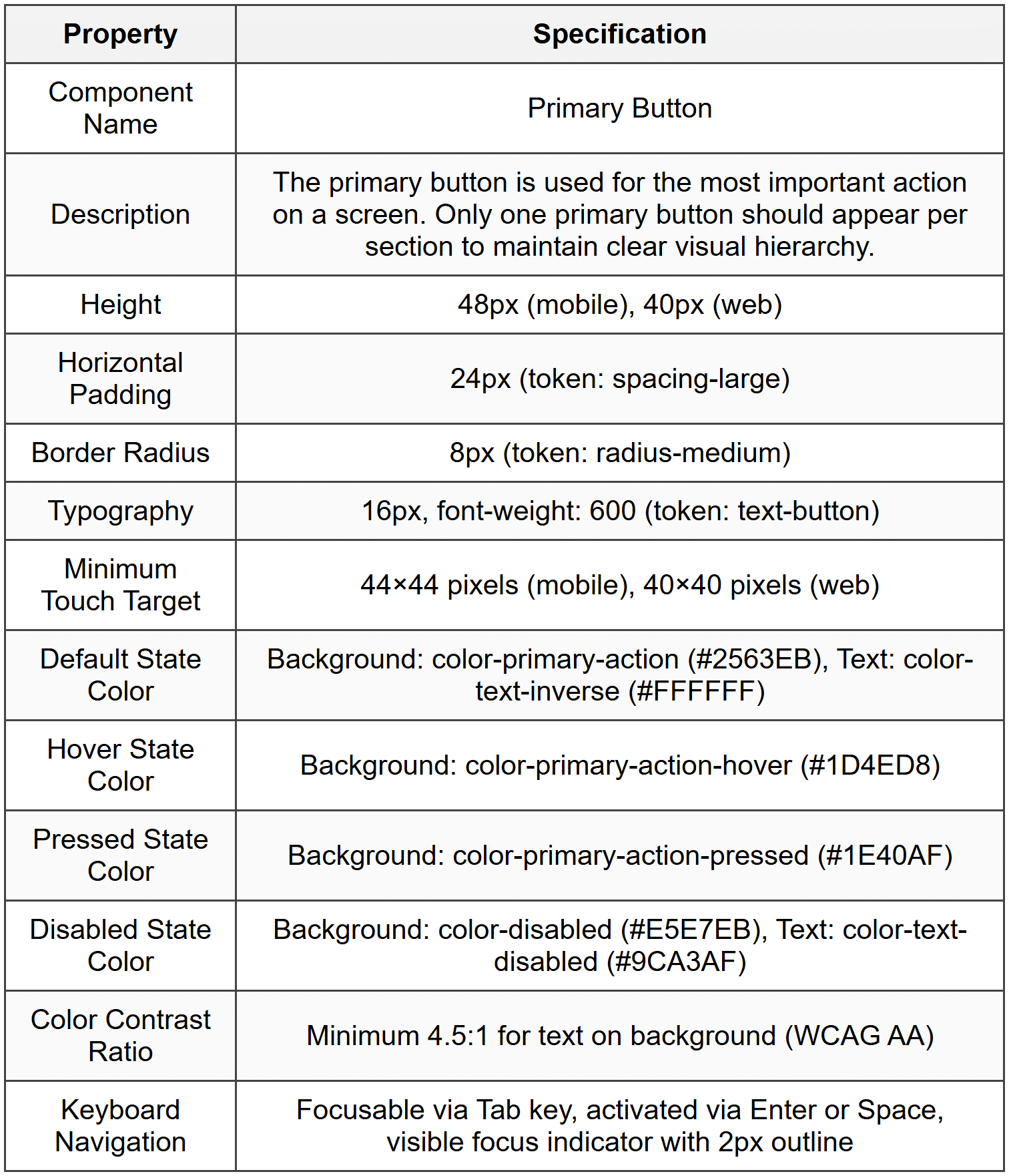
Design Tokens:
- color-primary-action: #2563EB (Brand blue used for primary interactive elements)
- spacing-large: 24px (Large spacing unit for generous padding)
- radius-medium: 8px (Medium corner radius for modern, friendly appearance)
- text-button: 16px / 600 weight / -0.01em letter-spacing (Typography specifications for button labels)
Usage Guidelines:
- When to use: Use the primary button for the main action users should take on a screen, such as "Submit," "Save," "Continue," or "Purchase." This button should represent the primary user goal.
- When not to use: Do not use multiple primary buttons in the same section or screen area. If multiple actions are needed, use secondary or tertiary button styles for less important actions. Do not use for destructive actions like "Delete" - use a specific destructive button variant instead.
- Accessibility consideration: Always include descriptive button text that clearly indicates the action. Avoid generic labels like "Click here." Ensure sufficient spacing between buttons to prevent accidental taps on mobile devices.
Platform Adaptation:
The primary button maintains consistent visual identity across platforms while respecting platform conventions. On mobile (iOS/Android), the button uses a larger minimum height of 48px to accommodate comfortable thumb tapping and follows the 44×44 pixel touch target guideline. Press states include subtle scale animation (98% of original size) for tactile feedback. On web, the button height is reduced to 40px to match desktop interface density, hover states reveal the darker shade, and cursor changes to pointer. Focus states on web include a visible keyboard focus indicator for accessibility, while mobile relies on system-provided focus feedback. Both platforms use the same color tokens and border radius to maintain brand consistency.
Section 5 - Reflection Guidance
Q1 Sample Response: Looking at Spotify's mobile app and web player, I can identify strong evidence of a design system. The green accent color (#1DB954) appears consistently across buttons, progress bars, and active states on both platforms. Typography follows a clear hierarchy with consistent font sizes and weights. The card-based layout pattern for playlists and albums is identical across contexts. The play button icon and other controls maintain the same visual style and positioning. However, I notice some inconsistencies in spacing - the mobile app sometimes uses tighter padding in lists compared to the web version, and some iconography appears slightly different between platforms. The navigation patterns are also quite different, with bottom tabs on mobile versus a persistent sidebar on web, though this could be an intentional platform-specific adaptation rather than an inconsistency. These observations suggest Spotify has a robust design system for core visual elements and components, but may have platform-specific pattern libraries that allow for appropriate interface adaptations.
Q2 Sample Response: The aspect I find most challenging about design systems is ensuring adoption and proper usage across teams, particularly as organizations scale. It's relatively straightforward to create components and write documentation, but significantly harder to change team workflows and habits. Designers may be tempted to create one-off variations instead of using existing components, developers might implement components inconsistently due to time pressure, and product managers might not understand why standardization matters. Getting stakeholder buy-in requires demonstrating concrete value, which can be difficult in the early stages before efficiency gains become apparent. Additionally, maintaining a design system requires ongoing effort - reviewing contribution requests, updating components as technology evolves, and keeping documentation current. I believe the key to overcoming these challenges is treating the design system as a product itself, with dedicated resources, clear governance processes, regular communication about updates, and metrics that demonstrate its impact on design and development velocity.
Q3 Sample Response: I would measure design system success using both quantitative and qualitative metrics across three categories. Efficiency Metrics: Track the time required to design and develop new features before and after design system implementation, measure the reduction in design QA issues and inconsistencies, and monitor the decrease in redundant component creation. Adoption Metrics: Measure the percentage of products using the design system, track the number of components from the system versus custom implementations in new features, and monitor the frequency of system updates and contributions from different teams. Quality Metrics: Assess improvements in accessibility compliance scores, measure brand consistency through design audits, and track user experience improvements through usability testing and satisfaction scores. Qualitative Indicators: Conduct regular surveys with designers and developers about system usability, gather feedback on documentation quality, and track the number of support questions or clarifications needed. Success would be indicated by increased adoption rates, faster feature delivery, improved consistency across products, positive team feedback, and ultimately better user experiences as evidenced by user research and product metrics.


