Assignment : Components & Variants


Section 1: Multiple Choice Questions
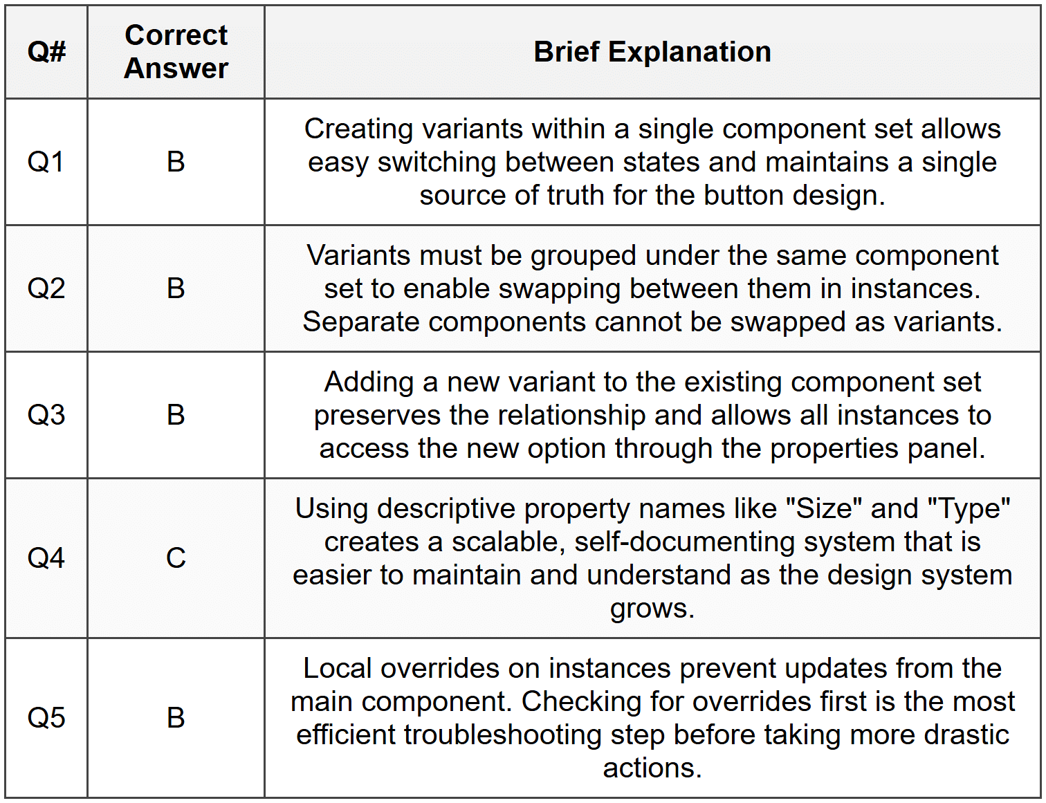
- Q1. You are designing a button component that needs three states: default, hover, and disabled. What is the most efficient way to manage these variations in Figma?
- Create three separate components and manually switch between them
- Create a component with variants for each state
- Use instances and override properties each time
- Duplicate the button frame for each state without creating components
- Q2. A designer creates a card component with variants for "Image Left" and "Image Right" layouts. When they try to swap between variants in an instance, the option doesn't appear. What is the most likely cause?
- The component properties were not published to the team library
- The variants were not grouped under the same component set
- The instance was detached from the main component
- The component layer is locked in the design file
- Q3. You have a navigation component with variants for desktop, tablet, and mobile sizes. A team member needs to add a fourth variant for a new smartwatch interface. What is the correct approach?
- Create a new component set and link it manually to the existing one
- Add a new variant to the existing component set with appropriate property values
- Duplicate one of the existing variants and rename it
- Convert the component to a frame, add the new design, then recreate the component
- Q4. When organizing a design system with multiple component variants, which naming convention best supports scalability and clarity?
- Button1, Button2, Button3, Button4
- Button_Blue, Button_Red, Button_Green
- Using property names like "Size=Large" and "Type=Primary"
- MainButton, SecondaryButton, TertiaryButton
- Q5. A designer notices that changing a color in the main component doesn't update in some instances across the project. What troubleshooting step should they take first?
- Delete all instances and recreate them from the updated component
- Check if those instances have local overrides applied to the color property
- Restart Figma and republish the component library
- Convert the instances back to frames and reapply the component
Section 2: Conceptual Understanding
- Q1. Explain the difference between a component and a variant in Figma. Why would you use variants instead of creating separate components?
- Q2. What are component properties in Figma, and how do they enhance the flexibility of design systems?
- Q3. Describe a real-world scenario where using component variants would significantly improve design workflow efficiency compared to using individual components.
- Q4. What happens to instances when you modify the main component? How does this behavior support design consistency?
Section 3: Situational / Applied Questions
- Q1. You are building a design system for an e-commerce application. The product card needs to display different states: in stock, low stock, and out of stock, with visual indicators for each. Additionally, the card has two layout options: grid view and list view. How would you structure this component using variants? Describe the properties you would create and their values.
- Q2. A marketing team requests that all primary buttons in the app be changed from blue to green for a seasonal campaign, but the change should not affect secondary buttons. Your button component has variants for Type (Primary, Secondary, Tertiary) and Size (Small, Medium, Large). Explain the steps you would take to efficiently implement this change across 50+ screens.
- Q3. You inherit a Figma project where the previous designer created 24 separate icon components for a social media app (each icon in four sizes and three color variations). How would you reorganize these into a more maintainable structure using variants? What properties would you define?
Section 4: Skill Demonstration Task
Create a comprehensive plan for building a toggle/switch component with variants that demonstrates best practices in component architecture. Your plan should include:
- A list of all variant properties and their possible values (e.g., State, Size, Label position)
- A description of the visual differences between each variant
- Naming conventions you would use for properties and values
- How you would structure nested elements within the component (e.g., the switch handle, background, label text)
- At least three use cases where different variant combinations would be applied in an actual interface
- Considerations for maintaining consistency when the component is used across multiple projects
Section 5: Self-Reflection
- Q1. Reflect on your current understanding of components and variants. Which aspect of this system do you find most challenging, and what specific steps will you take to improve your proficiency?
- Q2. How would implementing a well-structured variant system change the way you approach repetitive design elements in your projects? Provide specific examples from your own work.
- Q3. What strategies would you use to decide when a design element deserves to be a component with variants versus remaining a simple frame or group?
Answer Key
Section 1 - MCQ Answers
Section 2 Answers
Q1: A component in Figma is a reusable design element that serves as a master template. Variants are different versions of the same component grouped within a component set, allowing designers to swap between variations (like different sizes, colors, or states) without creating entirely separate components. Using variants is more efficient because it keeps related variations organized in one place, reduces the number of individual components to manage, and provides a cleaner interface for swapping between options through properties.
Q2: Component properties in Figma are customizable attributes that define the different variations available within a component set. Properties can include boolean toggles (on/off), text values, instance swaps, and variant selections. They enhance design system flexibility by allowing designers to quickly customize instances without breaking the connection to the main component, enabling rapid iteration while maintaining consistency across the design.
Q3: Consider designing an alert or notification component for a web application. Without variants, you might create separate components for success alerts, error alerts, warning alerts, and info alerts, each potentially in dismissible and non-dismissible versions (8 separate components total). Using variants, you create one component set with properties for "Type" (Success, Error, Warning, Info) and "Dismissible" (True, False). This consolidates management, makes it easier to find the right alert in the assets panel, and allows instant swapping between alert types when designing flows, significantly speeding up the design process.
Q4: When you modify a main component, all instances of that component automatically update to reflect the changes, unless specific properties have been overridden at the instance level. This propagation behavior ensures design consistency across an entire project or design system. If you change a button's corner radius or padding in the main component, every instance updates simultaneously, eliminating the need to manually update each occurrence and reducing the risk of inconsistencies across different screens or projects.
Section 3 Answers
Q1: For the product card component, I would create a component set with two properties: Stock Status and Layout. The Stock Status property would have three values: "In Stock," "Low Stock," and "Out of Stock," each displaying different visual indicators such as color-coded badges or inventory text. The Layout property would have two values: "Grid" and "List," controlling the arrangement of the product image, title, price, and action buttons. This structure would result in six total variants (3 stock statuses × 2 layouts), allowing designers to quickly select the appropriate combination for any product display scenario. Each variant would maintain consistent information architecture while adapting the visual presentation to match both the availability status and the viewing context.
Q2: To efficiently implement this seasonal color change, I would follow these steps: First, locate the main button component set in the Figma file. Second, select specifically the Primary variant (or all Primary variants if there are multiple sizes). Third, update the fill color from blue to green on these selected variants only, leaving Secondary and Tertiary variants unchanged. Because instances are connected to the main component, this change would automatically propagate across all 50+ screens wherever Primary button instances are used. If color was managed using Figma styles (which is a best practice), I would simply update the primary button color style once, and all components using that style would update instantly. This demonstrates the power of component-based design systems in maintaining consistency while allowing targeted updates.
Q3: To reorganize the 24 icon components into a maintainable variant system, I would create a single component set for each unique icon design. For each icon, I would define two properties: Size with values "Small," "Medium," "Large," and "Extra Large" (or specific pixel dimensions like "16," "24," "32," "48"), and Color with values matching the three color variations needed (for example, "Primary," "Secondary," and "Neutral" or specific color names). This consolidates 24 separate components into potentially 6-8 component sets (depending on the number of unique icon designs), each with 12 variants (4 sizes × 3 colors). This structure makes icons much easier to find in the assets panel, allows quick swapping between sizes and colors through the properties panel, and significantly simplifies maintenance when design system updates are needed.
Section 4 - Sample Demonstration
Comprehensive Toggle/Switch Component Plan:
1. Variant Properties and Values:
- State: Off, On
- Size: Small, Medium, Large
- Label: None, Left, Right
- Disabled: False, True
2. Visual Differences Between Variants:
- State = Off: Switch handle positioned on the left, background color neutral/gray, label text (if present) in default color
- State = On: Switch handle positioned on the right, background color in brand/primary color, label text (if present) potentially in active color
- Size = Small: Track width 32px, height 18px, handle diameter 14px, label text 12px
- Size = Medium: Track width 44px, height 24px, handle diameter 20px, label text 14px
- Size = Large: Track width 56px, height 30px, handle diameter 26px, label text 16px
- Label = None: No text element visible
- Label = Left: Text label positioned to the left of the switch track
- Label = Right: Text label positioned to the right of the switch track
- Disabled = True: Reduced opacity (40-50%), cursor changes, colors desaturated
3. Naming Conventions:
- Component set name: "Toggle/Switch"
- Property names: State, Size, Label, Disabled (clear, descriptive, capitalized)
- Property values: Descriptive text rather than codes (e.g., "On" not "1", "Left" not "L")
- Variant naming would be auto-generated by Figma based on property combinations
4. Nested Element Structure:
- Track: Background rounded rectangle that forms the switch base, with auto-layout horizontal spacing
- Handle: Circular element positioned inside the track, using constraints to move left/right based on state
- Label Text: Text layer with conditional visibility based on Label property, using auto-layout to maintain proper spacing
- Container Frame: Outer auto-layout frame containing all elements, allowing proper spacing and alignment
- Use auto-layout to ensure consistent spacing and responsive behavior when swapping between variants
5. Use Cases for Variant Combinations:
- Settings Panel: Medium size, Label = Right, shows "Enable notifications" with toggle beside it (State varies by user preference)
- Compact Dashboard: Small size, Label = None, used in tight spaces where labels are shown elsewhere (State = On for active features)
- Accessibility Settings: Large size, Label = Left, Disabled = False/True based on dependencies (e.g., "High Contrast Mode" disabled until system theme is set)
6. Consistency Considerations:
- Define component using color styles and text styles from the design system to ensure updates propagate correctly
- Publish component to a shared team library so all projects access the same source
- Document usage guidelines including when to use each size and label position
- Create clear property descriptions in Figma so team members understand variant purposes
- Establish version control practices for component updates to avoid breaking existing designs
- Test component behavior across different backgrounds and contexts before finalizing
Section 5 - Reflection Guidance
Q1 Sample Response: I find organizing complex component sets with multiple properties most challenging, especially deciding which variations should be separate properties versus separate values within a property. To improve, I will practice by rebuilding existing component libraries, study design systems from established companies like Material Design or IBM Carbon, and create small practice projects where I intentionally build components with 3-4 properties each. I'll also review Figma's official documentation on component best practices weekly for the next month and join design community discussions to see how experienced designers approach component architecture decisions.
Q2 Sample Response: Implementing a well-structured variant system would transform my approach from reactive to proactive. Currently, I often duplicate elements and manually update them, which leads to inconsistencies when changes are needed. With variants, I would invest time upfront to identify all possible states and variations of repetitive elements like buttons, form fields, and cards. For example, in my recent mobile app project, I created separate instances of navigation icons in different colors-with variants, I could have created one icon set with a "State" property (Default, Active, Disabled) and swapped between them instantly. This would have saved hours during design reviews when stakeholders requested color adjustments and reduced errors where I missed updating certain instances.
Q3 Sample Response: My decision strategy would consider three factors: repetition, variation, and maintenance. An element deserves component treatment if it appears three or more times across the project, has multiple distinct variations (size, color, state), or requires consistent updates. For example, a unique hero image used once would remain a simple frame, but a testimonial card that appears in three layouts (with image left, right, or top) and two sizes (compact and expanded) would become a component with variants. I would also consider team collaboration-if others need to use the element, componentizing it ensures consistency. Elements that are purely decorative or highly contextual without reuse potential can remain as frames or groups to avoid cluttering the component library.


